This is pretty incredible...
DIA 1 min-remember we had accumulation yesterday and today, but look how much stronger the accumulation today is by looking at how shallow the trough of the 3C depth chart (bar chart below) is.
Here's the DIA 2 min chart with yesterday's accumulation, even in to the initial sell-off right after the FOMC statement, toy can see the crest of distribution fading yesterday and we are at a very shallow trough with a 3C leading positive divergence.
The 5 min chart is doing exactly what it should and reaching new leading highs on lower price moves, smart money always accumulates into 1) flat trading ranges 2) lower prices.
Here's the 15 min chart reaching a leading positive divergence.
This is what is truly spectacular. Look at the 3C depth chart on this 15 min chart, the deeper the rest, the more distribution, the shallower the trough, the more or stronger accumulation. This is a new low in the 3C depth chart, you can see by following the arrows marking the lows of each accumulation zone. This is why I chose the Dow as one of the longs. Usually (recently anyway) 1 day of accumulation led to 1 day of rally, but at these new, unseen lows that we see presently, I have no idea what the relationship would be, this is heavier accumulation then we have seen in 6 weeks.
IWM 2 min is also very low and a reason I also chose an IWM leveraged long.
A closer look shows a leading positive divergence on the 2 min chart.
IWM 5 min chart zoomed out so you can compare the 3C depth chart and see how low the trough is.
IWM 5 min chart zoomed in, a leading positive divergence and nearly making new highs at new lows in price.
IWM 15 min chart which is now leading positive and has made a higher low at each successive lower low in price.
However, the zoomed out 15 min chart really shows something incredible. Look at how shallow the trough is, the shallowest since July and probably a lot further back.
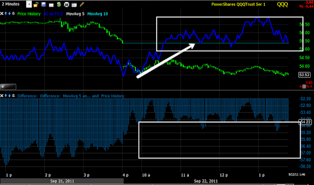
QQQ 2 min chart is positive, but not showing the same lows in the depth hart, this is why I didn't chose a QQQ long compared to the others. However it is still respectable.
The 2 min QQQ chart zoomed in closer reveals a leading positive divergence with higher lows at lower lows in price.
QQQ 5 min showing yesterday's accumulation and today's, somewhere between will be the average and distribution on a move up shouldn't start until that average price is passed.
15 min QQQ zoomed out, not seeing new lows, but still respectable.
SPY 1 min in a leading positive divergence today with yesterday's accumulation.
SPY 2 min chart zoomed out, this is a new low in the trough, not as low as the DIA/IWM, but still a strong signal.
SPY 5 min chart, note the relative position of 3C, it is in a leading positive divergence, not just for the day, but for the 6 week period.
And the 5 min chart zoomed in to a leading positive divergence making new highs.
The shallow troughs are something of an extreme that we haven't seen before and I'm guessing they have more to do with intensity, as to how that translates in to duration as we had the duration formula figured out, I don't know yet. Either way, it looks like the market is getting ready to put in a strong move up. The longer it accumulates, the longer the move up will be, but it should be enough to create a head fake on the bear flag, I'm starting to think we see two, unless this continues to accumulate over the next several days, then we could be looking at a move up totally different then what is assumed now.
Is interest rates about to start going up?
-
Yes, I know - it does not make any sense - FED is about to cut
rates...but....real world interest rates are not always what FED wants it
to be.
6 years ago


No comments:
Post a Comment