I consider myself a student of the market, not a guru or anything like that. With the market changing so fast, how can you not be an eternal student of the market? Just last Thursday we witnessed a 3C event, a literal event, that differed greatly from the normal process of a positive divergence. What I mean for some of our newer members is that distribution and accumulation are typically a process, Thursday we witnessed an event which is rare, in fact I don't recall the last time I saw something like this, so there's always something new to learn.
One of our members who has picked up on the proper use of 3C much faster than I did as its creator, shared with me a new timeframe that I hadn't used before (I learned something new again) and as yo know, I commonly say, "When in doubt, go to the longer timeframes" as they show more of the trend and less noise, although they lack the intraday detail, they are indispensable for understanding the big picture from micro to macro. So it is with much appreciation (thank you Tina) that I share this new 4 hour timeframe, which just so happens to confirm our view that we would see a strong short squeeze move up before the next primary leg down.
I'll share both the sub-intermediate view as well as the longer term charts representing the primary trend view.
The DIA 4 hour chart shows the distribution that we saw through various charts back in March when we started building Primary trend core short positions, this divergence ran right through May 1 which was the last area we were actively building primary trend short positions. As many of you know, by mid-May we were looking for a halt to the down trend (among some gimmicks and a bear trap) and eventually a short squeeze move higher. The leading positive divergence in the DIA now suggests that short squeeze move is still coming. Key notable positive divergences were at the bear trap lows of June 4th and the perceived failure of a test of resistance and the lows that came after that at June 25th.
As for the larger picture and primary trend...
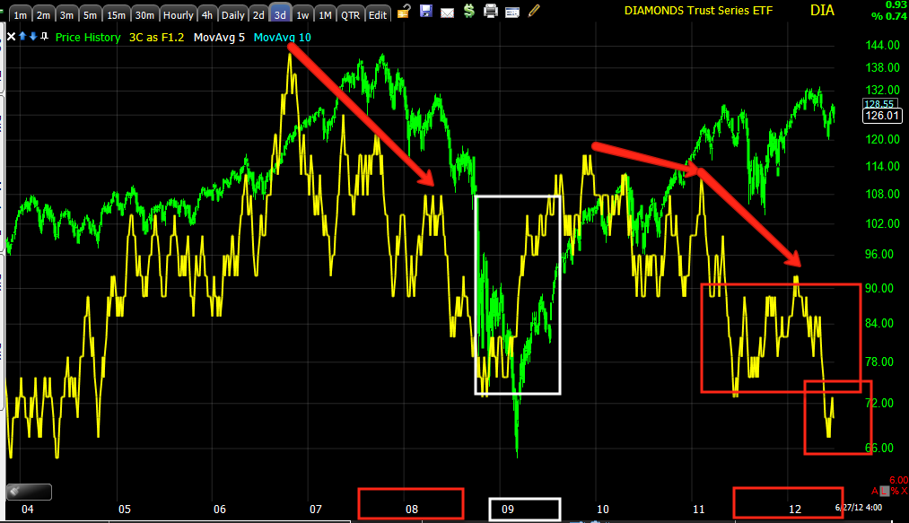
I'm using a DIA 3 day chart to show quite a bit of history going back to distribution during mid-2007, the leading positive divergence of March 2009 and how QE has created the rally from 2009 which I call a "house of cards", as we have a new leading negative low below the 2009 3C lows. Other notable negative divergences other than 2011 include the very fast and sharp March 2012 divergence.

The 4 hour QQQ chart which I would equate with the sub-intermediate-close to intermediate trend, also shows the negative divergence in to March 2012, the final May 1 high negative divergence and then the positive divergence we watched build in to a bear flag/pennant through May with a positive divergence at the bear trap lows of June 4th, a leading positive at the perceived failed test of resistance and the low that followed on June 25th and a current leading positive divergence that is well above the 3C reading at the May 1 highs. Again, this suggests the market DOES have more upside as we have felt for well over a month now, most likely a short squeeze move which I have said, "Could be VERY impressive", which would also allow us to add to or start new primary trend core short positions in to price strength.

The daily QQQ 3C chart showing the distribution "process" during 2011, the August lows we called as the market was in seeming free-fall, the October low we also called and the March 2012 negative divergence, since a leading negative divergence suggesting the Primary trend is alive and well and very bearish, however as you know, nothing moves straight up r down and the market is never going to make things easy. In fact I often say, "If it does look easy, you are probably being set up".
The SPY 4 hour chart is the one that Tina was telling me about, that ultimately got me working on getting the 4 hour timeframe on the layout. Again, the March 2012 distribution process is evident going in to the Mat 1 highs, the bear trap we expected at the June 4 lows with a positive divergence and at June 25th, 3C is in leading positive position, currently leading positive well above the 3C readings at May 1 and moving toward the readings from the March highs.
The daily 3C chart shows the primary trend with a positive divergence at the Oct. lows, th sharp distribution at the March highs and a leading negative divergence since then.
For perspective, the 2 day chart showing the major primary trend...
Here we see the positive divergence of the 203-207 bull market rally with confirmation of the ptrend at the green arrow, a negative divergence starting in 2007, the positive divergence of March 2009 and negative divergences at 2011 and March 2012 with a current leading negative divergence below the 2009 3C readings.
This should hopefully help to illustrate our view of the market from the near term sub-intermediate trend to the major primary trend.
Thanks again Tina for your help and dedication to bettering our understanding of the market.


No comments:
Post a Comment