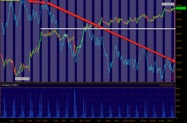
After having looked at the short term breadth charts (meaning since the break above resistance-move above the July area) and the longer term breadth charts, I found the ES shorter term and longer term 3C charts looking incredibly similar to the market breadth charts so I wanted to post them while the charts were still fresh in your head.
The ES 60 min 3C chart
The daily ES 3C chart, the yellow area is where we entered Core short positions, not only does 3C show the negative divergence going in to the end of April, but now another divergence and when compares to where price was in late April vs now, the divergence is monstrously large.
Is interest rates about to start going up?
-
Yes, I know - it does not make any sense - FED is about to cut
rates...but....real world interest rates are not always what FED wants it
to be.
6 years ago


No comments:
Post a Comment