That last post with the Inverse H&S I drew was pretty right on the spot, this isn't because I have any evidence to forecast it or it was just a guess (it was of course), but as I said in the post, it's just common price patterns that traders are use to seeing, in this way many times they are led around by the nose as these familiar patterns are used against them.
The charts...
This intraday chart is inline, the first higher peak has 3C higher, the second lower one has 3C lower, as long as it isn't leading lower, it's in line or price/trend confirmation.
The 3 min is leading as is the 1 min, but I had to zoom in closer for you to see the inline status.
What I was going to say was, the current 3C reading to the far right hasn't turned down which would have put it "In line " as well and I was going to say, "I'll be watching to see what it does". Well it has moved right up to the previous peak's 3C reading, dead even with it which is a stronger signal as price in lower at the most recent peak and it still hasn't locked in meaning it's still heading up.
QQQ 5 min leading positive also with an open ended 3C current reading like the one above. If you just step back and look at the chart it tells you or shows you a lot about how underlying trade works or "accumulation/distribution".
And the 10 min QQQ, again it's a longer timeframe, this more important, but they never look as sharp, however the longer the timeframe, the larger the underlying signal is.
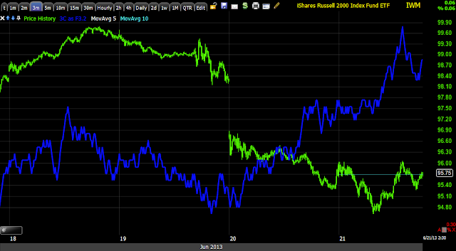
IWM 1 min looks perfectly in line zoomed in intraday, now look at the same chart in perspective.
IWM 1 min, this also tells you a lot about underlying trade, very often in a flat or range bound area or in a quiet area.
IWM 2 min also in line, but when zoomed to perspective below...
IWM 2 min
IWM 10 min, this represents the larger view, the bigger move. It takes time for smart money or any large player to move things around, this shows the process and again, the longer the timeframe, the larger the underlying movement.
Is interest rates about to start going up?
-
Yes, I know - it does not make any sense - FED is about to cut
rates...but....real world interest rates are not always what FED wants it
to be.
6 years ago


No comments:
Post a Comment