*I captured these charts about an hour ago for the most part, but their trend should still be intact and their meaning as well, I'll double check them just incase anything is different*
Earlier this week, I mentioned the market's lower volatility, we had just come out of 9 consecutive days in the S&P-500 in which there was a close down, a close up, a close down, a close up and so on and so forth for 9 days. The volatility for each day's ATR was quite wide which is why early this week I said that volatility had dies down and that was worth taking note of.
Changes in character lead to changes in trend. Then I showed you some previous tops like the September highs and more recent ones and showed you how the market can bounce back and forth with no direction that really holds until volatility makes its way back to the market.
Yesterday I explained again the 4 stages of a market or asset cycle, accumulation, mark-up, top and decline and I showed in every instance just how volatility preceded each of the transitions to the next stage whether from stage 1 to stage 2 or 2 to3, 3 to 4 or 4 back to 1. Volatility always manifests before a trend change and that's what I saw this week, the die off of volatility and though t it was worth noting.
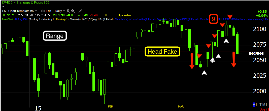
Early 2015 was the obvious range with very defined resistance which is why we forecast in advance that there would be a head fake move above as retail traders would chase the breakout above a clear resistance area and smart money would sell in to their demand which is what all of the 3C chart and breadth charts show us as it happened and now. In early MArch the entire head fake move was retraced which below the area where long stops would be hit, made for a perfect area for a bounce which is what we first spotted on March 10th as we took action to protect profits in puts,
Closing Down the AAPL and QQQ Puts for now
Since then, the market did bounce as we expected on MArch 10th and that's the 9 consecutive days of high volatility and daily ATRs (average True Range) with a small white arrow for each day up and a small red arrow for each day down as they alternated day after day for 89 days.
Then suddenly volatility died at the top of stage 3 distribution and the candle bodies were small, the die off of volatility. Since then, it has picked up the last 3 days as half of the major averages have not only retraced ALL of the F_O_M_C Knee Jerk reaction,
but are also red Year to Date,
Today's hammer suggests we see a bounce and it doesn't matter if there are a few days of upside, what matters now is that the volatility increases, as it does, we enter an area or stage that is ready to transition to stage 4 decline with the increased volatility
so while the bounce (if it has strong volatility) may look very strong and may look like the market can't or won't break down, THIS IS EXACTLY WHAT WE HAVE BEEN LOOKING THE LAST SEVERAL DAYS FOR IN ORDER FOR THE MARKET TO BREAK DOWN.
As I often say, "Price can be deceiving".
The Hammer candle is almost enough to convince me we are going to bounce to the upside, especially with internals as shown in last night's Daily Wrap and Tuesday's both showing a strong short term 1-day oversold condition. This bounce is what we have expected and is also what we need for stage 4 decline to really make a move to the downside and for that move to stick.
As for Leading Indicators, I showed yesterday before the overnight surprise fundamental news sent the market lower, that they were in line to support a short term bounce. I also try to include the bigger picture so you know what the longer term probabilities are, in this way we can use the bounce to our advantage in selling or shorting in to it, replacing positions like UVXY or entering new put positions.
Leading Indicators...
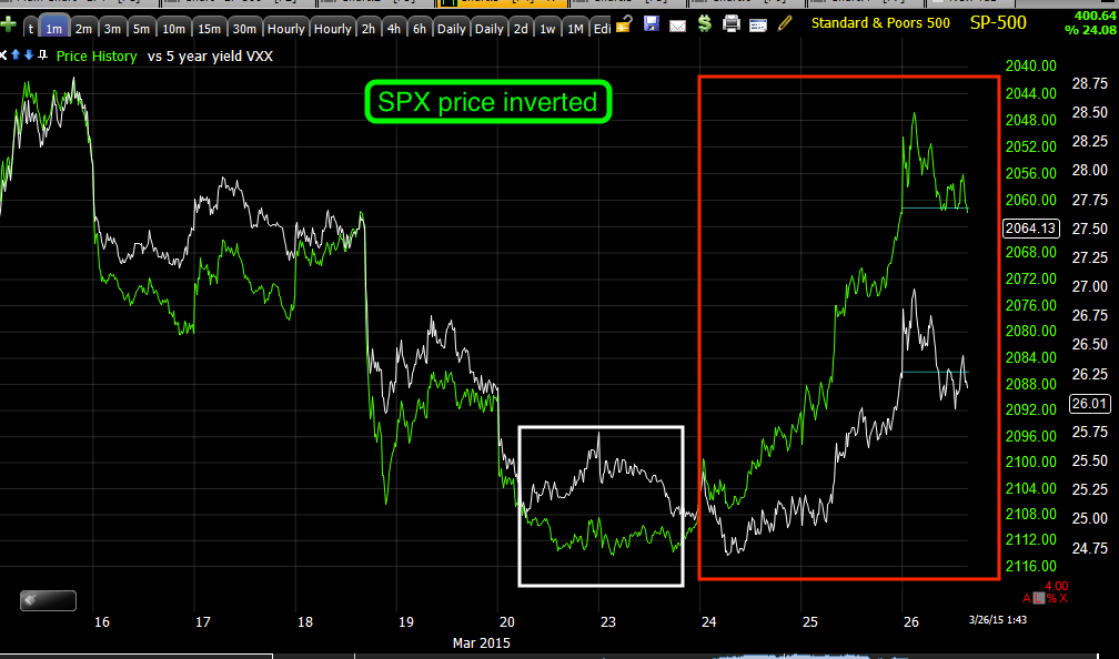
The FX pair EUR/USd has had a strong correlation with market Index futures and they have moved in line with EUR/USD. However last week I pointed out that Index futures ran too far above the FX pair and that they'd need to come down. Like anything with the market, they overshot to the downside and that's part of increasing volatility. We'll see them overshoot again as the normal correlation gives way to stronger emotional instincts like fear and there will be less and less correlation between the two assets.
For now...
EUR/USd is in a downtrend from the overnight and although there are some signs of positive 3C divergences or accumulation,
I expect that the main trend will be the EUR/USd continues to move lower generally while the Index futures bounce higher without the support of the EUR/USD as it makes its way lower.
This will put the Index futures in a place (above current levels) with no support from EUR/USD which you will see, has been all about support of the market. This tells us volatility is picking up, fear is building and the market starts acting more and more extreme which eventually, is what I'm looking for on a strong stage 4 decline move.
This is the EUR/USd (red/green) vs ES/SPX Futures (purple).
Today is one of the first days in which the two have had nearly the opposite correlation as it looks like the market is trying to get ready to bounce, but the EUR/USd pair which is now acting as a leading indicator keeps moving broadly/generally lower which leaves any market bounce unsupported.
This is the trend down in EUR/USd and ES on a 60 min chart from the February cycle's stage 3 top. The green arrow shows they are moving together in correlation in a stage 4 decline and then our most recent bounce from March 11th comes. This is where ES/SOPX futures (purple) ran too high above the support of EUR/USd and for days I had been saying ES will fall back down to EUR/USD and not only did it fall , but it overshot to the downside which is usually indicative of rising volatility and more fear to the point in which sellers don't care about correlation, they just panic and that's wen we get the sharp moves down, but volatility (whether up or down or both) still needs to increase.
I checked the single currency futures of EUR and $USD to make sure I understand the most likely trend for EUR/USD. below is the Euro single currency futures on a 7 min chart.
Note the Euro had 3C support as it moved higher and as it moved higher, EUR/USd moved higher as well. But now, note the negative 3C divegrence to the far right (now) in the Euro futures suggesting the Euro makes a move lower. This move lower in the Euro will pressure the E?UR/USd lower, which is what we already expected so this is additional confirmation.
This also means that there's less support for any market bounce and it's more likely to fail although I have almost no doubt about it failing before it has even begun.
This is the $USd futures bellow (US Dollar Index)
Note not only the positive 7 min divergence in the $USD, but also the head fake move in yellow, a stop run that we often see just before a trend reversal which in this case was to the upside. 3C is leading and supportive of higher $USd prices, thus this is the third asset confirming the EUR/USD moves lower and leaves the market on a bounce, with no support, thus shorting in to the bounce seems like the best course of action as everything is lining up to tell us any such bounce, no matter how strong it may look, will FAIL,
Our Professional sentiment indicator (blue) vs the SPX (green) is also suggesting pros are getting ready for a short term bounce very soon.
This is the SPX (green) vs High Yield Corporate Credit or HYG, the most often used lever of market manipulation. On an intraday basis, HYG and SPX are almost perfectly in sync. In fact the SPX has pulled back a little today since I captured this chart, but HYG continues higher supporting a short term move to the upside in the market (SPX, NASDAQ, Dow, Russell, etc.).
However, you can't just look at a map in 1 inch sections and expect to understand it, you must look at th whole thing.
This is a longer timeframe of HYG (high Yield Corp. Credit) vs the SPX (green). You can see that the February cycle's stage 4 decline to the left is being lef by HYG to the downside and then HYG provides minor support as we first discover the probability of a market bounce on March 10th as we closed Put positions,
Closing Down the AAPL and QQQ Puts for now
This is the date we closed the puts in the Mach 10, Closing Down the AAPL and QQQ Puts for now As you can see, we were only a day off.
I ust however remind you that even with HYG supporting the market very short term, the long term prospects are very bad as HY Credit has already entered a primary downtrend. As they say,
Credit leads, stocks follow" so this downtrend in HYG should be leading the market lower despite what happens over the next few days.
Even HY Credit is leading the SPX (green) intradat since yesterday.
However looking at the larger trend and you see HY Credit has been moving lower only giving the market some support at the accumulation area for the recent bounce of MArch 10-11th and March 13th, the "W" base. At #1, the F_O_M_C knee jerk reaction higher we warned about, Credit did not support the market but instead diverged lower.
High Yield Credit is a risk on asset for smart money the same as AAPL would be for retail traders. So why is smart money not buying risk in to the F_O_M_C knee jerk higher? Also at the stage 3 top of the cycle HY Credit is heading lower as the market makes a higher high. Again,
Why is smart money not buying risk? Because they are too busy selling in to the bounce and shortly after Credit's leading divergence against the SPX was indeed a clue as to what was to come as the SPX moves lower AND IS NOW RED FOR THE YEAR TO DATE (2015) JUST LIKE THE DOW.
Yields (red) move opposite bonds (the flight to safety trade), thus they tend to be excellent leading indicators pulling stocks (SPX in green) toward them so when 30 year yields trended lower during the last bounce, we knew it was safe to sell short in to the bounce as the market would eventually be pulled down to yields as if they were a magnet.
At the green arrow you see the SPX pulled lower toward yields again as if they were a magnet for the market.
Very short term bonds have sold off and yields have rallied providing short term support for the SPX (green) to bounce as we expect.
However, don't forget where the big picture lays.
Here I inverted the price of the SPX so you can see what VXX should be doing and it is not performing as well as it should in red, again, indicative of a bounce.
Spot VIX has been in line with the SPX.
Commodities are once again acting as a leading indicator since the end of QE3. In red you can see where commodities negatively diverged in price vs the SPX and pulled it lower and in white where they positively diverged and supported the SPX.
The main trend is lower, but near term there's support for a bounce. This chart alone tells us a bounce is a probability , but also it's failure is an even higher probability so how do we want to use that information we have in advance? I want to use the bounce to sell in to or short sell in to.

This is the very near term positive divergence in commodities vs the SPX, however the chart above at the red area is an even larger divergence suggesting a move higher in the SPX wit this short term commodity chart's leading divergence and then a failure and a larger move lower.
Intraday, the TICK Index is signaling the market appears to want to pullback and widen out that base I mentioned that needed work early this morning. Being tomorrow is an options expiration Friday, little will get done, this could run in to next week.
And the custom TICK/SPY trend showing a larger break lower, short term capitulation or selling exhaustion in yellow and a rising trend of improving internals today, consistient with a short term bounce and failure of that bounce.


No comments:
Post a Comment