Since April 2nd's market forecast, IMPORTANT: AAPL Set-up & Market Movement (AAPL was used as a proxy, but as explained before that was a matter of chance as I had been seeing the same patterns and indications on a number of watchlist stocks, I just so happened to decide "I've seen enough" at AAPL and it just so happened to have a clearer triangle than the market averages) the market has not only done what was expected in price, even if a bit on the light side in the upside gains for many of the broad market averages with certain stocks and sectors having a bit better relative performance, but the 3 major signs I had laid out that I'd be looking for based on the probabilities of April 2nd's forecast, have also been right on track.

Since April 2nd at which time the SPX was at a mere +0.43% YTD or as of the day before, April 1st the SPX was flat at +0.07% YTD, (although you may not feel like it, the market's trend has been VERY lateral for all of 2015 which is indicative of a topping price pattern). I've already covered it recently so I won't get too deep in to it again, but many averages like the SPX are tracing out an unorthodox (not Technical Analysis handbook, but few price patterns are in the cherry-picked examples), a Broadening Top which already has the prerequisite or common 5-points of contact and the market has failed to meet the upper trendline. This is important because in a Broadening top, typically after 5 points of contact with the widening megaphone style trendlines, it is quite common to see the last rally attempt in the top to fall short of reaching the upper trendline, sometimes it makes it about half way, or 2/3rds the way, but not all the way and it's from there that it fails and falls out the bottom of the Broadening Top's trendline which is currently around the SPX 1600 level, more than satisfying my expectation for the next mjor swing to take out the October lows.

I'll admit that from both a forecast point of view and the opportunity to use higher prices to enter new or add to existing positions, the move has been very tame and not the upside breakout I anticipated. I'm still not sure or have a strong feeling whether this is just not completed yet, although all of the indications are suggesting we are in the end-phase or whether there has been such a change in the market's ability to rally based on the lack of institutional support as strong distribution has sent institutional money out of stocks broadly speaking, whether evidenced by SEC filings, 3C charts or breadth indications which don't lie and cannot be misinterpreted, they are like math, hard numbers, not opinion. Every move we have seen this year has failed far earlier and begun to see distribution far earlier than previous moves as recently as the last quarter of 2014. Part of me suspects that the lack of institutional support via distribution has simply created a change in character and just like a move that doesn't have a strong base, a move without strong institutional backing is doomed to underperform as we have seen all year so far. I suspected this would be the exception, the increase in volatility that "looks" strong, lures in the "Buy the dip" crowd or the "This time it's different" crowd and lock them in a bull trap, which is already in place on a larger trend basis (Intermediate, perhaps even primary trend).

One of the most important things I wanted to see and may still, although the evidence backing it is not strong, is an increase in market volatility whether up or down, I don't care. It's something we see before major trend changes and I suspect we are on the ledge if a major primary trend change (from the primary uptrend of 2009) and that increased volatility would be a normal sign of an impending change in trend to a stage 4 decline considering where the staging is for the market since 2009 with 2015 lateral (sideways as are most stage 3 tops).

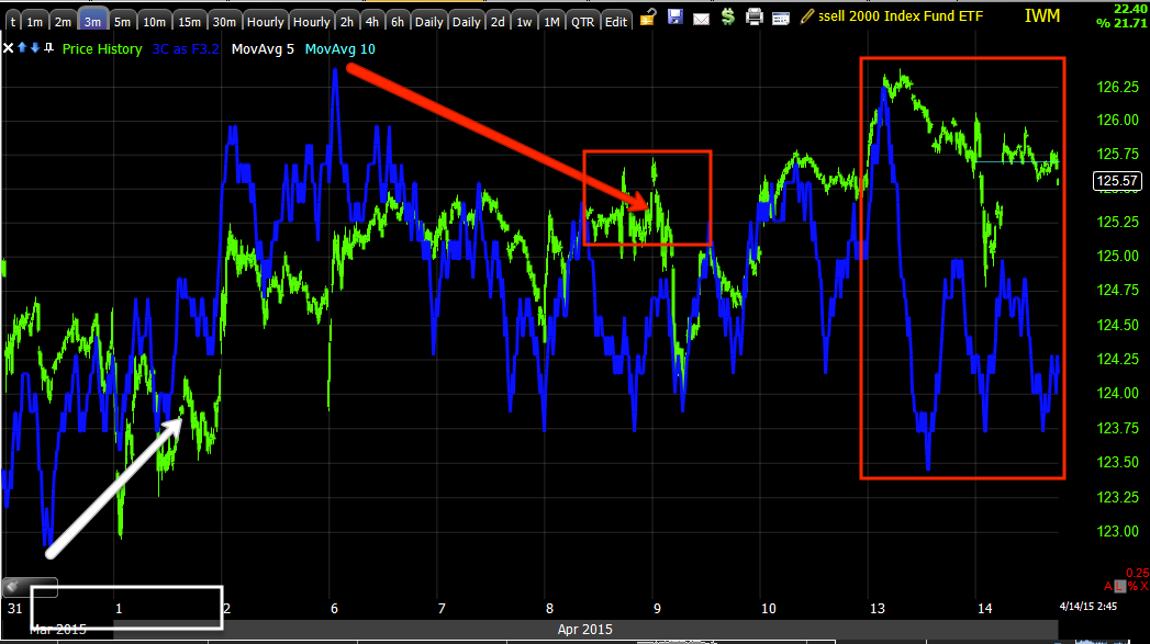
The red area represents a tight reversal event which is rare. This is why this morning in the A.M. Update I was sure to express what I felt the most likely near term price trend would be:
" I expect to see a bit more of this, sideways chop in the area, maybe a head fake move of this little range if it becomes very defined."
Near term could mean a day, but more often than not based on what we have so far, I would say something more like the chart below.

In this example I also wanted to drive home the point that if a well established (even short term/intraday) range is established such as what you see between the two red trendlines, the probability of a head fake move increases dramatically, which as I also noted in the A.M. Update would be useful:
"...the typical small bodied candles at the top that are reminiscent of a reversal process, there's usually a head fake move in the reversal process itself, that's the ideal area for puts broadly speaking."
This particular head fake move is a Crazy Ivan, the initial break is of clear support drawing in seller and initial shorts which creates a bear trap and the opportunity to pick up shares on the cheap, then reverse as short sellers are forced to cover creating a squeeze (in general theory-remember this works on any timeframe as a fractal concept) which powers price to break above the resistance range at which point traders who were just shaken out on sales below support will buy the breakout as this is one of the foolish concepts of Technical Analysis, "If your trade goes against you, reverse and open a trade in the opposite direction".
Thus longs will chase the breakout, shorts are squeezed out of their position even though broadly they were right and then this move comes down, it's advantages are not just shaking out both sides of the range/price pattern/moving average, etc., but self-fulfilled momentum without having to support the move.

Note that the range is identifiable, even if small, these are the types of ranges and resistance zones that garner attention from technical traders and Wall St. knows exactly what they are looking for and how they will respond. Wall St. WILL give it to them and then use it against them. In this example the lateral choppy range of a reversal process creates a clear support/resistance range and like all of our concepts, these are fractal meaning I could substitute this hourly chart for a 5-day chart and the same principles would stand, the same concept would hold true and therefor is useful whether a 60 min chart, a weekly chart of even a 1 min chart, the concept is fractal because it is based on human nature and that is unchanging.
In a standard head fake move, we get a break above a WELL DEFINED resistance level, traders will chase it, Pros will sell it. Thus it makes for an excellent timed Put entry as this tends to be the last thing that happens before a reversal whether up or down and I often try to point these out on charts (head fake moves) using a yellow arrow. They can work either way, at a base they'll often make a new low taking out stops before a reversal to the upside and allowing smart money one last chance to accumulate on the cheap. In that case, we want to use the lowered premium of calls to enter as long as we confirm the head fake move. In the example above, it is a break above resistance that traders chase, smart money sells in to at the best prices and with demand which is most important for their larger positions which is one of the main themes you must understand in the difference between our orders and theirs and why these head fake moves exist.
The example above we would look for a resistance range to become clear as traders would notice it and start making plans to buy a breakout, once there is a head fake breakout, we need to confirm that there is distribution in to the move the same as we did with NFLX on its move up from 1/21 to 2/26 where we entered our last NFLX short at the exact highs as the charts confirmed distribution. Once again, like the "call" scenario, the put premiums fall, the head fake is a fantastic timing price formation as it usually occurs right before a reversal (in this case to the downside), we enter at excellent prices, low risk and high timing probabilities and general probabilities.
IF YOU HAVE NOT ALREADY, I STRONGLY recommend reading my two articles on the subject, which are always linked at the top right of the members' site:
PART 1: Understanding the Head-Fake Move... How Technical Analysis Went From an Asset to a Trap
PART 2: Understanding the Head-Fake Move... Motivation
Again , these concepts are fractal and work on any timeframe, any type of trading and in any asset. Human nature creates repeating patterns and events as it doesn't change which has made it so predictable and easy for Wall St. to take advantage of. Instead, we use these concepts not only not to fall victim to the tricks, but to use them to our advantage because Wall St. has become predictable in what they will do as they use Technical Traders' predictability against them.
As for the market updates near term beyond conceptual themes....

Note the pullback yesterday as the 3 conditions I was looking for advanced, although not completely there, they have moved exactly as expected as the move unfolded and are still one of the very best timing indications we have so we are not caught in a ranging market, especially with time sensitive assets like options.
The vertical small white arrow is the April 2nd forecast, the larger white arrow is the trend that began the VERY NEXT trading day, which was a Monday after the Good Friday 3-day weekend.
The "Hammer-like" candlestick (daily) today represents support in the area, not a downside candlestick as I was "hoping" without any proof, just hope, we might see a bearish engulfing candle today. This should create the upside move for the range and maybe some additional upside, which would be very welcome as this move has not had the upside that I initially expected for a volatility squeeze/pinch breakout of a triangle.
My near term intraday, this is the SPY 5 min chart as of about an hour and a half ago. Note the advance off this morning's lows creating the hammer daily candle as lower prices were rejected. This candlestick is indicative of local support, however...

My forecast in Quick Market Update just before this post was for a pullback, largely based on the declining volume in to higher intraday prices.
Since...

While each average is slightly different, I think the 15 min ES/SPX futures is a great all around broad concept example of where we are in the larger process and where we are in the very near term trade.

The trend up according to our forecast predictions saw 15 min ES confirmation. We know shorter , more detailed charts showed near immediate distribution in to the trend, but it takes some time to migrate to a chart as strong as 15 mins. Remember I am looking for Index futures to show negative divergences from 7 to 15 min charts which we have already seen in ES 15 min, at least the start of. Intraday however, the white triangle shows a positive divergence in line with support locally and a bounce (like for our lateral range, maybe some additional gains).
The most probable outcome is still easily seen on a 60 min chart.

However, I have not wavered on what I'm looking for as far as timing and I'm not about ready to start unless the market tells me so, which is where I believe we differ with Elliot Wave forecasts which have changed nearly every day over this period.

The 10 min Es above also shows in line on the entire trend and a recent 10 min positive at this morning's intraday lows just as the market averages and volume analysis/candlestick patterns suggest.
MARKET UPDATE
As for the charts right now for the market averages, again each is slightly different due to relative performance, where the charts (like IWM 15 min) stood on April 2nd, different price patterns like SPX 90 degree triangle vs AAP, symmetrical. triangle or Russell 200's bear flag...


I'm also watching for ES, TF and NQ to all post negative divergences in every timeframe of 7, 10 and 15 min, although all already show the highest probability longer term charts leading negative.

ES 5 min has been signaling a near term move to the downside with a negative divergence. The chart is still leading negative, but it will be much more impressive if price were to mover up a bit and 3C continued moving down. While not essential to the signals, I almost never trade an asset without a 5 min divergence in the direction of the trade.
Almost all Index futures on the 5 min chart look the same.


I expect the reversal process as demonstrated and drawn on a chart last week will play out as is the norm while the rest of the few remaining charts fall in to line. It all actually makes perfect sense from where we are and I expect there will be no second guessing or even second glances at the charts when they are completely ready.
AS I SAID EARLIER, PATIENCE HAS GOTTEN US THIS FAR AND KEPT US OUT OF TROUBLESOME POSITIONS TAKEN ON TOO EARLY AS WELL AS RETAINING PROFITS IN TRADES LIKE GLD PUTS.
WE ARE NEARLY AS CLOSE AS YOU CAN GET AND IT'S DIFFICULT FOR ME TO SHOW PATIENCE WHEN I SEE ALL THAT I DO, BIUT I WOULDN'T RUIN FANTASTIC SET-UPS BY LOSING PATIENCE THIS CLOSE TO OUR PIVOT, ESPECIALLY WHEN YOU HAVE SEEN WHAT PATIENCE BRINGS US IN LOWERING RISK AS YOU HAVE SEEN THE PAST WEEK+ IN NOT ENTERING POSITIONS LIKE NFLX TOO SOON.


No comments:
Post a Comment