This morning's update is slightly different than normal, a slightly different perspective based on the charts I've seen this morning. I mentioned right away on Monday as the market had a strong push to the upside, that distribution signals started coming in almost immediately, they continued through the day and had moved much further than I had anticipated last Thursday when prosing this volatility squeeze/triangle breakout, which is not an exact replica in each of the averages or stocks, for instance I used AAPL as a proxy for the broad market as it had the cleanest or a cleaner drawn triangle than most of the averages, but that was to simply illustrate the point of the pinching volatility associated with a triangle coming to its apex.
I don't know where, but I was looking for Kocherlakota's full comments yesterday on Google and ran across a site I've never seen as I don't ever like to look at other people's analysis (other than members as they know how our indicators and concepts work),
I certainly NEVER listen to Cramer or CNBC unless it's a F_O_M_C day, I simply don't want their subjective and questionably motivated opinions effecting even my subconscious.
However, in this particular article, it was the first time I've seen someone refer to the markets as being in a Broadening Top or a Mega-Phone Top, something I've maintained since mid to late 2014.
I may be out of touch with mainstream opinion and perhaps my lack of looking at other people's views means that there are a number of people who see a Broadening Top, but from my more limited perspective, it was the first person I had seen mention it which I found interesting because it's not the Technical Analysis textbook version of a broadening top, however there are very few price patterns that look like the textbook examples given which is why so many people miss them when they occur.

This is the SPX is a FAR from perfect or textbook triangle, but what people miss in looking for the textbook triangles and throwing everything else out is that the triangle forms (in its authentic form) as a result of psychological factors, the price pattern itself is no more than a representation of a set of psychological factors so... So what if the triangle's trendlines aren't perfect, the fact you can make out a triangle is the representation of those psychological factors or market perception (one and the same to a large degree). While this triangle isn't as clean as AAPL's and hasn't officially broken out as AAPL did Monday, doesn't change the fact that volatility has pinched from the left arrow to the right arrow.
A larger view...
The near perfect 2013 trendline has an obvious change of character in to 2014, this is the broadening top drawn in, i will grant you right off the bat that it does not look like a traditional, textbook broadening top,
but what has been traditional or textbook about this market over the past decade with unprecedented Central Bank intervention worldwide, approaching something like 500 independent easing actions taken?
A closer look reveals the typical characteristics of a Broadening top, 5 points of contact with the two trendlines and most often a failure for the final move to reach the top of the upper trendline which if I could extend out to where it should be, you'd see we are well below it,
another change in character and price trend within the Broadening Top itself.
The pattern is certainly of the appropriate size given the preceding trend as tops tend to be symmetrical or have a certain proportionality with the preceding trend and often base.
In our normal analysis, it's starting from the macro or strategic view to understand what the highest big picture probabilities are, to make sure that they continue to meet the expectations or to change our view when the market changes. From a Broadening top perspective, the market is essentially living on borrowed time and has been since the start of 2015, ironically when a whole host of things changed including the end of QE, the impending threat of rate hikes, the macro economic data slump in the US and across the globe, ridiculous valuations, major fund managers taking EXTREME action (I'd say reducing your already reduced equity exposure by -40% when the higher AUM puts more money in your pocket and doing so in a single quarter qualifies as extreme, especially among Wall St.'s greedy standards).
It is within this context that I find this week's charts most disturbing, not that I'm rooting for the market to do anything, I'm simply rooting for us to be on the right side of the most profitable move and as you know I feel we have the opportunity not even of a lifetime, but of multiple generations, perhaps even the greatest opportunity the market has seen if you are on the right side of the trade.
It's within this larger macro tend framework that this most recent forecast is surprisingly shocking to me.
*
I didn't intend to add any more charts than the SPY 1m-15m charts so you can see the deterioration of this latest move, however as usual I got a little carried away being the market is so dull pre minutes release at 2 p.m.*
SPY intraday 1 min, as I said, very dull today so far in advance of the minutes at 2 pm
SPY 2 min since last Thursday's forecast for this week and the immediate negative signals upon higher prices starting Monday and continuing.
This is where I started getting a bit carried away, this is the same 2 min chart showing the trend, it's clearly not good for the market and at a new leading negative low.
You may be able to see more if you ignore my scribblings on the chart, but I wanted to point out divergences for those not use to seeing them.
SPY 3 min with a couple of smaller accumulation areas for the small volatile bounces we have seen,
I have previously shown how these have formed the actual triangles and they are not a naturally occurring phenomena.
SPY 5 min deterioration specifically in this most recent move. You may recall on Monday that I said at the pace these divergences were forming, by "Tomorrow" which would have been Tuesday, I'll likely be posting 10 min negative divergences which was the case yesterday.
And the deterioration/negative divegrence in the SPY 10 min chart as suspected on Monday.
Now even the 15 min chart which is strongest in SPY is seeing movement to the downside, others are in worse shape.
*This was to be the extent of the charts for this post and my thought is, "How is the market possibly going to push higher without some sort of outside help such as a F_E_D comment (conveniently the minutes are out soon) or some other manipulation?*
I then added this 4 hour SPY chart so you could see when David Tepper, the highest paid fund manager the last 3 consecutive years (of Appaloosa) said at a Financial conference in May of 2013 that the market was "Priced to perfection" and that they were selling, "EVERYTHING not nailed down" which has been proven to be the case from their SEC filings.
Note the deterioration in 3C around the time, but even more so from last summer to present and consider where the Broadening Top is.
This is really where I intended to stop...
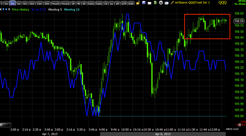
Instead I posted the 1 min Q's intraday, same as SPY, showing little action in front of the "Minutes" release at 2 p.m. which is why I took the time to put this together now.
QQQ 2 min with some slight intraday deterioration.
And like SPY 2 min, I decided to show the 2 min trend, I marked a head fake move/stop run at the yellow arrow as a way of pointing out the concept that these head fake moves up or down are generally one of the best price-based timing indications we have so long as the 3C charts confirm it's a head fake or false move such as this run on stops that broke support just before sending the Q's higher.
I think the trend is interesting, but more so where 3C is ow in relationship to this large, volatile sideways price movement most of 2015 which has fallen short of the upper trendline of the larger Broadening Tops on Daily Charts.
QQQ 3 min with the small "W" base from last week in advance of the expected upside this week largely based on the AAPL/Triangles as well as distribution areas in red and a new leading negative low.
The QQQ 10 min chart's trend, but more specifically the damage to the most recent move to the far right and the new leading negative low
QQQ 15 min now seeing damage as expected, this was the "gas in the tank" chart.
The longer term QQ 4 hour chart with some confirmation going in to the distribution causing the October lows and a much worse picture since in to 2015 and at present.
This is where I said the post is getting too long, I abbreviated some of the charts to get this out.

I wanted to point out the IWM 15 min chart never went positive with the rest of the averages and looks even worse right now.
I purposefully did not draw the divegrence to the far right so you could better see it for yourself.
IWM 30 min since the forecasted October low's "Face ripping rally" and massive deterioration.
And the 2 hour chart in to the 2013 "Priced to Perfection" Tepper coomment and "selling everything not nailed down". There's a discernible change in 3C character around that area.
Remember how big these funds are and how they need demand to sell to retail who buys in much smaller size.
VXX's 30 min chart and the most recent positive divegrence much larger than the previous which had a decent run, this is something entirely different.
And for longer term historical perspective, unfortunately these charts aren't as well scaled as some in the past as time has moved on and some left edge data has fallen off.
The Dow during the roaring 20's when the market seemed like it would never go down, everyone owned stocks and the F_E_D under Benjamin Strong's leadership (the equivalent of the NY F_E_D President) first engaged in "asset purchases" or the precursor to QE, which Bernanke was a fond student of in this era. Strong dies in 1928 before he could see what the result of F_E_D tampering in the market ultimately would be.
Note that the crash was not a sudden as many would have you believe, there was very smart money, people like Jesse Livermore (considered to be the greatest trade ever) who were VERY short the market before the crash and 3C reflects that smart money had been moving out about a year in advance.
I though it would be interesting to compare the 1929 3C signals to the current ones for a larger perspective and why I think this is the opportunity of multiple generations if you are on the right side of the market.
This is the 2007 distribution in the Dow in to the Housing Bubble and Financial Crisis, note the confirmation from 2009's lows through 2011.
Again confirmation around 2009 and starting to go south in early 2012, but just starting.
Unfortunately I don't have the history on the left side of the chart to properly scale 3C to price, 3C should be much lower. Imagine shifting 3C down to be in line with price at 2011 as we saw above it was, that means everything to the right would be shifted that much lower as well.
This may not be the best representation of the current situation, but I wanted to give you an apples to apples comparison to 1929, this is a far larger, longer and deeper divergence than at any other time in the Dow's history.


No comments:
Post a Comment