Friday, July 15, 2011

SPY Update

We've had a slew of not so good economic news this morning including the U of M Consumer Confidence number comng in at a disappointing 63.8 from 71.5 (previous) consensus of 68-75; Empire Manufacturing came in at -3.76 on consensus of 5 with a very disappointing Number of Employees Index, dropping from 10.20 to 1.1!

The SPY has pulled bak to the bottom of the recent range and there we find a positive divergence brewing. We'll see today if the market is able to shake-off the bad economic news and drive the SPY higher to cause maximum pain in options expiration.

VXX Follow Up

For anyone still holding VXX long, I would consider it a temporary sell here. I think there may be an opportunity as early as later today or Monday to get long VXX again.

 3C 5 min negative divergence

3C 1 min relative negative divergence (comparing the two relative points defined by the trend line.

TLT Follow Up

It was just 2 days ago I posted this article warning TLT was looking like a pullback.

Bonds still have a bullish overall look to them, but this pullback seems was needed.
 Here's the warning day at the red arrow.

 The UltraShort 20+ year ETF, TBT was suggested as a long play on the TLT pullback, you can see recent accumulation on this 15 min chart at the white arrow.

I view this trade as more of a swing trade and nature and therefore would keep a trailing stop on the trade, like this 10-bar s.m.a. on a 60 min chart.

Keep MCD on Your Radar (Possible Short Trade)

MCD may be setting up for a decent swing trade.

 MCD formed a bull-flag and broke out of the flag yesterday, but as I've shown you in recent posts, there appears to be some underlying problems in MCD, which may mean the breakout above the bull flag may be a false breakout, if so, when they fail, they tend to drop fast and hard.

 The 1 min 3C shows price just above (now) support of the upper flag trendline, it looks as if MCD may bounce off the area, but watch for a break below and back into the flag.

The longer term 3C chart shows some underlying problems with MCD, especially on yesterday's breakout suggesting it's a head fake.

Thursday, July 14, 2011

The Miners Trading System

As you know, both system 1 and system 2 were stopped out by the 3% stop-loss rule, however, both systems still are giving a long signal to DUST. The way the system has been backtested, there is no trade on right now and there wouldn't be until a new signal is given.  However, I have received a lot of questions as to where the system is. So for your information, the system is still showing a long DUST signal.

Yesterday I showed you some 3C improvement in DUST and I know several of you have stuck with the trade.

Here's an update of what 3C did with DUST today
 3C 60 min, this looks slightly better then inline confirmation as DUST was up today 1.27%


 3C 15 min This too looks slightly better then inline confirmation.

 3C 10-min This chart overall looks strong, including yesterday, it's currently in a positive leading divergence.

 The 5 min 3C chart showed a strong positive divergence on the open and since then it has confirmed the rest of the day.

The 1 min chart is the only one that was negative and I would suspect that it had more to do with slowing the pace of DUST's advance then actual distribution.

Today's closing stats

I'm going to focus primarily on the Price / Volume relationship. There are 4 P/V relationships (while the P/V relationships should always be considered relative to the market action, in general you can consider each as being bullish or bearish), they are:

Price Down / Volume Down - This is the thematic relationship of a bear market and is the most neutral.

Price Down / Volume Up - This can be bearish or bullish, at the end of an extended down trend it can indicate bullish capitulation. At the start of a break away downtrend it can be bearish bearish.

Price Up / Volume Down - This is considered to be the most bearish of the 4, it indicates traders are backing away from higher prices.

Price Up / Volume Up - This is considered the most bullish of the 4 relationships.

Price / Volume relationships are only considered relevant when there is a dominant theme, usually something approaching 40% for a single relationship. I scan every night after the close for dominant P/V relationships among the component stocks of the NYSE, The Dow-30, The NASDAQ 100, the S&P-500 and the Russell 2000.

Tonight's dominant theme can be found in 4 averages (The Russell 2k did not have a dominant P/V relationship) and they are all Price Down / Volume Up.

NYSE: 2520 stocks
Dow 30: 18 stocks
NASDAQ 100: 57 stocks
S&P-500: 255 stocks

As I said, the relationships must be viewed in light of market conditions. I view the dominant theme as being somewhat bullish as short term capitulation, which falls in to line with my guess that the SPY will close around $132.50 tomorrow which is based on the options chain.

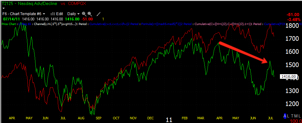
I haven't showed you breadth analysis for the market n some time so here are a few indications of where we are now. This can be a little confusing, but the green line is the breadth indicator and the red line is the comparison symbol, which is usually the NYSE composite, unless otherwise specified.

 Percentage of NYSE stocks above their 200-day moving average. As you can see, when the market was lower in October of 2010, the % of stocks above their 200 day moving average was around 90%, now with the market even higher, that percentage has dropped to about 62%. This shows poor market breadth or the number of stocks participating in an advance, it shows thin market breadth.

 The NASDAQ Composite Advance/Decline Line Here you can see the NASDAQ in red has been moving higher over the time period, but since March 2011, the advance / decline line has been steadily marching lower meaning there are fewer advancing issues and again, market breadth is thin, counting on a handful of heavily weighted stocks to carry the average higher. The NASDAQ has a proprietary weighting system for their stocks, at one point AAPL alone represented nearly 20% of the NASDAQ 100, about the same as the bottom 50 NASDAQ stocks (by weight) combined. The actual weighting of the NASDAQ 100 is available through NASDAQ for $10,000.

 Percentage of NYSE Stocks Trading 2 Standard Deviations Above Their 200 Day Moving Average- Once again, these stocks that are some of the better performers have declined from their October high of around 40% to the current 7.9% even though the market is higher now then in October. Again, this shows very bad market breadth.

 Percentage of NYSE Stocks Trading 1 Standard Deviation Above Their 200 Day Moving Average. These are healthy performers, but not as strong as the 2 standard deviation stocks, still they have declined from their October, 2011 high of over 65% to a level currently at 31%. This shows many stocks are moving lower, despite the market moving higher over the time period.

 Percentage of NYSE Stocks Trading 1 Standard Deviation Above Their 40-Day Price Moving Average. Once gain, this indicator peaked around October of last year around 70% to a current level of 23%. This is a huge breadth problem considering the NYSE composite is about 10% higher then it was in October.

 Percentage of NYSE Stocks Trading 1 Standard Deviation Below Their 200-Day Moving Average. Ideally this indicator should decline in to a rally, but once again it went from a November 2010 low of 7% to a current 20.44%

Percentage of NYSE Stocks Trading 1 Standard Deviation Below Their 40-Day Price Moving Average.  Here I'm comparing two recent troughs which are roughly the same, 1 in March 2011 and the last in June of 2011. At these troughs, the number of stocks trading a standard deviation below the 40 sma increased from 55% to nearly 65%.

The Take Away-

I've been calling this area a top and tops take time to form and can be quite volatile, they can also be arbitrary so we look for evidence of a deteriorating market and breadth indicators are a pee of that puzzle. Each of the indicators above have shown significant deterioration in the market. It's almost like comparing the market to a house of cards, there are only a select few, heavily weighted stocks among the averages that have been pushing the market higher, when the legs of these stocks give way, the market tumbles as most of the other stocks are already in bad shape.

I hope this was helpful in showing you the condition of the market by looking at the actual percentage of stocks that are performing, especially compared to the market at lower levels.

3C on the close

The market looks set with enough underlying support to head toward the SPY $132.50 area which seems like the ideal spot to pin the most calls and puts.

 DIA positive divergences on a 10-min chart, note that the second move below the range showed an even stronger divergence then the first.

Here, the IWM which has been one of the weaker looking indices puts in a 5 min positive divergence during the afternoon chop.

 The QQQ 5 mn 3C chart also builds the strongest divergences this afternoon.

Here's the 1 min SPY chart with 2 head fake breaks below the sideways chop, both divergences are positive and strong for the timeframe. This all appears to fit well with yesterday's Call/Put option analysis in which the maximum pain looks to be in the area of $132-$132.50 on the SPY.

As for the bigger picture...
 Defining the trend, we see the short squeeze rally at the green arrow, the candle in the red box broke the back of the uptrend and every daily candle with an orange arrow defines the downtrend making lower lows/lower highs, only yesterday's candle was a noise candle within the trend. My guestimate target for the op-ex close based on the options chain is around $132.50. Today becomes the signal candle in defining the downtrend and so long as there s not a candle that has a close with a low higher then $132.78, the downtrend likely stays in effect. Even with a close at $132.50 tomorrow, tomorrow's candle would likely be considered noise in the downtrend.

 Here is the 3C cycle from accumulation in June to stage 2 mark up or the short squeeze rally confirmed by 3C at the green arrow as it makes higher highs with price, to the distribution phase at the red arrow and now stage 4, decline makes a nearly completed cycle, I say nearly because the decline section is likely not even close to finished. Nearly all trends proceed in this fashion, whether on a swing basis, a long term investing basis or an intraday rally. Technical analysis tends to be fractal n that way.

Here's the SPY 30 min chart, if you recall it was the strength of the 30 and 60 min charts in June that gave away the short covering rally, so they are significant timeframes and currently confirming the downtrend as far as the larger picture goes. There's strategic action and tactical action, in my view, the strategic outlook is for a trend down, the tactical view s to use any remaining strength n the market to enter short positions that you like, that are high probability and low risk.

PCLN Follow Up

Here's yesterday's update on the PCLN short trade

And here we are today, having made a substantial step in the right direction.

 Yesterday I defined this red trendline as the next step in PCLN's journey, the break on the trendline represents a new low and a downtrend is lower highs, lower lows as you can see by my annotations above.

 This daily chart was part of the catalyst for the trade idea, 3C showed a false breakout.

 As you can see, yesterday we had a negative divergence suggesting PCLN would make that lower low today as it has, but we also have a positive divergence and the trendline is likely to be gamed a bit over the next few days.

 Here's the 1 min positive divergence today, so I expect price to move toward the trendline.

The next significant move for PCLN will be to break the 50-day moving average. There' nothing special about the average except that trader's and thus Wall Street pay attention to it. At this point you should have about a 5% gain on the trade since it was mentioned. You may want to lock that in and re-establish the position or just ride it out.

You can also use the Swing trend identification.
The red candles are the trend, lower highs/lows, the yellow candle is noise in the trend. The swing downtrend would be broken with a losing candle that has a low higher then today's high as today is the new signal candle, being the last in the series to make a lower low/high.

SPY head fake

I think I mentioned this s the last update, the break of the range would likely be a head fake... Remember that the point of the range was to accumulate a position and the easiest, fastest way to do that is to generate supply so Wall Street an absorb or accumulate that supply, so a break below support will trigger stops, create supply that Wall Street can absorb and add to their accumulated position. This isn't a large accumulation zone, but t may be enough to get to the $132.50-ish level to pin the calls and puts.
This is what  mean when I say technical traders are so predictable that Wall Street's response is getting to be predictable. Here's the sideways chop range that I thought would develop, then the break below support, note the increased sell-seide volume and the 3C positive divergence on that break. Now they not only have taken the long's shares, but have put some shorts in a position to be squeezed, sending the SPY even higher as the shorts cover and create more demand, but it's not about supply and demand, it's about fear and greed, that's what causes the long to sell and the short to cover.

USO update

Yesterday I warned that USO, although I feel bullish for the intermediate term, was bumping up against resistance and 3C was showing signs of a pullback, all the charts can be found in this post from yesterday afternoon.

Here's an update..
 Here's what prompted yesterday's warning, a negative divergence at yesterday's highs/resistance

 And on a 15 mn chart, you can see today's early attempt at strength was sold as 3C moves lower. Right now 3C is in line with price.

 There's a slight 5 min positive divergence, but I think it isn't going much further then to create the flag formation already in place.

 Note the Tower Top formation in USO as well. My initial target yesterday was the $38 area, we're $.45 past that and it appears we may have some more to go.

If we take this price formation from the decline to the bear flag and extrapolate the implied pre pattern target, we come up with a downside target of $35.70 with the flag's current position. I don't see anything to suggest this is the bottom of the pullback so I'm assuming we have more downside to go. Since USO is widely watched and this price pattern is widely followed by technical traders, their bets are going to be for a downside break from the flag, they'll probably be right, but they'll most likely get knocked out of the trade first with an upside head fake breakout of the flag. This will make technical traders think the bear flag has failed and what are you supposed to do on a failed pattern, take the other de of the trade. If this happens (an upside breakout of the flag) and technical traders take the bat, that will likely be the cue that the downside move s about to begin. As of now, that's my opinion of USO. If anything in 3C changes to show support, I'll update the situation.