Monday, April 2, 2012

AAPL Update

As mentioned late on Friday, I decided not to enter AAPL after it saw an 11 point drop and was showing signs of a positive short term divergence in this AAPL Update.


AAPL closed the week with its biggest 2 day drop since November, a shakeout to the upside certainly seemed logical, whereas the dogma of technical analysis would tell you to be all over a short position on a move like that, as I mentioned in the update above, I'd prefer to wait for a better set up and we are seeing that unfolding today.

This was the AAPL 5 min positive divergence posted on Friday, still intraday timeframes and a rather short divergence which would fit with a shakeout move.

To the left is the action from earlier in the week.

As for AAPL today and the longer term....

 There have been warning signals before this leading negative divergence in AAPL on a 60 min chart, I have been warning that something appears to be changing for AAPL, I'll address that on another chart. At last week's Monday/Tuesday highs, AAPL was already in a leading negative position, I don't think it is coincidence that it put in the largest 2 day drop in 4 months this week.


 The 30 min chart shows the same leading negative divergence and perhaps more importantly as far as timing goes, it is in a flat area, almost a H&S type formation. Negative divergences are often seen in flat-ish areas of trade, again I suspect it has something to do with institutional orders being filled near the VWAP.

 Again, the 5 min chart from last week's highs to the lows and the divergence that made me decide to be patient and wait for a better set up in AAPL (short strength, not oversold weakness-although looking at a longer term chart of AAPL, oversold only applies to intraday trends, certainly not to the daily/weekly). At this point, I view AAPL as a short, it's just a matter of the tactical entry, being able to get the best position with the least risk and highest probabilities. If I were a long term investor, a few points here or there probably wouldn't bother me and I'd likely just short AAPL right here and put it away for a while.

 This a.m.'s action on the 2 min chart is showing non-confirmation.

 The 1 min chart is worse, it went negative right at the highs. If it were later in the day and the Q's had moved up decently, I'd probably be looking to short AAPL here, but as it is early and there's still that European closing trend of recent, I will be patient with AAPL.

 Look at the weekly chart, I think I may have posted this (I send a lot of charts via email so sometimes it's hard to remember where I posted what), but the VERY parabolic move that actually started since 2009 has become EXTREME since the start of 2012, everyone knows how I feel about parabolic moves either up or down, they tend to end badly and we have seen the evidence of this on numerous occasions, but this being a weekly chart, it carries special importance toward the longer term trend in AAPL. I want to show you MSFT when it was behaving in similar fashion...

 MSFT weekly chart back in 2000, it also went parabolic and got very volatile toward the end. MSFT declared a dividend after the Tech Bubble popped and MSFT has never seen this kind of growth again, this is what I was talking about earlier, perhaps the trouble seen in AAPL starting several months back might have been dividend related, certainly I think there's a Steve Jobs influence there too, but the point being, these two tech giants look very similar between MSFT in the 90's and AAPL now.

 Since 2012, this 10 day moving average has moved up, it is now moving laterally, something few AAPL longs probably notice as they are more focussed on AAPL new high headlines.

And on a 15 min chart, you can see what does look a lot like a H&S top forming. There are very few "V" shaped reversals, this is a huge market cap stock and they don't usually turn on a dime as institutions have to move positions and huge amounts of shares around. However, the danger as pointed out in the breadth post is the day when it unambiguously cracks. If we saw the biggest 2 day drop in 4 months off some lateral action, when the ice breaks it could be a whole lot worse in a single day and thus we have a term for that, "Bull trap". I can't think of a better stock to set one up in.

Again, for now, I'll be patient with AAPL and se if I can't find a better entry.

Early Market Update

As suspected from this morning's earlier positive divergence in ES, we are seeing some upward movement in ES and a little in the averages. Here's what ES looks like now.

ES working more lie it usually does and calling intraday moves, right now ES is in line after earlier positive divergences I covered pre-market. I've already received several emails of members having made several thousand dollars in closing out some AMZN puts from Friday! Excellent use of the updates!

 Here's the DIA 5 min, I didn't mark the positive divergence, but it was mostly on the 29th, 3C is still trending down, although last Monday saw a much stronger market bounce, this was the same behavior, 3C negative divergences/distribution in to higher prices and non confirmation on the short term charts.

 Here's a 1 min chart, this is non-confirmation.

 The IWM positive divergence last week was a bit stronger then the Q's, but as you can see on the 5 min chart, a leading negative divergence is in  place.

 And non confirmation on the short term charts.

 The Q's had the weakest divergence (5 min chart), they'll need AAPL and the rest of the market to jump start them in my view.
 Short term non confirmation on the opening action

 The SPY showed the best negative divergence Friday, but remember only the SPY and DIA even moved, it is still leading negative here on the 2 min chart so again, no confirmation.

And the 5 min chart started with a negative divergence Friday, that has only gotten worse, thus far this is part of what I expected, although I still did expect to see a sharper, more impressive bounce in price action. The day is still young. We'll look at AAPL soon.

RENN Trade Idea Update (long)

I featured RENN as a trade idea on March 27th last week (long)

Here's RENN Today...

 RENN's Triangle, it's hitting some resistance at the breakout line.

 Here's the reason I liked RENN, a 1 60 min positive divergence in the triangle.

Friday RENN formed a smaller triangle with a 1 min positive divergence so it looks pretty good thus far, hopefully it will blow through resistance and put in some real nice gains. If you need stops for the trade, email me.

Warning For MasterCard / Visa Holders

As you can see by this link in a local newspaper over the weekend, MasterCard and Visa have had over 10 million card numbers breached via a third party that appears to have been hacked. Here's more on the article and what you can do to protect yourself 

I mention this because over the weekend, we had one of our accounts emptied, someone made a copy of my wife's card and used it at a supermarket in another state and nearly drained the entire account. We were warned by Card Security services that criminals are putting magnetic readers on things like gas pumps and suggest you should always pay inside. I'm not sure how our card was breached, but there are also scanners criminals can use and there are specific wallets you can buy for about $10 that protect your card's data. I pass this along to you because even as the money will be replaced, it will take weeks and it's a real pain in the rear.


Overnight/Premarket

I was wrong about overnight sentiment which I thought although there was some slippage, should largely hold up.

Overnight the Japanese Tankan sentiment report was full of exporters worrying over Yen strength, which is a topic I touched on last week as the Yen carry trade is being closed out, the Yen appreciates and the funding for stock purchases disappears.

There was also weak unemployment Eurozone numbers in which it rose. Also French PMI dropped nearly a point from 47.6 to 46.7, the effect on ES-S&P Futures?

To the left is the opening high from last night and pretty much all bad news from there, 3C is showing a positive divergence, lets not forget the strange EU market close effect last week, US stocks weak in the am on a strong dollar and as the EU markets close, the dollar looses strength and they have rallied in to the afternoon, not saying that is what will happen, it was however a notable trend last week.

As of now the markets look to open close to flat so a bounce is still not out of the question, neither is deterioration not only in the EU, the US, but the world's 3rd largest economy, Japan and I doubt anyone really believes the Chinese PMI print.

Sunday, April 1, 2012

The start of the week

Last Wednesday and Thursday short term accumulation was noted and I said many times I expected a brief, but impressive bounce along with negative divergences throughout that bounce, much like we saw Monday last week and most of Tuesday before the market started to crack and head lower near the close.

This 1 hour chart shows last week's open on Monday and the Close on Tuesday in the white box. These two days saw persistent negative divergences, there was no let up at all and not even an attempt at upside confirmation, in short, more negative then we usually see and more sharp. 3C ES which usually is very good about calling intraday moves up and down even in a negative trend, was on a one way path straight down which I commented on at the time, it's very rare to see.

After the short term positive divergences started to form on Wednesday (and I think Wednesday was more of a handbrake kind of day with the positive divergences halting the early downside momentum of Wednesday and the last hour of Tuesday) and then more cleanly on Thursday, I wrote that I thought we would see a sharp bounce, but short lived. There simply wasn't a long enough accumulation period to provide for much more. Usually for a swing type move of a week or so, there needs to be at least 3+ days of solid positive divergences and reaching longer timeframes. Last week's positive divergence was sharp, but there's only so much that can be accumulated in a day or a day and a half without moving price against the position.

Friday we saw the bounce start, except it was underwhelming and the NASDAQ and Russell 2000 didn't participate, this is not what I expected to see, I expected a sharp move, but brief. The only thing that was there as expected was the negative divergence in to the Dow and S&P move as well as ES which started again with that persistent negative divergence (nearly a diagonal line straight down in to Monday/Tuesday's move up. I will say it again, this is rare, especially on 3c/ES.

As a matter of fact, in one of the last Market Updates Friday I started the update with the following,

"This is a very tough call to make here, especially when there's negative divergences as suspected and expected in to any kind of strength, but I was clearly looking for a more spectacular bounce."


I also noted the triangles in the IWM and QQQ with the following comment under the chart...


"The IWM with a triangle, these can be head faked 3 or 4 times before you get a real move or it could just fall apart which is rare, but a lot of damage was done early in the week. No bounce at all in the IWM?"


And ended the update with,


"I really expected a stronger much more impressive bounce."


This is one of the reasons I waited on taking a new position in AAPL after having closed a Put position earlier in the week for about a 12.5% 1 day gain. Just before the market update was the AAPL update in which I showed this chart with the following comments...


"I'm pretty conflicted on AAPL, the NASDAQ and IWM haven't bounced, obviously AAPL is hurting the Q's today."


"There's a positive divergence there and after an 11 point drop today, a shakeout would make sense on the upside."


So I decided best to wait as AAPL was showing a positive divergence, it took a huge beating since Wednesday and it packs a lot of influence over the Q's which were in the same triangle formation as the IWM posted above.


As mentioned last Sunday, today the official Chinese Flash PMI is coming out. It's no secret that China is very opaque with everything data related so I suppose it is not surprising that the Chinese Flash PMI contradicted the HSBC Markit Chinese Manufacturing PMI and in a big way.


The HSBC/Markit PMI for China shows a 4th month of consecutive contraction in the Chinese Manufacturing base. Again it should not be surprising that the official Chinese PMI data shows 3 months of consecutive expansion. China's release today says 53.1 (above 50 is expansion/ below 50 is contraction), while HSBC Markit contradicts this with last week's release showing a contraction to 48.3.  HSBC's data suggests China's first quarter Manufacturing PMI was the worst since Q1 2009, obviously this conflicts with the official Chinese release.


Here's a historical chart of the HSBC data vs the Chinese PMI data.


HSBC's data shows China's manufacturing base in contraction for the entirety of 2012, while Chinese official releases contradict that. Judging by commodities, I'd guess that HSBC's numbers are more in line with the truth then China's. 


Whatever the truth may be, the effect of the Chinese data has sent Futures higher, which is more in line with what my original thoughts were regarding the bounce, sharp, but brief with negative divergences/selling/short selling in to the move. As noted from Friday, the action on Friday WAS NOT what I expected to see, the opening in ES is more in line with what I expected to see and thus far, although it is early, the 3C reading so far is what I expected to see, kind of "The second verse, the same as the first", referring to the same type of action on Monday/Tuesday of last week. The difference though is Monday and Tuesday's negative divergences did some serious damage so this bounce is in to a lot less support.


Interestingly, and this is the one chart I wanted to include in the Market Breadth update but didn't, although I do believe I touched on the increasing ratio seen through this year, sometimes a picture really does say more then words.


This is insider selling. I once heard a quote, "There are a lot of reasons insiders may sell, but one of them is not that they expect their stock's price to rise much more". So just as breadth charts showed a huge number of stocks declining, the insider selling is nearly literally off the chart at the highest level in at least 8 years as the chart only goes back to 2004. Note where insider selling really picked up, in 2012. Who knows their own company's outlook for the future better then those who run them?


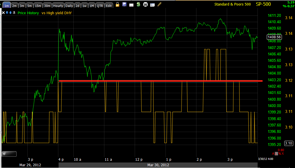
In any case, the 3C charts from late Friday are linked above, here's what Credit did Friday afternoon.


 High Yield Credit sold off to the lows of the day and below Thursday's close.

High Yield Corporate Credit (I believe I showed you the recent trend of the last month or so in the breadth post), also sold off sharply in to Friday's close, it nearly hit the lows of the day and was well below Thursday's close. So apparently the credit markets which lead equities are much more sanguine about the bounce on Friday, even though it wasn't very impressive.


ES, although having popped on the Chinese data is doing exactly what it did almost the entire day Friday (save for a small positive divergence toward the end of the day) and throughout the entire Monday/Tuesday bounce after Bernie's pre-market speech; they are leading negative in to the price strength, suggesting a repeat of Monday/Tuesday and selling aggressively in to any strength and hitting new lows. It is interesting that there was brief accumulation late Friday, it appears someone may have been front running the Chinese PMI data, I'm not sure how friendly China is with Wall Street, but I don't think there's anything that would stop a Chinsese official privy to the number from putting on a trade. 


The light shaded area to the right is tonight's open in the Futures market/ES (S&P E mini Futures).


So this is more in line with what I expected and makes sense with the AAPL divergence and the triangles in the Q's and IWM, plus it's what I expected Thursday.


Here's the SPY as of Friday's close and showing the positive divergence we saw last week.
The first divergence on Wednesday as mentioned above seems more like a hand brake slowing the market's decline off the negative divergences of Monday/Tuesday. Thursday looks more like an accumulation period, but again, it's 1 day so while I expected a sharper move then what we saw on Friday, I also expect it to be short lived, which should take open the opportunity I was looking for to get short AAPL again.


As of right now, there's a little slippage in ES, a little decline, it's off the opening highs as I'd expect from profit taking, but I think it should hold up overnight which with continued negative divergences like the one seen above, should set up some very nice opportunities.


Have a Great Week!


Saturday, March 31, 2012

Market Breadth

With Equity Index weighting, the true composite picture of market action can be deceptive as an advance in a heavily weighted stock can make an average look strong on the day, while the stocks with less weight  may in fact have seen a majority decline, this would not be evident by looking at the market average's return alone, so we look at market breadth to get a clearer picture of the trends among all stocks without the weighting scheme that can cause distortions with regard to the market's true nature or action among stocks.

Breadth indications can also be leading market indicators as well.

As a quick example, perhaps you might be considering buying a breakout in the NASDAQ 100, would you feel more comfortable knowing 80% of the NASDAQ stocks advanced in the breakout or only 20% of the most highly weighted stocks while 80% declined?

This is reason enough to keep tabs on market breadth.

These first several indicators show all NYSE stocks and are compared against the S&P-500 (red)

 This indicator in green represents the percentage of all NYSE stocks trading 1 standard deviation above their 40 day price moving average, for the most part these are strong momentum stocks. Since the new year we've seen a high of 78.5% of all NYSE stocks trading 1 standard deviation above their 40 day moving average. The dip in the S&P during the end of January was a -1.00 pullback over 3 days and saw the percentage of these stocks dip to 68%, still a healthy majority for strong stocks. The dip in the S&P in early March was a similar 3 day pullback, this time -2.26%, the number of stocks that remained 1 standard deviation above their 40 day moving average fell dramatically to only 15%. After the first dip in yellow, the S&P advanced 7.32% higher from the reading of 78.5% of all NYSE stocks, however the percentage of stocks as of Friday still 1 standard deviation above their 40 day price moving average has fallen by more then half (-57%) to a current reading of 33.68%. Put differently, the % of strong stocks has fallen by more then half even as the market advanced 7+%.

 The opposite, stocks trading 1 standard deviation below their 40 day moving average, weak stocks was at a low of 6.44% around late January, at the early March pullback that % of weak stocks rose to 24%, a nearly 400% increase. At the Latest Match dip, it increased eve more to 34% from 6.44%, over 5 times more stocks have fallen a standard deviation below their 40 day moving average even though the market moved higher. Currently the percentage stands at 27.83%, more that 4 times as many stocks while the S&P has advanced

 This is just the simple percentage of stocks trading above their 40 day moving average, you can see they led the market as leading indicators in June/July 2010, moving up while the market made a lower low, they also warned at the 2011 congestion/top pattern and again just before the market plunged 20% in late July. This indicator also showed more stocks advancing in to the October bottom while the market was making a new low, another leading indication. Currently they have diverged away from the market's advance in the red box.

 Around early February about 88% of stocks were above their 40 day moving average, even while the S&P has advanced since then, the percentage as of Friday, which has been falling ever since early February is down to 53.7%, or just barely half of the market is above their 40 day moving average.


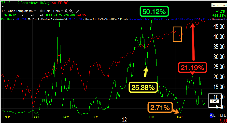
 The very strong stocks that are 2 standard deviations above their 40 day moving average peaked during late July at about half of the market, 50.12%, the first dip in January saw that percentage fall to 25.38%, it hasn't recovered since. The early March dip saw only 2.71% of stocks still 2 standard deviations above their 40 day moving average, falling from 25.38% from the previous dip. The recent March highs saw less then half the amount of stocks still above this measure, falling from over 50% to 21.19% and currently at a meager 8.41%. That's a huge decline!

 Meanwhile, the weakest stocks trading at least 2 standard deviations below their 40 day moving average had been at a low of only 1.96% in January, at the March dip this number multiplies by 5x to hit 10.82% on a dip. At the most recent dip, 14.62% of stocks were trading more then 2 standard deviations below their 40 day moving average and this coming from a low of 1.96%. Each dip sees more and more stocks fall significantly below their moving average.

 The MCO which I like as a leading indicator through divergences went negative just before the July decline of 20%, it also went positive at the October lows, now it is showing a huge and long negative divergences from Feb through now.

 The advance decline line for the NASDAQ Composite, all stocks trading on the NASDAQ electronic network, warned in 2011 as the A/D line fell vs the Composite Index, it fell significantly just before the late July sell off.

 Again the NASDAQ Composite's advance/decline line (advancing issues less declining issues) has diverged away from the composite and refuses to make a higher high sine early Feb., a much worse divergence then seen in July before the market fell 20%.


 The Russell 3000 Advance/Decline line is showing the worst divergence now since the 2007 market top.

 Here's the R3K A/D line in 2007 qt the market top.

 This is what the Russell 2000's A/D line looked like at the 2007 top.

 Currently this is the worst divergence in the Russell 2000 A/D line since the 2007 top.

 The MCO summation index is often used as a trend following tool by applying a 10 (yellow) and 20 (blue) day moving average to the index in green. Crossovers of the index through the averages and the averages through each other give buy/sell signals for trend followers, as you cane see, the Summation index is not only negatively divergence with the market, but also has crossed to a sell signal.

 Some still claim it's Dr. Copper that is a leading indicator for the market, others now believe lumber is the better leading indicator for the market. This is a lumber average, before the July decline, it diverged away from the SPX badly from April-July. As you can see it has done the same during this current rally.


 Applying a 1 month (22 day) rate of change to WOOD shows the warning in 2011 at also is warning now.

 If you still prefer Dr. Copper, loo how Copper has failed to confirm the rally, but worse still is in a full on decline in the yellow box.


Using the same Rate of change indicator applied to COPX, there were warnings in 2011 and a more severe warning currently.

A few other leading indicators...
 Commodities have underperformed badly, they are usually in near perfect sync with a rally so there's definitely a warning signal to pay attention to, but the larger warning signal may in fact be the global growth engine of China starting to fall apart. While commodities failed to keep pace with the market, more dangerous is the turn down fro mid Feb. through the present.

 High Yield Credit is also known to be a leading indicator, Credit markets are much larger and mostly traded by smart money. HY credit should lead a risk on rally, yet HY Credit has failed to make a higher high since Feb 6th.  As the Wall Street saying goes, "Credit leads, equities follow".

 Yields have provided excellent leading indications on every timeframe including intraday, this recent divergence in an area in which the SPX almost looks like it is completing the right shoulder of a H&S top is another clear red flag.

 The $AUD or more specifically AUD/USD carry trade which is often hedged with USD/CAD appears to be in the process of unwinding. The $AUD itself has a good correlation to the market and this recent divergence between the $AUD and SPX is yet again another warning signal, this also works well on intraday timeframes and has called many moves recently intraday and day to day, but the larger picture here is one of a red flag.

 High Yield Corp. Credit is also warning. At the 2010 pullback lows, HY Corp. Credit led the market higher, it warned in 2011 before July and is warning again as it has not been able to surpass the 2011 highs at the yellow trendline, diverging with the SPX.


Here's a closer more recent view, HYG itself as an ETF has seen no new share creation and the trend here is at best a triangle, but more then likely the decline from the tops of HYG are again another warning as once again, the SPX has the look of a market coming off a right shoulder in a H&S top.

I'll be covering Friday's action this weekend as well. We saw a good bit of what we expected to see as of Thursday, however there were several averages, the Q's and IWM specifically that did not participate, I knew from the Thursday positive divergences that the Q's looked the weakest, I still expected them to move. Perhaps the rally early in the week and the consistent distribution throughout that rally, sending it lower, did more damage then we realize.