Tuesday, April 16, 2013

Futures

For our currency traders, you should like this one. Given this weekend's post and the important I think currencies play, I think it's important to know what they are doing.

I'm going to add a quick legend with the general relationship between the currency and the market. Then you'll see different timeframes, the longest are the primary trends, the middle are the sub intermediate and the fastest are the short term trends, they all differ and they all seem to confirm our market expectations.

The $AUD Up is supportive of the market/ Down is typically putting downward pressure on the market.

The Euro has the same relationship as the $AUD.

The Yen moving up puts pressure on the market and down is supportive of the market

The $USD has the same relationship as the Yen.

These are the single currency futures only, not FX pairs, but you can get some idea of what they FX pairs will do by the single currency futures.

I'll start with the longer trend first, which is the bigger picture move we expect, the intermediate right now is more transitional leading to the bigger picture and the short term is of course, short term, expectations in the very near term for the market. You will find all of the timeframes represent different trends.

The $AUD
 60 min is in line, I don't think the $AUD has determined which way it will go longer term as the RBA (Australian Central Bank) chose to leave policy alone at the last meeting, but is expected to cut at the next meeting and maybe 1 more time this year so there's still a lot of uncertainty there and that shows on this chart.


 30 min Has clearly been in a move to the downside

 15 min This move is starting to reverse to the upside, short term this is market supportive for a decent move.

 5 min is showing increasing momentum to reverse the last swing down to a move to the upside, again short term market supportive as well.


 1 min these charts change a lot as they are intraday so overnight it will bounce around a lot, right now it still looks to want to head higher.

EUR
 60 min longer term looks like it wants to break down below the $1.30 level, longer term is in line with a broad market move to the downside, at least sub-intermediate in trend, maybe more.


 30 min is still leading to the downside

 5 min the Euro very short term looks like it wants to bounce, but I wouldn't be surprised if it started to head down before a market bounce was over, the Euro/market correlation has been weak lately, the $AUD has had much better short term correlation.

 1 min looks like it will move a bit higher overnight as of now.

$USD
 1-Day This is a long term, large bullish base, when currency wars breakout and everyone races to the bottom, the $USD tends to be bought, this is very negative for the market probably out to a primary trend or what is called a bear market.

4 hour The "W" pattern has pulled back recently, but that looks to be ending and a move higher will put pressure on the market.

 1 hour also shows the probabilities are high the pullback in the base is ending.

 30 min This also supports the pullback is ending, but it looks like a correction to the downside in the shorter term is building.

 5 min leading negative, clearly the short term looks like a correction in the larger trend of a move up from the pullback of the last 2-3 weeks or so.


 1 min also supports a short term move to the downside or correction, this is short term market supportive as well as commodities and most risk assets incl. precious metals and oil.

Yen
 60 min The initial drop from BOJ policy seems to have been under accumulation for an upside reversal ever since the drop ended, there's a rounding base that has started higher, longer term this is a general market negative.

 30 min however that move higher, like the USD in some small way, also looks to pullback to the downside short term, this is market positive.

 15 min This is confirming and on a timeframe that suggests a decent base and/or move up in the market would be well supported by the Yen as well as the other currencies above.

1 min

Equity Index Futures ES (SPX), NQ (NASDAQ 100),  TF (Russell 2000) *ES will be used as the model/example as they are all similar with the R2K looking the weakest.

ES
 4 hour The trend in ES is starting to fail, it is going negative long term-at least sub-intermediate to intermediate trend, maybe more.

 60 min the leading negative divergence has seen price catch up to it, the divergence worked great (As I showed it Friday morning), we are now at a sort of temporary reversion to the mean

 30 min also caught down to the leading negative, reversion to the mean, but slightly more positive as some changes are happening.

 15 min starting to lead, ES is trying to put together some accumulation, this is for the "Stage 2" move up I wrote about in the first post of the day Monday morning.


 5 min confirms the short term trend, however overnight there's some weakness, this could be VERY MUCH in line with the idea of an intraday or perhaps longer, but intraday is all that is needed, break below the 50-day moving averages in several market averages like the Q's or a break of SPX obvious support nearby.

 1 min also went positive after the close and is losing some of that momentum overnight, it gained a bit back, but overall it look like we could see some stop running/head fake moves set up on the downside for a short term move higher.


NQ For short term direction
 5 min NQ confirms that the short term is building positive, but overnight there's some weakness coming in, again in line with the downside head fake theory.

 1 min gives us a very clear sign of short term intraday weakness setting in overnight, prices should follow, it could turn at the US open, but I doubt it can hold that long.

TF for short term direction

1 min Also confirming overall short term strength, but looks to want to make a head fake move lower where they will likely add to the positive divergences in a meaningful way and the strength of the short term move, as described this morning as "Stage 2".


A Few More Things

Considering Boston, I wanted to keep tonight's post short, give you the links if you wanted to look up the charts and look deeper in to the subject for yourself.

However there are a few other things that I should add, some will help us determine the outcome of the days to come, some will just highlight the red flags, some are just universal concepts for your tool box.

I listed a lot of red flags in the last post, many were worse than I had ever seen like this CONTEXT chart for ES posted at 12:20 a.m. Monday morning. Here's the chart posted and the comment after...

"The CONTEXT model for ES is at an astounding 45 point negative differential!!! I HAVE NEVER EVEN HEARD OF SUCH A THING!"

Just so you know why we use CONTEXT, let me put it in context. Friday's ES 4 pm close was $1582.50, the low today was $1538.75, the differential above was 45 points, the drop from Friday's 4 pm close was 43.75 points!

Here are several more things (in no particular order):

The subject of this weekend's post was largely centered on the $USD and the Yen and by way of each, the Carry Trade, so lets look at what the Carry pairs did today.

 EUR/JPY plunged, this is not good for the carry, @ leverage as high as 200:1, a single pip is a huge move, a pip is the smallest unit of measurement in FX trade which is usually to the 4th decimal place (the 3rd here), there are 100 pips in a point, this is over a 3 point drop. However tonight we see some upside.

 USD/JPY did the same, over 2 points.

 As did the AUD/JPY with a massive 3+ point move.

 The AUD has been tracking the SPX (green) fairly well lately. Friday there was a sizable negative divergence between the two, it's barely noticeable now against today's move which was the biggest drop in $AUD in 5 months, even more than anything near the RBA's (Australian Central Bank) recent policy decision.

Both gold and silver had the biggest 1-day drop in 30 years, I know there are other factors causing selling in both, but covering the carry, raising margin money for margin calls, etc, were also chief among the reasons, after all many of these funds have gold as one of their most profitable positions.

This GLD chart lends some perspective.
There have been some very nice gains in GLD, however remember that triangle at the red arrow that I suspected was at least an Intermediate trend, if not Primary trend top? This is a 5-day chart so Gold's recent drop is in perspective and here again we see how much more powerful fear is than green in the size of the drop vs. any of the gains.

As for some Breadth charts (and these don't lie, they are as objective as you get)...
 This is the Percentage of ALL NYSE stocks trading above their 40-day moving average, with a price trend like this in the SPX (red), breadth should be rising and was late last year, early in the trend, but almost all of this year has been showing terrible weakness in the market, while the SPX is still elevated even after today's move, the %>their 40 m.a. is at a new low, at 64% on Thursday, it has shed 21 percentage points just since Friday!

The higher momentum stocks represented by Percentage of ALL NYSE stocks trading 2 Standard Deviations ABOVE their 40-day moving average, again breadth has seen more and more stocks declining below their 40-day average as SPX prices rose, this has been a major red flag. Today there are only 6.85% of all NYSE stocks 2 SDs > their 40 m.a.

This is why I have said that, "This market is like walking out further and further on to a thinning branch and when you hear the crack, it will be too late."

This is also why I've had no problem whatsoever believing the 3C charts showing strong distribution, it's evident right there in breadth,  a majority of stocks can't fall while the market goes up without there being heavy distribution not to mention manipulation.

Daily (One of the strongest 3C timeframes, these are heavy flows of institutional funds), the 2011 top and the 20% fall in the market led to the last really strong accumulation period which we predicted, specifically, "it would make a new low, drawing in shorts and accumulate further and then lead to a strong rally", that was the October 4th low-the preceding 3 months we doubled a model portfolio using 2 and 3x leveraged ETFs on a series of 2-4 day moves up and down, calling every one correct and doubling the model portfolio. The distribution since that last strong accumulation period is rather intense compared to the size of accumulation (3 months), but distribution includes short selling as well. This is why (especially in 2013) I have felt this was a VERY unpredictable and dangerous market. I believe a lot of the short positions we have amassed will pay off big time.

As for more recent market analysis and predictions, THE VIX/MARKET ANALYSIS HAS BEEN 100% CORRECT SO FAR.

The idea was the Bollinger Band volatility squeeze at the VIX triangle would lead to a highly directional move, but first we'd see a head fake move or two (a Crazy Ivan shakeout), we saw the first one to the upside out of the triangle which failed, then the downside was shaken out and today is the start of the "Highly directional move". We can and will have corrections and counter trend rallies, but I believe this is the start of the move in most people's view, I believe it started when the Trend Channel broke.

For the analysis on the VIX/Market expectations, here are the links... The original and then one stripped of other analysis and just presenting the VIX portion. So far every thing has happened and on time.

Speaking of the VIX and some other leading indicators...

At 2:19 I posted "Levers are being pulled" and I don't know if it was Boston or the market lost control, but the SPY arbitrage confirms they were trying to manipulate the market, perhaps not higher, but perhaps just to get it slowing down and moving in a more "U" shape, here's the SPY Arb. chart for today, notice when the manipulation started in Green and the time of my post above as well as the charts in it.
That's 2:28 highlighted, the post was at 2:19, that area is green meaning the VXX, TLT and HYG were all being manipulated, but the market couldn't hold it.

As for other leading indicators...
 Commodities yesterday were at a deep leading negative divergence vs the SPX (green), today that's barely noticeable with today's destruction in commodities. However note that the afternoon trade was rather flat, just barely making a new low, this tells us something about trade in the days to come as it looks like risk assets are trying to get the market to a point in which it can consolidate at minimum or bounce as earlier expected. HYG and TLT are showing the same things.


 Yields went negative locally as you can see and have pressured the market lower from highs, but today's fall in yields was no where near as strong as you'd expect, again this seems to be another sign of an upside move. Yields should have at least made a new low today considering the SPX move (green).


 VXX was one of the levers today, it looks like Boston changed all the dynamics of the market as it is a truly non-discountd fundamental event.

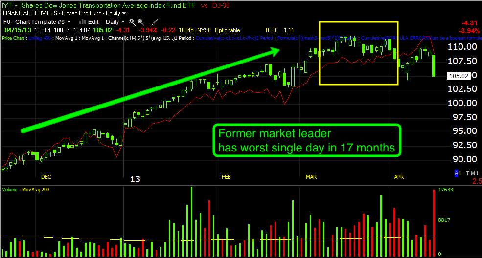
Longer term the once stellar performing transports that were all you heard about gave a clear change in character and negative divergence vs the Dow-30 (red), this was the single worst day for transports in 17 months. Note Transports failure to make higher highs, this is a change in character for transports and the market, it led to a change in trend.

As to the near term indications, we had(as you might imagine) Dominant Price/Volume Relationships (all the same) in all of the averages.

This is not the Index's Price/Volume relationship vs Friday, it is all of the component stocks that make up each average.

 Dow-30

All 30 stocks closed red, but dominance was in Close Down and Volume up. Every average had the same dominant P/V relationship, Close Down/Volume Up which is normally considered and leads to short term, 1-day capitulation with the next day closing higher or in the same area. These have worked amazingly well, last week was the first time I saw them not work and it turns out that was because of the lowest volume day of the year on Monday controlled by algos and Tuesday and Wednesday most of Wall St. was trading on inside information from the F_E_D minutes they received Tuesday morning when they were supposed to come out Wednesday afternoon which is about the time they did come out so blatant manipulation all 3 days the P/V didn't work.


 SPX


Russell 2000 with only 38 stocks closing unchanged or better of 2000


 Russell 3000 with 50 stocks closing at unchanged or better!


NASDAQ 100 

This would suggest as does price and volume that we are at a short term oversold condition.

XME/Metals and Mining was the worst performing S&P sector today/Monday.
The sector was down -6.25%. A few stocks I track in the field were down -12% or more. Typically many stocks are down about double the industry group.

I wouldn't be surprised to see support on the SPX tested or have the stops run on at least an intraday basis...
SPX support at the hammer @ $1539.50, today was the heaviest volume ex-quad witching op-ex (red arrows). The 50-day m.a. is in the same area.

The NASDAQ Composite close right on the 50, I wouldn't be surprised to see stops run at least intraday there as well.
NASDAQ Composite close right at the 50-day. I don't care about the average, it's just most traders do and Wall St. often uses that against them with head fake moves like a break below to draw in shorts and then a pop to the upside using a short squeeze to help upside momentum as well as accumulating shares on the cheap with huge supply available which they need.

I would guess if the SPX and NASDAQ Comp stops are run on a head fake move, the upside would at least take out the R@K's 50-day and maybe a bit more to make it believable. Counter-trend rallies from a move down can be some of the sharpest, most powerful moves to the upside you will ever see.
The initial head fake move down followed by a move up and > than R2K's 50 ma, a classic "Crazy Ivan" shakeout.

Futures coming next...