I absolutely hate these rumors like we saw today on the Greek debt deal. I don't know who is floating them, if they are true or not, but if the FX market reacted like it did, someone took them seriously. If there's one thing that the market hates above all else, it's uncertainty, thus the market maxim, "When the missiles fly, it's time to buy". The idea behind the saying s not that the market prefers war, it's the lead up to war and the uncertainty that the market hates, so when the situation is resolved (i.e. the war starts), the market can then go about discounting the situation.
Here's what I've been expecting for several weeks, it hasn't played out perfectly from day to day, but the larger idea has played out.

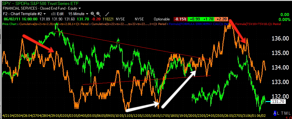
I view this triangle in the S&P as a top, I have reasons for it based on observable indications, it's not based on my fundamental opinion. The very fact that there's a very common price pattern there causes a lot of volatility. Technical analysis is not like it used to be 10 years ago when you saw a top formation and new to just short it, because back then, they typically just broke down out of the triangle, nice and clean. Over the last several years (especially with the advent of high frequency trading and pattern recognition software), Wall Street has used technical analysis against technicians. So instead of a top like this breaking down cleanly, technicians who just have not adapted to the new realities of Wall Street and technical analysis, go about things the old fashioned way-they sell the triangle short. I see this so often that it's predictable. When the top broke down last Monday, I knew it wasn't going to see follow through selling and it would set up a head fake to shake out technical traders. Since then the market has moved up until yesterday. Again, according to traditional technical analysis, you short a move like yesterday's, a big breakdown on heavy volume, but as I posted last night, I felt there was a good chance that there would once again be no follow through selling. The shorts from last Monday were already squeezed by Tuesday of this week when the market posted it's recovery high. Many technicians would then see the triangle as a failed top and expect the market to move higher, thus the next day we get a nasty breakdown, once again knocking traders out of their long positions and if you think it was the news alone that did it, think again, there was bad news the day before and there's been bad news through the entire recovery since the market broke down on Monday May 23. Lets take a more technical look.

Here's the same triangle on a 15 min 3C chart of the SPY. to the left, (red arrow) we get our first negative divergence or distribution/selling sending the market lower. At the first white arrow we saw a brief break down in the triangle, note the positive divergence, the breakdown was accumulated and the market moved back up from there. On May 23rd the market fell out of the triangle on the most serious break to date, but 3C didn't move lower, once again the break was accumulated. I've believed since before then that there would be 1 final move above the triangle, a final shakeout before the market truly heads lower. Most of last week and early this week we were on that trajectory. Tuesday closed very close to the breakout point of $135. However last Friday I saw weakness in 3C and said I thought this week would open on weakness. Tuesday went nowhere, Wednesday we saw the big breakdown, but again my belief has been that we would still see the $135+ move and today was a good start as we saw NO follow through selling.

Here's today on a 1 min 3C chart. The morning started with a negative divergence (red arrow) sending the market lower. The market took out yesterday's lows and another intraday support level so a lot of stops were triggered. At 11:30 a.m. there were signs of accumulation in some of the averages, so once again the stops that were hit/and the traders that went short, were accumulated at the lows. The rest of the early afternoon the market moved up off that positive divergence. The green arrow represents confirmation of the intraday uptrend, the SPY even ended the day with a leading positive divergence. Typically all of the averages (QQQ, SPY, DIA, IWM) all give the same signals around the same time, but the last week we've been seeing signals in one or two of the averages that have led the others. The DIA and QQQ have been particularly accurate this week.
Late morning/early afternoon Reuters reports a deal has been reached in the Greek debt crisis, this is overall supportive of the market.
Then come the retraction rumors that no Greek Debt Deal has been reached. I would not normally pay much attention to the rumor, except there appears there was some serious confirmation. It appears this hit the market at 2:17 p.m. as you can see by the heavy selling in the Euro Trust ETF on a pretty strong move down. Currently there's a bear flag in the FXE as of the close.
I checked the FX market as well for confirmation...
Here you can see on this 5 min chart, at the exact same time, the EUR/USD plunged, also forming a bear flag as of the market close.
The FXE today on a 1 min 3C chart, the FXE (Euro) gapped higher on the open into a negative 3C divergence, from there FXEFXE moved higher. Between 1 and 2 p.m. a negative divergence formed. Likely the locals had already heard the rumor and were distributing their positions before the news hit the wires.
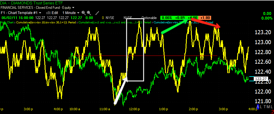
Looking at the DIA, you can see the positive divergence in the DIA (as I mentioned earlier) between 11 a.m. and 12 p.m., it was actually quite strong as it reached leading divergence status (in the white box). This may have had something to do with knowledge of the Greek Deal to be announced later, it also corresponds to the stop levels being hit which were below yesterday's lows. The DIA saw confirmation of the uptrend between 12 and 2 p.m., there was a negative divergence from 2 p.m. through the recovery highs at 3 p.m. It looks like the rumor which denied the Greek deal was being discounted.

The DIA 5 min chart also confirms several things, 1) there was a positive divergence at the new lows around 11:30 this morning, suggesting we would not see follow through selling from yesterday, which fit well with my expectation that the market would produce a move higher, possibly to the breakout level I've been anticipating. Even in the DIA 5 min chart (which takes longer to respond) there was a negative divergence between 2 pm and 3 pm, again suggesting the retraction story was again being discounted.
The QQQ 1 min is a bit different, but the important parts are there, 1) the 11:40-ish lows, which were accumulated sending the QQQ higher and a negative divergence which got worse through the afternoon, the 3 p.m highs saw the worst negative divergence again suggesting the rumor was being discounted.
The 5 min chart ( a longer term view) also showed a positive divergence at the open, suggesting we would not see another follow through selling day with the market down 1.5% or more and a positive divergence on the 11:40 shakeout when stops were crushed. The 5 min QQQQ moved in confirmation of the afternoon uptrend until the 2-3p.m. timeframe. Again suggesting the rumor was being discounted.
Currently it looks like the FX EUR/USD bear flag is being broken as of 6:27 p.m.
In the red square in the bear flag that started with the release of the retraction of the Greek debt deal.
Several sources have printed the denial by the EU of a Greek rescue plan including:
RanSquak
The New York Times "A press officer for the Greek Finance Ministry denied Thursday that Greek officials and European envoys were having trouble agreeing on details of a new austerity program. “The negotiations are continuing; they are going well and are due to conclude in coming days,” said the press officer, who under ministry rules could not be quoted by name."
To me it sounds like Reuters may have prematurely announced a deal, although they are standing by their story. There are a lot of very sensitive issues including Bond Holder participation in losses, probably some sovereign issues with regard to tax collection and the sale of Greek national assets.
The Euro overnight may give us a better feel for where negotiations are at and whether a deal is imminent.
Personally, I feel the right thing to do at this point is to reduce risk exposure to short term trades and focus more on the longer term portfolio positioning. There's a lot of domestic resistance to the Troika's demands on Greece for a bailout package, even if they come to an agreement in principle, it's seeming unlikely that the majority government will be able to get specific demands through parliament. The protests in Athens attests to the unpopularity of the austerity measures and the sovereign issues that are seemingly conditional to any bailout. In other words, this thing can go either way and as we saw today, the news changes very quick.
Here are some of the MACRO trends you may want to consider.
Financials... (XLF)
This is a double top, the most recent test of the April highs, posted a false breakout at the red arrow sending the XLF down nearly 11%
From a daily 3C perspective, the first April top failed on a negative divergence. June through November 2010 was used as an accumulation zone leading to the second top or test of the April highs, it failed on a negative divergence (distribution). In addition to being a double top, the large descending triangle in 2011 is a very bearish price pattern. It looks highly likely the first stop will be the November 2010 lows, I'd expect some consolidation there or roughly in the $13 range, but ultimately the chances of seeing the XLF in the mid single digits look to be very high. Banks are among the sectors that have the most to lose with an end to QE. Furthermore the Fed/Treasury's actions during the Lehman crisis created monster banks. A failure of one of these will make Lehman like look an insignificant footnote in the history books.
Tactical considerations...
Greek rumors aside, just looking at the daily chart, we have a well formed Harami (2-day reversal pattern) with today forming a doji (1-day reversal pattern) on heavy volume (often reversals are accompanied by heavy volume). If my original thoughts about an upside head fake play out, then the XLF would be an intriguing short candidate around the $15.80 area. As for 3C, late day action was negative toward the close. The biggest accumulation zone in XLF lasts approximately 1-day which doesn't give a lot of support to an upside move. If XLF is to see the $15.80 area, it will have to float on the back of the market (A rising tide lifts all boats), in and of itself, there simply isn't a strong case for XLF to stand on its own two feet.
Gold...
Gold is a natural hedge for inflation. The prospects of the Fed raising rates significantly n the near term seem dim at best. This may give gold an opportunity to pullback in the near term, but continue it's ascent as the Fed normalizes policy and rates later in the year. Of course this is based on what we know right now and no one knows for sure how the Fed will react and what their capability to react is after unprecedented loose monetary policy. In any case, this may present an opportunity to buy gold at a discount.
Heavy sell side volume in GLD. GLD also fails to make a new high suggesting that the current trend is bending and likely to see a pullback. The short term trendline looks a little shallow.
3C daily has been in confirmation for months, the recent negative divergence carries more weight.
On a 15 min chart, the negative divergence at the high is very clear. there was an accumulation period (as I've mentioned many times, the market runs in cycles) at the white arrow, it seems that is under substantial distribution since failing to make a new high.
Here's the long term trend in Gold and where significant opportunities exist at minimal risk, as you can see, this only happens 2 or 3 times a year so be on the lookout for such an opportunity.
Silver... Silver is a bit more complicated. The historical valuation between Gold and Silver has been artificially suppressed by JP Morgan's short position in Silver that Blythe Masters has spent so much energy and time trying to protect from a short squeeze. Silver also does not have the same inflation hedging value as gold. So there are 3 main issues with silver, the JPM position (as a side note, when the silver bugs beat JPM and forced a short squeeze, the COMEX entered the picture with a series of margin hikes to kill the silver rally, one might suspect Federal interference to the benefit of JPM). 2) Silver is historically undervalued, but outside influences seem to want to keep it that way. 3) The demand for silver by Central Banks is far less then that of gold.

I've showed you this in the last few days, the price pattern here is that of a bear pennant, a bearish continuation pattern. There was also an RSI negative divergence at silver's small double top and the pennant has recently broken out which is a move that runs counter to traditional technical analysis, making it likely that the move was the often seen head fake. Currently the downside the last few days looks like the head fake may come to completion and silver could see the downside that is implied in the larger price pattern.

The 3C 30 min chart shows confirmation of the uptrend in green, this is around the time the COMEX started hiking margin requirements for silver in an attempt to kill the rally, despite what they say about volatility. The first red arrow is the top's negative divergence or distribution in the silver position, prices fell from there and created the pennant portion of the bear pennant (the triangle). You can see there was accumulation in the triangle which is needed for the breakout. Since the breakout, 3C has gone very negative, again suggesting it was a head fake move and the downside in silver looks likely to continue once prices move below the apex of the triangle.

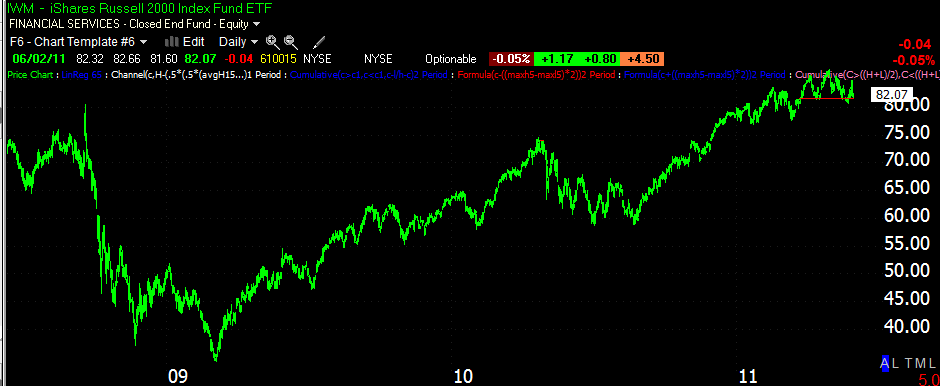
The Russell 2000... I use the Russell 2000 because it is one of the broadest measures of the economy, Bernanke himself often makes reference to the performance of the Russell 2000. It also happens to be one of the most juiced of the averages (courtesy of the Federal Reserve). For example, during the period of lows to highs (7/6-4/29) the R2K has returned 46% , the S&P-500 returned 32%, the Dow Jones 30 returned 31.5% and the NASDAQ 100 38.5%.
There are several different tops that can be drawn, I've chosen to just look at the area in which the R2k stopped making higher highs, higher lows (the definition of an uptrend).
Whenever I'm trying to confirm a top (and I've found many head and shoulder patterns in price, which were not true H&S patterns by looking at the volume, the analysis of a random pattern that looks like a top was later confirmed when these apparent H&S tops went on to make new highs. A similar situation existed very early in the 2009 rally, what appeared to be a H&S top was not confirmed by volume and of course the market went on to make new highs). This is the cumulative volume indicator I created to make volume analysis easier. Simply stated, rallies should see increased volume and declines in price should see decreased volume in a healthy market. If you follow price and the indicator, you will see the opposite is true here.

Just so you don't think I'm leaning on 3C for all of my analysis, I often check MoneyStream which does a good job on the big picture, it' not as useful on intraday charts and swing moves. MS confirmed the rally since August 2010, Around March distribution showed up in the R2K, currently MS, which works much like 3C, is in a leading negative divergence. Price tends to follow these leading divergences so it looks like a very nasty decline is setting up in the R2K and broader market.
3C gives similar results, confirmation to problems in March and a current leading negative divergence.
Looking specifically at the top using a 30 min chart, you can see negative divergences in red which always lead to lower prices and positive divergences or accumulation leading to higher prices. The move into a leading negative divergence over the last few weeks is a significant development.
Finally just looking at the trend we can gain a valuable perspective. I've applied a linear regression channel , notice how the R2K never trades in the lower half of the channel until March. Currently the R2K has broken below the LR channel. Frequently we see a rally in price back up to or inside the channel after a serious breach like this, it's called "kissing the channel good bye". We'll want to watch for such an event as it provides an excellent risk:reward position. Very rarely do stocks break a channel and recover, especially over a long term channel like this.
So there's a look at the macro view. Sometimes or a lot of the time, we look at the tactical side so often that we forget the seriousness of the strategic side. Having a strategic perspective often helps in making shorter tactical decisions.








 | Theme by Thur


