I'm just going to use the SPY for a market update, I mentioned before that three's dispersion between the averages, meaning the typical "one looks like all" is just not there- for instance the charts of the QQQ give a different impression, a more negative one, but I'm trying to average them together and I think the general idea as we start to come out of the Op-eX pin remains the same as what I suspected yesterday, "CHOP", dangerous, portfolio grinding chop.
Two things about chop, for the most part it's an area of the market I'd generally rather sit out and wait for it to clear unless I have a really good reason to do otherwise as it can create tactical opportunities.
The second thing is 3C has proven to be VERY effective in chop if it's tradable. I think the only time I ran a very specific trade model portfolio (rather than a tracking port. of all idea out there) was just after the nearly -20% loss in the market around the end of July/start of August of 2011.
We had 3C signals 2 or so days before the end of that dump that it was going to stop, I think most traders were just scared and assumed it would keep going. From early August to early October, we hit EVERY SINGLE SWING UP and DOWN using 2 and 3x leveraged ETFs and had an overall portfolio gain of +75-78% for that narrow period.
Here's the drop, in white was where we killed it and even predicted the new Oct. low leading to a strong uptrend after.
I'm not at all suggesting we are in for anything like this, I can't even say we will see this for any more than a half day, we just have to let the market tell us as we go.
So far for the afternoon and these are the more important signals as they tend to pick up where they left off on the next trading day (Monday), even more so than price...
As mentioned in a market update earlier, an intraday 1 min positive divegrence sending the market higher today. This could grow even more as we exit the op-ex pin in to the close, but I'll be keeping tabs on it.
The 2 min chart, negative and today's positive, so again this looks conducive to the move up to create chop while the stronger negative charts are kind of a lid creating the move down and thus "Chop".
The 3 min chart negative with a small relative positive.
This 5 min chart has a very clear negative with (so far) a much less impressive positive, but it's still a 5 min chart and is respectable.
However now let me put this in to some context.
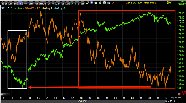
This is that same 5 min chart in context, it not only has shown dramatic distribution through higher prices as distribution normally does, it is leading negative well below where the move started at Oct 9 lows, so we have to keep short term charts in context with the bigger picture.
Multiple timeframe analysis is one of the most difficult aspects of the market to grasp because people are use to "Buy, hold, sell" and the market can't be navigated that easily anymore if it ever could be beyond the kind of bull market long where anyone can be right or bear market short where anyone (who isn't afraid to short) can be right.
Thus far the SPY is in a downtrend, lower highs, lower lows= DOWNTREND.
When I say chop, I really can't qualify it until we see the signals which we are starting to see, but I imagined something like this.
i'm off to collect some more information and see if it looks safe enough to place any other new positions or manage existing ones.
Is interest rates about to start going up?
-
Yes, I know - it does not make any sense - FED is about to cut
rates...but....real world interest rates are not always what FED wants it
to be.
6 years ago


No comments:
Post a Comment