The one thing that makes me nervous in the market and I don''t get nervous very often is a quiet market. I've often compared a quiet market to being like having children in the room next door and they're just a bit too quiet, that usually means they are up to something and this market has seen volatility very low all year, but the last couple of weeks have been insane, which is the reason we've been using a lot of leveraged (options) trades and in and out.
Forgive the number of charts below, but I want you to see what I'm seeing. Some of this such as the VXX 15 min+ charts I've known about for sometime just like the negatives in assets like Transports, however it is the shorter term miming charts I have been looking for with good confirmation.
This is the flag-like pattern that I suspected would give us a false break that would fulfill the head fake/false price move in to the Igloo/Chimney Top once it broke $212.50, thus far, hasn't held. I also thought this would need to happen and be complete BEFORE Greece and the IMF payment come due, unless Tsipras is going to go against his party and accept the Troika's final best offer, which they have called a red line that they would not cross, but I guess default could make you do some things you didn't expect. In any case, we have to wait and see. A relief rally if Greece accepts the Troika demands would have the same effect, stronger even and would help us out with additional positions enormously, but until then we have what we have and no way to divine what Greece will do at the 11th hour.
Volatility has been low all this year as you see in the SPX daily chart above and getting worse. We've had 1 failed head fake/false breakout already and these large triangles are almost always tops.
However the pinch in volatility the last couple of weeks has been unreal. Again, these dull markets I consider to be the most dangerous. It's easy to let your guard down and expect today will be just like the rest of the year until it isn't. If anything, this is the time to be paying extra attention.
As for the Leading Indicator that is causing me the most, well I shouldn't say concern as I've already set up core shorts and am ready for a decline, but in the case of wanting to enter some additional positions in to some price strength, this has caused me the most worry that the market will drop quickly before we get a chance to enter those set-ups, one of which I featured yesterday, NFLX Trade Set-Up
HYG
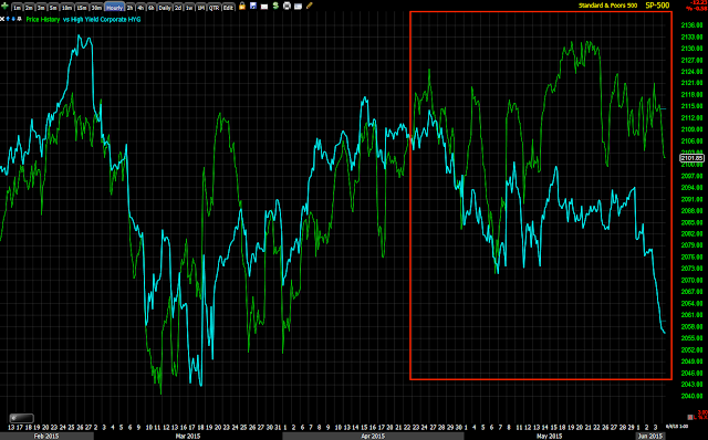
HYG (High Yield Corporate Credit) is leading negative in a big way recently, this in addition to already deep dislocations on longer term charts.
It looks like smarter money is heading for cover.
HYG daily leading negative vs the SPX. On a longer term chart, the dislocation is much worse with HYG already in a primary downtrend.
Very short term, this is the 1 min HYG chart, it has been in line on the downside, maybe a bit oversold right now, remember this is only a 1 min positive divergence through yesterday afternoon and this morning.
The 5 min HYG chart is leading negative and has full 3C downside confirmation.
As does the HYG 15 min 3C chart, actually it's worse as it is leading negative.
And the HYG daily 3C chart, you can see why it's in a primary downtrend. Note the price action/3C signal since the red arrow.
As for VXX, I'm also using UVXY and the inverse XIV for confirmation as each has different volume so there wouldn't be confirmation based on price movement.
VXX 1 min has shown accumulation at recent lows, any move higher was sent lower and accumulated.
Looking at UVXY's 2 min trend, you can see the same trend through this entire period.
UVXY 2 min leading positive with a clear accumulation area.
The 3 min XIV (inverse of VXX) shows confirmation at the green arrow and then a large leading negative divergence confirming the VXX/UVXY positive divergences above.
VXX 10 min leading positive and 15 min charts I have been aware of as someone seems to be building a large position/protection, it's the shorter timing charts that have grown more active.
VXX 15 leading positive as well. The divergence (positive) to the left is interesting, I wasn't quite sure what to make of it, however...
The VXX 60 min shows the same positive divergence at the same area and the current leading positive. Most often we see divergences in flat range areas like this one to the right.
The very inverse XIV chart confirms VXX's 60 min chart with a leading negative divergence. Thus we have good confirmation through multiple timeframes and multiple assets.
Even in VIX futures we are seeing recent local activity...
VIX futures 5 min 3C chart leading positive...
VIX 7 min futures 3C chart positive
And impressively, the 60 min VIX futures chart positive as well.
I chose UVXY for a little extra leverage without having to worry about time decay of options at the moment, but I may fill out the remaining position with VXX calls if I feel there's a good set up and signals for such a trade.
Is interest rates about to start going up?
-
Yes, I know - it does not make any sense - FED is about to cut
rates...but....real world interest rates are not always what FED wants it
to be.
6 years ago


No comments:
Post a Comment