This is definitely a weekend post, but pay attention because there's a lot to be learned here. Concentrating on the market averages to tell us WHAT THE MARKET IS DOING, is helpful, but as you are about to see, it doesn't tell the whole story and a sorted story it is.
Lets start off with some simple facts:
Watching the SPY (ETF for the S&P-500), it has gained 1.26% during the last 15 market days or 3 weeks. While it seems that this is an uptrend that won't die, a 1.26% gain is a very reasonable 1-day gain, stretched over 3 weeks? It becomes very obvious just how little this market has moved. In fact, did anyone notice that the QQQQ actually lost 1.29% over the last 6 days?
I told you that I thought the NASDAQ 100 or QQQQ would lead the way higher and indeed it did. Over the course of the September rally the averages (by ETF) work out like this from August 31 to their highest close:
DIA (DJ-30 ETF) gained 8.34%
SPY (S&P-500 ETF) gained 8.89%
QQQQ (NASDAQ 100 ETF) gained 14.27%
I also said that I thought the NASDAQ would lead the way down. As you recall, the NASDAQ has lost more in 6 days then the SPY gained in the last 15, 1.29% in 6 days, but what about the others?
The SPY lost -.17 over the last 6 days, not even 1 5th of a percent.
The DIA lost -.24%-almost one quarter of 1%.
Again, over the same period the Q's lost 1.29% and again-more then the SPY has gained in 3 MARKET WEEKS!
Averages can be misleading about what the market of stocks is actually doing. So first we'll take a look at the internal health of these stocks using breadth readings. A simple understanding of breadth would be to ask yourself, "Which is a stronger rally, one in which 99 of 100 stocks gain 5% each to put the index up 5% or a rally in which only 40 of 100 stocks close higher, 60 close lower, but the average is still 5%?"
The answer is simple, in the first hypothetical, we have almost all stocks showing broad strength. In the second, we have a majority of stocks declining with a minority showing large gains. The first market is likely to last longer and see more gains then the second market. So we study breadth readings as a way to measure the health of a rally.
These are Worden's TeleChart Market Indicators called the "T-2000" series. In all cases, the indicator itself will be green and the comparative index like the Russell, S&P or NYSE will always be red.
First we have a measurement of the percentage of stocks that have closed 1 standard deviation ABOVE their 40-day price moving average. Above the moving average is bullish. When we compare the top of the July Rally to the top of the September rally, we see that the September rally has carried up higher then the July top, we'd expect to see the green indicator of the % of stocks +1 above their moving averages higher as well, proportionately. This is not the case, we have about 5% fewer stocks above the moving average on a rally that went higher. This shows relative weakness in the August rally vs the July rally in terms of breadth.

Here we have the same, except this indicator is TWO standard deviations ABOVE the 40 day price moving average, these are really bullish stocks. Again, the July rally showed a little over 35% of stocks were above that m.a. The August rally which is higher and therefore should show a higher percentage, is actually lower at 20.71%-a 15% difference between the two rallies, even though the one that has the weaker breadth actually had a bigger % gain. This is a warning.
This is indicator is the Russell 3000 Index, Advance/Decline line. An Advance/Decline line is constructed by taking the advancing stocks in the index and subtracting the declining stocks in the index. therefore, the higher the line, the more stocks that are participating in the rally. Here we see the Russell 3000 in red making new highs, but the advance/decline has started heading down
This is the same indicator, just applied to the Russell 2000 Index which is one of the best measures of the market. Again, the index in red makes higher highs, but the Advance/Decline line is making lower highs showing fewer stocks participating in the rally.
Now for some of my NASDAQ Breadth Indicators I use on Worden's StockFinder 5
On the left, we have the NASDAQ 100 Advance/Decline Ratio Notice how it starts strong at the beginning of the rally, buy much like 3C showing distribution throughout the rally, it too is showing fewer stocks in the 1 hour time frame to the point where it actually goes negative and we have more stocks selling off then rising. How can this be without the NASDAQ falling? It's because there is not equal weight among all 100 components. I did a rough calculation and figured out that AAPL itself is worth about the same weight as the bottom 51 components. So the first 10 components account for most of the weighting in the index. You can have more stocks selling off then rallying, but if you rally the weighted stocks, you can maintain a positive close. Still, the internal health has shown a steady trend of declining.
There is no way you can look at this chart and conclude that the NASDAQ 100 Index is strong or healthy.
Here we have the price for the QQQQ ETFIntraday momentum index. If you look at candlesticks-the way price is represented for each bar, the long open bodies are the strongest, when the bodies shrink like we have seen recently, the daily momentum has wained, showing a day in which there is less enthusiasm. Look how the candles look the first 3 days of the rally and compare them to the negative (filled) smaller bodied candles we've seen recently. This red indicator should rise with price in a healthy rally, instead it is in a downtrend.
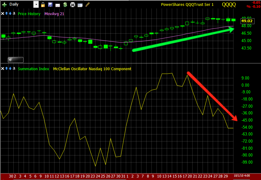
Above, again we have the NASDAQ 100, below the McClellan Oscillator. This indicator shows the difference between advancing issues and declining issues. A health market it should move up. Recently however, near the time 3C gave a rare reversal signal, the oscillator went into a downtrend, each day fewer and fewer listed stocks participated in the rally.

These next two indicators are ones I like a lot. This is a 30 minute chart, it is the right length to show us changes in character for a swing rally. The QQQQ's price is in the top window. In the middle window is the percentage of NASDAQ 100 stocks that are above their 30-min, 50-bar moving average. Being above the moving average shows momentum and a healthy stock. In Red is the percentage of stocks that are below their 30 min, 50 bar moving average. These stocks are sinking, closing lower and just generally not performing well. You can see the time frame starts August 31st at the end of the decline and the start of the new September rally. Notice, when the rally starts we have 90+% of stocks above their moving average and less then 10% below their moving average. However, that, like 3C has deteriorated the entire rally showing THIS IS NOT A HEALTHY RALLY. Currently about 50% are above and 50% are below the moving average, this is quite a change.

ANOTHER FAVORITE, this is the same 30 minute QQQQ price chart, but this time the indicators are the percentage of stocks that have made a new high or a new low over the last 50 bars (each bar is 30 minutes). In a strong trending market you should see many stocks making continuous new highs. We start the rally with a reading of 80% of the NASDAQ 100 stocks have made a 50-bar new high. That number now is around 10%. The new lows started the rally at 0% and stayed that way for about 4 days. Slowly they increased. On 9/30 we had 0% of the components making a new high and 21% making new lows. However, the trend as represented by the arrows is what is important.

Here are two indicators on the QQQQ chart, Williams Accumulation/Distribution (similar to 3C in what it tracks, but using a different method) and Price-Volume Trend (PVT) Both should rise with rising prices in the QQQQ. Notice the recent downturn in Williams A/D and the steady downtrend in PVT. comparing two relative points of the same price (the green arrow), you can see both have declined.
Here are some other charts of note.

Since AAPL has the heaviest weighting on the NASDAQ 100 (roughly 19%), AAPL was used much throughout the rally to keep the index moving higher. It's a lot easier to buy 3 or 4 stocks with weight then all 100 and cheaper. You can see the 3C positive divergence in AAPL at the white arrow, this is an extended period, longer then what we saw in the SPY, and it's obvious because they needed a lot of inventory as it was going to be the main stock used to move the NASDAQ 100 higher as well as other averages t is a component of. You can also see a very defined channel in the red trend lines that AAPL traded in, this is indicative of computer trade programs with few pullbacks. However, around the time 3C gave that rare signal last week, AAPL showed a negative divergence at the first red arrow. Since then it has developed into a leading negative divergence suggesting to me they not only sold all the inventory, but also went short AAPL. Look where 3C is now in comparison to the same relative point in the rally (last red arrow)-much lower.

Here we also see a huge move down in AAPL intraday on huge volume. Many things could have caused this, but it is very indicative of a market with very few participants on a large order to sell/short. It is also where AAPL's uptrend was broken.
Currently on this 30-min chart of AAPL you can see the relative flat trading recently. Also in the red arrows you can see a bearish continuation pattern called a "Bear Flag". It looks like they are done manipulating the market higher with AAPL.
After AAPL, for a few days, the semiconductors seen here in their ETF SMH, were used to move the market higher. Note the accumulation in august at the white arrow. Now there's a negative divergence at the red arrow, it may go into a leading negative divergence like AAPL. Note how 3C confirmed the uptrend at the green arrow, making higher highs and higher lows with price, now there's a change in character.

Here is the SPY ETF (for the S&P-500) Notice when the SPY broke above $115, it quickly fell back below, note the huge red volume as it declines. This is fairly simple to explain. When price is under the trend line at $115, that trend line represents RESISTANCE, when above the trend line, it should provide support, so many traders will enter the trade above resistance, they expect that newly formed support to hold, when it doesn't, they are at a loss and sell. the human mind also gravitates toward whole numbers like $115 instead of $115.13, so their orders to buy are placed there and their orders to sell are placed there. In any case, $115 would be an easy level to hold if the Fed or whoever is acting on behalf of this rally wanted to hold it. If they can rally it up this far, they can hold onto $.50, they didn't which tells us something along with the 3C and breadth readings.

Look at the volume into the rallies on the SPY, compare that to the volume on the declines in the white boxes. there is heavy selling/short selling going on.
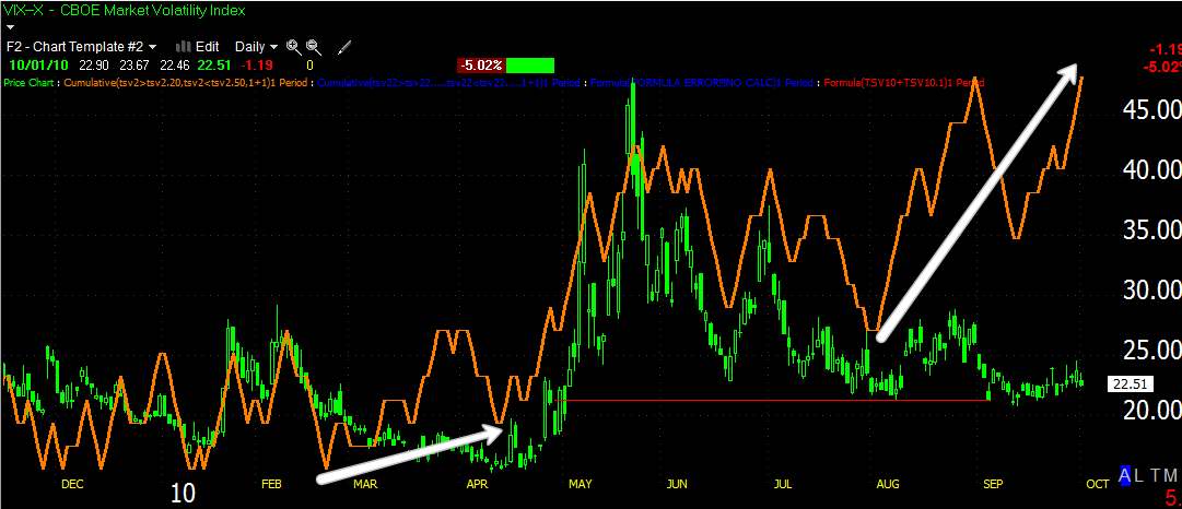
And the VIX daily, 3C positive divergence I told you about. The last one we saw from March to April (first white arrow) was much smaller and produced the sell-off that we saw from the April top. This divergence is even bigger and LEADING too, suggesting a much bigger sell-off.
While we've been watching the averages waiting for the reversal, look what has been going on in some of the biggest stocks in the market-they've already begun their reversal and downtrends. (If for no other reason, this is a good lesson is some great Candlestick reversal patterns)
Amazon (AMZN) Here is a Harami Candlestick bearish Reversal pattern. A Harami s a 2-candle pattern, the first a large open body candle like the first one and the second a smaller -the smaller the better-star like candle inside the body of the first candle. The Japanese call this pattern "Mother with baby". The reversal has started a short term downtrend.
American Express (AXP) Here we see a sequence of two "Hanging Men", the name implies bearishness. Look at the volume on the downtrend after the last Hanging Man. there's serious selling going on in AXP.
Bank of America (BAC) This is a "Evening Doji Star Reversal", the confirmation of the bearish candle came the next day with a lower close, since then AXP has been in a downtrend.
Google (GOOG) is showing a 3 candlestick pattern called a "Shooting Star" The shooting star has gapped above the previous candle, this is our warning. The third candle is the confirmation of the reversal by making a lower close. While the short term pattern is lateral, I would expect to see GOOG move lower shortly. This is a very strong reversal pattern.
Hewlett Packard (HPQ) Is a two candle formation called a "Bearish Engulfing Candle" Note how the body (green part) of the second candle completely swallows the first candle, which was fairly substantial on it's own. So such a bearish engulfing candle is significant. Note what happened today. That's a big move for a large company and the volume is heavy.
Johnson & Johnson (JNJ) is showing another bearish "Harami", mother with child. The 3rd day is confirmation of the reversal pattern making a significant lower close on heavy volume.
Kraft Foods (KFT) is another bearish "Harami" setup, the trend since the reversal is decidedly down and on increasing volume. With a Harami, the second candle's body needs to be inside the first candle's body, the wicks of the candle are irrelevant.
Here's another "Evening Star" reversal in Altria Group (MO). The reversal was confirmed and the short term trend has changed to down. The qualification for an "Evening Star Reversal is that both candles on each side of the star have a gap between their bodies and the star's body, the wicks don't matter. This is another highly effective reversal formation.
Priceline .com (PCLN) is in a large Broadening top (looks like a megaphone). It had what I suspected and 3C confirmed as a false breakout above the top trend line. It is now falling back inside the top and likely to make a run for the bottom trend line on a large negative (filled in) candle on heavy volume. Remember that obvious formations are seeing a high percentage of false breakouts. This is a large top and suggests a lot of downside below the top formation.
Qualcom (QCOM) is a "Star Reversal", it does not qualify as an "evening Star because the body of the third candle did not have a gap between it and the star. That's okay though because what we got on the third candle was a bearish "Engulfing Candle". This is a confirmed reversal and a downtrend should follow shortly.
Target (TGT) Is a poor formation of a Harami, but the effect is the same. It has started its downtrend on heavy volume.
United Technologies Corp. (UTX) shows a weak Hanging Man, followed by a Star, followed by a "Bearish Engulfing pattern" of the star. Look at the downside volume the last two days.
Walmart (WMT) Is an "Evening Star Reversal", the downtrend has already been in lay for 6 days now.

Exxon Mobile (XOM) is at a resistance point and putting in a "Hanging Man" today, the two combined make for a likely reversal of XOM's uptrend.
The point is, these are not insignificant stocks, they cover a large range of Industry groups. They are almost all in downtrends already. So while we've been watching the SPY, the market has quietly and without much fanfare, already been moving down. I think between the breadth indicators and these stocks, and I could have provided hundreds more, but I selected some of the biggest most influential stocks, we will soon see a move down in the averages. They are in no condition to enter a new rally leg up from here. The path of least resistance is definitely down which is all the more reason to be setting alerts on the nightly trades I provide. Many of these trades are well into the double digits already.
As it says at the top of the site, "Strategy is something that happens when you are looking the other way"
Have a great weekend and check back for more posts.


 Exxon Mobile (XOM) is at a resistance point and putting in a "Hanging Man" today, the two combined make for a likely reversal of XOM's uptrend.


7 comments:
So, can we get this clear, because i and others have queried this:
Are equities going down (big) as 3C has been suggesting for over a month now, even if the $dollar gets even weaker or even stronger? i.e. the market will go down no matter how the $dollar behaves?
Thanks!
I observe markets and try to make plans based on what I think is the most likely path. I think the most likely path is equity markets are going down. The dollar is in a dustbowl of confusion with different elements pulling it every which way, I assume it will straighten out at some point, but there's already evidence that the market has gone and broken the traditional dollar/equities relationship. That doesn't mean I'm saying the dollar will continue to go down, I just don't know what it will do until I see a clear signal, but the evidence is already there showing us the market has begun its slide. As I said , I could have provided hundreds of charts all moving down after the September rally. The SPY, DIA and QQQQ are 3 charts.
You are correct Brandt about the US Dollar. There is confusion about it. Seasonally, it peaks in June and heads down to October, bounces, and then can double bottom in November. It is following its historic seasonals perfectly this year.
Most Americans think of the US Dollar on its own, without examining the consequences of it falling. The current US Dollar weakness is slowly destroying the economies of Europe, Japan, and elsewhere, while seriously damaging the ecomomies of countries like Canada and Australia who have lost the edge of their once weaker currencies. If the US Dollar ever were to crash versus other currencies, it would be a disaster for the world economy. This would cause everything to crash big and the result would be a huge rally in the US Dollar.
Imagine the impact of a US Dollar crash on the Chinese economy. The Chinese, Japanese, Europeans, and everyone else cannot afford a US Dollar that is too weak as it will lead to their demise. That is why it will not happen at this time at least. The Dollar will bottom in October or November at the latest in line with its seasonals and probably not much below where it is now. The coming decline in the markets 3C is forecasting will facilitate this bottoming process.
Mr Pink you are asking again for a prediction, I think the path of least resistance as showed by my post last night, is down. The technicals now are worse then previous declines, which leads me to believe it will be a significant event. The biggest companies in the US have already started a downward trajectory. So I'm staying short, it seems very likely so that is what my bias is toward. I'd like to see the dollar rise, I'd feel better about the scenario, but the facts I presented are the facts. I think in the face of the facts it would be foolish to conclude we are going to see a new leg higher. Interestingly, the time that 3C had all the timeframes line up is similar to when most of these companies got their reversal signals and started downtrends. There's obvious manipulation, there's obvious evidence the big stocks are declining, yet the SPY is relatively unchanged, which do you consider the market? A few heavily weighted stocks that are holding up the averages or a bulk of stocks in the market declining?
I wouldn't be net long here under any circumstances.
Brandt,
Thanks for the reply.
Just to clarify, I'll say again, i'm never looking for a prediction per say, i'm always looking for the most probable outcome combined with your experience of 3C.
Seeing as you have said that you thought the SPY 'broke' on the Thursday before last (23rd September) and that it has been a record breaking September climb, can you comment on what you think is the most probable market action for the week ahead? Is there really any need for 'the powers that be' to play anymore tricks? Is their distribution followed by short positioning agenda not complete, and therefore the only benefit to them now is to see the market down?
Personally, i want to know when i should close my remaining long positions (which i have used to hedge my overall short position on the markets for the past month), i've already started closing some of my long position at this 'top', but want to know when i should close the remainder, so my shorts get full 100% benefit from any fall, what would be the 'trigger' for me to do this?
Thanks!
... but, obviously i don't want to close my long hedge positions if the market is going to go higher still, as this would leave my overall short position fully exposed and expose me to an even higher paper loss.
I think it could happen next week, I don't think what has been happening the last week or two has anything to do with what we were expecting. It seems the last few weeks have had nothing to do with our expectations. What it has been about is a mystery but I assume to prevent outflows from funds creating another Wall Street financial crisis. We are past the quarter now so it would seem they don't have the same concern. Individual stocks are already declining so I think we are pretty much at that point.
As far as your hedges, I would treat them like normal trades, when they start acting badly, I would close them. As for next week, I don't see any reason now that I'm aware of for the continued interference which seems to have abated the last few days.
Post a Comment