The last post gave me an idea which led to some real insight. There are lot of charts below and I don't mind putting them together for you, but you have to decide whether to spend the time reviewing them and I don't just mean glancing at them, I mean comparing price action to 3C, notice what the 3C divergence led to in price. Look at the scale of things and really try to understand. If you can do that, I think you will find this post to be hugely insightful.
First lets start with what I posted on Tuesday, November 1st (this week). Click the link for the original post.
Here was the chart...

I said, "Today's close looks to be a Doji, con't be surprised to see some upside off this close tomorrow."
I clarified in a later post that a Doji is a reversal signal, but it carries no target, it just says the current trend will likely reverse, the same as I posted on Friday 10/28 when I saw the Harami Cross, I thought it was highly likely that was the reversal signal even though we were going in to a weekend that had very bullish potential and the day before the S&P posted a 3.43% gain.
Several times I have shown you comparisons between now and a very similar price pattern right before the market collapsed in 2008. The two patterns share every major event and look nearly identical. Here's an update that shows that pattern in 2008 that led to a 50% decline in the market.

This is the pattern in 2008 and the yellow arrow would be correlated to Friday's top. The similarities go on, after a few days of decline, in the white box is a 3-day bear flag. Then there's a few more days of lateral trade and a decent up day at the white arrow. Two days ago I posted charts of this time period to help anchor your expectations, you may recall, I showed how there can be just as many if not more up-days in a bear market then down days and that even during the worst bear market, that is normal activity for the market so you would not "Get lost in the lines".
Today in my last post I wrote the following,
"Here's the ES chart again with volume and you can see the volume surge at the EOD in the last hour, really through most of the afternoon on a very negative divergence. My gut feeling is a large number of shorts were set up sine about 1-2 p.m., the time before that was distributing the accumulated position in white.
With Credit leading the what lower and both the market in general and ES specifically out-performing the risk basket, it seems as if this has been a fairly obvious underlying countertrend trade, or in other words, the strength was used to short ES/the market."
So I just spent the last hour and a half looking for evidence of what I suspected. One of my favorite Technicians of all time has said some things that have stuck with me over the years.
"When you look at charts (price), always keep this in mind-the charts are often unfolding with the intent to mislead"
The quote that hit me at the end of the day when I posted the above is as follows, "The best payoffs will grow out of original insights, often gained during fleeting glimpses of market action"
That last quote is why I pay so much attention to things that seem insignificant, like the correlation value of the EUR/USD vs ES that lasted only an hour today.
 At the EOD, the SPY was divergent in both RSI and MACD, price made no significant advance and volume was huge, this often is the churning or transaction of strong hands selling to weak hands and fits with the end of day comments.
 TLT which is a Treasury Fund is also a safe haven trade, why was it under accumulation today? This is where money goes when equities decline. 1 min chart
 TLT 2 min hart shows the same thing with an emphasis on the 1-4 p.m. timeframe, about when I said I thought we transitioned from distribution of a short term long trade to actually seeing smart money go short.
 TLT trades inversely to the market, with the market making new highs at the close, TLT should have made significant new lows at the close, rather it closed higher then it opened and with a large green volume spike.
 FCX-Doctor Copper- 1 min 3C shows distribution today, especially starting around 1 pm
 The 5 min chart is leading negative today, similar to the last fall.
 I checked JJC-The Dow index for copper to make sure it wasn't just stock specific, a worse 1 min leading negative divergence (remember copper is supposed to be a leading indicator for market direction).
 JJC 2 min-even worse.
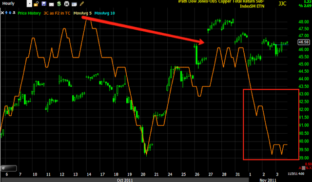 And the larger view hourly trend has clearly topped out and is leading negative.
 GCC is a commodities basket ETF, look at the negative divergence leading lower today.
 On a slightly longer chart, price up, major 3C distribution the last few days (since I said the market would likely see upside on Tuesday).
 GCC's longer term 30 min trend is very ugly and looks to have clearly topped.
 How about the Euro, we know it was headed down the last hour of trade, even though it was at odds with the market correlation. 3C shows distribution in FXE just as the negative price action started. Note the time.
 FXE 5 min has been under longer distribution since the reversal I mentioned.
 And the longer term view, it looks like the Euro has or is topping, bad for stocks. You should notice a trend of short term distribution the last day or two and long term distribution, meaning the market has likely entered a new bear phase. Look at the extent of the divergences and what they produced in the past.
 FXA, the Australian Dollar, another leading indicator for the market is seen under distribution this afternoon.
 And the $USD (trades the opposite of stocks) is under accumulation starting around 1 pm
 A longer term chart for confirmation
 XLF financials under distribution since 2 pm
 And the long term chart shows them hitting new leading negative lows.
 XLB-Materials, under distribution this afternoon.
 XLE-Energy under distribution this afternoon
 XLI -Industrials, again... under distribution this afternoon
 The long term view of XLI, hitting new leading negative lows.
 XLK-Technology, under distribution this afternoon
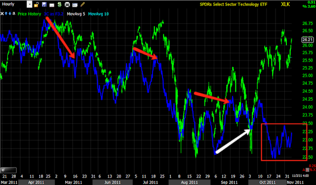 The long term XLK chart, leading negative, worse then any decline on this chart.
 XLP Consumer Staples, under distribution this afternoon
 Look at the 3C signals on the XLP long term chart, they are very effective, then look at this new leading negative low in 3C...
 XLU -Utilities, even the safe haven of equities, under distribution this afternoon.
 And the long term chart, as ugly as I've ever seen.
 XLV- Health Care, under distribution this afternoon
 XLV long term chart, look at the last leading negative divergence and what happened next compared to this one...
 XLY-Consumer Discretionary -under distribution this afternoon
 And the long term view with a leading negative divergence.
If you looked at the charts, not only today's action should be clear, but the state of the market right now should be very clear. I covered all of the main S&P sectors and not one disagreed with the others. I don't think you can find much more confirmation then that.


If you looked at the charts, not only today's action should be clear, but the state of the market right now should be very clear. I covered all of the main S&P sectors and not one disagreed with the others. I don't think you can find much more confirmation then that.


No comments:
Post a Comment