Where there's smoke, there's fire.
Why I have been collecting the charts for this post I see the market just ripped higher, not sure what's driving that, but I'm not too concerned about it right now, looking at the NYSE TICK below.
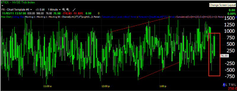
It looks like the uptrend channel is just starting to break.
The financial sector continues to underperform in the sector rotation map. In Europe, Credit and especially financial underperformed broad based risk assets/equities and actually the equities market out performed the broad based risk basket. Credit generally leads the market, the only time when that correlation fell apart was during the EUR repatriation during the last rally. Credit is warning.
I didn't go through every financial chart, but enough to see the same pattern generally. Here's a 15 min C chart which created an island top and currently a bear flag. Traditional Technical Analysis will look to short the bear flag, traditional Wall Street tactics will typically break the bear flag to the upside first, driving those shorts out before the market falls a the bear flag suggests. That may be part of the rip higher that started as I was preparing this post. Oh and is leading negative in the bear flag area as well as negative at the island top.
Here's a 15 min chart of GS with the same island top and essentially a poorly formed bear flag-check volume around this time.
GS 15 min was in line pretty well until that island top on a somewhat parabolic rally, 3C went leading negative right there and GS fell the next day, currently the bear flag is leading negative.
JPM's daily chart, this is an important and large top, doing exactly what tops do, breaking down and then a head fake move above the neckline of the top with a failure, that sucks longs in and helps propel the downside with a snowball effect as the longs that bought the neckline breakout are at a loss and every day JPM moves lower, more and more will sell, creating more supply then demand and putting downward pressure on prices. I think this is one of the most important and illustrative charts for financials.
JPM's island top and bear flag.
JPM 15 min 3C was in line very nicely for most of the rally and went negative right at the island top, of course like the others, the next day it fell and created a bear flag which is leading negative divergent-a pattern seen over and over.
WFC had poor relative performance in the rally, unable to make a new high with the market, in white there's another bear flag.
WFC 15 min shows why it performed so poorly with a relative negative divergence at reistance where it should have been making a new high.
Here's the 1 min 3C chart of WFC suggesting the rip higher will not last much longer.
In fact, I just looked at the hart since these posts take some time to put together, here's WFC 1 min-note the volume.
A little resistance and a whole lot of churning, which is never good in the case of a rally.


No comments:
Post a Comment