If you look at any of the posts of the last week or so dealing with a short term bounce and the bigger picture, they'll look a lot like last night's
"The Week Ahead" and
"Additional Charts"or this one.
Each of the averages as well as the SPX futures includes 3 charts, the intraday VERY short term (INTRADAY), the chart representing a bounce and a chart representing the cap on the bounce or the more negative larger picture. A quick look at these charts and the obvious strategic move would be to use any short term price strength that materializes from a bounce to sell short in to as we have been doing in building short positions like GS mentioned earlier.
ES (SPX E-mini Futures)
1 min intraday with a slight negative today
5 min (still intraday, but a more serious signal), leading positive representing part of the bounce...
ES 4 hour showing the big picture of the first leg up compared to the second leg up starting off the June 22nd lows, the day before we had data building from subtle messages of the market that most didn't notice like
the action in VIX futures. To this update on
June 21st that not only predicted a likely pullback in to the the next day (June 22nd was the market low), but more importantly how the market would, "Punch right through resistance" giving us the start of an upside reversal and the second leg up.
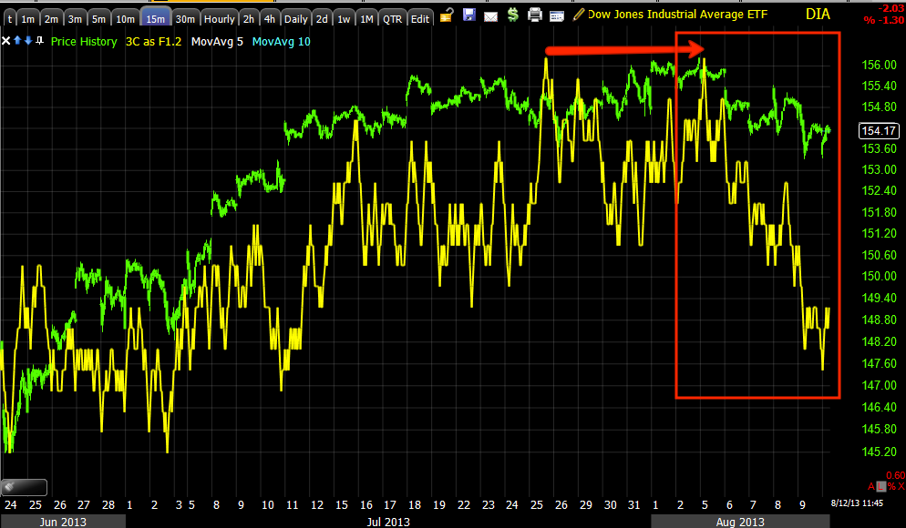
DIA
1 min chart shows intraday negative action which as you can see was captured around 30 minutes ago,
the market has pulled back since then and my last post warning of an intraday pullback just as the charts Friday afternoon as well as action in HYG posted last night all predicted.
DIA 10 min chart representing what I'm calling, "The Bounce" because last week it started out looking like a small bounce, it has obviously gained more traction the longer it puts together a base to bounce from, but the second chart for each of these averages shows this move is capped, it is
not the start of a 3rd leg to the upside.
DIA 10 min representing the cap or larger picture negative divergence that has just grown worse as any strength that can be found in the market has been used to sell in to, despite whether a bounce overall has started or not (I'm referring to relative strength in sector rotation).
IWM
1 min shows a clear intraday negative divergence, a 1 min chart that is negative has a 50/50 chance of being either a consolidation through time (like lateral price movement often manifesting as a trading range, a triangle, rectangle or flag). When the 2 min and higher charts are also negative, the probabilities shift dramatically toward a pullback, either way they are both corrections in price, one is through time and the other through price.
The IWM 2 min is also negative so probabilities went way up that we see an intraday pullback.
IWM 10 mins represents the "Bounce"
IWM 15 min represents the bigger picture , I didn't draw on the chart because the 3C divergence with price should be very clear
and it's important that you are able to identify divergences as THIS IS THE MOST EFFECTIVE USE OF ANY CONVENTIONAL INDICATOR including: Stochastics, MACD, Wilder's RSI, RSI (Relative Strength Index-differnt than Wilder's RSI), ROC, or just about any other indicator you can think of.
QQQ 2 min intraday negative representing an intraday pullback that has already started since this capture.
5 min Q''s chart representing continuing accumulation and the "Bounce".
And just past the 5 min chart at 10 mins there's a clear delineation between positive activity for a bounce and the cap on that bounce with negative activity on the very next timeframe and above.
SPY
1 min intraday weakness which has started off the gap fill from early a.m. action.
The 5 min chart representing the bounce,
and because this is on a 5 min chart, this typically excludes retail from being behind the bounce and shows more institutional sponsorship. However it's clear to see institutional traders ARE NOT bullish, so why bounce the market?
Think about that question, I've given you my answer numerous times in telling you what I believe the best use of any market strength is.
SPY 30 min needs no drawings, the negative 3C divergence should be very clear and this is a significant timeframe, representing the big picture.
***
If you are more aggressive as a trader and want to use an intraday pullback to hitch-hike a ride higher, these intraday pullbacks are valuable.
As I said last week though, I wouldn't fault anyone for just sitting it out and waiting for the opportunity to short in to higher prices as trying to make nickels and dimes (relative to the big picture) is getting more and more dangerous as we get closer to the steam roller representing the larger picture.


No comments:
Post a Comment