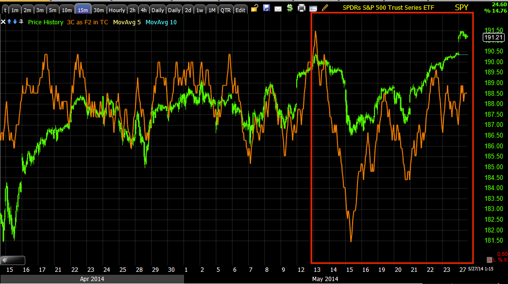
In yesterday's early Broad Market Update I showed 2 charts that were boxing in the market in a negative way, the roof which limits how far price can carry and that was represented by the SPY 15 min chart, which has been in effect since and well before the momentum caused by the Crazy Ivan slingshotting off the previous week's bear flag, which is what we expected, a downside break to suck in shorts and an upside move to cause them to cover in a squeeze which would provide upside momentum, albeit limited as it's really nothing more than a tactical strategy of using Technical Analysis concepts that retail traders follow and using it against them, there's no real demand or fundamental reason for the market to move unless you consider a short squeeze something sustainable and bullish for the market on a longer term basis, I call it smoke and mirrors.
The 15 min chart from that post yesterday morning looked like this.
This is the trend view of the 15 min chart deteriorating deeply as the range persisted or what many would call a multi-month , large top.
For the purposes of the bear flag sling shot momentum, this is the negative 15 min chart that acts as a roof or a wall as it is leading negative and there's really no accumulation, just short squeeze momentum. Imagine this chart to be a wall.
The 3 min chart is the one that has negative migration, meaning as price has moved up off the Crazy Ivan sling shot around the bear flag, there has been a steady flow of distribution in to the move, as this gets stronger it moves to longer term timeframes.
3 min with a small positive at the bear flag which is why we knew it would be used against traders rather than resolve to the downside out of the flag as Technical Analysis teaches. The Crazy Ivan concept we had no proof of, it just made the most sense to effect the strongest short squeeze, you have to trap some shorts by creating a break under the flag which was at #1 and the break under at #2, the distribution in to higher prices occurred last week and in to this week at #3.
As of yesterday morning, the only two charts that needed to see migration to link the divergences and create a rock (the 3 min chart turning more and more negative) and a hard place (the immovable 15 min chart's wall) were the 5 and 10 min charts which looked like this yesterday morning in the post linked above....
5 min chart in line since the bear flag/trap...
10 min chart in line since the same...
As of this morning, both have locked in their divergences as the 3 min chart has migrated to both the 5 and 10 min charts which now look like this...
5 min has locked in a negative divegrence with 3C's downside pivot.
10 min chart has locked in a negative divegrence.
As I explained the scenario above in yesterday's post, Broad Market Update
"The SPY 10-min. I think as the 3 min chart continues to deteriorate, the 5 and 10 will see migration and that's essentially the key to timing."
The other concept is that of 3C picking up where it left off.
In yesterday afternoon's post, A FEW EOD Charts... I had said,
"First, here's how we ended the day, typically the market will pick back up the next day where 3C left off...
There were varying degrees of negative divegrences in the averages, interestingly quite a few picked up in to the close where VIX was used to lift the market even though spot VIIX closed green today, up 1.76%"
You can click the link and see the first 4 charts and see what the charts looked like for the major averages at the EOD...all negative in to the close and here's how we picked up from those divergences at the close yesterday (which is a concept that holds up over weekends and even holiday weekends on the 3C charts of the averages and equities...
DIA 1 minIWM 1 min
QQQ 1 min
SPY 1 min


No comments:
Post a Comment