While I wanted to get that last post out before the close, I wasn't kidding that there are just too many charts I have looked at to capture, notate, upload, post and explain so I'll try to do it with fewer, but enough to make the points, to show confirmation among multiple timeframes and assets, but this is really a sample of something that at this point is more art than science.
Lets start with an average like the Q's which have been strong, in fact they are our leader for this move, almost 1 percent above the rest of the averages when measured from the 8/7 lows (8/8 is the completion of the base and 8/11 is the breakout to stage 2).
*I really should have run these from long term to short term as long term is the strategic or highest probability resolution and short term is timing and tactical which should work hand in hand with the strategic view or resolution of highest probabilities.
In any case, this is a minor intraday timeframe of 1 min on the QQQ, it is typically used for intraday moves, often the trend is useful as well, but it's for small moves. As you can see there was a positive divegrence at the lows this morning that sent the Q's higher and above yesterday's close before losing that just around 3 p.m., but that ran in to a second positive divegrence.
One of the concepts we see over and over again (and this makes sense as what we are watching is smart money setting up positions in advance), 3c and price almost always pick up where they left off on the next trading day, even over a 3-day weekend. So this positive divegrence at the close forecasts some price strength in the Q's, of course proportionate with the timeframe the divergence is found on, just look at this morning's to get some idea (the size of the divegrence and quality also matter).
The original base positive divegrence for the Q's was on the 15 minute chart, you can see the reversal process in yellow, which is really just a period of time proportionate with the preceding trend and with what they have planned for the cycle to follow.
We see VERY few "V" reversals, for instance a 1-day upside reversal rather than a full week of the reversal process. Reversals are a process, not an event and there are many reasons why, but one of the easiest is to imagine yourself as a trader dealing with half a billion dollar positions, say you want to get out of one. Would you put up the entire position at once and see the entire market front run you and drive prices down or would you feed that position out in pieces in to higher prices and demand? Now you understand part of the reason head fake moves exist.
To the right you see the downside reversal process, they are almost always about 2x the length of a bottom reversal process in the same cycle. *I was a little unsure about this one because of recent events and recent bounce attempts since July 1 and their change in character toward the ugly, but in the end we have a normal reversal process we have seen numerous times.
Like I said, I should have started with the longest chart and worked my way to the shortest, but in this case we have the longest chart above, the 60 min with a small relative negative divegrence to the left which led to a move down of -3% and then the stage 1 base/accumulation from 8/1 to 8/8. The distribution right now is insane as a leading negative divegrence on a chart this long (60 min).
I drew in the rounding top of a normal reversal process, but I'd say 80% of the time, no matter the asset, no matter what timeframe the cycle is in (weekly chart or 1 min intraday), there's almost always a head fake move
right before the pivot/reversal. In this case I describe tops as looking like an "Igloo with a chimney", the igloo being the reversal process, the chimney being the head fake move and then resuming down to complete the rounding over and a new stage 4 trend of decline.
This head fake move is one of the best short entries (in this case) or Put option entries you can get, it's the best price and the least risk, although emotionally difficult to enter, we usually have very good 3C confirmation that the move is a fake or will be a failed move which makes it a bit easier to enter.
The point being (although I ran the charts in reverse order) is that the strategic short has formed, the tactical entry is best entered in to a head fake trade, but if we don't get one (which is rare),
we still want the best timing possible and the intraday 1 min chart shows a bounce likely to start tomorrow morning on a smaller scale basis, but we're only a quarter percent or so from a head fake move in the QQQ so it's not far to go as the last 3-days have created a resistance zone (where long limit orders will be placed for a breakout move) around $99.65
The SPY 30 min is in the right order this time, you can see the last relative negative divegrence
( a weaker form than the current leading negative) then the base from 8/1-8/8 just like just about every other risk asset. and of course the reversal process and leading negative divegrence on a serious timeframe.
If Technical (retail) traders weren't so predictable, that it makes Wall St. predictable in the ways that they'll use TA against retail, then we'd likely not have head fake moves and just rounding reversals.
The intermediate 5 min chart (the fastest of the institutional displaying timeframes) shows a clear trend of distribution in to higher prices of large positions just as I asked you to imagine above. It's a delicate balance of selling, but not too much at once---hitting technical levels that traders will buy and taking advantage of the demand created.
Why do you think the SPX futures last week were always hitting the upper standard deviation of VWAP and pulling back and doing it again as VWAP was rising? Now VWAP is falling meaning we are well in to the reversal process.
ES/SPX futures 1 min with VWAP... Every little change in character matters if they all are lining up giving you the message of the market. Last week VWAP was rising and they were able to sell at the upper channel/standard deviation, now VWAP is flat or falling, indicative of the reversal process and the target sell zone is VWAP itself without letting out too much supply and crashing VWAP and the market before their orders are filled.
The one time I remember clearly that this was totally abandoned was AAPL 2012 as all sellers tried to squeeze out of the same small door at once and APPL went from all time new highs to a -45% haircut in 8 months.
This is the SPY 3 min intraday chart with a positive divegrence, there are positives on the 1 and 2 minute also, I used the 3 minute because it is the strongest. Otherwise, 3C was confirming the moves in SPY price most of the day.
These divergences are our edge, they are where our opportunities are.
DIA
The long term 60 min DIA 3C chart which is interesting for a number of reasons. First the positive divegrence at early August (
same as the other averages except IWM) and the confirmation for a short period followed by distribution or selling.
It's important to understand that a short sale and a sell both come across the tape as a sale, so distribution can mean short selling as well. Simple logic dictates that early distribution is sales of longs, even longs taken on at the base, "The piggy back trades" we were putting out in early August, later distribution is likely short sales as the long position has been handed off to retail (weak hands) which makes the other side of the trade attractive.
If you don't believe in the simple logic of that concept on a micro basis, here it is from BofA/ML on a macro basis.
Note institutional selling (orange) as net sellers and hedge funds as well (blue) as net sellers and look who's buying , WEAK HANDS, retail.
Also note, just as Appaloosa said in May of last year, "We've been selling everything not nailed down for the last 15 months". This chart would tend to confirm that as would 3C. You may wonder, why sell that early? Why give up all that upside? They saw the market as priced to perfection and additional gains were to be used to sell large positions in to as they expect something way worse on the downside.
Let me remind you, it took about 12 months to wipe out all of the 5 year bull market rally gains from the 2007 top. It took an additional 5 months to take out another 3 months to wipe out an additional 25% below the 2002/2003 bull market base/lows, or in other words, 5 years of bull market rally were wiped out plus 25% in about 15 months.
The 3 min DIA, although leading negative shows a relative positive divergence between the open today and the afternoon lows.
The DIA 2 min chart which is more detailed shows the same positive divegrence.
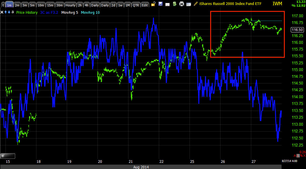
The IWM is the one average that didn't seem to put in a positive divegrence, but recall last night's Daily Wrap and the Dominant Price/Volume relationship, the IWM was the only of the averages to have one and it suggested that the IWM close lower today.
NFLX is one of my favorite long term position shorts, but has been a monster on this latest rip. I suspect a lot of you will be happy to see what has happened the last 2-days in NFLX.
This 60 min chart dipped in to one of the largest , fastest leading negative divergences I can find in the market, meaning institutional selling on almost a panic scale.
As an aside, note the head fake move (under yellow trendline) before the upside reversal. Also, I believe NFLX is a large 90-degree Broadening top. All H&S patterns start first as Broadening tops and there aren't too many you see, but this looks like a good modern example of one.
The intermediate 1 5min chart shows the same very fast pace of distribution in NFLX over the last 2-days.
As does this 10 min chart which also shows a monster base, this is one of the stocks we expected to rally several months back, I think that base shows you why it has been such a monster, but things are changing quickly for NFLX which I specifically chose for this post because of how strong it has been.
There are other divergences in the 2 min range as well, again this hints at an early move up or perhaps some additional strengthening before that move, but I do think we get some sort of move, likely a head fake to enter short positions and fill out others like FAZ.
FLSR 30 min shows a different, but very strong base/positive divegrence and equally as impressive distribution
Here's the 2 min chart showing a small positive divegrence so again I expect the broad market to either build on to this and create a stronger positive divegrence, but still within the topping stage, or simply early strength,
we'll want to be looking for our entries and in some cases, exits.


No comments:
Post a Comment