BIDU happens to be one of the assets that I have been watching and am interested in as well as keeping tabs on it for many members also interested in it.
Take a look at the charts, the first charts are more of a macro look and why I'm interested in a BIDU short.

While you can pick out some other divergences on this chart and while there may have been numerous divergences on shorter timeframes, one of the next significant divergences is at the 2013 pivot lows, a large rounding bottom.
After that, the last very noticeable and by far the largest divergence on the chart is a leading negative divegrence in to 2014 and current highs.
This represents large institutional underlying action.
For more color on why institutional money creates divergences this large and how they differ from us in orders, how orders are placed, filled, etc and tactics, I'm going to repost the two articles linked on the member's site, "Understanding the Head Fake Move" as not only is the head fake move in play and important right now, but as I mentioned, it gives some color on a different outlook from an institutional position. I'll post those two articles after this, but they are always linked at the top right of the members' site.

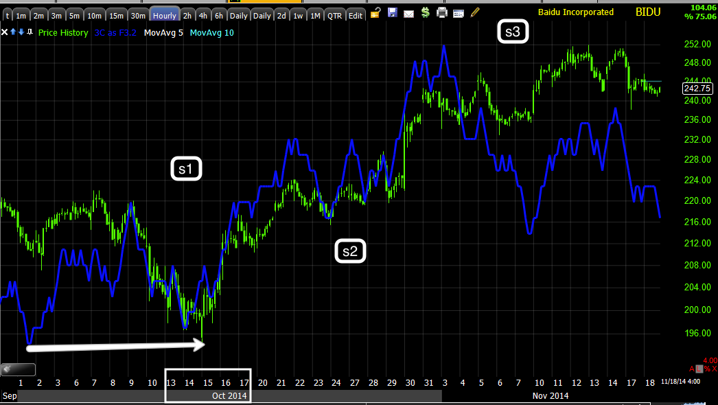
On BIDU's daily chart you can see the second positive divegrence in 2013 which I labelled "S1" for "Stage 1 bottom", the positive divegrence is easily spotted and on a chart this long with a divegrence that big, you can expect a strong trend to follow at "S2", stage 2 mark up or rally.
Note how price starts to increase its ROC at the orange arrows, just like on a micro basis with BABA this past week, it means the same thing on a long chart as a 15 min chart or a 1 min chart, the trend is getting ready to change and 3C is in a clear leading negative divegrence just as it is at the same place on the 3-day chart.
As a core short position, these are two of the main reasons I'm interested in BIDU as a core short, the largest divegrence in almost 9 years is distribution. In other words, BIDU is capable and probably going to produce a large downtrend well worth trading on a long term basis.

This one we were right on top of, in fact I was short and tried to trade around an expected bounce and missed a good deal of the downtrend, which has changed the way I look at core positions.
Just to give you an idea of what size divergence on a daily chart produces what kind of move.

The 2 hour chart which is a very strong timeframe in its own right, capable of showing primary trends is sharply leading negative, the same area as the 3-day chart and 1 day chart.
It should be pretty clear by now why I and others am interested in BIDU short for a long term position.
Shorter term...
Stage 3 "top" should be obvious not only by the 3C chart, but the price pattern itself. This is why the staging is so important, you have to know where you are before you can determine where you are most likely to go.

As I showed this afternoon in the GLD post, Trade Idea (speculative) GLD / DGLD
, something started moving quickly that looked to move multiple assets, but small moves, but likely sharp moves.
I saw the same in Nikkei futures, TLT, TBT, numerous trade assets, but all of these were late day/afternoon divergences and sharp ones on short timeframes.
The only thing I can think of that can do that and take advantage of it is High Frequency Trading. I don't suspect it's standard, large institutional money in any way or Leading Indicators and breadth wouldn't look the way they look, but with the F_O_M_C minutes due out tomorrow, volatility in front of them, at them and after them is a virtual certainty.
I suspect the move ends badly not just because of leading indicators, but if it were meant to be a larger, longer move, there would have been stronger, longer accumulation of it.
If you needed something stronger as a reason, then the trend of leading indicators is more than enough.

While this could play out numerous ways, my best guess is a Key-1-Day Reversal which would mean a gap up above today's close and intraday high and close below today's intraday lows, essentially a huge bearish engulfing candle.
The late day accumulation would make sense for the gap up , although it's not such a large position that it couldn't be distributed quickly, I'd guess easily in an hour, but more likely in to the F_O_M_C minutes release in the afternoon.
A Key 1- day reversal here would make sense with all of the indications from the Nikkei to Leading Indicators and breadth which are far beyond what I can recall as far as the size of their divergences implying a move far beyond what we've seen since using them.
This is what a Key-1-day reversal would look like on the SPX...

The red candle represents a Key 1-Day Reversal, also a head fake which I'm posting next for you.
So far this is my best guess/thesis to this afternoon's strange behavior in numerous assets.


No comments:
Post a Comment