It's no secret that we have been expecting a decent pullback in gold with a recently added GLD put position, Feb 20th 121.
However, if you've been following our analysis of gold and gold miners over the last year or so, we've also been seeing hints of a larger primary trend developing, a new trend since the 2011 top we called. Price action and 3C charts seemed to take a break for a bit and things cooled off, but it looks like those same longer term expectations that we had been seeing develop, are on the grid again.
First though, we are looking at a pullback,
we may find a good buying opportunity in a pullback, but we'll let the charts tell us whether a pullback looks constructive or not (whether there's accumulation of the pullback).
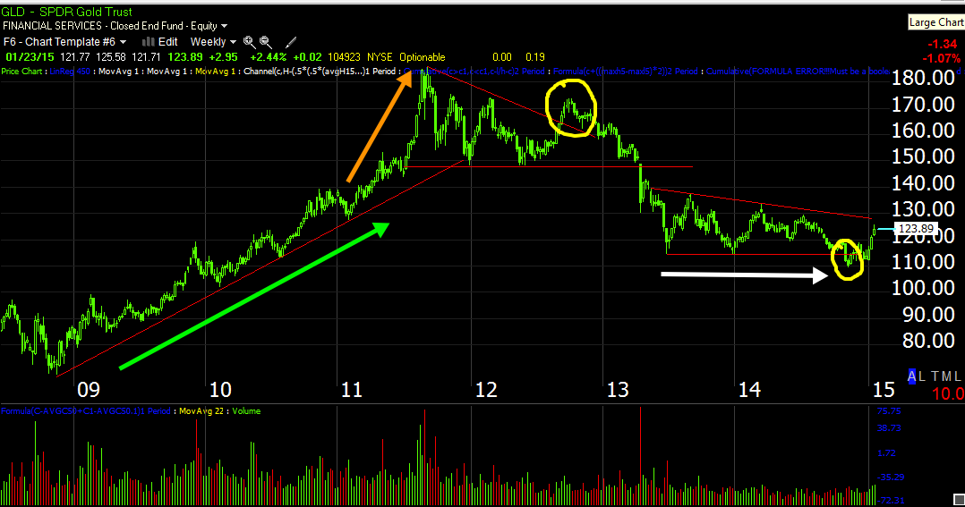
GLD's weekly chart showing a clean "Mark-Up" trend at the green arrow and a stage of excess or a change in character in which the price action sees an increased ROC to the upside at the orange arrow, peeling away from the trendline, which was one of our first clues in 2011 that gold may be topping. The large Descending Triangle on this weekly chart is NOT a consolidation pattern, triangles of this size are generally tops or bottoms depending on the preceding trend. Also note the head fake move in yellow to the left before GLD really started to break down, losing about -40% from its highs as gold sentiment in 2011 was feverish, as if it could only go one way which was up. Dow Theory describes trend stages and the different sentiment/perceptions at each, we use the same in our 4 stages of a trend.
The white arrow and the flat or lateral trend in GLD is where we first saw evidence in both gold and gold miners that something might be up, as in a large base for a new primary uptrend. We haven't broken out of the triangle yet, but note the head fake or shakeout in yellow )to the right) just before the most recent move up got underway. This is our head fake concept directly preceding a change in trend and useful as a timing indication as well as an excellent entry point for long or short positions (depending on the trend).
We probably see these head fake moves in one form or another at least 80% of the time just before a reversal and this concept is fractal, meaning it works on a weekly chart like this just as well as with shorter timeframe trends such as a 5 min chart or a swing trade as well as working in just about every asset I've seen.
The one thing these head fake moves all have in common , however they appear, whatever timeframe they are in or whatever asset they are in, they all contradict what Technical traders have been taught or brainwashed about how price action "should" behave over nearly a century.
On a daily chart of GLD, this is the far right side of the descending triangle I suspect is a large base, in yellow is a shakeout/head fake move which was accumulated and a move higher which started to see the same excessive move as we saw on the weekly chart in 2011 just before a top was reached (the increased ROC of price to the upside). In this case it looks parabolic (orange) with tall upper wicks on the daily candles on heavy volume, indicative of churning and closing off the highs each day. Then a Doji Star (common reversal candle) yesterday followed by oday's move lower thus far of about -1.2%

On an hourly chart, this is the head fake area or shakeout, the way we differentiate between a true break down and a probable head fake move is checking to see whether the move is confirmed or as in this case, is accumulated suggesting a head fake move or shakeout, essentially grabbing shares on the cheap as long term support is broken while also creating a bear trap that will eventually lead to a short squeeze and the kind of parabolic rise in price.
This is looking much more interesting as a long candidate, but again, we'll see if there's a decent pullback as I believe and if it is accumulated which I think is a high probability.
The 10 min chart shows an in line status, a pullback that was accumulated and the first real negative divegrence of this trend.
The more detailed 5 min chart shows the same thing, although I'm trying to avoid drawing on the chart too much because I want you to get use to seeing divergences on your own as they are some of the most powerful signals in almost any indicator you use and this is a good example of both positive and negative divergences.
On an intraday basis, we have been looking for a move down and near term 3C action has suggested we are in the area.
As for Gold futures (e-mini)...
The timeframes differ a bit, but this 60 min /YG chart show the same divergence and expectation for a DECENT pullback, one that may be worth buying.
The 30 min chart shows the same
And the 10 min chart shows the same with a rounding top obvious as well.
And near term, the 5 min chart has been negative.
So for now, it's just about management of the short position / puts, but at some point we should see accumulation of a pullback, a reversal process start to take shape and at that time we'll look at gold and make a decision as to whether this is the right time for a longer term long position.


No comments:
Post a Comment