Amazingly for such a parabolic move, (
another sign of the weakness inherent in the broad market) so far it's holding together pretty well and both new positions opened yesterday are in the green,
TRADE IDEA: SPECULATIVE TLT PUTS &
TRADE IDEA: SPECULATIVE VXX Puts.
A quick look at the charts and they are amazingly strong for such a tight "V" shaped base and parabolic move, but this is what we expected, a strong, albeit brief move. I have alluded to the brief move that does not end well, but I thought that I'd show it to you in visual form via multiple timeframe analysis and you can see for yourself what the very near term looks like, why we closed yesterday's put positions in IWM & QQQ as well as TLT and VXX calls all at a gain and almost immediately opened TLT/VXX Puts for a short term position and why I want to use any price strength to enter longer term core/trend shorts and in some cases long positions.
I think that this visual (set of charts) that moves through multiple timeframes from the very short term, brief moves to the very long term market trends makes all of this quite clear. We'll look at TLT which I still expect (
despite today's puts) to see a strong counter trend rally before it fails miserably (
although the developing F_E_D story seems to be taking on more and more of a June Rate Hike theme which could have implications in TLT's future). We'll also take a look at VXX/Short term VIX futures which despite today's put [position, should make a huge move to the upside and the SPY as the market proxy which again is right on the ledge of a cliff from which there is no recovery.
As for asset choices yesterday, TLT is a toss up, it (
as a put) is outperforming certain averages and slightly underperforming others, so it all depends on which of the averages you chose as to whether TLT would have been a better position or one of the averages so it's a coin toss. VXX (
puts) are clearly outperforming any of the percentage moves in the averages.
*It takes a while to capture and upload this many charts so some of the very short term intraday charts may look a little different obviously, but it has no effect on the point of the post.
VXX 1 min intraday is in line with the move lower today. Remember yesterday we closed VXX calls at a gain and 15 minutes later opened short term VXX puts for today and perhaps a bit longer.
VXX moves opposite the market averages for the most part.
VXX 3 min with Friday's leading positive divergence leading to Tuesday's cash market picking up where Friday's divergences left off , a strong 3C concept that we see on the next trading day...even over a 3-day weekend.
That should tell you something about how the market is set to move in advance, sometimes days, sometimes weeks and even months in what we call "Cycles". The market is not nearly as random as you might think, but the mainstream financial media can't explain this and doesn't want to explain this, it would reveal too much about how the market really works and it doesn't fit in to a 30-second sound bite that tells people why the market did what it did today. That's about all the mainstream of retail investors can handle, a simple 30 second explanation of how some meaningless economic data from before the open moved the market even though in past weeks or months the same economic data had no effect at all on the market.

VXX 5 min which is a fairly strong near term timeframe, the first or earliest timeframe I consider to be able to show institutional activity on an intraday basis, while shorter timeframes can show institutional activity through longer term trends and generally show the middle man activity like market makers, specialists and HFT's performing the same liquidity functions in which they make their money on the bid / ask spread through 10's of thousands of small spreads per day.
Again note last week's positive divergence sending VXX higher yesterday and the negative divergence at the intraday highs yesterday sending it lower today...the reason we closed the VXX calls yesterday and opened VXX puts 15 minutes later.
However the stronger 10 and 15 min charts have a large leading positive divergence. Perhaps in the very near term VXX runs down to the bottom of the recent base and runs one final stop run below support before launching higher on a longer term trend at the same time the market moves lower.
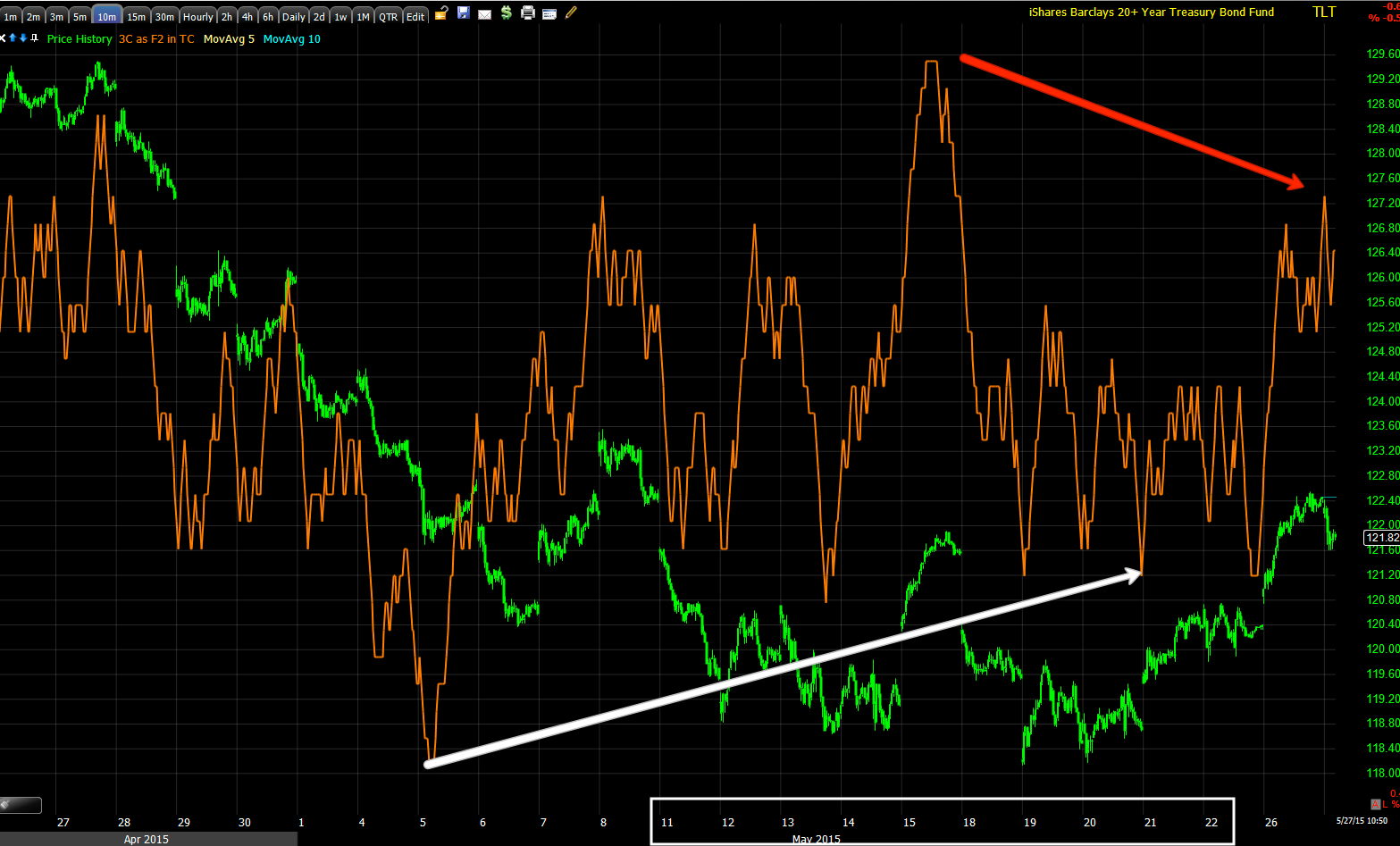
TLT-20+ year Treasuries...
This morning's 1 min intraday chart with a slight positive divergence that has caused a slight lateral consolidation intraday which is looking like a bear flag right now. It should break lower soon (
today).
This is the TLT 1 day chart. Treasuries out performed equities in 2014, but since have made a top and are on the edge of moving from stage 3 top to stage 4 decline as they have broken below a long term trendily,
but in my opinion before they do, much like the $USD right now, I expect a shakeout of new shorts and older ones in Treasuries, a thick trade. This is the counter trend rally I expect in TLT much as we expected it in the $USD and as of yesterday's close, the $USD had put in the strongest 7-day move in about 7 years despite its primary trend turning down this year.
Note the resistance yesterday at the trend line as the area below the trend line is serving as the base to support the counter trend rally. Today's candlestick on the Daily chart taken with yesterday's forms a bearish Harami reversal (
down) or what is known in western vernacular as an inside day. I suspect TLT moves toward the bottom of the recent range, maybe puts in a last head fake / stop run below recent support before breaking above the trendily and squeezing all of the shorts, powering the counter trend rally at least initially.
The 2 min TLT chart shows 3C distribution yesterday right at the highs that hit the long term trendily on the daily chart above, this is when we closed out the TLT calls yesterday at a gain and 15 minutes later opened short term TLT puts.
The stronger 3 min chart is also leading negative suggesting there's still quite a bit more downside in TLT and our put positions should do well, at least double digit gains in a short period.
The stronger 5 min TLT chart shows the base/accumulation I mentioned above as well as yesterday's negative divergence at trend line resistance,
And the 10 min TLT chart, a much stronger timeframe showing us much more trend than near term trade like the intraday 1-3 min. charts above showing a strong positive divergence forming under the long term trendily, the exact place technical traders would short or add to shorts as TLT broke below a technical level (
the long term trendily). While this worked for Technical Analysis in the late 1990's before it was mainstream with the advent of the internet and cheap online brokers and a rush of investors wanting to manage their own accounts, but needing an easy way to make decisions which led to the rise in popularity of Technical Analysis, it no longer works as well as Wall Street knows what the majority will do when faced with any particular technical set up that has been taught the same way for nearly a century in many cases. Wall St. adapted and uses these technical concepts against traders, traders never adapted and use the same concepts that were in use in the 1930's.
The base area as seen above on the 10-15 min TLT charts just under the long term trendily, once prices move above the trend line the short squeeze begins as traders are very predictable as to where they put their stops and they often place them in advance so Wall Street (really anyone) can see where they are grouped making them easy targets.
TLT's 15 min chart in line on the downtrend (
green arrow) as prices break below the long term trend line (
yellow hash line) and accumulation for a counter trend move begins to shakeout a trade thick with shorts.
Note the leading positive divergence on this strong trend timeframe.
The stronger 30 min chart shows much less detail, much more underlying trend.
It looks very clear that TLT is being set up for a strong counter trend rally, as we have seen with the $USD, these tend to be some of the strongest rallies you'll ever see.
However it is still a counter trend rally with this TLT daily chart which shows the 4 stages of a trend or at least the first 3 so we know which comes next. Stage 1 accumulation/base; stage 2 mark up/rally; stage 3 top/distribution and as 3C daily (3-day) leads negative to a new low, the next stage is 4, DECLINE.
Thus after a short term decline in TLT we should see a strong counter trend rally which will ultimately fail the same as the $USD rally under way now and move to stage 4 decline or bear market.
That's the essence of multiple timeframe analysis and how we use it to enter, exit and plan our next positions.
SPY...
The 1 min chart with the leading negative divergence as the market closed Friday leading to yesterday's downdraft in price and a positive divergence, as I said, any of the averages could have been used for call positions, I just liked VXX and TLT puts better.
The 2 min chart showing the same thing
As well as the 3 min chart.
And the stronger 5 min chart with Friday's 3C weakness and yesterday's leading positive divergence. It doesn't matter how strong the divergence is and it is a strong divergence,
it doesn't have the time, meaning it doesn't have the accumulation or size to hold up very long. It's like building a skyscraper, if the foundation is not strong, you can't build very high before the entire thing comes crumbling down.
The 10 min SPY which has been a key chart in determining when this cycle ends and the next begins. Note the positive divergence on May 6 and 7 which we see everywhere in all kinds of assets other than stocks. I've been waiting for the already negative 10 min chart to put in a new , lower leading low which it has begun to do.
I suspect the SPY may rally to the gap created yesterday, maybe even a bit more, but it doesn't have the base to go too much further or for too much longer.
The Daily SPX chart with the triangle and the head fake move or failed breakout we expected above this very obvious resistance zone that technical traders would chase upon a breakout (
yellow).
This 30 min 3C chart of the SPY shows the distribution in the triangle culminating with stronger distribution in to the head fake move above the triangle (
yellow) and why?
Because there was demand (by retail traders) on the break above the triangle that allowed institutional money to sell in to the demand or short in n to the demand, both transactions come across the tape as sales.
And the daily SPY 3C chart leading to a new negative low through 2015 and the triangle area.
I hope that makes our view of the market and its multiple trends a bit more clear.


No comments:
Post a Comment