12/14 dip on the dxy0 bottom?
Dow pullback to 9917
Today we saw sector rotation once again, this time into the REITs, I just listed quite a few REITS that are looking good for short trades, a bounce is an opportunity to get better positioning on the trade. With the amount of long term damage done in the sectors I listed, I view the bounce as an opportunity to get it at lower risk with greater profit potential.
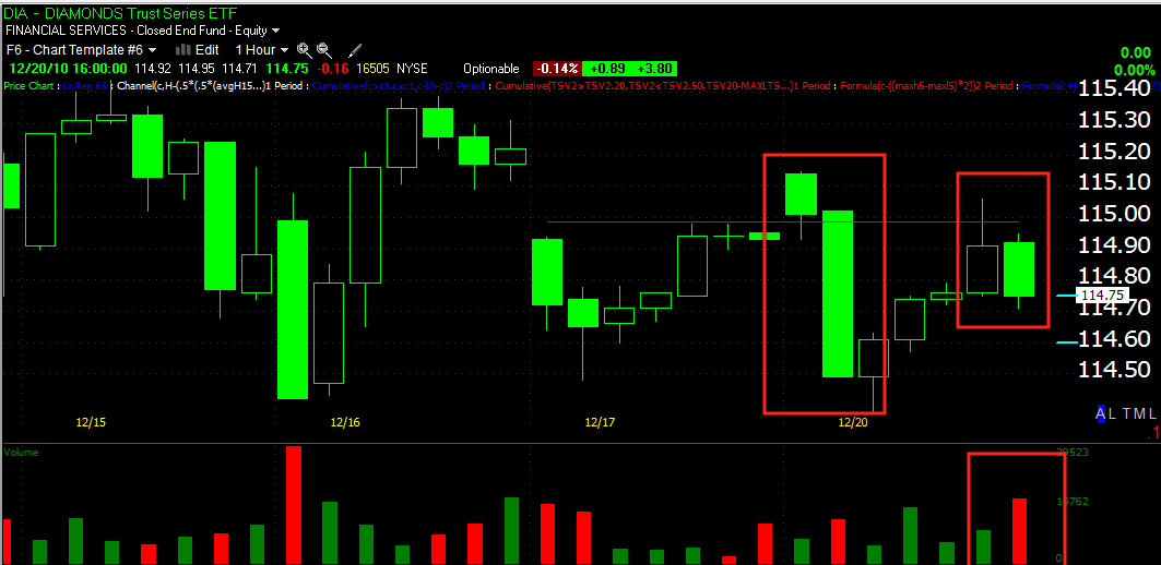
We did see (see the late afternoon posts) what has thus turned out to be exactly what I thought it was at 2:30 today, a false upside breakout that failed at various resistance levels in each of the averages. The volume on the failure to hold the breakout (the descent below the breakout level) came on increasing volume. We have seen a trend of these opening gaps and the market failing to do much with them or down right close at a loss.
Here's an interesting chart, I suppose you could call it a momentum chart, but it's also in my opinion a sentiment indicator to some degree.
Below are two moving averages, the blue one is the moving average of each day's opening price, the yellow one is the typical moving average of each day's closing price. In a strong uptrend, there's some distance between the two and the yellow moving average is above the blue, this shows that prices are closing higher then they opened and thus showing strength.
At the far left in the red box, you can see a crossover, which means prices are closing lower then the open, it happens to fall within a downtrend in the S&P-500 of a couple of weeks, in the white box, the yellow average gets back above the blue and we see some momentum but notice how that difference between the two averages has diminished recently.
Again in August, we see the red box, the downtrend with the blue average (opening prices) above the yellow (closing prices) meaning there's a trend (as we are looking at an average of these open and closes) of price closing lower then it opened which is to be expected in a downtrend. The relationship flip flops in the white box when an uptrend begins in September. Other indicators like MACD and RSI are showing negative divergences in this rally, but the moving averages are what grabbed my attention. In the past they behaved as you would expect.

Here's a closer view of the NASDAQ 100. At the left, AFTER a downtrend has begun, the averages (which lag because they are averaged data) show the proper relationship once the downtrend is already underway, but if you look closely at the red box to the right, you will see the moving averages are showing the opening prices higher then the closing prices. This is the first time on this chart that this has happened without the average being in a downtrend. In other words, we are seeing the bearish behavior of the average closing lower then the open and for some time during December. I believe this not only shows a loss of momentum, but also reflects the sentiment of the market. As I've noted recently over the last few weeks, the market has been giving numerous opportunities with gaps up on the open to run higher and it has failed to capitalize on those head starts, even worse, the average is showing that it's been closing lower.

This is a longer view of the NASDAQ 100 with MACD and RSI both showing faded momentum/negative divergences and also outlines the areas in which the moving averages have acted as they should within up and downtrends, except for recently. The moving averages are acting like the market is already in an established downtrend.

To make this easier to visualize, I created a MACD type of indicator that measures the convergence/divergence of the two moving averages (yellow=the average of the closing price/ blue= the average of the opening price). Note again on this chart of the NASDAQ 100 in the first red box the averages behave as they should, but in an already established downtrend. The second red box (now) the moving averages are behaving as if the market were already in an established downtrend. Looking at the charts, this is the first time I've seen this to this degree, other then a day or two here and there. Translation, the average behavior of the market is to close lower then the open. I believe this relationship is a warning of a trend reversal.
Below are the daily 3C charts for the SPY/DIA/QQQQ. Note that these are all in large multi month negative divergences to start with, meaning the move up has been used to distribute. However, also in the red boxes you will see that the last week to 2 weeks, 3C has been moving down (distribution) while the markets have been largely lateral with a slight upward bias. I believe the S&P-500 has gained a half of 1 percent over the last week-really it's statistically insignificant.
DIA
QQQQ
SPY
For this along with numerous other reasons, we have been using any strength to short into and weakness to buy into. The positions however are being accumulated and will not be filled out until price confirms the reversal we are looking for, in certain individual stocks and ETFs that has already happened.
I know it's a little early to be counting the chickens here, but for risk management's sake, you need to be able to figure out a risk:reward ratio when setting your risk management plan. This is where I see the first major leg of the S&P pulling back to-around 1025. From what I see in 3C daily charts, I believe that will just be the first leg; thus we are building positions on strength (shorts) and buying on weakness (longs).