Tuesday, September 4, 2012

A Quick Look at the Dow

At first site the Dow doesn't appear to be in a dire situation, it actually looks a bit plain, but as always, it's those things that we see and the crowd misses that give us an edge.

The Dow is also one of the averages of only a few that we can get direct 3C readings from, not that they differ that much.

 This is a key formation in the Dow, it may not look that key, but look at it from a different vantage point with a 5 day chart (this is why we compare as much as possible, you never know where you'll find a big clue).

 On a 5 day chart, this looks very much like a very clear and probably organic bear flag, I say organic meaning created by human emotion rather than manipulation (not the price trend, we saw the June bottom head fake/accumulation), but the actual bear flag because it IS NOT obvious on a daily chart. For those members who have been around for a while, you may recall a string of trades that were successful during a period in which the market had formed a lot of channels and then produced "Channel Busters", which is (in this case) an upside breakout from the channel that appears to be bullish, but in almost all instances they were bearish. A simple understanding of how technical traders would view such a breakout allows you to put together how that move is used against them. The bottom line though as the Trend Channel uses as it's very premise is that changes in character precede changes in trend. Look at what has happened to the trend since the Channel Buster break out failed.

It is in this area of the Channel Buster that I have felt we have seen the actual end of this move or the pivot.

 Most Technical traders are looking at a daily chart and will have drawn the trendlines like this, but even her we see some key 1 day distribution days with candlesticks with long upper wicks where higher prices were rejected.
 Using the "Clear Method" Swing Trading trend identification (slightly modified) there's a clear difference between the last 2 pullback/corrections and the current one, higher highs have not been made, a series of lower lows have been and today officially makes a new lower low as Friday's low is already surpassed, today already qualifies as a key day and not a noise day no matter how it closes, the move was bearish.

 Stripping out the noise of the DIA trend with a 4 hour chart, the May 1 top is clear, the June 4 low is clear and the current negative divergence is clear.

 The hourly chart is the same.

 And the 15 min chart

This is the actual Dow-30 and not the DIA
 The 4 hour chart, really ugly.

 60 min

15 min.

While somethings don't jump out (the important things on price only charts rarely do jump out), other things are VERY clear in the same suspect areas identified on price-only charts and this is just the Dow.

The reason I started looking closer at this is so I could view the areas technical traders will think are important and watch how the average reacts at these areas (they aren't as important as other areas that aren't easily identifiable from a daily chart only).

Market Update Charts

As for that intraday swing, I'm guessing it's volatility related, we can't have the market just slide all day, there's no money in predictability.

 NASDAQ Futures leading positive 1 min.

 QQQ leading positive 1 min

SPY leading positive 1 min.

The IWM/DIA aren't showing anything very impressive right now, this is a 1 min divergence associated with intraday swings or volatility.

A Quick Intraday Bounce

Getting some fast building 1 min charts leading positive, it looks like an intraday bounce is coming for any of you who enjoy swing/day trading

Throw the US on the Heap

US ISM Manufacturing released at 10:00 this morning did not get a favorable reaction as you can probably see already...


Here's why...
ISM Mfg Index
Released On 9/4/2012 10:00:00 AM For Aug, 2012
PriorConsensusConsensus RangeActual
ISM Mfg Index - Level49.8 50.0 49.5  to 50.5 49.6 

ISM missed consensus

New Orders contracted for the 3rd month in a row at 47.1 in August (below 50 is contraction), this is the deepest contraction since April of 2009. New Export Orders also saw their 3rd month of contraction in August at 47.0. The lack of New Orders is now hitting production which fell 4.1 points to a contractionary level of 47.2 (the pain is being felt).  To put this production downswing in to context, this is the FIRST sub-50 print since May of 2009, this has caused the first build in inventories since September 2011 as producers didn't expect New Orders to fall off this hard.

Further bad news showed Import orders are down and delivery times are shorter-both bad news and to add insult to injury, costs are up from 39.5 to 54 (assumed to be Energy).
One plus is continued gains for employment which however are the slowest in 3 years and won't last if orders don't pop up soon.

One beneficiary of the weak macro-data was of course, Gold where bad news is good news, but even this was a minor and thus far short lived move.

 Gold acting as a QE sentiment indicator would be expected to move up, in fact a lot stronger than this as the report was released as bad macro-economic data is "supposed" to force the F_E_D's hand in unleashing QE3, which gold would be one of the main beneficiaries.

However...
It appears the move up was sold in to, my best guess is the disappointment with the Bernie/Jackson Hole speech that did not unleash QE3 as many have hoped for all year.

So the US joins China and Europe in very ugly manufacturing data today. Consensus for today's ISM was 50! This is the 3rd contractionary reading below 50 in a row and the 4th miss to consensus in a row. According to data released yesterday and today, we now have approximately 80% of the entire world's countries in manufacturing contraction-I'd like to see what the BDI looks like today.

Oh and as for a housing bottom, Construction spending, expected to come in unchanged at +.4 came in at -.9.

AAPL September $675 Calls

You may recall last week when first trying to get a fill on AAPL weeklies I could not get a fill so I went with the next best thing, AAPL September $675 calls, only to later see that the weeklies were filled.

The entire point of the weeklies was looking for a quick move up in AAPL that actually failed later on Friday, if you were lightening fast, that play could have worked as the Weekly calls were up 22.5% for a fair portion of the morning. There were some late day signals that made me think we might see a late day surge.

The bigger picture was this was more of a hitchhiking trade in looking for AAPL to make a higher price concession and ultimately that is what I had hoped AAPL would accomplish Friday, allowing the weekly calls to gain huge while being able to sell those and fund the second half of a Put position from a over a week ago (a week from last Friday the first 1/2 was opened, the second half was waiting on the AAPL price concession above the smaller triangle).

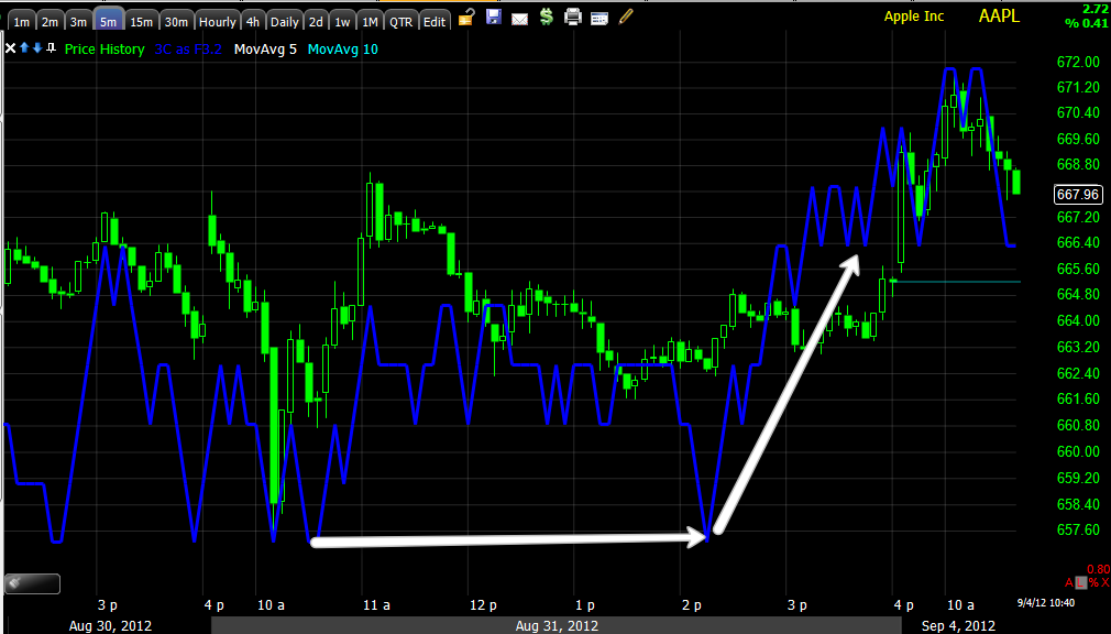
Here's AAPL now, I'm still holding with the September $675 calls and intend to for the time being.

As an aside, BIDU was another in a similar situation, it remains a core equity short, but if there is a price concession lowering the risk another BIDU put position may be considered as the last BIDU put was closed for a 102% gain.

 AAPL this morning on a 15 min chart

 AAPL and a 5 min 50 bar m.a. I'll be watching as traders like to use this moving average/timeframe.

 The 1 min shows strength Friday afternoon, the reason I had hoped for a late day surge, the open was in line today.

 The Friday strength in the afternoon, an in line opening today

 The same theme on the 3 min chart.

 An the 5 min chart


The larger theme on the 30 min chart and why I hope to get a price concession above the $678-$680 area in AAPL and at least $122 in BIDU, then I'll start paying attention to BIDU.

Always Surprised

This particular oddity seen among Currency ETFs never fails to amaze me, I know (I think we all do) that the market is manipulated, but the skill in which some of these currency ETFs seem to be manipulated with, even over a long 3 day weekend is absolutely astonishing to me.

Whatever the Euro was worth during European trade yesterday as the US was closed, it didn't effect the currency ETFs like FXE or UUP (Euro and $USD respectively) until the US markets opened today, what is astonishing (if it was just seeing it a couple of times I would chalk it up to chance, but it is a consistent feature with these ETFs) is the fact that divergences from 3 days ago on Friday are being put in to motion within hours of the US open, regardless of what was happening since currency trade opened this week Sunday. It is as if the divergence is there and the currency will move to reflect that divergence only when the ETF is open, it's a sort of invisible hand.

Take a look at the EUR/USD pair which I described last night as effective in short term trade, but not a particularly good pair as a leading indicator.

Although we aren't thus far seeing the same level of legacy arbitrage ($USD related) that we saw on Friday and I doubt we will as humans come back from the Hamptons, we are seeing some movement in $USD (by proxy EUR) sensitive assets.

 Since last night when the EUR was near Friday's intraday highs, it has seen a fairly sharp sell-off since the European opening this morning.

 Here's a closer look at the EUR/USD.

Here's where it gets strange and as I said, I wouldn't mention it if I had not seen it with such regularity.

 Euro on Friday gaps up with a leading negative divergence on the 1 min chart.

 Also the 2 min chart

 The trend with a leading negative position on the 5 min chart as of Friday as well as almost the last 2 weeks, which is interesting when one considers the arbitrage action, the light volume, the ease of moving the Euro on Macro-rumors, etc and the hedge fund re-allocation to defensive sectors over the last month.

The $USD on the other hand as represented by the UUP ETF...
 Leading positive on Friday (2 min)

 Also on the 3 min

 The 5 min with several weeks of positive positioning.

The 15 min with nearly a month of positive positioning in to lower prices.

And finally the 60 min trend seems completely unfazed in 3C while price pulls back to an exact break of support late last week.

We can get in to the reasons later, the behavior is the point of the post.

USO Ticking Down

Late last week, Friday in fact, I was looking for some upside price concessions to short in to in several items, USO being one, GDX, GLD and the related DUST trade being another (looking for downside in DUST), GDX/GLD are also ticking down, I'll cover them in another post and DUST is ticking up as hoped.

USO..
 USO didn't quite make my target, but neither did most as the target was quite lofty, today USO is showing early weakness.

The opening indication in USO pales to the trend from Friday, very negative.

Futures Pre-Open Indications

Here are the Futures for the S&P E-Mini Contract and NASDAQ as of 9:20 pre-New York open.

 ES 1 min 3C overnight with the European open at the yellow arrow at 3 a.m. EDT. There is what could be a positive divergence forming, it's hard to say as it is still heading down , it may just be catching up to the downside move from the European opening negative divergence.

 ES 5 min chart is clearly negative since opening for trade this week.

 ES daily VWAP

 We just broke under ES weekly VWAP

 NASDAQ Futures and where they closed Friday, the European overnight open at the yellow arrow with another steep negative divergence on the open and a possible positive now, again 3C is still heading down so its too early to call positive, but it is in the right position for an intraday move if it turns upward.

 NASDAQ 5 min 3C very negative overnight.

 The daily VWAP

And another break under the weekly VWAP

The $AUD is flashing red lights

While the Euro sees a bump in a very thin market, the leading currency and Carry Trade Pair are flashing red lights.

Since FX markets opened this week...

 The EUR/USD is seeing a bump, it WON'T see a short squeeze as EUR shorts are at 2012 lows.

While the EUR/USD may be decent at tracking short term moves, mostly volatile chop lately, the bigger picture, more important AUD/JPY carry trade pair is falling as is the $AUD/USD.

 AUD/JPY (Yen) as the Yen becomes more expensive, the carry trade becomes more expensive, small moves in the FX markets lead to huge losses and gains, in this case the carry trade just became a lot more expensive, NEVER good for the market moving higher.

The AUD is falling vs the $USD as well.

Why?

You can almost guess it has something to do with China, it does have to do with Australia as well as it is their currency, but often reflects major problems with China.

In this case, Chines Flash PMI. Last week's HSBC Chinese Flash PMI was just revised lower, actually to the lowest level it has seen since March of 2009. Even the VERY opaque Chinese official reading came in disappointing. Australia added a little sting to the currency with weak Retail Sales.

Both the more reliable HSBC and official Chinese PMI are now both in contraction.
Note that the HSBC print has been in contraction since 2011, more interestingly, the Chinese data is moving closer to the HSBC data, the differential since April has declined substantially.

While the EUR/USD may not be reflecting the same disappointment that the $AUD is (thinking the PBoC will act, which they won't because of inflation), things aren't much better there either, manufacturing is faltering faster than last month's data suggested. In fact, the core, Germany (and France) are not supporting manufacturing, they are starting to see their own drag. The fall of German manufacturing will not be taken lightly, it is the reason the EU exists. More from Reuters...

As for Thursday's big event, the ECB, apparently things aren't as rosy as Draghi seemed to talk the market up (remember when it came time to act the next week, he punted). This time it appears the ECB will demand a memorandum of understanding or conditions for bond purchases in the secondary market to lower sovereign debt yields, the problem, Spain has already outright rejected any such conditions and without the country first making a plea for help, the ECB can't/won't step in even if Draghi does commit to such a plan on Thursday.

As for the task master, Merkel, she subtlety is making Germany's "conditionality" as well as the role and limits of the ECB's role known.

Merkel:
`DEBT MEANS DEPENDENCY'
EU MUST ENSURE THAT IT FIRST EARNS WHAT IT SPENDS
EUROPE HAS TO LEARN TO ONLY SPEND WHAT IT TAKES IN
TOO MANY IN EUROPE HAVE LIVED BEYOND THEIR MEANS (Without naming names...Portugal, Ireland, Italy, Greece and Spain )
And my favorite, ABSOLUTELY CONFIDENCE' ECB TO WORK WITHIN ITS MANDATE


Monday, September 3, 2012

Hedge Fund Flows This Month-Risk Off

Some interesting developments are taking place in the positioning of hedge funds through 2012, moves that haven't been seen since the 2009 bottom when hedge funds positioned themselves for a risk on or rally environment, during 2012, they have made the biggest move since 2009, but in the opposite direction or de-leveraging as I have been talking about recently, the hedgies were right in 2009...

However the more recent de-leveraging that we have seen in extreme fashion has been very pronounced over the last month. While the 2012 yearly data is very important and very interesting, the re-positioning over the last month has been even more telling as our charts have been suggesting.

One of the recent themes I have been talking about is the severe underperformance of hedge funds through 2012 with only a paltry 11% outperforming the S&P-500. When Q3 ends in September, the re-demptions will start coming in fast and furious, the end of 2012 will be more dramatic.

The flows of "Leveraged Money" (Hedge Funds) over the last month suggest exactly what I have been showing you virtually market wide, I have even commented that I don't recall ever seeing such a dramatic change in character, not just in the averages, but Industry groups and bellwether stocks, you can literally see key levels such as AAPL $600 where the move down in 3C is very clear.

When we are following the movement of such flows, we have to keep in mind how their process of re-posiitoning is different than ours, these are huge positions, they can't be changed significantly in a short period of time, especially big flow changes so rather than an event, they tend to be a process.

If you are a large fund manager holding a large position in AAPL, you need demand to sell in to or short in to, you need retail buyers to take those shares off your hands and since retail doesn't buy in the size needed, it takes some time. More than that, it takes a psychological event that will bring retail in to the market. If we consider what moves the market it comes down to two very simple things, Fear and Greed. Greed is triggered by making retail think they are missing a move and typically a significant pyschological/ technical level has to be broken. Fear is by far a stronger emotion, just look at the bottom of the 2002 SPX move to the top in 2007 and how quickly that move was erased and then some in about one quarter of the time.

A couple of examples...
 A 5 year rally completely erased and then some in a mere 17 months, most of the damage was done in 10 months.

There are numerous examples, take a look at the Dow's 1929 Crash, 8 years of Rally completely erased and then some in 2.5 years.

Light Sweet Crude Oil Index. As a side note, 3C called the top of this multi-year rally starting when oil was around $22 a barrel, the same week I was writing on Trade-Guild.net about the impending reversal of one of the strongest and psychologically impenetrable trends, Cramer was telling viewers to buy oil/USO on the next weak Wednesday EIA report in what he called a "Contrarian trade" (buying oil on a week EIA report), any of his viewers who bought oil that week bought at the top and never recovered their losses. More amusing, how in the world can millions of viewers all doing the same thing at the same time possibly be considered contrarian? This isn't to point out that Cramer was wrong, this is to point out that Cramer created retail demand right at the very top when smart money was not only moving out or already out, but likely shorting oil in to higher prices. Remember who Cramer's lunch buddies are, he is a Goldman Sachs alumni and while I have no idea how Cramer (literally) might benefit from helping GS, I doubt his loyalties to the, "Little guy". Have you ever tried to read the disclaimer on MadMoney?

This happens on all timeframes for a variety of reasons, mostly though it comes down to the unchanging reality of human emotion.

As for the point of the article, $600 in AAPL is a major psychological level, century marks are always important psychological levels, while that may have been one of the biggest, it certainly wasn't the last, but it did see a major change in character. Keep in mind, among hedge funds, AAPL is by far most widely held equity.

AAPL changing character from in line/confirmation to a negative divergence at $600, but the technical resistance level around $620 saw a VERY large change in character to a large leading negative divergence, this will make sense when you see the flow of Hedge Funds over the last month.


If anyone recalls what happened to legendary fund manager,  John Paulson's Advantage Plus Fund in 2011, the flagship Advantage Plus lost more than 50% of its value in 2011 alone. Among Paulson's top 5 holdings, the only profitable position was GLD;  At the end of the third quarter, Paulson was the largest shareholder of the SPDR Gold Trust (GLD) exchange-traded fund with about 20 million shares, according to quarterly regulatory filing, but he had slashed his holdings in Q3/Q4 of 2011 as the new year rolled around and redemptions in the fund hit hard, GLD saw a sharp sell-off. Look how the character of GLD changed in Q3/Q4 of 2011, the most significant loss in GLD in years.

Look at the macro change in character starting in Q3 2011 in GLD/3C.

 This is the first leading negative divergence in the 2-day 3C chart in 6+ years. However it's not only 3C that showed a huge change in character... MoneyStream is created by the father of all money flow indicators, Don Worden who started the new breed of indicators with his Tick Volume, leading to his MoneyStream indicator.

Money Stream goes relative negative t the Q3 top and then leading negative through the remainder of the year (Q4) to at least 3 year new lows, this indicator has no similarity to 3C in its construction, a totally different indicator with the same extreme signal at the same time that Paulson was selling GLD to raise money for client redemptions after a horrible year.

Back to the point of the post, Hedge Fund Flows for the year and more importantly for the month.

Leveraged Money is simply another word for Hedge Funds, note the difference between Leveraged Funds and "Real Money"-non-leveraged accounts. It seems the question of high yield credit performance has finally been answered, Hedge Funds are doing what I've been expecting to see in High Yield but haven't, one of the few bothersome questions is apparently answered as High Yield Credit leads equities, "Credit leads, stocks follow".


Hedge Funds (red) have moved out of High Yield at an incredibly fast rate, now with less exposure than anytime since 2009. Note Hedge funds moved in to High Yield at exactly the right time in 2009 while un-leveraged, "Real Money" was wrong, moving out in 2009, again they are diverging significantly.


If we compare un-leveraged "real money" vs leveraged Hedge Funds and the changes they have made in the last month, hedge funds on the right side have moved aggresively out of Cyclicals and in to non-cyclicals.

What does this big change in the last month mean? Cyclical companies are highly correlated to the economy.  The sales of companies with cyclical stocks depend on whether or not the economy is strong; sales will thrive when people have extra income to spend on luxuries, and they'll decline when the economy slumps. These are the stocks hedge funds have moved out of rapidly over the last month, AAPL would certainly be considered a "Cyclical", probably explaining why the AAPL chart has looked the way it has looked over the last month.

Non-Cyclicals are also known as defensive stocks, they tend to see profits regardless of economic
gyrations because they produce or distribute goods and services we always need: food, power, water and gas. Hedge Funds have moved in to Non-Cyclicals over the last month.

The bottom line, hedge funds moved out of the "Risk-on" trades and in to the "Risk-Off"/Defensive positions over the last month, you might say they have used the rally to sell in to or even short in to.

The changes can also be seen in very simple sector rotation right out in the open without even looking at underlying trade.

Staples, HealthCare and Utilities are defensive sectors. This is hardly the most convincing chart for me, but it is interesting.