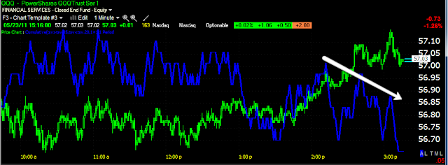
I'm using the Q's as an example for expediency, bit the other averages look the same.
With the 5 min charts still looking unusually strong considering what the 1 min chart looks like. Some charts longer then 5 minutes in some of the averages look strong as well. So we'll see if this is a correction, a multi-day shakeout or something else. Again, these are the trees, the forest looks pretty ugly.


No comments:
Post a Comment