Here are the chart for both leveraged ETFs. Any use of these ETFs by smart money would likely see strong movement in the mid-term charts, around 15 min as leveraged long ETFs are killers on the downside and in choppy markets, so I would expect any accumulation in them for a bounce type move not to take place over a longer period moving from strong 1, 2 and 5 min charts to the 15 min chart, but rather a much faster positive divergence and much stronger, in other words a faster entry in to them.
I have enough room that I can add to them if I wanted and still not upset my short positioning that much as I still (like the AAPL calls) view these trades as speculative because they run against the big picture perspective.
As an example, take a look at XLF (I could use any long market average though)
Typically accumulation periods/positive divergences would have a more "U" shape. However you may recall on 5/1 when the market bounced up, I expected the reversal to be a "U" shaped one, but much tighter than normal, you can see it on this chart at 5/1. I would expect the same here, a gradual sloping "U" shape reversal wold not have the same impact on a short squeeze as one that is tighter and more vertical on the upward slope or the second (right) side of the "U". If shorts had too much warning, the squeeze wouldn't be as effective. I can still imagine a pullback, perhaps to the red line area and it wouldn't do much damage to the "U" shape, it could even be deeper, but the start of the bounce would need to be fairly quick, maybe a late day rally or an opening gap.

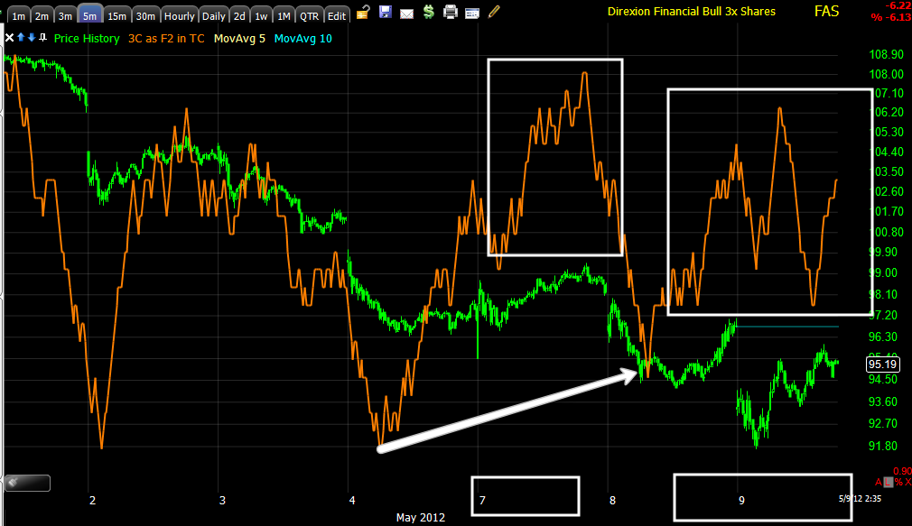
FAS 3 min saw a sharp negative divergence on 5/1 as was expected and posted that day before the reversal. The recent 3 min chart shows a couple of ares where positive divergences appear to have taken place, late on May 7th and at the bottom of May 8th and today as the chart is leading positive.
On a 5 min chart, the same areas are showing likely positive divergences, on the 7th, at the lows yesterday and today.
Even the 15 min chart identifies roughly the same areas. If it were me accumulating as smart money, the bulk on the 7th would make sense as to have the position started and not give away too much in needing to accumulate quickly yesterday and today in which trade sizes would show up as being larger as well as volume.
The 30 min chart is interesting because it's a long time frame, but the divergence is very compact and in the same areas pointed out above.
TNH 1 min is leading positive today as well as on the 7th and yesterday's lows, similar to FAS above.
The 3 min chart also shows a relatively new and fast positive divergence that is nearly above the May highs.
The 5 min chart also shows a large leading positive off yesterday's lows, the red area is where I would expect or at least not be surprised to see a pullback, if that happens and the charts are still positive or rather more positive, my position size would allow me to add there.
Agin, the 15 min chart has changed character very quickly with a strong leading positive divergence starting on the 7th.
If Wall Street runs the bounce as I have suspected, they will only accumulate what they think they can offload in to higher prices and won't want to spend any more money than need be to get a bounce moving. They'll depend on a short squeeze to get the momentum moving, thus the positive divergences that I thought I would see, strong 15 min positives that developed quickly are in place.


No comments:
Post a Comment