Something big is going on in the market, something that is going to take bears by surprise and really test Jesse Livermore's advice, paraphrased as, "It's not being right on the market that makes you money, it's the sitting". A lot of people were right on the market direction, very few made money though. This speaks to the courage of your convictions.
I have a lot of new data from today to pour over, We've expected this top would end with one final, very strong bounce and have thought that since before May. Around the middle of May we had good evidence for such a bounce which has built since then. Today the market gave away many more clues than yesterday, it's always in the heat of the moment that small shifts occur in different assets while everyone is focussed on one thing, "SPX down 2.47%". It's during these emotional extremes that you find the best nuggets of information, kind of like beach combing, you find the best stuff after a strong storm. I have a lot of analysis to do and I'm not sure where it will lead, perhaps to our long held expectation or perhaps something bigger, but something big is brewing. If I discard all of my technical indicators, all I've learned about the market, I can still make this argument based on one simple fact, the market is a zero sum game, for someone to in, someone must lose and that can't happen with everyone on the same side of the trade.
The recent bearish trade has been too textbook, too obvious and if there's one thing we've learned by simply observing, it's that textbook and obvious are almost always the doorway to a nasty trap.
However, before I look at the new data and try to fit the pieces together, it's important you understand just how bad the market truly is. Years of research have gone in to this so it can't be all detailed in one post, but the main theme that ties all of this together is the world being a much smaller place now than it was 20 years ago before globalism, free trade agreements, new financial derivatives exploding. We are in an era where almost literally, a butterfly flaps it wings in Asia and we have a hurricane here and vice versa. Europe's structural problems were set in stone with the creation of the EU, when a sovereign country can't control it's own money supply in a fiat system, it's just a matter of time. One of the main catalysts was the housing crisis and debt in the US, we gave Europe a cold, they came down with pneumonia and the contagion is spreading across the world. There's no historical precedent to look to because the wold has never been through such a financial crisis and been this interconnected.
Lets let the charts do the talking.
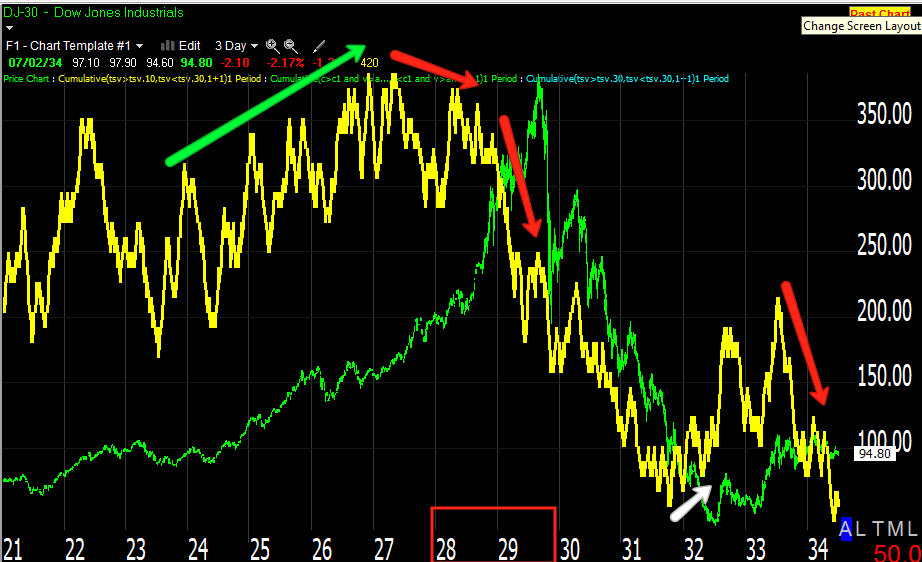
First I want to give you a feel for a market crash and what 3C looked like, there's none better than 1929.
Here you can see the accumulation period between 1918 and 1921, to the right, distribution, note that 1929 wasn't a complete surprise, money had been moving out of the market t least a year before, however when the top came, 3C was deeply divergent.
This chart shows a little more detail of the distribution period leading to the crash as well as a small base in 1932 that failed in 1934.
This is a closer view of the 1932 accumulation and 1934 distribution.
The early 1940's saw accumulation, heavy accumulation, note that there was selling in to strength as prices went higher, that's part of the human fear factor, taking gains too early. The 1960's were pretty stagnant.
Now for the Dow now...
Here 3C looks very strong with the Dow, both making higher highs until the late 1990's which led to the 2000 Tech crash. The 2007 top was even more divergent or at least deeper, the actual top came very quickly. Note 3C from 2009 on. This may look totally wrong, but you have to understand most of the gains in the market were artificial because of the QE programs and POMO. The depth of this divergence should be worrisome to long term investors. In long term analysis I have said in 20 years when people look back at this period, I wouldn't be surprised if the called the 2009-2012 period the biggest bear market rally in the history of the market. Economically we are in no different or no better a position than we were at the 2009 bottom.
I included Money Stream which is Don Worden's signature money flow indicator, the code is totally different than 3C, but the divergence is very similar.
Here's a closer look at 2009-present
The 2007 top was quick distribution, things changed fast. The first two distribution periods in the Dow were as or after QE1 and then QE2 ended as they were the only real support for the market, artificial monetary policy created that support, also note how each successive top has been more negative than the previous one. You could call this the QE House of Cards, clearly without QE the market wants to collapse back toward what would probably be fair value considering the economy. Right now the market is higher than 2005 when everyone had money to spend, employment was normal, the only reason the market is higher is because of monetary policy, not organic growth or even the prospect of it.

This indicator is derived from 3C, the deeper the indicator, the more distribution. In red is the 1929 crash, obviously we can't compare apples to apples as there's a lot more money in the market than in the 1920's plus other factors such as inflation, etc, but the 3 most recent major tops can clearly be seen.
The S&P
A daily chart of the S&P-500 since 2005, note the 2007 top and the same lower 3C through the 2009-present, each top also coincides with QE ending, the current reading is at new lows below the 2009 bottom.
The chart with the effect of the removal of monetary stimulus.
I mentioned earlier that the last really strong accumulation period we saw was Aug.-Oct. 2011, the distribution at this current top has been very sharp and very strong.
Volume should rise with prices in a healthy rally, note the only time over the last 40 years it didn't was since the 2009 rally started. If we view the last 3 major tops together with the preceding uptrend, it looks like a secular H&S top. The standard price pattern implied target would take the S&P down an impossible 825 points from the neckline at 750. While that is impossible, 750 is probable and if this is a major top, then 500 wouldn't be out of the question, it would in fact be reasonable.
3C moving up with price in confirmation from the early 1970's through the 1998 area, then institutional distribution in to higher prices in to 2000, every top since then has shown less money, deeper negative divergences, a market that is rotting from the inside out.
The same chart with no annotations, the trend and the historical price history offer proof.
I planned on including many more charts showing the deterioration of market breadth, commodities, how we discovered the recent top before it formed, etc, but what is important is to show the condition of the market.
As confirmation of the S&P bearish position I'll also include Money Stream's take, as you'll see, this totally different money flow indicator looks very similar.
Not only is it similar to 3C, but to the Dow as well, again note the 2009-2012 period, the market is exceptionally weak at exceptionally artificially inflated prices, in other words, it is ripe for the mother of all crashes (unless the F_E_D steps in again, but they can only kick the can down the road so far and each time they do, it makes the situation worse).


No comments:
Post a Comment