The last update for MCP was Friday, we are looking at MCP as a potential long trade as it would be the type of trade we want to take, one that comes to us at a better price point and less risk, so we've been keeping an eye on it.
Here's today's update and also a wider perspective.
As for the 4 stages of a stock's life-cycle, MCP started at Stage 2 "Mark-up", volume increased as it should in a healthy uptrend. As stage 3 (Distribution/Top) started to form, we see a parabolic move up, this is the sort of volatility that precedes a top and marks the end of an uptrend although it doesn't feel like it at the time, chart after chart will show you the same thing and note volume is no longer rising.
AAPL has the same conditions although to the extreme, if AAPL is viewed on a monthly chart, the area in which volume is rising with the trend stretches from about 1985-2007 and saw a gain of about 7300%. Going from there, AAPL becomes very parabolic and from that 2007 area until now, although the gain looks huge, it's only about 250% by comparison! Interesting.
Stage 4 is "Decline" and volume falls off, low volume is a hallmark of a bear market believe it or not. It appears we may be entering a stage 1 "Base" for the first time in MCP, so there are two possible trades here, 1) the shorter term Swing -like trade and 2) there may indeed be a larger base forming that will support a larger move.
On MCP's decline there's a nearly 30% 1 day drop on volume, this looks like capitulation which marks the end of the downtrend, but in almost all cases the stock tends to drift lower before building a new base. Support is formed and at "A" it looks like stops are run blow that support, at "B" there's a breakout above the same level (former support turned resistance and now support again).
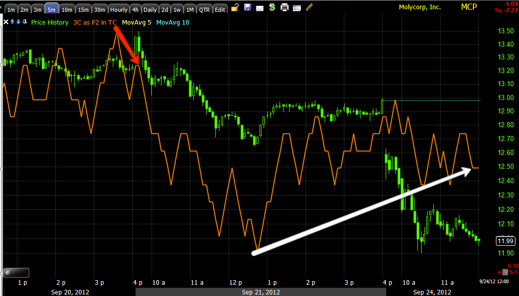
On the X-Over Screen we see a short/sell signal in red and a long/buy signal in white.
After the initial crossover to a new trend the first pullback is typically to the yellow 10-day m.a., subsequent pullbacks are deeper, we are now at what is typically the second pullback point which is the blue 22 day m.a.
Friday I said we were in the area, but we needed to see accumulation before it becomes a high probability long. There is a decent move on the 3 min chart as divergences start on the shortest charts and if they are strong enough, migrate to the longer term charts. For a swing trade, maybe longer, we want to see at least the 15 min. chart show a positive divergence.
Also note the concept of the head fake move being one of the last things that happens before a reversal, either to the downside or upside, in yellow you can see a push above resistance that was a head fake move. On the daily chart, marked in yellow-point "A" that also appears to be a head fake move as the trend reversed from there, or at least the start of it did.
We now have migration to the 5 min chart with a leading positive divergence.
The 15 min chart is not there yet, also note the head fake moves in yellow above on negative divergences.
As for a longer term, larger base, the 30 min chart shows a leading positive divergence at what would be the head fake move below support of the capitulation day, the reason it is leading so strongly is because a lot of stops were triggered on that break below support, offering a lot of shares of supply on the cheap, it appears they were accumulated and you can see the divergence for the pullback move to the right. We'll keep looking for that 15 min, but the 3C charts already look better than Friday so it appears we are moving in the right direction.


No comments:
Post a Comment