Yesterday I started tossing out some short ideas that were looking pretty ripe, I'll probably continue to do so today.
There are some things I have seen building and now when we take a look back at events like the move above the recent range, the entirety of trend #1
(remember trend #1, the move higher, was always considered a transition to trend #2-the move lower) that has shown the 3C signals I was expecting and hoping to see and the signals that we all would expect
(once you understand our basic concepts and 3C).
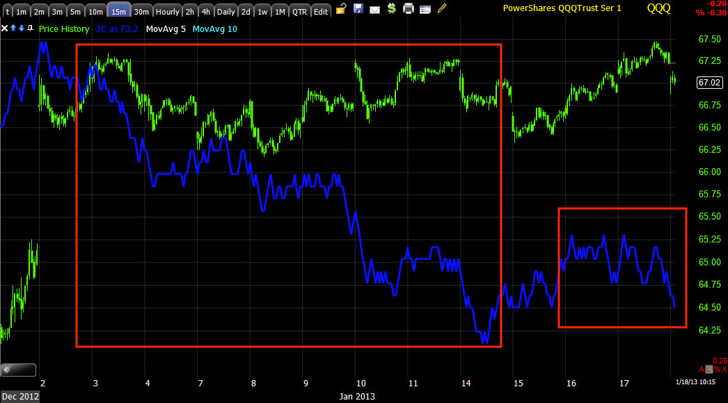
Here's a look at the market averages, pay attention to 3C during trading ranges and 3C at moves above trading ranges like we saw this last week and last few days, there's an old familiar pattern there.
We'll also take a look at volatility with the 3C depth indicator which gives us a view of the difference between 3C and price that is sometimes lost in scaling.
DIA 1 min shows the negative divergence we'd expect to see at the brea above recent range highs as well as the accumulation that prepared that move.
DIA 3 min shows the trend of this timeframe, it is declining through the range as it should during a distribution period, it's longer than I anticipated, also meaning stronger. The move to a new high sees a 3C move to a new low, this is the concept of how distribution works and why the market needs these moves higher, 3C is just showing the mechanics of the move.
Put it altogether on a long timeframe showing the strongest of underlying trends and the December distribution from the 11/16 cycle looks tame compared to January. This is a 60 min chart, a very important and strong timeframe for underlying trade and it's at a new leading negative low with a lot of recent momentum.

IWM 2 min trend shows a very clear, very sharp change in character.
The 10 min chart just confirms the sharp change in character and tells us more about the strength of underlying trade, as we always say here at WOWS, "Price is deceiving".

IWM 15 min from confirmation to a new leading negative low in a rather short period.
QQQ 1 min -remember it saw recent strength this week as the average that didn't make it above the range, yesterday's price action was a change in character for the move.
QQQ 3 min just confirms the same with a new leading negative low.
QQQ 15 min showing distribution through the flat range, we most commonly see distribution during these flat ranges or in to higher prices above key technical levels, here we see it at both or at least the latest attempt at the key level.
SPY 1 min also showing the recent change in character above the range.
SPY 5 min shows deterioration in the range and then much heavier underlying action above the range, this is all about supply and demand, not in the conventional way that business school teaches, almost the opposite.
Most of us can open or close a position with 1 order and not move the market too far against us, institutional positions are too large for that, they need demand to sell in to as to not move the market against them in the transaction, this is why these head fake moves above key technical levels are so important as they get retail to act and ultimately to stand alone holding the bag.

SPY 30 min showing the overall trend.
Here's the volatility ETF for short term VIX futures, VXX. Below is the 3C depth chart, it is more or less the difference between 3C and price which can be skewed at times due to scaling. When the bottom indicator is making a deep crest like we see at the yellow box, that is typical of distribution areas, when it makes shallow troughs, those are consistent with accumulation areas, the size or difference between the far left and far right are important.

The leveraged version of the same, UVXY 15 min is a good example of two distribution areas and a longer accumulation area that is shallow between the two distribution areas and finally to the far right, how shallow the indicator is tells us something about how the overall picture of underlying flows have changed. If you look carefully at smaller troughs and crests, you'll see they correlate with smaller distribution and accumulation areas.
This is the Daily Inverse VIX Futures, XIV, it is the opposite of the two above, you can see it also has the opposite signal.
When I wrote the post, "Nerve Racking" a week or so ago, this is why, this is one of the more extreme moves we have seen over the last year, maybe one of the most extreme.


No comments:
Post a Comment