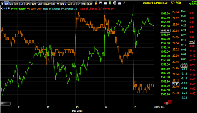
These are the kind of charts that I describe as "Jumping off the chart" and as you know, "Credit leads stock", this is scary.
First I borrowed a chart of European Financial Credit.
It started diverging at the new year.
I like HIO as a leading indicator because it has no correlation to anything other than the attitudes toward risk, look at the attitude toward risk starting around the new year and progressively worse, especially today
Closer view of HIO, the last 2 days have really made a statement if you are listening.
With the $USD down this much, this market had to be monkey hammered yesterday? And what about today? I suppose Quad Witching could be responsible so we'll give it a pass, but not for the previous 2 days.
Yields? Uh that's a flight to safety.
And commodities as a reminder are a risk asset that get bid up in a healthy market, what happened here?
THIS IS TRULY THE SCARY CHART OF THE WEEK, MONTH, MAYBE YEAR.
HIGH YIELD CREDIT IS HOW THE BIG BOYS PLAY RISK, WHAT DOES THE LAST TWO DAYS TELL YOU?
WAIT, GET SOME PERSPECTIVE...
The last 2 days gave up the entire year's gains and in a big, big way!
Is interest rates about to start going up?
-
Yes, I know - it does not make any sense - FED is about to cut
rates...but....real world interest rates are not always what FED wants it
to be.
6 years ago


No comments:
Post a Comment