So far my theory is half correct or on course, we don't have a close yet and as I suspected, even on the new high, few would be willing to chase risk as there has been such a strong flight to safety. Now I think we may know why the SPX was only 2 points, a fraction of a fraction of a percent away from the new high and was held back from breaking it for over two trading weeks, it's as I said yesterday, or that's what I believe.
So I'm going to post these leading indicators, you'll see some differences between the very short term / intraday and the longer term, then I'm focussing on if, where and when any changes to core positions need to be made for the remainder of the day.
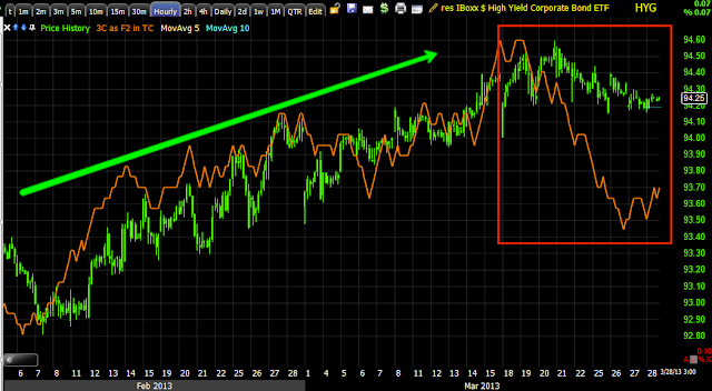
HYG Credit has moved down enough that it seems to be far enough away from an egg thrown against the wall.
However I believe HYG really saw the exodus of money a while back and we have seen a short squeeze and manipulation of credit to fool the algos in to bidding the market higher.
It would seem on an intraday basis, HYG is helping the market accomplish its goal as algos read it as green and risk on.
However 3C of HYG seems to tell a different story in underlying trade, I'd rather follow credit than stocks.
HIO is not correlated to anything so it is a good proxy to use to see where sentiment is, it's risk off.
Actually it has been risk off for some time.
HY Credit is illiquid, it can't afford to be manipulated like HYG or you get trapped with no liquidity, interesting how they are moving out no ifs and s or buts about it.
Again, I think the real exodus happened weeks ago when HY credit took out the entire years low in 2 days, that would be heavy open market selling or FEAR.
Here's the 3C chart of HY credit, the white arrow are those 2 days I mentioned, clearly negative in to them on a 2 hour chart.
The Euro has been disconnected from the normal SPX correlation...
VERY disconnected for a time.
Intraday though it was used and helpful.
The $USD was also helpful today
However this is the furthest thing from a natural $USD/SPX correlation-this can't be ignored.
In white is the normal $USD/SPX correlation, in red is not normal and I think it to be unwise to ignore it, the red trendline is an area that a month or so ago looked like it might be resistance, the dollar blew through it.
The Yen which is important because of the FX carry trade that finances stock purchases, to close it the equity position must be closes, we see that in market breadth, Japan has done everything to keep the Yen down, but to close the trade it has to be bought, so the demand sending the Yen higher despite the most dovish PM and BOJ in the last 20 years appears to be a function of the carry trade being closed.
Yields today look helpful, they probably were, but...
They have taken out the 2013 lows, this is a sign of a flight to safety in to treasuries/bonds as TLT has shown us on longer term 3C charts.
Here's the big picture of Yields vs the SPX, they are so disconnected now because of F_E_D policy to keep rates low through QE, but the F_E_D has to unwind the assets at some point and they are talking about it already, these two lines should once again revert to the mean and move together with each other, rates will rise, the market will fall.


No comments:
Post a Comment