I'm sure you've heard the expression, "One step at a time", although a lot of us like to think of a market in bad shape as just crashing like this...
2007-2008 crash, looks like a nasty, straight forward crash right?
When I taught Technical Analysis for the Palm Beach County School System's Adult Education program for nearly 4 years, the hardest thing to do was to get students to be able to look at historical charts where they can learn a lot, but to be able to put themselves emotionally in the moment of the past. They just say moving averages and trends, they didn't think about what that time was like day to day.
I was trading full time then and I remember that one day a bank would say they disclosed all of their subprime exposure and then the next several quarters they'd write off 4 times more than they disclosed, the emotions were up and down in an insane way until no one trusted anyone anymore and all interbank or overnight lending stopped because of counter party risk, in other words, no one trusted who they were lending to because no one was telling the truth, then came the 2008 melt down.
That market looks so easy to have traded in retrospect, but in real time at the right edge of the chart, not so.
This is the same 2007-2008 SPX chart, take that bounce in white, that's two months after the market had supposedly topped and broke down, this caught a lot of people off guard, a lot of people thought the worst of it was over.
The downtrend at the red arrow that follows had 21 down days and 20 up days, the trend is only apparent after some time in retrospect, not at the right side of the chart when you don't know what is coming next and if the F_E_D's unprecedented measures were really enough to cancel the bearish tone as no one had seen the F_E_D do so much.
In any case, 1 step at a time, the mini cycle off the Friday Non-Farm Payroll lows and the cycle off the October 9th lows...
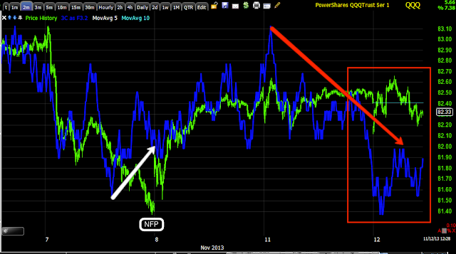
off the NFP lows Friday after we knew we'd be up Thursday as the signals were there, but even I was surprised the market could move up against that NFP print., however the 3C trend since is pretty clear, not good.
From the 10/9 lows, note accumulation in to the lows, then confirmation initially as we move up, the leading negative divegrence here is at the lowest point on the entire chart.
QQQ from the NFP/Friday lows and since...
QQQ from the 10/9 cycle, the leading negative is accelerating
And the 30 min chart is at lows for the chart while price is far from the same areas.
IWM since the NFP
IWM since the NFP, accumulation Thursday
And the 10/9 cycle with a leading negative 30 min lower than anything on the chart past August.
These are very much in line with the Index Future Charts.
Thus, I still refuse to let go of trading shorts as well as core shorts.
Lets see if we can get to PCLN
Is interest rates about to start going up?
-
Yes, I know - it does not make any sense - FED is about to cut
rates...but....real world interest rates are not always what FED wants it
to be.
6 years ago


No comments:
Post a Comment