I don't know what it is about PCLN, I like to think there's some objectivity here, although there is a hint of gut feel as well in seeing the price action and underlying action on a day in which it is some diametrically opposite.
In being 100% honest, I have to question whether it is impatience as we have been waiting on >$1200 for months, since we were under $1100 if I recall. I always look to question motivations which is why I'm such an ardent supporter of real trading journals, not journals of trades.
Questioning your intentions and emotions about why you do what you do in the market is never a bad thing, in fact it's one of the most useful things if you keep a journal and can identify patterns.
As far as why we have been waiting so long for PCLN +$1200, all you need to know can be found in these two links (you'll need some time)
#1
#2
As for PCLN itself, here are the charts...
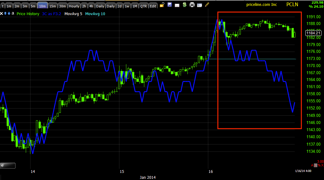
5-day chart, again note volume on a parabolic move up and the recent change in character in the red box, it may seem small, but each bar is a week.
PCLN's ROC in price is definitely a red flag.
This is the $1200 level we have been waiting for since we were around $1100 or so, it was just such a magnetic, obvious level that would create all the opportunities discussed in thee 2 links above.
Today's higher volume with a longer upper wick on the candlestick is another change of character which is indicative of a rejection of higher prices, but adding the heavier volume makes it a probable churning event, the hand-off of shares from smart money to dumb money.
The Trend Version of 3C which loses a lot of detail, but cleans up the trend, note the change in 3C as price goes parabolic.
The 4 hour chart has been interesting since the start, completely in line and then a clear move to distribution.
The hourly chart does the same thing, these are among my favorite 3C charts. Green represents in line, not a divergence.
The 15 min chart is full of confirmation and a few minor signals, but the distribution is the strongest.
If you follow this 5 min chart from left to right you'll see all of the divergences and how effective they have been. Note also the head fake move, I talk about them a lot so I want to point them out because often we look at a chart and don't see them unless they are happening in real time. Today's 3C action is leading negative with a relative negative preceding it as is often the case.
I believe this will move to the 15 min chart soon.
A closer look at the 5 min chart (as far as the migration that fed the 5 min chart, see the 3 min below) which shows another head fake move under clear support, it is used for the same reasons many head fake moves are used for, last minute and significant accumulation or distribution and to create the momentum that jump starts a new move.
Again, a relative negative divegrence at #1 and a leading negative divegrence at #2, leading to a new low on the chart while price is elevated.
The 10 min chart viewed intraday does show a clear leading negative divegrence so it did see migration and this is coming from a local "in line" or confirmation trend.
And likely where it all started as most new divergences do, the intraday 2 min chart that is marked as a relative divegrence, but it is leading. This however is a good way to understand divergences and comparing two relative points in time and price with 3C.
The 2 min chart, if the divergence is strong enough, will migrate over to the next longest timeframe which is this 3 min chart. Again, the classic relative negative to leading negative and in
an area that is a natural reversal process.
My Trend Channel set for 2013, first note the direction of the trend channel, from an uptrend to an increased ROC uptrend to a lateral/down move. There are 3 stop outs on this chart.
I NEVER have claimed the Trend Channel will take you out at the exact top or the exact timing, in fact there's usually additional volatility that increases and sometimes if you are lucky, you can sell at the exact top, HOWEVER, AFTER YEARS OF USING MY FIRST AWARD WINNING INDICATOR THAT WAS SUBSEQUENTLY COPIED BY PRICE HEADLY (in my opinion) I HAVE LEARNED YOU ARE USUALLY FAR BETTER OFF TAKING THE STOP OUT SIGNAL AS YOU WILL HAVE COLLECTED 80% OF THE MEAT OF THE TREND, THE EXTRA 10% OR SO IN THE TOP AREA IS EXTREMELY VOLATILE, EXTREMELY DANGEROUS AND IS NOT WORTH THE RISK FOR THE POTENTIAL REWARD. In other words, more often than not, I have found only pure luck would get you out at a better price and often there's a big gap down shortly after that takes out months of gains and it you hang around too long, you are likely to lose gains on that move. In addition, the time spent in the volatile chop is opportunity cost which could be better used in an asset that is ready to make a new move. There's also that open position risk of a gap down and for what? An extra 5 or 10%?
A close up of the TC, the stops are always on a closing basis, not intraday and at the highest level of the lower channel (in the case of a long), we have 3 stop signals.
My X-Over Screen is not perfectly at a short or sell signal, but the price moving average is right there, the custom indicator and moving average in the middle window are moving closer to the second confirmation every day and the bottom window has given a signal.
This is where volatility picks up and chop.
So, I'll still be patient as far as filling out the put position and the core short which is in place, but was intentionally opened and added to with the ultimate goal of adding the last bit reserved for the position >$1200.
Part of me just wonders if PCLN will even do it as it has been $1.25 away from that goal or a mere move of ONE TENTH OF A PERCENT!!!!!!!
GOOD LUCK TO ALL OF YOU HAVE PATIENTLY BEEN WAITING AS WELL, AREN'T YOU GLAD YOU DID THUS FAR?


No comments:
Post a Comment