Monday, May 16, 2011

If you are trading Silver, you should check out this interview with Eric Sprott

Sprott as in PSLV (Sprott Physical Silver Trust)

Here it is 

USO UPDATE

For all intents and purposes, everything I just said about silver can more or less be said about USO, they look very similar.

 The same lateral range is developing, the volume on the decline is interesting as it may be short term capitulation.

 The hourly chart looks nearly identical with the same positive divergences near the bottom of the range.

 The 15 min chart shows the same divergences again at the bottom of the range.

On the 1 min chart, its been mostly inline with price today, which isn't always a bad thing, it could be leading negative which would be a problem.

So I would approach USO the same way as Silver, try to buy (if you are interested in USO) near the bottom of the range and reduce you position risk, while maximizing position size.

PSLV

What a voltile day, which is pretty much going nowhere in terms of breaking significant levels, just a lot of chop and an ugly intraday trading environment.

I was just answering an email from one of our more active silver traders. Here was the gist...
 It is a little difficult to see with the chop today, but there's a lateral trend in PSLV, a wide one at that, but it's there.

 What I pointed out was the positive divergences that occur at the bottom of the range. Silver fundamentally is speculative because of the unknown factor of whether there will be another margin rate hike. However, the positive divergences keep showing up near the bottom of the range in SLV.  This is where I would look to put  a position on or accumulate a position because if theres a break below, your stop is rather close and you can mitigate the risk.

While the trade today in silver has been all over the place from a gap down to unchanged to a nearly 4% move down, looking at the daily chart nothing of significance has really happened today. There's no new intraday low, it doesn't appear that there will be a new closing low, so nothing technically significant has happened.

On the hourly chart, there's a pretty nice looking positive divergence in the trading range, I would think it is taking shape from the positive divergences near the range lows. So again, while fundamentals remain speculative in silver, buying near the bottom of the range seems to be a pretty decent risk:reward trade.

I prefer PSLV over SLV because of the controversy surrounding SLV. It would be a shame to see a move in silver negated by business practices within the ETF itself. This however creates a problem for those wanting to trade options as PSLV is not optionable.

SIVR is optionable, but a little low on the volume side.
ZSL is a Proshares UltraShort which is optionalbe, the volume is good there
AGQ is a Proshares Ultra (long) which is optionable with decent volume
DBS PowerShares  is also optionable with ok volume

By the way, they all look similar in terms of the 3C 60 min chart, with the Inverse ETFs showing the inverse 3C chart.

QQQ/IWM Chart Request

On Friday of last week I mentioned that the QQQ are not looking too good and off doing their own thing as opposed to the other averages.

Heres the SPY for comparison
 As of Friday last week, the SPY saw consecutive positive divergences at the lower triangle trendline (divergences marked with arrows, the areas of divergence in the boxes).


 The IWM has been a bit more neutral then the SPY, but nothing like the Qs. The posture of the 3C charts can clearly be seen in the % moves today in each average with the Q's being hit the hardest, the IWM in the middle and the DIA/SPY being the closest to unchanged. The 5 min chart above of the IWM doesnt look particularly good right now.

 The IWM 1 min chart makes a bit more sense, you can see the positive divergence late Friday and into this morning's open which lifted it into the green for a bit this morning. At a 1 pm there was another positive divergence lifting the IWM a fraction of a percent. Right now it appears a negative divergence may be early in the making.

 Contrast the above, especially the SPY chart with the QQQ which has been negative since Wednesday with NO signs of anything like a positive divergence.

On the 1 min chart, there was no opening positive divergence like the rest of the market saw, there was the 1 p.m. divergence, but that's the extent of anything positive. Right now I'd call the current divergence negative as it has moved down further since this screen capture.

The NASDAQ is performing roughly in line with the technology sector-See the last chart in this post covering XLK showing it's very negative disposition.

 In the post linked above, I mentioned the breakaway gap in XLK from Feb. that remains unfilled, which is very bearish.

 Compare to the 5 min QQQ chart and you will see every rally attempt in XLK has been met with selling. Both rally attempts here are very close to the resistance of the breakaway gap which is difficult to see, but it's the red trendline at the very top of the chart.

The longer term view on an hourly chart of XLK is also very bearish. Again, note the distribution at the attempts to fill the breakaway gap (in the white box-the same attempts seen above on the 5 min chart).

Economic Data

We'll start with the Empire Manufacturing Index, this was a HUGE miss. This month it was nearly cut in half coming in at 11.9 from a previous 21.7 with consensus coming in at 19.55.  While everything pretty much came in disappointing, from new orders to rising inventories and declining business conditions, the real problem (which is part of a long standing trend) was the prices paid input costs which climbed to the 2nd highest ever reading. Prices received remained unchanged.

This is the Bernanke Finger Trap with inflation soaring. I was a bit surprised that prices received hadn't seen price hikes passed onto consumers, but it can't be far behind.

While we could consider the above data "Bernanke's left finger caught in the trap", the Treasuries TIC data released this morning might be called "Bernanke's right finger caught in the Chinese Finger Trap" which is appropriately named since Chinese holdings of US debt have fallen for the 5th consecutive month, a drop of approximately -2.6%. This may not seem like a huge drop, but when you consider the amount we are talking about, it may equate to a drop of hundreds of billions of dollars. This is China alone, I'd be interested to see what Japan's holdings look like as the BOJ and insurance agencies have been selling USTs to finance rebuilding.

If Bernanke is going to end his path of monetizing debt, (the Fed is now the second largest holder of US debt) as he has suggested, their going to need to find a buyer for these auctions pretty quick. The fastest way to achieve that would be an interest rate hike, which is interesting as the Fed's Kocherlakota has twice floated the idea of a 50 basis point hike in the last week.

The NAHB Home Builder Confidence came in unchanged, which is a miss as consensus was looking for a more positive outlook-just waiting for that SRS trade to set up...

As a corollary to the conditions in China that have FXP (Ultrashort FTSE/China 25) on our long trade list, 2 short term Chinese bond auctions failed today. The problem is the yield on the bonds is not seen as worthwhile considering the rate of inflation in China. China is seeing wage inflation, of course the same rising input costs and a housing bubble much like our own in 2007 in addition to consumer inflation.

On the very bizarre weekend news concerning Dominique Strauss Kahn's arrest in NYC for rape allegations, we have another woman stepping forward in France claiming to also have been abused at DSK's hands. So effectively, DSK has nowhere to hide, not in the Washington based IMF, nor his homeland of France. Although that doesn't seem to matter much at this point as bail has been denied. Other then being a curious news story (you'd think he could pay for his sexual misconduct or at least abuse his position of power), this may have serious consequences for debt structuring/restructuring for Ireland, Portugal and most importantly, Greece as the clock is ticking. DSK had a more tolerant disposition toward Greek debt restructuring. Whether his predecessor will or not remains to be seen. However perhaps more importantly in the Greek situation is the ticking clock.

And finally, the Treasury Department confirms that today, the debt ceiling will be breached, which will certainly not help those UST auctions. In reality once you got past the creative accounting, the debt ceiling was actually breached last Monday. The Treasuries answer to this, as Congress certainly hasn't provided one, to dip into the Federal Pension Fund. So not only is Social Security insolvent, along with most state pension funds as well as corporate pension funds, now the Treasury will start to inflict damage on Federal Pension funds.

It's absolutely amazing that the US is still able to sell treasuries (even with monetization), and what will happen once the Fed curbs quantitative easing? I'd expect to see rising rates. Take rising rates and add them to an inflation trend that has proven to be more then "transitory" and the US starts to look amazingly like Greece, except Greece has actually implemented austerity measures!

None of this bodes well for the market and most likely explains the following charts...
 The current negative divergence in which Wall Street has had plenty of warning and an environment in which to sell into thanks to the Fed's POMO operations.


The above chart looks a little like the 2007 top. OF course the more drawn out nature of the current divergence is due to the Fed's extraordinary loose monetary policy, giving Wall Street plenty of time to prepare.

Follow Up on the Morganza Spillway

Last night I listed the energy companies that would likely be impacted by the opening of the Morganza spillway over the weekend. You may recall that there was a short term positive divergence throughout the sector (in both stocks effected and not effected by the opening of the spill way). Here are the stocks listed last night and what they look like this morning.

APA
 Heres APA's 1 min 3C chart this morning, it gapped lower only to head into positive territory for the day, since a negative divergence on the 1 min chart has set in and APA is back in the red.

COP-This one would have been effected either way, but it seems the opening of the spillway is more advantageous as their downstream production which would have been effected should the Morganza remained closed is about 247,000 barrels a day as compared to the site which could be effected by the opening which produces about 2600 barrels a day. Still, theres been a short term negative divergence and a slight pulback, although COP remains in the green.


CVX-
 CVX is right at the last level of support for the top. This intraday chart depicts 4 attempts in the last 3 days to break above that resistance. Each one has been met with a negative divergence sending CVX back below the important support line. Although CVX gapped lower on the open today, it did make another run above that support level, only to see another negative divergence turn it back down below the support level. This seems like a good candidate.

 PQ has seen a nice move off the positive divergence.

 PQ also happened to be one of the stronger positive divergences as you can see on this 10 min chart.

SFY
 SFY also gapped lower and headed into the green, most likely off that short term positive divergence. Right now, although its still in the green, there is a leading negative divergence.

SGY
 SGY, like most others, also opened lower and moved higher, again most likely off the short term positive divergence noted last night. Since a negative divergence has set in. This is also another that showed a more positive disposition then the rest of the group as you'll see below.

a 15 min 3 day positive divergence.

USO UPDATE

Last week there were signs of some accumulation in USO, last night I mentioned USO is a likely candidate for some upside momentum this week based on the fundamental situation in the MENA region with regard to Israel.

 While this daily chart doesn't seem to depict anything ominous today, USO was 1% lower this morning which is a pretty decent drop for morning trade. However, like most of the market which was also down this morning and has since made up the lost ground to trade in the green, with the exception of the QQQ/NASDAQ 100 which I pointed out last Friday, did not look good compared to the S&P, Dow and Russell 2k.

Here USO shows a 15 min relative and leading positive divergence.

PSLV Chart Request

Interestingly, after 4 nearly consecutive margin hikes in silver from the CME, there are rumors of more coming down the line. However, theres a source of new competition on the block from the Shanghai Exchange who have actually lowered silver margins and are floating the idea of another drop in margin on silver at the end of business today if silver doesn't show any wild volatility. The CME seems to be operating more like the tax system, once there's a hike, it's there to stay despite what fundamental conditions may have changed.

Here's a look at PSLV which I now favor over SLV for trading.

 PSLV 15 min. is showing a positive divergence into a lateral environment with both divergences occurring at support.

On the hourly chart, there are also 2 positive divergences (although not as well developed as should be expected with the longer timeframe). Again, both divergences occurred when PSLV touched support. It appears as if PSLV is under an accumulation cycle, the question now is how long does it last. It may be worthwhile if you like trading silver, to start building a position whenever PSLV is near support around the $15.50 level. Do be aware that $15.50 is a very obvious stop level and stops may be run before a move higher begins.

XOMA Chart Request

XOMA was a long idea from last Monday, May 9th.

 Heres the recent daily chart, XOMA is holding in a steady lateral consolidation which appears to be part of a larger base. A breakout of the base would occur around $3.19 which would mark the start of stage 2 mark up where the stock usually sees a nice move up.

 The recent 10 min chart is bullish looking and appears as if XOMA is preparing to move higher.

Here's the bigger picture on a 60 min chart and shows the extent of the larger base with a positive divergence throughout the lateral basing phase.

If you want to take a shot at this particular move, a tight stop can be set around $3.02. ADX is just crossing up through 20 which generally denotes the start of a new trend.

I still like this trade.

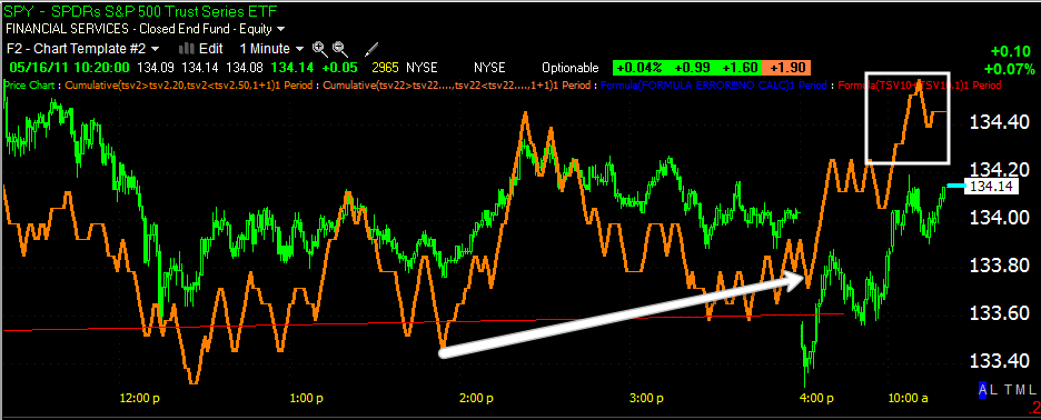
SPY Update

 The SPY broke below the lower trendline, an obvious stop level.

This looked very much like an intentional move. As I pointed out in my last market post, there seems to be a consistent pattern of positive divergences or accumulation at the lower trendline of this obvious price pattern.

This is the obvious price pattern and I still believe the most probable outcome will be an upside breakout from the triangle. I'd also be very wary of that breakout and suspect it will end up turning into a bull trap/false breakout.

However it can be used tactically to enter inverse or short positions that you may have your eye on.