Friday, August 26, 2011

Financials

I'm going to use several ETFs to compare financials.

FAS Financial Bull 3X
 5 mn chart shows the negative divergence off yesterday's open, as well as the accumulation of today's lows.

 The 1 min chart showing accumulation of today's lows and what looks to be a pullback, maybe a consolidation getting ready to take place in financials.

FAZ Financial Bear 3X
Here yesterday you can see support for FAZ at the support trendline, if this trendline is broken, FAZ should fall fast.


 FAZ 15 min shows to the far left a negative divergence and a head fake in the red box that made new high, then accumulation the second being at yesterday's open lower.

 The 5 min chart shows accumulation into the gap lower opening lows yesterday and a current negative divergence.

 The 1 min chart shows much the same, several negative divergences.

UYG Ultra Financials Long
 The daily chart here is pretty strong and in a leading positive divergence.

 Looking at the 1 min, it looks like FAS (Financial Bull 3x) in that there was accumulation of today's lows and it now looks ready for a consolidation or more likely a pullback.

XLF Financials ETF
 The 10 min chart shows yesterday's negative divergence on the gap up open and accumulation on the drop this morning.

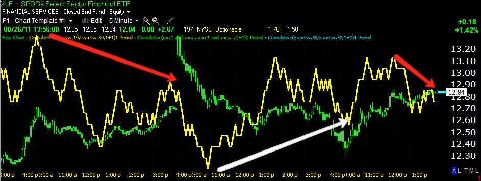
 The 5 min chart confirms all the others with a negative divergence on the gap up yesterday morning, accumulation of today's lows and a current negative divergence suggesting a pullback/consolidation.

The 1 min chart is consistent with all of the other charts, implying at least a consolidation if not a pullback.

MCRL Follow Up

MCRL was a long trade idea from 8/23
 MCRL Daly chart and resistance-there's a nice "W" shaped bottom in place.

 The daily 3C chart looks fantastic.

 The hourly chart also looks very good with a leading positive divergence. Note the negative divergence at the red arrow, see the little pre spike in the red box-that is a head fake move. The head fake forces shorts to cover, sucks in longs and ultimately adds a snowball effect to the reversal as longs are forced to sell, adding supply when their positions turn n to losses.


 The 15 min chart shows accumulation of the dip today, but also seems to indicate MCRL will pullback on more time before it is ready to breakout, hopefully we'll see strong accumulation on a pullback.

 The 10 min chart confirms the15 min chart's findings.

 As does the 5 min chart.

 And the 1 min chart.

I would think the pullback wouldn't be too deep, maybe to the support level, maybe to the 50-bar /30 min moving average. You can see volume is weak on this move higher, so it needs to gather some strength and make another attempt at the breakout, it may be a good lace to buy if you are not in the trade. Feel free to check with me to see what 3C looks like should the pullback materialize.

Energy Update

XLE
 XLE 60 min in a leading positive divergence.

 XLE 30 min shows 2 leading positive divergences.

 XLE 15 min another leading positive divergence

 Same with the 10 min, with sharp accumulation on this morning's dip.

 Same as above.

The 1 min chart is indicating either a pullback or a consolidation, I would think t is more likely to be a pullback.

GLD/SLV addendum

I wanted to add these charts...
 Also keep an eye on the 50 bar simple moving average on a 5 min chart, with GLD, the signals have been quite clean for reversals.

With SLV, there's been a break and then a false move followed by a reversal, you can see currently we've already had a couple of breaks, so be careful with SLV here.

GLD/SLV Update

So far both PMs are progressing just like a normal mini-cycle 1) accumulation 2) mark up 3) distribution and finally 4) decline. This is the cycle almost all stocks and indexes go through on a micro and macro basis, 3C has done a good job of pointing out the different cycles as we have progressed and the 3C signals are exactly what I expected them to be, even several days ago.


GLD
 GLD 1 min chart showing negative divergences, but a bit bouncy in this area as I'd expect. Accumulation and distribution are often in to flat trading zones and there are often last minute head fakes.

 The 2 min chart is a bit more clear. Remember I said distribution would start on the 1 min chart and then flow to the longer term charts as it gets more serious.

 The 5 min chart clearly shows the trends in accumulation/distribution and the following reversals, so we have 5 min negative divergences that are pretty solid.

 The 15 min chart is where we really look for them to show up because once they hit the 15 min chart, then we are very close to a reversal.

This is what I would expect based on countless experiences. We are starting to see the flat trading range of distribution, however, one of our best timing signals is that of the head fake, a move above this zone of lateral trade, when prices enter the lateral zone trade again, the move is almost certainly over with and we can look for the downside movement to begin. We don't always get the head fake, but probably 85% of the time, so if you are holding, make sure to set alerts and be on top of the trade.


 SLV looks largely the same, the 1 min chart is getting a bit scattered now, but its negative divergence have travelled in to the longer time frames.

 The 2 min chart shows the negative divergence, but also a recent positive divergence. I drew in the box for the trading range, watch for a break above the range as a signal of the final move before a move down, just like GLD.

 The 5 min chart again is very clear.

 The 15 min chart went negative, but is now signaling the possibility of the head fake coming soon. If you are long either SLV/GLD and the head fake comes, feel free to email me to confirm the negative divergence on the move up.

 The 30 min chart is flat, it doesn't suggest any more real upside.

Here's the SLV range and the most probable outcome with price moving out of the range on a head fake and then down in to stage 4 decline.


ATrade Idea APKT (long)

 This is the daily chart, notice the lateral trend, this is where we most often see accumulation-volume is correct as well.

 The daly 3C shows a nice positive relative divergence at the first arrow and another at the second arrow.

 The hourly chart shows a nice positive relative divergence as well as the more powerful leading positive divergence on an important timeframe.

 The influential 15 min hart shows a leading positive divergence as well as the distribution that turned prices down.

 The 5 min chart is in a leading positive divergence

 The 1 min suggests you MIGHT get a little pullback shortly or it may just consolidate.

Here are my versions of custom Demark indicator buy and sell signals, currently on a buy signal.

I realize prie is a bit lofty today, but the stock hasn't even broken out of the lateral trend yet, so there could be much, much more upside.

PMT Follow Up

PMT was a long trade idea on Aug. 5th. I followed up with this post on August 16. I still like the idea of this trade.


 The triangle has formed nicely, volume is right for the pattern and if you didn't already try the trade, it's in a great spot right now.

 ADX has shown the downtrend to be over and is in position to start a new uptrend. The Trend Channel has a stop on the close around $16-DON'T USE A WHOLE NUMBER! Maybe give it a little more room initially, we can always add and tighten the stop. In my opinion, this makes PMT a high probability/Low risk trade.


 Look at the leading daily positive divergence!

And the 5 min hart looks like PMT is prepping for a run higher. There should be at least a move up to the $18-$18.50 area as a first stop.

While we are on the subject of real estate, we might as well cover SRS, one of my favorite long time long trades. Here was the stop that should have taken you out of SRS near the top for a 50+% gain.  And... Here s the LONG Trade idea at $13.77 on 7/27

 SRS daily positive divergence-this has been a long time favorite, we entered the trade at $13.77 and got out above $20.

 Here are some of the signals telling us to get out-the 30 min 3C chart

 Here's the more current action on the 15 min chart.

 The 5 min chart

And today's negative divergence on the 1 min chart. I feel SRS will pullback, but is yet to meet even a 1/3 of it's long term potential.