Monday, August 29, 2011

Energy to fall a bit because of strengthening dollar in the short run


XLE Energy ETF
 60 min chart is very bullish with a leading positive divergence, this is the longer term picture, not the day to day or intraday picture as it is a 60 min chart.

 XLE 30 min shows confirmation of the leading positive divergence in the chart above, this is bullish for energy in the days and weeks to come.

 XLE 15 min chart shows an actual leading positive divergence, but within that there are some negative relative divergences, meaning in the shorter term, there's going to be some bumpy ups and downs.

 XLE 5 min shows confirmation of this morning's move and still a slight positive leading divergence, so there's still some lingering short term strength there.

 The 1 min XLE chart shows a negative divergence right now, suggesting that Energy will shortly see some downside intraday and possibly over the next couple of days.

USO US Oil Fund
 This is the hourly chart, a bit different then XLE as it is specifically the US oil fund, but part of energy. Here too we have a leading positive divergence for the bigger picture, but some negative relative divergences within that, suggesting some possible downside shortly.

 The 30 min chart confirms the downside finding in a negative divergence on the day today.

 The USO 15 min chart finds the same, so I'd expect a pullback to begin soon.

 The 10 min USO chart is in agreement. USO looks a bit worse then the broader energy industry, I believe tht is because it has more specific correlation with the $USD.

 The 1 min chart is simply in line right now, not implying strength or weakness. I expect this to change shortly.

Some of you wanted to see the leveraged ETFs in Energy specifically, here is ERY Energy Bear
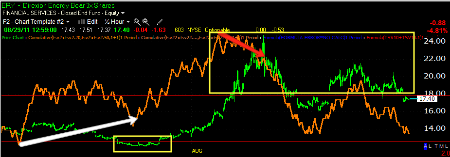
 As you can see there was a channel it was trading in, it seems it's seen several head fakes and this most recent pop above the channel may be a head fake, it does fit well with my longer term theory on the markets, should ERY fall back in the channel for a period of time and accumulate more. However, this is the daily view, there's a lot of intraday and daily action not represented here and today's drop in the channel itself may be considered a head fake of sorts for the short to intermediate term over the next few days.


 Here's the daily ERY showing substantial accumulation in to a flat trading range. Remember what I said about the dollar last night and how it appears to be putting in a larger base, that fits well with my theory on the market- a trip up to set up the second shoe to fall. That's a theory right now and subject to change, but it's what I expect based on the charts now. The two yellow squares represent head fakes, the downside head fake out of the channel was the last thing that happened during accumulation before ERY took off.

 The hourly chart shows the same downside head fake and more or less in line 3C/price action.

 The 30 min chart shows the downside head fake and what appears to be an upside head fake in ths rally above the channel-again this fits well with my intermediate trend theory.

 The 15 min chart just shows some more detail of 3C action.

 The 5 min chart shows the break lower from Friday's distribution leading to today's break back in to the trading range.

 As I would expect, as I said above, today's dip in itself appears to be a short term head fake, we see some 5 min accumulation as I would expect.

ERX Energy Bull ETF
 The hourly chart shows distribution sending ERX lower and accumulation and a longer term positive divergence.

 The 30 min chart has more detail, but has the same findings.

 So does the 15 min chart...

 The 10 min chart shows today as in line only, no really bearish or bullish bias, this is kind of like the tide line.

 The 5 min chart is similar.


 Back to USO 5 min, this is showing the negative divergence on the shorter term side of the "Tide Line"

 ERX 1 min also shows the same.

UUP-Prxy for the $USD Index
 Note the strength today in UUP which suggests upside in UUP, which would put short term pressure on Oil specifically and Energy more broadly, also some pressure on equities.

 The 5 min chart is showing the same strength toward a rising dollar over today and possibly the next few days-remember, I have always expected a false break or head fake to the downside in the market and don't forget the triangle's I showed you last night, it wouldn't take much to get there.

 UUP is also showing signs of positive accumulation n the dollar-this is still somewhat short term, perhaps a day to a few days.

FXE-Euro Trust
 In confirmation, the Euro is showing distribution, meaning a higher dollar is likely. I like to get as many pieces of the puzzle confirming the same thing.


 FXE 5 min in confirmation of UUP and a stronger dollar over the short term-intraday to several days

As well as the 10 min chart.

As I warned about equities in the last post, I think the strengthening dollar has something to do with this as well as the likelihood of energy prices falling a bit on a stronger dollar, I expected a downside head fake over the short term (days) so this could be it, we still have longer term (week/s) that look very strong in equities and energy. This would provide the upside catalyst in the intermediate term and allow the dollar to accumulate more in the intermediate / longer term for the second shoe event which I think will see the markets drop substantially as I pointed out last night.

Market Update

It seems the last update was correct in some intraday strength building, but watch out for a pullback, in some places the market is getting a little parabolic and 3C is suggesting a rest, either a pullback or consolidation-I'd think a pullback given the gains thus far.

Recent 3C 1 min charts of the majors.


 DIA 1 min

 IWM 1 min

 QQQ 1 min

SPY 1 min

SLV Update

You can use the same link in the GLD post below for SLV and Friday's warnings.

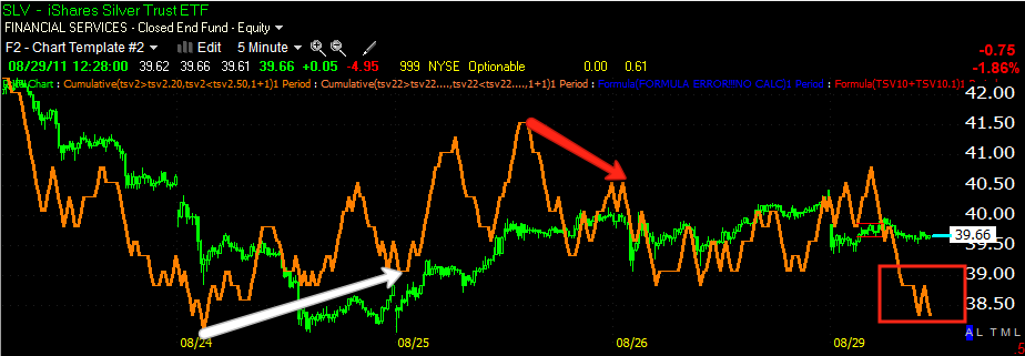
 SLV 1 min (click on the charts to enlarge) The green arrows show confirmation, the red arrows distribution, look at the flat range bound market with distribution, this a common feature in both accumulation and distribution. There was some early strength in SLV today intraday just like GLD, which faded into mid morning.

 Here's a closer view on today's 1 min SLV chart. You can see the early accumulation to try to fill the gap, the fade of that around 11 a.m. and some recent small patch of accumulation with a slight leading positive divergence, remember this is intraday moves, so like GLD, I expect there to be some choppiness and maybe an attempt at a higher intraday high.

 The 5 min hart shows the entire move from when I first pointed out accumulation and some of you traded this very well with options making over 100%, the distribution is evident and the longer term perspective shows a leading negative divergence, so while today may be choppy, it appears SLV will be heading down as for the bigger intraday picture and over the next day or so from this chart.

 The 10 min chart shows the longer trend of SLV from turning down, to a slight bounce that we just went through which is normal in any downrtrend or even uptrend (pullback).

Here's a look at the bigger picture with SLV heading down, then up, then the head fake I warned about in the yellow box, to the reversal back down and a small counter-trend bounce which s what we are just completing. This chart would suggest that SLV has more downside as far as the bigger picture.

GLD Update

This is why I was warning about GLD not only the last few weeks, but Friday specifically.

Head Fake Alert Warning since the head fake is the last thing usually to occur when we transition from distribution to a reversal, this post was sent out Friday followed by...

Warning 2

 Here's the moving average that I said usually shows a reversal in GLD, clearly it was taken out this morning.

 This 5 min chart gives a more specific area of where accumulation started, since it wasn't a huge position the White box is about the area of accumulation and the white trendline is probably a decent idea of the average accumulated price. As you can see, they will always lift prices above their accumulated average before starting to distribute, the triangle that formed was a perfect head fake as it told traders that GLD was going higher, giving Wall Street demand to sell in to or even go short. However, distribution was clearly evident, between the distribution and the head fake, it was time to take some profits as I said in my second post about "Pigs get slaughtered". I hope this is a good example for you of how Wall Street really operates.


 The 1 min chart confirmed the gap down, there was some early accumulation to try to fill the gap which faded, on this chart 3C is running ahead of price a bit so there's a slightly bullish intraday bias.

 The 2 min chart confirmed the gap down, showed the same early accumulation and right now is in a leading negative position, so I expect a little choppiness in GLD in the near term.

 The 5 min hart shows the triangle that sets up the head fake-technical traders just won't learn, furthermore the gap don is confirmed and we have a negative leading divergence suggesting after and through the choppiness, the path of least resistance is still down.

As you can see, the important 15 min chart has a relative negative divergences, the two yellow areas are the comparison points between 3C and price. In short, I expect some choppiness, maybe an attempt to make a new intraday high, but over the longer run, it looks like this will end up being a reversal of the short bounce up. Note there wasn't a lot of accumulation to start this move so we wouldn't expect a very big move up.


Market Update

 In just about all of the 1 min harts we have consistent confirmation of the move higher, I guess there was something to the last minute Friday accumulation.

 DIA 15 mn still needs improvement, it's lagging a bit here, but it can take some time for this chart to move.

 QQQ 1 min shows again perfect confirmation of the gap up and then some weakness into mid morning, it looks like a little strength is trying to build in now, that will have to be watched for confirmation, not bad though with all of the bad eco reports so far.

 The QQQ 5 min  even showed confirmation right on the open, then a little mid morning weakness and now it too is trying to improve a bit.

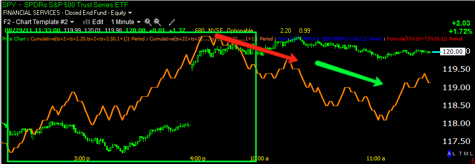
 The SPY 1 min shows the same, great early confirmation, mid morning distribution and right now it's trading about in line with price.

The 10 min chart, amazingly even showed opening confirmation of the gap up and is looking rather strong right now.  I think we are going to get some more clarity as I mentioned last night.

Just BACK in-or out (pun intended)

Forgive my absence, I usually schedule mr Dr.'s appointments before market hours, but it seems I really did a number on my back this month so it ran a bit longer then expected.

I have some catching up to do, but so far we've had a pretty bad news day and the market is still taking each hit in stride, it seems something in my commentary last night may have been right on.

As for GLD, this is why I was warning over it last Friday.

Up next is your market update.

Busy Week Ahead