Wednesday, May 28, 2014

Leading Indicators and Reversal Candles

Last Friday, I expected we'd see some kind of move above the range because it's so large, so obvious and I suspected we'd see something like the last candlestick reversal that was a failed breakout above the range...From last Friday, A Few Broken Levers

"In any case, the candlestick pattern (and I'm forecasting this based on the condition of the charts and levers available) would look like the chart posted already,...

That's a common candlestick reversal pattern."

A few variations on the pattern included a Shooting Star, A Hanging Man, an Evening Star, or some kind of Star/Doji (bearish reversal candlestick patterns).

we're not at the close yet, but we have quite a few of these candlestick patterns mentioned Friday as probable candlesticks showing up early this week (considering the holiday).

 The DIA put in a Doji Star yesterday and a Hanging Man thus far today on increasing volume which makes the reversal patterns that much more effective if volume is higher than the preceding day.

 The NASDAQ Composite has a Doji inside yesterday's candle, an inside day or a Harami Reversal thus far.

The QQQ has something similar, volume is still a bit low.

The IWM also has a Hanging man-type candle inside yesterday's body, a Harami or inside day.

And the SPX has a hanging man reversal candle thus far on the daily chart today.

As far as leading indicators, I'll have to get the more liquid version of HY Credit after the close, but High Yield below...

Continues to deteriorate vs the SPx.

 Bonds continue to rally despite the 180 degree correlation vs the SPX as you see TLT doing here.

VIX continues to be strong despite the market with another (at least the 3rd in a row) green day thus far.

 This is VIX vs SPY with SPY prices inverted so you can see the correlation that would normally exist, VIX is way outperforming the correlation.

Pro Sentiment has falen off the chart vs SPX, they aren't chasing, in fact the opposite.

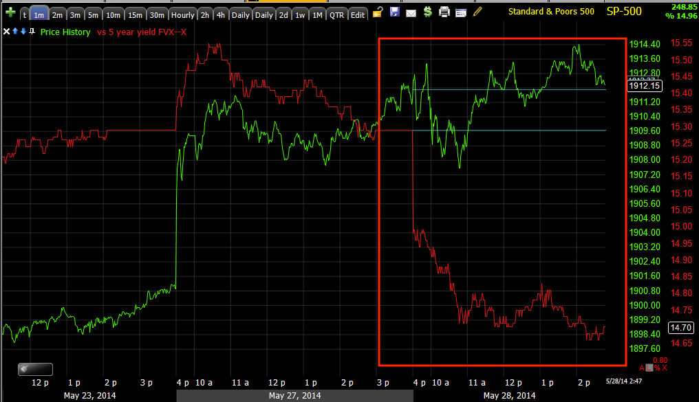
 Yields continue to lead the market in a downward/bearish dislocation.

The longer term Yields look like...
This which is a fairly large top-type dislocation as this is one of my favorite Leading Indicators.

We'll see how volume closes, the higher the better. The 3rd candle in a candlestick reversal pattern would be a bearish candle tomorrow, like an engulfing.


NFLX Update

I'd say for my purposes 8 years or so ago, I'd have entered NFLX short with a wide stop as I prefer to give all new positions some extra room, especially if they are in a top or a bottom, however since then we've been able to fine tune things a bit more.

Yesterday NFLX popped up on the radar as a position that was just about ready and there were a few things I still wanted to see, thus this post from yesterday, NFLX Trade Set-up which isn't a trading idea, for immediate action, but a rough sketch of what we want to see for this to become a trade idea that is actionable. One of the things we were looking for yesterday was a return of NFLX to the $400 area, it's a strong psychological magnet and beyond that, it had been broken and as is the case with most support or strong psychological areas, there's typically a short period of loitering in the area just like we had talked about last week for USD/JPY after it broke two major support areas and it has been loitering in the area since then, although as you may have seen earlier today vs SPX futures, it looks like it's rolling over now and the Yen and $USDX futures support that probability, which isn't good news for the broad market, but even more specifically for individual assets like NFLX as they draft the market being it's the strongest directional force that influences them.

Later yesterday we started to get that move up toward the $400 area where I set multiple alerts, today we are clear above it and in the general area.

Here are a couple of charts with a bit more detail as to the bigger picture in NFLX as well as today's update.


 On a longer term daily NFLX chart, the proportions of a large primary cycle are nearly perfect from the base at Stage 1 and its rounding bottom (note these are the same stages and price patterns we see on 60 min charts, 5-day charts or 5 min charts. Stage 2 is the easy money stage, mark up, thus if you know where you are in the stages, you know what's coming next. 

Stage 3 looks like a H&S top of proportional size for the cycle that started in 2012. The approximate price pattern implied target is about $200, depending on how you draw the H&S top's neckline, it could be as low as $150 and these targets are more often than not, overshot just as the pendulum swings too far on the upside, it often swings too far on the downside, but this is a longer term target, not something I'd expect to see in a month.

With H&S tops, we would be at the top of the right shoulder which is the second place I'll short them, the top of the head being the first and favorite place and after a break below the neckline, a volatility shakeout that takes out all new shorts who came in on the break of the neckline being the 3rd and last place I'll short them so there are likely other opportunities in NFLX, but even a -75 -125 point move to break the neckline is a worthwhile trade or a longer term core/position trade entry.

 I added my custom cumulative volume indicator, you always want to confirm H&S tops and bottoms with volume. The rallies should see diminishing volume (red), the declines should see advancing volume (white) and that trend should be clear by the time the head is being formed and continue through the right shoulder as it has done so far.

 The daily chart shows the 3C divergences of the stages, accumulation at #1, in line at #2, distribution in to #3 and #4 is decline which would start to come off the top of the right shoulder and through the neckline. This is the easy money like stage 2 is the easy money, although stage 4 often occurs much faster than stage 22 making it extra fun and profitable to trade as fear is stronger than greed.

 The intermediate charts like this 10 min are negative and getting worse in to the top of the right shoulder.

The 15 min chart

The 30 min chart

And the main underlying trend, only eclipsed by the daily 3C chart above,
 The 4 hour chart giving excellent confirmation for a H&S top.

This is the 3 min chart from yesterday, you can see where we saw some light accumulation and this is why I set price alerts in the area above $400.

I'd like to see a little more damage in the 1-5 minute charts, but all in all this is still a decent looking area to consider starting to phase in to a position.


Trade Idea: NUGT (Long)

I've had a partial position in NUGT long and waiting to fill it out as it went through a reversal process under the trading range that lasted from aprox. the end of March to just about the last week or so.

For many of the same reasons, I'm going to go ahead and finally bring that NUGT long up to a full size equity long position.

I'll have some charts out soon.

Trade Idea: GLD (Long)

I'm going to go with the GLD July (standard) $120 Calls as I'm not crazy about the choices in leveraged gold ETS, but GLd long would be an interesting choice as well. The reason for the July expiration which I admit is pretty long is there's really not that much time until the June expiration and I prefer to have some time.

If GLD looks interesting, that means the market will also be interesting as there has been an inverse relationship between the two and GDX and NUGT are interesting as they have a near exact correlation with GLD.

For now I'm going to go with a half size position just because I'm not sure how much larger the reversal process "might" be in what looks to be a perfect head fake move and candidate for one as you'll see all these things on the charts below.

 This is a daily chart of GLD (green) vs SPY (red), you can see that since March, there has been an inverse relationship between the two, this use to be there, but generally only on minor swing moves while the trend would generally move in the same direction, now the correlation is much more inverse (opposite) than it has ever been, I suspect this has something to do with the continuing taper of QE.

 These are the same two assets (GLD and SPY) on a 60 min chart, also showing a VERY inverse relationship. Given what near term expectations are for the market to come down as the momentum from the bear flag / Crazy Ivan sling shot (short squeeze) wanes.

Note GLD has had a near perfect area of support that is very well defined, a break of this support or a head fake move is one of several things I've been waiting on, you'll see below why Gold/GLD hasn't been very interesting for several months as a trading vehicle.

This nearly 2 month range has been a chop-fest and really not worth the risk to try to capture a couple of points or percent at best, but with yesterday's break under the range and stops clearly hit/shorts coming in as volume surged, and with today's smaller bodied candle, GLD is looking much more interesting.

 This is the intraday chart (1 min) of GLD since breaking below 2 month support and the range, there's a strong leading positive divergence, my only doubt right now is how large it might be, thus the half size position for now, plus I have to consider the tight correlation between GLD and the already half size position in place, NUGT. I'd prefer to treat both as 1 trade for risk management purposes due to the high level of correlation which you'll see below.

If you are not interested in options as GLD has a lot of leveraged ETFs, but really none with decent volume, you might consider NUGT (3x long gold miners) as an alternative play as there's excellent volume there, it's an ETF/Equity position and gives you 3x leverage.


 This is the 2 min chart seeing a positive divegrence or migration of the divergence since the stops were hit and shorts entered on the volume surge yesterday. This doesn't look like the typical market maker/specialist take up that comes with market orders that can't be matched, this looks like a confirmed head fake move or one being confirmed.

 We have migration from yesterday and today moving to the 5 min chart already as well.

The 15 min chart shows the negative divegrence back in March sending GLD lower and in to a range, there wasn't much going on at first and as the range developed, I wouldn't consider it a long until there was a head fake move as this range and support are VERY obvious.

However about mid-way through the range you can see a positive divegrence picking up, this is about in line with the action in Gold Miners/GDX/NUGT as they too had a range that saw a false breakout/head fake that sent price below the range where it started showing strong positive divergences.

The 15 min chart is in leading positive position already.

 Even the hourly chart shows positive divergences starting at about the same area within the range.

 This looks like a decent reversal process underway and with the inverse relationship with the market and all that is going on there between Treasuries, Credit and VIX, I can't imagine probabilities are very high for a large reversal process here, especially as the 15 through 60 min charts are already leading, this looks to me like a quick move to grab shares on the cheap by hitting the stops piled up under clear support.

This is the GLD (green) vs GDX (red) correlation, we saw the same kind of move in GDX which is something we talked about looking for last week and we got it the first trading day of the new week.

I'm going to go ahead and enter the 1/2 size Call position, July (standard monthly) GLD $120. As I said, because the Gold leveraged ETFs have such poor volume and because GDX/NUGT have such a tight correlation, NUGT might be a good alternative choice if you prefer some leverage, but would rather not deal with options, otherwise a straight GLD long could also be considered.

NFLX is on the radar....

Yesterday's NFLX Set up and alerts, NFLX Trade Set-up

And yesterday's move toward the set up...There's the set-up starting in NFLX

I'll let you know when it looks like an entry, this one looks like it will set up a put position for those who prefer trading options, but I also really like the longer term equity short.

Early Indications / Concepts

There are 2 conceptual ideas that I mention all of the time, but rarely have followed up to show you what the concepts actually look like.

In yesterday's early Broad Market Update I showed 2 charts that were boxing in the market in a negative way, the roof which limits how far price can carry and that was represented by the SPY 15 min chart, which has been in effect since and well before the momentum caused by the Crazy Ivan slingshotting off the previous week's bear flag, which is what we expected, a downside break to suck in shorts and an upside move to cause them to cover in a squeeze which would provide upside momentum, albeit limited as it's really nothing more than a tactical strategy of using Technical Analysis concepts that retail traders follow and using it against them, there's no real demand or fundamental reason for the market to move unless you consider a short squeeze something sustainable and bullish for the market on a longer term basis, I call it smoke and mirrors. 

The 15 min chart from that post yesterday morning looked like this.
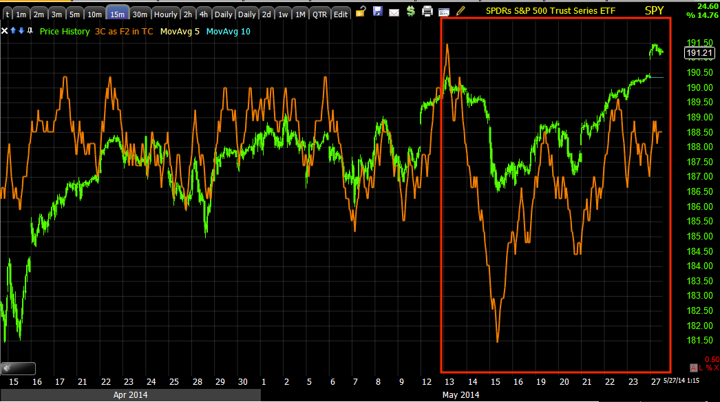
 This is the trend view of the 15 min chart deteriorating deeply as the range persisted or what many would call a multi-month , large top.

For the purposes of the bear flag sling shot momentum, this is the negative 15 min chart that acts as a roof or a wall as it is leading negative and there's really no accumulation, just short squeeze momentum.  Imagine this chart to be a wall.

The 3 min chart is the one that has negative migration, meaning as price has moved up off the Crazy Ivan sling shot around the bear flag, there has been a steady flow of distribution in to the move, as this gets stronger it moves to longer term timeframes.
3 min with a small positive at the bear flag which is why we knew it would be used against traders rather than resolve to the downside out of the flag as Technical Analysis teaches. The Crazy Ivan concept we had no proof of, it just made the most sense to effect the strongest short squeeze, you have to trap some shorts by creating a break under the flag which was at #1 and the break under at #2, the distribution in to higher prices occurred last week and in to this week at #3.

As of yesterday morning, the only two charts that needed to see migration to link the divergences and create a rock (the 3 min chart turning more and more negative) and a hard place (the immovable 15 min chart's wall) were the 5 and 10 min charts which looked like this yesterday morning in the post linked above....
 5 min chart in line since the bear flag/trap...

10 min chart in line since the same...

As of this morning, both have locked in their divergences as the 3 min chart has migrated to both the 5 and 10 min charts which now look like this...

 5 min has locked in a negative divegrence with 3C's downside pivot.

10 min chart has locked in a negative divegrence.

As I explained the scenario above in yesterday's post, Broad Market Update

"The SPY 10-min. I think as the 3 min chart continues to deteriorate, the 5 and 10 will see migration and that's essentially the key to timing."

The other concept is that of 3C picking up where it left off.

In yesterday afternoon's post, A FEW EOD Charts... I had said,

"First, here's how we ended the day, typically the market will pick back up the next day where 3C left off...

There were varying degrees of negative divegrences in the averages, interestingly quite a few picked up in to the close where VIX was used to lift the market even though spot VIIX closed green today, up 1.76%"

You can click the link and see the first 4 charts and see what the charts looked like for the major averages at the EOD...all negative in to the close and here's how we picked up from those divergences at the close yesterday (which is a concept that holds up over weekends and even holiday weekends on the 3C charts of the averages and equities...
 DIA 1 min

IWM 1 min

QQQ 1 min

SPY 1 min


A.M. Update

The market continues its, "Irrational Behaviour", we can't even call it exuberance as Alan G. once did although there is that element as well.

As we have been seeing with increasing intensity (as addresses in some detail yesterday), the market saw ES print a fresh record high overnight/this morning while at the same time the 10-year yield hit a fresh low of 2.49% as treasuries continue to rally. German Bunds are rallying, even while a 30 year bund auction today was technically uncovered and EVEN SPAIN is seeing their bonds hit record low yields of 2.87%- remember yields move opposite the price of bonds/treasuries.

In Germany's case, unemployment rose for the first time in six months. In Spain's case, loan creation has fallen off severely.

It's not just the Flight to Safety bonds though, Credit is not playing along as was shown both last week and yesterday and VIX is not playing along as we first got strong signals of 3C buying last week followed by VIX's refusal to move any lower, now it has been green 2-days in a row.

It seems like something has to give as this is a very bizzare market, but we have often seen this behaviour for short periods right at transitions in the market, we may be seeing one now as expected.

Just after ES printed a record high this morning, the Yen/$USD divergences seem to have kicked in and USD/JPY has taken a pretty big spill in pre-market, this has pulled ES futures off record highs and below yesterday's 4 p.m. print, or right about at it.

The ES v USD/JPY correlation is off again after reverting back to the mean earlier and USD/JPY looks to be rolling over after its period of loitering after breaking 2 strong support areas last week, looks to finally be ending.
ES dislocated positively although it followed USD/JPY on a 1 min chart nearly exactly.

Something has to give and with Index Futures negative across the Spectrum on timeframes and USD/JPY components negative across the timeframes, it looks to be a pretty easy guess as to which direction they resolve. Note the rounding USD/JPY.


Tuesday, May 27, 2014

A FEW EOD Charts...

You saw a lot of these already earlier, Leading Indicators was an enlightening look at the multiple dichotomies in the market such as bonds and stocks moving together or VIX and stocks, or USD/JPY failing stocks when it was the last of the levers.

First, here's how we ended the day, typically the market will pick back up the next day where 3C left off...

There were varying degrees of negative divegrences in the averages, interestingly quite a few picked up in to the close where VIX was used to lift the market even though spot VIIX closed green today, up 1.76%
 DIA worse in to the close

IWM worse in to the close

QQQ worse in to the close

And SPY worse in to the close.

As for VIX...
 SPY intraday in green vs VIX intraday in red, VIX closed green on the day despite the market gapping and closing up, only at the EOD did VIX get a little monkey hammered which seems to be the only thing that sent it higher.

TLT in red vs the SPY is moving opposite of what is the norm, it's a Risk on and risk off trade at the same time or as I suspect as we closed TBT (TLT 2x short) last week, money is flowing from equities from the bear flag boomerang momentum as it loses what momentum the bear trap and Crazy Ivan could create and flowing in to the safety not only on Treasuries, but VIX as well.

The USD/JPY surely wasn't supporting the market in to the close as it was the last lever left as of Friday.
USD/JPY 1 min (red/green) vs ES (SPX futures in purple). Every time we've seen a dislocation of ES/SPX futures from the USD/JPY correlation, ES has been brought right back to the correlation which would mean downside and the other issue is USD/JPY looks like it has about had it as it has been loitering after a severe break of several forms of support last week.

 $USDX was in better shape this morning, but by the EOD, it was negatively divergent on multiple timeframes which isn't good for USD/JPY.

 And the long end of $USD/JPY where probabilities are at 60 min, leading negative.

The Yen for its part is leading positive so if USD/JPY loses even more ground as its loitering period ends, that's even more dislocation for ES to revert down to.

Credit as you saw in the Leading Indicators post had given out, I mentioned I'd get a chart of the liquid High Yield Credit, a smart money risk on asset...

Just like HYG and DHY, High Yield Credit didn't trust the market to move any higher today as we saw last week as well.

I believe the momentum that was scraped together last week was largely from a bear flag and a large head fake based on a Crazy Ivan used for short squeeze momentum, I think that's about used up, the week before last was the set up that we had pretty much nailed as far as forecasting, last week was the move, this week seems to be the resolution of the move.

The way I had imagined a possible resolution Friday was a bearish reversal candlestick pattern, the DIA is a good example of what I'd be looking for and I also put out the SPY 5/10 min chart negative divegrence resolution (Broad Market Updatethat I believe will lead to excellent timing as we saw set ups already starting to form in assets like NFLX, NFLX Trade Set-up


This would be an Evening Star Doji, similar to the last failed breakout, the only thing missing was broad market confirmation and volume, but these often show up in pairs or several which are often called "Spinning tops", I believe increasing volume on one of these days with a bearish reversal will be a key element.

So I intend to keep looking for assets that are looking like excellent set ups like NFLX out today or FXI also out both Friday and today, FXI / FXP Trade Set-up.

Ultimately the watchlist will really tell the story, a few more set ups like NFLX and you really don't need to see much more.

This also gives the head fake move I thought we'd see as we see it on 80% of all reversals right down to intraday, so how much more on a large multi-month range/top?
In this case it's not just a range bound head fake breakout, but an ascending (bullish technical analysis price pattern that traders buy on the breakout like today (yellow) that sets up a real bull trap or the entire reason for a head fake move just as the bear flag set up the upside momentum, the bull trap sets us the downside momentum,

However what's really screaming "Something is not right", is the divergence in credit, the rally of the "Flight to Safety" bond trade, the VIX ignoring the market and moving with it rather than against it, Yields dislocating negatively and of course, "CREDIT".