Wednesday, September 10, 2014

XLF / FAZ Update Filling out Position

If you saw last night's post, XLF was referenced as a bellwether for the August rally way back in early August, actually I had been waiting for this positioning before we even knew about the August cycle or start of a base on 8/1.

Last night I put in the actual posts showing where I was expecting XLF to move to and essentially with that, where I expected the August cycle/rally to top out at.

This is what it looked like more or less...
 While XLF was in the range, I had been waiting to fill out a partial FAZ long (3x short Financials) on a break above the range. As XLF broke below the range I did not add to FAZ as the resistance/upper range was just too juicy not to be hit, this was also around the time we started getting breadth oversold readings and initial positive divergences for the first week of August which was the base that fueled this entire move so as posted well over a month ago and reposted last night, a move ABOVE the range in XLF was a kind of bellwether for the general market target and where I've wanted to add to FAZ and fill out what is essentially the core of my short position, not to say other stocks won't come up or perhaps even better positioning in FAZ won't come up, but this is what I was looking for, the reversal process has been sufficient in time and breadth is breaking. I don't need to temp fate any longer over a couple percent here or there when I really need to get the core of my short position completed which is what filling out FAZ long will do.

This si also a good example of how a head fake move creates the momentum to do what XLF could not do in the range, a Crazy Ivan on a larger scale around the rectangle range.

 The longer term 4 hour XLF chart is a clear strategic reason of why I want exposure in financials on the short side.

Closer to home within the reversal process area, the 15 min chart has seen sharp deterioration and in the past, this is the kind of chart I would not ignore.

Since the early August base area for the broad market, you can see the intraday 3 min trend from accumulation to distribution in to higher prices/demand.

The 2 min chart shows the same.

On a very short term basis...
 The 1 min chart has been leading negative and I don't see any kind of positive divegrence that should cause me to wait on adding the rest of the FAZ position, in fact, it's the opposite.

 FAZ on the other hand, 3x short financials (long), has a beautiful 15 min chart showing where the August base formed with a negative divegrence, but not a very big one and what has happened since entering stage 3 for XLF, stage 1 for FAZ.

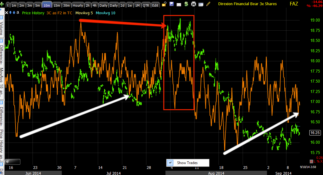
 On a more detailed 10 min chart FAZ saw accumulation, a move higher which I suspect was knocked down to accumulate at lower prices / or allow XLF to be sold at higher prices and the recent positive divegrence in to the lower prices as I would expect to see for confirmation.

 I didn't draw on the 5 min chart because I wanted you to be able to pick out the divergence rends yourself, although I did add some hints on the time axis.

Again short term, like XLF, I see no reason not to add to FAZ right now.

I can't say as no one can, that this is the very best entry, but I can say this is the entry that I've waited for patiently for months. I can't ask for much more than that.

I'll be filling out FAZ which puts the core of my short position back in place.


GDX/GLD Update & Surprisingly, TLT

For now I'm going to try to keep this brief as GLD and GDX recently, have been some of the most difficult assets to get good confirmation in as it seems correlations are shifting all over the place, especially the $USD which I have suspected for about 2 weeks is reverting back to its historical legacy Arb. correlation, not seen since the Bernanke put/QE and the carry trades which cause a rising $USD to be bullish, although that recently changed as well, last week and definitely this week as seen in numerous posts including this morning's, A.M. Update.

I've had (and still do) an expected shorter term swing NUGT trade open as a hedge against a longer term GDX pullback that has been expected since the day we closed out out NUGT long at a +40 and +50% gain as it broke out of GDX's base, but with poor signals on July 9th. It seems the DUST position is now hedging the NUGT position.

From July 30th, 

On July 30th, I was looking at a small speculative call position in GDX, Trade Idea (Speculative Very Short Term) GDX Calls, while leaving the longer term GDX pullback trade in place, DUST. GDX had been expected since early July to pullback leading to the July 18th, Trade Idea: (Swing Trade) DUST Long which is still open. 

Below is an excerpt from the July 30th, Trade Idea (Speculative Very Short Term) GDX Calls

"This is the DUST position entered for a GDX pullback, I'll leave that in place..."


The DUST (3x short Gold Miners) position is still in place currently looking like this as it was never closed.


Here are some of the most recent charts that suggest something may be going on with Gold, GDX and of course NUGT and DUST as a result. I'm not ready to take action on anything yet, although I'm close to considering closing the DUST long if we get continued signals and better confirmation. I'll likely break out the old miners trading system and see if there are any good correlations, strong signals from the past and see if there's anything showing up now as this was written before the $USD correlation changed with the carry trades which is why I put the system away for a while as the Cary trades dominated.

As for Gold...
 Gold futures are showing positive divergences starting up, this is actually a 60 min chart so it's a pretty strong signal, however it does look like it needs more of a "U" shaped reversal process rather than a "V" shape which it would have on any upside right now.

 This is the Legacy Arbitrage correlation between Gold futures (candlesticks) and the $USD, a correlation we haven't seen as a dependable on in years.

 There have been some signals in $USDX that have been negative divergences and this 5 min chart is one of a few, possibly sending the $USD lower.

This is where it gets confusing, AS YOU MAY RECALL I'VE LONG SAID, "WHOEVER FIGURES OUT THE NEW MARKET DYNAMICS, WINS"  as I believe there are huge opportunities no one alive has seen or huge trouble if you are not on the right side of the market.

We are already seeing those dynamics change and they are changing fast as the F_E_D keeps changing multi-year guidance in a bat of an eye in market terms, such as holding assets bought in QE through maturity which has been the message for years to shirking the balance sheet which is a new development.

The reason TLT is in this post is because as I showed multiple times and again as recently as this morning in the A.M. Update, the new correlation replacing USD/JPY and ES seems to be USD/JPY and yields. Remember yields move opposite treasuries. So yesterday I saw some initial signs that TLT's pullback may be ending which would mean yields would fall in the long end, IF THE USD/JPY CORRELATION HELD, THEN EXPECT THE USD TO ALSO LOSE GROUND.

IF THE NEW LEGACY ARB. CORRELATION HOLDS, THAT WOULD SEND GOLD, OIL, AND $USD DENOMINATED ASSETS HIGHER. Normally I'd include stocks, but the correlation there is clearly inverse.

So TLT...
 The 15 min TLT positive divegrence continues suggesting TLT may end it's pullback that we called late last month, the 26th.

The shorter term 5 min is also leading strongly, also pointing to a probable TLT reversal of what we always expected to be a pullback correction in TLT rather than an outright reversal.

The key here is the new correlations, TLT rises and yields fall in the long end which have been correlated to USD/JPY. Which means we'd expect the $USD to lose ground. Gold has been inversely correlated with USD/JPY back to the old legacy correlation in which the two move opposite each other. These are new correlations, it's difficult to call them trends, but we can't ignore them.

The implication of all of this (assuming all correlations hold) would be gold and GDX making a move higher. This would be pretty close to in line with our original July expectations of a Gold/GDX pullback, not reversal, but pullback in which I wanted to re-enter NUGT/GDX longs. I think it's too early to take action at the moment, but here are some of the charts for GDX and the 3x leveraged long NUGT and short DUSt which often give earlier signals than GDX, presumably because of the added risk of their leverage.


 NUGT long was entered near the June lows and exited on the first breakout above the red trendline, from there we expected a pullback below the trendline which we now have and a set-up for a new NUGT long or GDX (or Gold) long position with a move much higher.

 Here's the NUGT 60 min chart showing a CLEAR positive divegrence which is where we bought NUGT long and in red is the breakout for GDX/NUGT and where we sold NUGT long/ This is the chart that caused me to believe we'd see a pullback in Gold, GDX and NUGT which I wanted to use to re-enter any of the 3 assets on a new long for a breakout move that has legs.

It seems our highest probability and original expectations have played out, although taking months longer than expected.


 NUGT's 10 min chart is showing a leading positive divegrence, I think it would still need more basing activity and stronger divergences, but this "MAY" be the longer term primary trend trade entry we were looking for since last exiting a core long position in NUGT.

 The inverse ETF, DUST (3x short GDX) is confirming on the 10 min chart with a leading negative divegrence.

 DUST 5 min is also confirming...

And NUGT's 1 min is leading positive.

There are about 8 assets we use to confirm here, the most complicated asset we trade and probably the most manipulated via gold, however when we have strong signals, they have paid well.

Just something to keep on the radar.

I may close the older DUSt trade soon and hold on to the NUGT swing position , if there are continuing signals, I'd certainly add to NUGT long.

Quick Market Update

All of the market averages which have gained today are now showing multiple negative divergences in the timeframes which allowed them to gain, the 1-3 min timeframes for today's move.

I'd expect some market downside shortly. We'll have to go from there to see what is coming next, possibly a larger base to be formed with the recent lows from yesterday/today serving as the base area or possibly moving to a new low, depending on how 3C responds during a pullback.

For AAPL longs, intraday AAPL is in the same boat, it should pullback. It still has a 5 min positive and may be able to add more, but if I could get out at a gain or something close to it as I did yesterday, I'd be looking to do so.

Quick MCP Update

Yesterday MCP was looking very ugly. The one thing I was looking for was higher volume and the next thing would have been an intraday EOD ramp to create a bullish reversal candle like a hammer.

I was very close to tapping out on MCP until the higher volumes started coming in, b the is really a concept that we saw en masse yesterday, but not just volume, the degree of oversold with 9 of 9 S&P sectors red, 17 of the 239 Morningstar groups green, horrible intraday breadth, etc. Years ago as technical traders we'd have been short and stayed short through a day like that, but Wall St. has long since (not only known everything about TA), has known that most traders are using TA since online brokers became the rage with the advent of the internet, changing Technical rules forever, although technical traders have not adapted to Wall St.'s adaptation.

Thus, heavy volume days, just like the heavy volume candlestick reversal days are about 3x more effective than a reversal candle without heavy volume, often translate in to short term 1-day oversold/overbought events which is why I track the Dominant Price/Volume Relationship that pointed to a move higher in the averages today or the S&P and Morningstar sectors, also both pointing to a 1-day or short term oversold event.

The same was true of MCP yesterday and stayed my hand from closing out the position. As much as I still believe in MCP, if it's dead money, it's not doing me any good if it can be better utilized in other places, luckily for the position, there weren't too many other places I was interested in putting funds to work yesterday.

Here's a full update for MCP because I think the longer term context or reason I like this one is important. If you are looking for the shorter term indications, especially since yesterday, see the last few charts near the bottom, but when you have time, check the rest as there's an interesting parallel.

 This is the volume action in MCP as various levels of support are broken, you see stops hit as volume rises,  it seems to me that $1.50 which would be a psychological magnet for stops was the target and that's where the heaviest volume of the day was.

I've said many times in the recent past, that with the Bernanke Put being lifted as QE is phased out, Volume Analysis which has become a lost art in a sea of new indicators, will be VERY important moving forward. You won't find too many if any bull markets like the 2009 through present with volume actually declining.  Any market advance that is healthy should see rising volume just like the 2002/2003 to 2007 bull market. Volume hasn't mattered during the F_E_D's accommodative policy term, the only thing that mattered was the size of the F_E_D's balance sheet which has a direct correlation with the SPX which should be something to take note of as the QE taper is just about done and the F_E_D which once guided that they'd hold assets UNTIL MATURITY are now openly talking in F_O_M_C minutes about SHRINKING the balance sheet. However the main point is volume will matter again more so than it does now and there are few who are versed in the subtle art of volume analysis, especially if they grew up in the market during QE.

 On a daily chart I didn't get the hammer I was hoping for yesterday, but there was the increased volume. One of the finer points of volume analysis is looking for changes in character that others miss, you aren't looking for volume that stands out like a sore thumb, everyone sees that, you are looking for increases like yesterday's which may not stand out, but is nearly twice the volume of the preceding day.

And look at today's candlestick combo, an inside day as we call it in the West or a Bullish Harami reversal (Mother with baby) as they call it in the east (Japan). This is a bullish reversal price pattern and thus far volume is good.

 I like to cross check underlying money flow indicators for confirmation, this is TSV showing the same divegrence 3C shows at the decline over the last several months,

The 3C daily shows the same which reminds me of some interesting charts that I use to use as an example when I taught Technical Analysis for the Palm Beach County School System's Adult Education program (for nearly 4 years).

 The 4 hour chart shows the same divergence in the same place.

As does the 2 hour chart.

This is where it reminds me of some interesting charts that should make you think twice about how far in advance Wall St. REALLY works as well as the inside information they have and how long it takes them to put together a position. They magically know things about the market that we won't find out for years and they prepare for them far in advance. Of course being on the F_E_D's early release list like the minutes released by the F_E_D a day and a half early to 154 major banks and private equity funds,  by EMAIL (I thought everyone got the same information at the same time...if so, why would they need email which in market terms is virtually snail mail unless you are getting information days early?). Yep, the F_E_D got caught red-handed sending out inside information which is just further proof in my view that QE was nothing more than a stealth bank bailout as the initial bailouts of companies like AIG at the start of the crisis weren't very popular with the voting public.

Here we are... it may not look like much, but it is. HOV, a home builder under accumulation on a daily chart through 2000 while the market and tech bubble were crashing around it.  
 Why accumulate the dullest asset class out there, housing? Why accumulate it during an economic downturn and looking back, why accumulate it years in advance?

To the left is HOV's accumulation zone in the red vertical trendlines, you can see what happened next and for your information that's approximately a 2500% gain in a home builder.

This raises all kinds of questions like why would boring housing lead the next bull market after the amazing advances of the Tech era? Who would have ever suspected that housing that had very small gain year over year back then , would lead the next bull market through consumer discretionary spending (the HELOC or second mortgage)?

How did Wall St. know at least a year in advance , as I recall, housing didn't really start taking off in to bubble territory until aprox. 2002-2003 with initial gains in 2001, but these didn't look too different from the short term bubbles that would build quickly, peak and pop, sustained bubbles were rare.

In reality, the economic growth/bull market from 2002/2003-2007 was largely driven by Consumer spending as equity was taken out of homes and spent on discretionary items.

In any case, it's an interesting period to study and I've spent a lot of time looking at it. MCP reminds me of this environment.


 Shorter term...

 MCP's 5 min divegrence in this area has been pretty strong.

Very short term the 3 min chart seems to have shown accumulation of numerous stop levels being hit with a VERY healthy short presence in MCP, it's primed for a short squeeze of epic proportions. Approx. 38% of the float in MCP is short, with a short ratio of nearly 12 and 45% institutional investment (strong hands),  doesn't leave a lot of room for covering.

This is the 2 min chart as of the capture about  35 mins ago,

This is the most recent capture of MCP's 2 min leading positive divegrence , remembering the daily bullish reversal candlestick set up...
2 min current as of 1:15...

Although the short squeeze here would be epic, I still suspect there's something bigger going on in MCP.

The Sub-Industry group also looks like it has hit intermediate capitulation and has the same inside day today...
Industrial Metals and Minerals Sub-Industry group with a gap down in huge volume which looks like intermediate term price capitulation on heavy volume with the same Harami as MCP today.


Full AAPL Update

We still have some short term traders in AAPL and some longer term traders in or looking to get in.

If you have time one night or weekend, go back and look at MSFT from the 1990's to 2000, it was actually a much bigger growth stock story than AAPL before AAPL hit a brick wall in 2012, one we had been warning about for several months. Of course AAPL longs were in love with the stock (Fall in love with your spouse, your children, a football team, fishing, BUT NEVER with a stock)  and anything negative was not taken well. The typical response was, "You've been warning for 2 months and AAPL is at all time new highs", then it wasn't and don't ask me why, but for whatever reason most people just don't get out of a stock like this despite the decline which ate half of AAPL's value (-45%) in 8 months, so you would have been much better getting out two months earlier, even though we weren't calling for a reversal two months earlier, just saying there was big trouble brewing, our actual reversal was near pin-point, which was a hard lesson for me as I got lost in the lines trying to get the best possible short position and closed a short on expectations of a SMALL bounce that I could re-enter, then AAPL fell apart. This is the kind of dynamic I have been talking about recently (past week or so), which is deciding at what point you strike a balance between trying to get the best entry/timing (top-tick the market) vs. at which point you say, "This is close enough, let my risk management handle any volatility from here and lets get ready for the ride".

In any case, MSFT's growth story ended not only because of the Tech bubble, but like so many other growth stocks, once the "D" word, "Dividend" is declared, the growth story ends. Then watch MSFT from about 2002 to 2011.

In any case, here's a full AAPL update...
 This is what I'd call the kind of "Crazy Ivan" shakeouts.

A Crazy Ivan is a shakeout of stops and limits, typically on both sides of a price pattern or some other technical level. I took the name from the movie "The Hunt for Red October" in which Russian Submarine captains would do a full 180 turn to "Clear the baffles" in case any subs were following in their prop wash were they couldn't be heard, it was a game of chicken that exposed any closely following submarines and that's kind of what this technical price shakeout does, clears a lot of stops and limit orders and leaves them burnt. There are a lot of reasons for this tactic, most often to use technical price patterns against traders to reach a specific goal based on the predictability of Technical traders' thinking. The high volume is a sign, whether intentional or not, that a lot of traders were shaken out of the trade wither way they were positioned.


 My Custom "DeMark" inspired Buy/Sell scan shows AAPL as a double top, a true Double top with a "U" shaped middle as they should have. The only difference is old school double tops use to often fall short of previous resistance, which was one way to know the stock was weak at the second top, however since so many technical traders expect this, it's much more common to see a new high in which traders will see as a breakout and put in a confirmation buy which sets up a bull trap so when prices start declining, retail is stuck holding the bag at much higher prices and eventually will give in, giving the short a lot of momentum on the way down at various price levels as all traders have different risk tolerances and levels of pride.

You can clearly see the indicator calling sell signals, even buy signals and a current large sell signal over the longer haul so I have little doubt AAPL is heading lower rather than continuing its growth story.


 This is a simple custom indicator I created and my MACD heat mp which is a full blown negative divegrence from settings of 6/12/9 all the way out to 52/104/9. The Channel itself is turning lateral and very close to showing a major change in character.

 The current Trend Channel's stop is at 98 on a 2-day closing candle basis, but I suspect we'll see signals before the Trend Channel hits a stop out which it came very close to within the last week.

 This is the daily AAPL 3C chart, one of the strongest indications of what's been happening in AAPL in underlying trade.

If you consider it was Dan Loeb's Third Point fund that started distribution first and then the rest of the hedge fund herd found out on a quarterly release that Third Point no longer held AAPL as a top 5 holding, all heck broke loose and all hedge funds tried to fit out the same small door at the same time sending AAPL down -45% in 8 months. It's little wonder 3C looks the way it does. Just from a psychological point of view from the perspective of a hedge fund manager going through absolute hell during the time, it's little wonder they've decided to move on and look for greener pastures  which is interesting because it was just before this that AAPL launched new products like yesterday and my opinion was, "This is the first time AAPL has had a product launch that was EVOLUTIONARY rather than REVOLUTIONARY", Steve Jobs will be missed.

 This is AAPL's 2 hour chart, we've been waiting on these longer charts to move from in line to negative being the larger daily charts are already rotten.

The 60 min chart broke first and then the multi-hour charts showing some heavy distribution in the area.

The 10 min chart accumulated like most of the market around early August to the 8th with the cycle moving to stage 2 on the 11th,  but notice the last minute stop run just before AAPL headed higher (head fake) at the yellow trendline and yellow arrow. The reasons for such a seemingly uninteresting move (except at the time if you were long) are numerous, they can be found in "Understanding the Head Fake Move" articles linked on the members' site toward the top right side.

I didn't think the leaked celebrity Iphone photos were inside information, but the 10 min chart seems to show increased distribution right before the break on that news.

From a short Position Trade perspective, AAPL is close.

From a short term trade (like the call trade from last week (added to this week)...

 The 5 min chart had some gas in the tank, you may recall the market maker situation and last night I mentioned it again as AAPL moved right to the area that would allow them to dump all of that losing inventory. I'm not sure how much the 5 min chart has left, but there's something there today and this tells me that higher AAPL prices short term are a probability as we have been seeing thus far this morning.

 The 3 min chart has a positive that developed this morning...

As well as the 2 min chart

And the 2 min chart's trend.

As of right now the 2 and 3 min charts are leading at stronger positive divergences and the intraday is in line so I'd expect higher prices. When I start to see these deteriorate, AAPL should be ready for the next trade  which I suspect will be a longer term position trade and on the short side.


Market Update

So far the market has been given the opportunity of a brief reprieve from the incredibly bearish readings from yesterday, an opportunity however doesn't always translate to a successful opportunity. From a daily chart perspective, there's enough volume from yesterday that a few of the small doji/star type candles today in say the QQQ daily chart, could be a toehold that the market can build off. However as of yet, I'm not seeing any big hurry or strong "Buy the dip" sentiment, I think yesterday scared quite a few people.

Here's what we have so far...
 This is a VERY small divergence in SPY, it's the type that at best, right now, is a short term consolidation. The SPY will have to do better than this for anything solid to develop.

The IWM looks better, but this is a 1 min divergence only.

Typically with a 1 min positive, if it stays there you have a 50/50 chance of either a lateral consolidation through time like a triangle or a correction through price with a small bounce. If the 2 min chart is added to the mix, the probabilities of a bounce on the upside increase dramatically, still the size of the divegrence says a lot about what to expect and right now it's not telling us to expect much, but we are very early in to the "Day After".

 The Q's so far are in line at best.

Intraday breadth has not been good, neutral is white. We've already seen a -1100 and -1300 TICK reading this morning, I suspect some big players are getting out of the way as they don't have the agility to navigate large positions in short periods of time. Otherwise the range has been about -800 to + 400 with a + 600 spike which is nothing.

The SPY/TICK custom indicator shows the SPY lateral this morning and TICK declining which is not good, but again it's still early.

The couple early indications on the positive side that I found were these...
 Pro sentiment (Leading Indicator) which has been very accurate has a small positive divegrence, it's not something I'd jump up and down about , but it has the chance to build off this and more importantly.

While HYG is still moving toward that lower low which will change its trend classification with a lower high and a second lower low, High Yield Credit has a small divergence with SPX this morning, this is a little more common as a short term bullish indication, but again, it's early.

For now I'll put up a few more updates and then I'll be off searching for positions.


A.M. Update

Good morning.

Yesterday's bite was a lot worse than its bark in the market, however, sticking with the dog theme, even the sun shines on a dog's.... once in a while.The entire Augusut cycle from the deeply oversol July 31st with the SPX down 2% that day, which was not the oversold condition, not even the Russell 2000 being down -8% on that leg was responsible for the oversold condition.

It wasn't indicators like Stochastics pegging 10 or RSI under 20 (those things can go on for a long time), it was market breadth collapsing. I've shown a lot of breadth charts and they are important because they are the support, the actual stocks, the internals and if they are going down with a market that is going up, sideways or not down as badly as the internals are, it eventually leads to what you might think of as a sink hole. I had just seen on TV a few nights ago a small neighborhood pond that saw a huge vortex or whirlpool sucking huge barges on the pond of 100 meters in to it, greatly expanding the pond to a near lake after it had sucked just about everything on the water and nearby in to it.

There had been a mining company mining salt beneath the pond for some years and an oil drilling platform made a small hole that accidentally punched through the roof of the mining shaft which wouldn't explain a whilrpool the size that could such down a 100 meter barge. Remember, this was a salt mine, so the erosion of the salt caused by a small hole from the oil drilling platform created what in essence was a large sinkhole which many of us in central and northern Florida are familiar with.

This is a lot like market breadth. Some of you may recall the comparisons I made in early August after putting out a near emergency Daily Update on July 31st, Daily Wrap (these are always interesting to look back on, roll the chart back to that day, see the bearishness in the market and then the update as we were on the right side of the chart at that point not knowing what comes next, but with a pretty good forecast based on concepts we use every day), in any case it was market breadth had been so exhausted, it's pretty hard for Wall St. to move anything in that type of environment. This led to our base call and bounce call, although it was hard to say how far we'd go at the time, but our targets were pretty darn close from August 11th, the first day of the rally.

Back to the whirlpool... The market is a lot like a sink hole or whirlpool as market breadth has collapsed below it, the only buyers left in the market have been corporate buybacks, but Q2 data shows that party is over and Corp. Buybacks are now back at levels seen at Q1 2013, in other words one of the last bastions of buying has essentially stalled and breadth is proving it.

Nearby breadth readings of late have seen intraday TICK sell offs in the -1500 to -2000 range which is extreme, it's no wonder these are manifesting on daily data seen after the market closes in the daily wrap when I can compile all of the data.

In any case, other than the August cycle which has run pretty much as predicted to the areas predicted and for the reasons predicted, we find ourselves at a nasty inflection point where the market's bite is a lot worse than its bark at present, but not for long.

However, as far as today goes, as shown last night, on a short term basis from the Dominant Price/Volume Relationship to the 9 of 9 S&P sectors red to the 17 of 239 Morningstar Industry and Sub-Industry groups green yesterday to the SPX down 5 of the last 6 days and the SPX and Dow with the worst daily performance in 5 weeks, WE ARE SHORT TERM OVERSOLD.

Check volume on days like yesterday, MCP which I will update later today put in the kind of volume I was hoping to see by the close, although not the candlestick, so far it has recovered 4.67% this morning.

There are no divergences other than what I'd call accidental divergences supporting the market averages, for example...
This QQQ 3 min chart capture from this morning is not a real positive divegrence, what it is is the lack of downside confirmation on yesterday's move which is why I was not chasing a bunch of shorts and panicking that the floor was falling out from under us. This kind of chart is inherently unstable, a lack of confirmation is not the same as a positive divegrence and this is a lot more apt to fail than even short term intraday divergences as the market gets more volatile as it has with the worst daily SPX performance in 5 weeks yesterday, but for now any way, I believe the increased volume in many assets and several averages combined with a lack of downside confirmation has given the market a brief reprieve. How brief ? I suspect very brief. Just like that drill penetrating a salt mine shaft, intraday breadth continues to deteriorate which is being seen on the EOD charts with 15-18 day new lows in breadth while the market remains relatively stable, in other words while the lake surface seems somewhat peaceful, the hole through the salt mine below is rapidly expanding, especially with the Corp. buyback trend now over.

Lastly, the USD./JPY v ES correlation is dead...
 USD/JPY in candlesticks on a 5 min chart vs. ES / SPX Futures (purple). We iuse to be able to set out ES/SPX price by the movement of USD/JPY, now it's nearly inverse, this carry correlation is dead.

The only one seeming to work is the wounded AUD/JPY

 5 min AUD/JPY (candlesticks) vs. ES (purple)...

However, if I had to guess, I'd say the NY F_E_D's trading desk has told their favorite executioner of orders, Citadel, to reprogram all of their HFT's to align the USD/JPY with 10-year yields. This is USD/JPY (candlesticks) vs. the 10-year treasury futures, note the near mirror opposite correlation, well remember yields move opposite bonds so if this were 10 year yields, they'd be moving nearly tick for tick with the USD/JPY. Changes in character always lead to changes in trends and we noticed this changes in character in an overnight session last Thursday when the USD/JPY ramped and ES fell, but we had been questioning the $USD role and the return of the legacy, historical arbitrage which has an inverse relationship with risk assets rather than what we've seen during the F_E_D's accommodative policy.

I'll have some updates for you, but most importantly I'm spending a lot of time looking for the right positions while we have the brief reprieve.

On a side note, the new website is truly, almost finished. There are tons of new resources for you including risk management calculators we have programmed for several different risk management theories, but what I need most of all is content types.

You'll be able to choose whether you want ALL content delivered to you by email updates just like now or if you only want certain types like Trade Ideas, Market Updates, Daily Wrap, etc.

What I'd like from you is a list , as specific as you need to be about the specific content types you'd like me to include, the content types that would make things easier for you.

Follow ups? Trade Ideas, short term trade ideas? Option trade ideas? Etc.

The sooner I get these pinned down, the sooner the site will be up and running and you'll receive your emails with temporary passwords allowing you to login, change your user settings and enjoy a lot of new features I think will enhance your experience. Again, these are all simple content types essentially tagged for email delivery, you'll still see all articles on the members' site.

Thanks for the input.