Today the averages, despite having strong looking Index futures before the bell, did exactly what the 3C charts forecasted for early Monday and declined, this is a strong concept,
3C charts picking up where they left off, even over a 3 day weekend and in today's case, even with Index futures looking very strong just before the cash open. I'll admit, even I didn't think we'd see the concept hold up this morning, but we did. In addition, the charts looked like the SPX would be the out-performer this week or at least going in to this week and the Russell 2000, the under-performer.
With the SPX closing at1.30% (the best of the averages) and the Russell 2000 closing at +.87% (the worst of the averages), it looks like the charts and their look regarding relative performance was right on as well.
As for the pop higher after the initial morning decline, we did expect to see more to this bounce attempt as Leading Indicators haven't thrown in the towel yet, but I do suspect it fails sometime this week, you probably have a feel for the gist of near term action I expect, if not,
Market Update should give you a fairly good idea based on what we have now.
The market's move off the lows and in to the green was widely attributed to Greek initial negations and a Financial Times headline this afternoon. While their proposals (Greek) supposedly got the market in a buying mood, they are clear non-starters, the best way I've heard them explained after reading a bit about them is a Greek Debt Write-down or "Haircut" for creditors without calling it that, in fact they called it a "Debt Swap" and "Smart Debt Engineering". There were two new bonds that were proposed by Greece, one linked to GDP, I'm not even going to go in to them because these are non-starters, the Germans and the ECB will not accept these as they are a "Hair Cut" without saying it.
I think if there's ANYTHING that investors might have a reason to be enthusiastic it is Greece's willingness to play ball with the Troika, EU, ECB, IMF, etc... However not everyone feels the same, Goldman is calling off a lot of European "Tactical " trades and although the Greeks didn't throw the Russian aid possibility around, when asked if it was off the table, the answer was one of..,. well Plausible Deniability".
Today was the first day in a process that will likely see many twists and turns and I suspect may not come out as cleanly as some think based on today's start.
Lets leave Greece at that for now.
Intraday trade in the major averages looked like this...
After this morning's initial decline, the market found a toe hold, but only after a technical "Crazy Ivan" or the first part of one was put in.
The potential "Crazy Ivan" which is a shakeout on both sides of a price pattern like the apex of this triangle, was actually put in with the a.m. decline hitting a new intraday low for 2015 as you can see, that's the downside shakeout, and as you know, I'm expecting an upside shakeout, explained in this afternoon's market update.
The upside move was giving evidence in 3C charts out to about 3 min positives and if you saw the
Leading Indicators post, then you know that VXX had short term (again out to about 3 min charts) negatives and short term positive in HYG, additionally USD/JPY correlated with ES and acted as the 3rd of 4 levers, one didn't go off and I'll show you that. In the linked Leading Indicators post, you can see the HYG short term positive divergence and as I always say, "There's only one reason to accumulate HYG", even on a short term basis like that, but as I described in
Market Update this afternoon, the longer term HYG charts as posted last week (much like the Averages posted in the update) have seen serious deterioration and thus before an upside move even started, the probabilities for its end were and are already in place.
In fact, USD/JPY looks like this right now...
There's a clear positive divergence before the USD/JPY's ramp up (taking Index futures with it) and there's a clear negative in place now that the pair did what they were tasked with, acting as a market ramping lever.
Despite the short term 1 min negative in the pair, HYG's short term charts look like they'll continue to provide support for our near term expectations of a head fake move above the triangle, in addition VXX (which moves opposite the averages) also looks like it has the negative divergences to allow this move to get off the ground beyond today's action.
While HYG leads the market and thus needs positive divergences which were seen and posted earlier today, VXX (Short term VIX futures) move opposite the market and thus to act as a ramping lever need to show negative divergences like this 1 min chart. However like HYG's stronger charts seeing deterioration as posted last week, VXX's longer charts are solid and have a lot more gas in the tank...
15 min VXX with a lot of gas in the tank for additional upside. This is what I was talking about in terms of probabilities in today's
Market Update which laid out the charts , near term probabilities and the resolutions' highest probabilities.
The 4th lever is TLT and while it wasn't buying the price action today, I do think near term it also provides the market with what it needs as a ramping lever (like VXX, TLT needs to decline to help lift the market higher).
TLT 1 min negative divergence suggests near term downside, thus helping the market higher. However, at 3 mins, there's no such divergence and this may be, like the other averages and charts around 5 mins, the roof on the extent of it's support for higher prices,
assuming the market doesn't sell them aggressively as it has through all of January giving us this chop.
TLT 3 min perfectly in line with the uptrend.
This is also where there seem to be changing perceptions on the F_E_D's rate hike and the timing of it. I suspect TLT
is showing the changing perceptions of an interest rate hike, although this is just 1 of the Treasury bonds (20+ year bond fund) in my analysis that is ongoing as things are changing quickly. The 10 year and the shorter 2-5 year are probably going to be even more informative, but from what I see, it seems like perceptions of rate hikes may have changed at least 3 times or are in the process of changing a 3rd time in a matter of 6 months or so. Again, this is something I'm working on as there are numerous influencing factors in bond prices and yields, NUMEROUS!
For now, I'd just say TLT looks like more evidence of levers being activated for the head fake above the descending triangle discussed today.
The reason I said on Friday in the
The Week Ahead,
"I'm getting the feeling that we are still not done, perhaps there's some fussing around the SPX 100-day and 200-day moving averages,"
was because of not only the failure (which is really a success as they would have called a false signal otherwise) of Leading Indicators to call a decline, but also the numerous support areas converging including triangle support, numerous moving averages that are closely watched and a few short term 3C charts that were in position to rebound off the early weakness expected this morning, for example (as I showed earlier today in the a.m.),
For instance, this 2 min SPY which was essentially in "confirmation" at the close on Friday, but refused to move lower on this morning's weakness, putting in a positive divergence, had it been leading negative in to Friday's close, I would have felt somewhat different about the action headed in to this week (Leading Indicators and support areas would have still been an issue).
We also expected GLD to see further downside this week (-.83%) and that includes silver as well.
GLD in a downside reversal process, doing some bouncing and jiggling/gap filling, but should continue to pullback...
The GLD 5 min chart...
GLD 15 min chart...
Also USO is expected to see further upside this week as it did today at a gain of +4.49%. The USO update contained a link to a recent USO update that raised some additional possibilities of oil services or Energy broadly speaking giving the market a helping hand on the back of a move higher in oil, that post can be found linked in today's USO / Oil Update.
In fact, that post from last Thursday was so
right on, if you look at the 9 S&P sectors, Energy led at a +3.06% gain, nearly doubling the second place performer, Financials at a +1.61% gain. All 9 of 9 closed green with Utilities lagging at +.43%.
Morningstar Industry and Sub-Industry groups I track has an equally impressive day with 215 of 238 groups closing green.
The fly in the ointment today was found in the Dominant Price/Volume Relationship, this is likely representative of the kind of move we are likely to see. This could be a potentially sharp upside move near term (I don't have a target on it as January has been ruthlessly selling in to any strength), however as far as the short term and highest probability resolution which once again, I explained in today's Market Update,
the Dominant Price/Volume Relationship is already telling us something about the character of the move.
In all 4 major averages, the Dominant Price/Volume theme was Close Up / Volume Down, the MOST BEARISH of the 4 possibilities and in every average except the Russell 2000, it was EXTREMELY dominant. Take for example, 28 of 30 Dow stocks, 73 of the NASDAQ 100, 324 of the S&P 500 and a dominant, but not as overwhelming 830 of the Russell 2000.
If you know anything about advances on weak volume, this is akin to that, but instead of looking at the average, we are looking at every component stock in the average,
thus we are seeing very weak tone in that regard, very much in line with a head fake move. This is part of the reason do many market levers were activated!
As I pointed out in the market updates, the market averages' positive divergences (which in some cases are impressive), only reach to the 3 min chart and there's a big distinction between a 3 min and 5 min 3C chart, although there wouldn't seem to be.
Normally I'd say we are at a 1-day overbought condition, but I think this move has to get off the ground, they need it to get off the ground and there's probably a reason for that which has nothing to do with what you'd think, like they need to relieve themselves of some inventory in to demand and higher prices if possible or short in to the same. I'm holding off on calling this a 1-day overbought event which normally sees the next day close red because of the levers and their divergences.
On a totally unrelated note, MCP looks to finally be making the moves that the charts have been suggesting.
Over a +45% gain today on volume!
As to Leading indicators, you already know from the
Leading Indicators post that we had a very small VIX Term Structure buy signal, it was intraday at the a.m. lows and one of the smallest I've seen. The last two previous buy signals on the custom indicator were at the two bases in January, the one on the 6th that failed by the 8th and the one from 1/14-1/16 which we have been trending down from as we have seen some aggressive selling.
Beyond that, one of our other custom indicators, the SPX:RUT Ratio led the market in to the recent lows we saw form up today in to a small "W" base complete with a head fake move as we normally see 80% of the time on a reversal no matter the asset, no matter the time frame (meaning it's a fractal concept and the head fake move is one of the best timing indications for a reversal)...
As you can see, after the "W" base formed with this morning's head fake move to new lows (intraday) on the year, the indicator which should confirm price did not.
VXX, despite it being used as a lever and moving mostly as it should, did show better relative strength today than should have been the case, this was mentioned earlier in the day as well.
HYG didn't stay in line with the SPX, but it doesn't need to at this point as it is still in leading position on a little longer scale.
HYG still in a leading position vs SPX, these are all the things that go in to the simple analysis of the week ahead statement,
"I'm getting the feeling that we are still not done,". It's not any one indicator, but taking the different pieces of the puzzle and coming up with the highest probability composite for the timeframe being analyzed as we deal in multiple timeframes.
Along the lines of that thought, some of the Leading indicators that have made me feel frustrated in that they refused to give a negative signal, I have to be thankful rather than frustrated as I realize just as we have periods in which 3C does this, they were right not to give a negative signal...if they had, they would have been wrong, just look at the market...
That's pure lateral chop all of 2015, a negative signal in the Leading Indicators telling us the timing for a downside move was upon us would have been absolutely wrong, so today looking at this, rather than frustration, I'm thankful they are doing their job.
However one of the stickiest has been Pro Sentiment, today I did notice a clear change in character to the negative which is what we should see in to price strength for a strong and valid signal.
Note how the indicator (light blue) vs the SPX refuses to confirm the late day ramp on all levers. This is a distinct change in character, but one day doesn't make a trend, so we'll keep an eye on it as I'd think we have just about spent enough time in this lateral chop.
Yields weren't buying the move either, even though I suspect TLT will help the market as a short term ramping lever...
30 year yields were not buying the move today....
And more importantly, the trend is quite obviously negative, it would take one heck of a move to overcome the gravitational pull of yields as they have already demonstrated on this chart, they are a serious Leading Indicator that have proven very reliable.
HY Credit also refused to buy in to the afternoon ramp job, which is not surprising as this is some of the smartest money out there and the move was largely propelled by ramping levers, not the market's internal strength.
And Futures tonight...
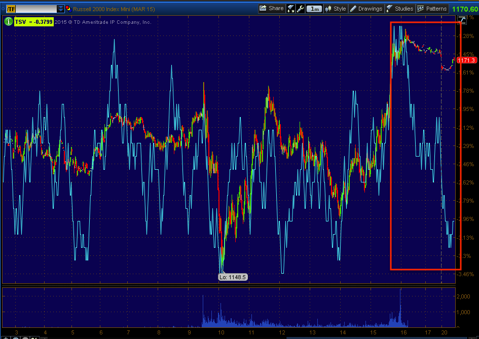
The 1 min intraday signals are a bit ugly...
ES 1 min
TF 1 min.
During the time it has taken me to write this, the negative divergence in USD/JPY has already gave ground so I suspect, being the FX carry pair lifted Index futures in to the close, it is having a negative effect on them as it loses ground which was shown above early on as I wrote this post as a negative divergence.
Cl/Crude also has a smaller negative divergence, which isn't surprising to see some consolidation after today's move and Gold futures also are showing some negative activity in the short term 12 min charts like the Index futures above.
Beyond that, at the 5 min charts all of the Treasury futures from 2 year to 30 year look set for a pullback, not surprising given TLT's short term 3C signals and the fact yields would need to rise to help the market on the upside, meaning treasuries would have to pullback. Gold is negative on the 5 min, crude is more or less in line which are both as to be expected given our trend expectations and Index futures are closer to inline than anything with a slightly more positive tone in NASDAQ futures (5 min).
At the 7 min charts, 30 year Treasury futures are negative, again not a surprise given TLT's near term charts, but the 10 year, 5 year and progressively 2 year treasury futures look less and less negative out on the 7 min chart. This is part of the analysis I'm doing as the short term Treasuries like 2 and 5 year will be most sensitive to the F_E_D's actions,
the F_E_D controls the short term rates/yields, but longer term like the 30 year are more a function of supply/demand and other market factors, having a lot less F_E_D influence. The 10 year is of particular note, especially with the threat of rising rates, while it generally is a barometer of inflation expectations, it's not as easy as a 2 or 5 year Treasury to hold until maturity should rates rise earlier than expected, the 10 year is much more problematic, but we have to account for inflation expectations and to make it even more confusing, I SUSPECT THE F_E_D WILL HIKE RATES EVEN WITH INFLATION EXPECTATIONS LOW AND NOT WHERE THE F_E_D SAYS THEY WOULD LIKE TO SEE THEM MOVE TO.
The fact the F_E_D upgraded the economy in the last F_O_M_C when it clearly has had terrible macro data is sort of an inoculation, right or wrong, the F_E_D can do as they wish with rates and say, "They saw the economy in a certain light", they were wrong, big deal.
They've done the same with inflation as it has remained persistently below their target of 2%, but they came out and said that as long as they "feel" inflation will move toward the target rate, they'll hike before it does, again inoculating themselves in advance as they can simply say, "We expected inflation to move toward our target rate", even though they have been wrong for 2.5 years on their inflation forecasts.
Thus, these are some of the many complications in understanding underlying action in bonds as the 10 year is sensitive to F_E_D rate hikes as it's too long a maturity to ride out, but it is also a barometer of inflation expectations, so which one is it forecasting... This is a big job, but one I think is VERY worthwhile.
As for Index futures on the 7 min chart, NOTHING, they are not positive, they are not that negative, pretty much in line so our head fake bounce scenario fits right in nicely.
I'll take a look at futures before I turn in, if anything is standing out, I'll post it as usual.
Have a great night!