Wednesday, May 20, 2015

Minutes Market Update

I have a theory as to what is actually going on and it is carry trade related, but I don't have the time to explain this theory before the minutes are released. To explain this theory requires numerous charts in numerous assets with numerous previous, historical examples.

Looking at index futures, the tone across multiple time frames is a very negative.

As an example, while I still haven't seen the 10 minute charts deteriorate like I would like to, they too show broad weakness.

Here's and example using SPY charts... You may wish to skim over them quickly

 . The one minute charts aren't showing anything interesting. However when we look at the trends of these shorter-term charts, it becomes very clear. Remember hour divergence on May 6 and May 7 which represents the gas in the tank for the balance that has occurred since. This is why I want to see those 10 minute charts fall apart.

However the trend into higher prices is clear as is the message of the market.
 SPY 2 min with the 7th to the far left. This is clear 3C distribution.

 3 min chart is nearly identical.

The 10 minute chart with the initial divergence to power this bounce, has deteriorated significantly more this week, it's not quite where I'd like to see it yet.

 SPY 30 min longer term trend and much stronger underlying trend showing the same 3C distribution.

 As well as the 60 minute chart.

VXX/ VIX short term futures are starting to looked very interesting today, I nearly put out a trade idea based on the charts below in VXX, I might not mind a VXX equity long, but for options, I want to make sure of the position and with the typical F_E_D knee-jerk move initially followed by the "real" response, I suspect I might find an entry somewhere between those events.

VXX 2 min which is something we saw yesterday that I chalked up to protection in front of the minutes.

However some of these charts are getting stronger like this five-minute

Or this 10 minute leading, but it is still two days .


 VXX 15 min a lot stronger than yesterday

And the long term 60 min chart which makes perfect sense with the market deterioration above in SPY charts and index futures.

We talked about this in the past, the market reaction we'll set the initial interpretation or tone of information such as the minutes. This is why I think it is interesting that the $USD started showing a negative divergence for a near-term pull back. This Price action would cause the minutes to be taken as dovish. The thing is, the price action is immediate and sets the tone of the interpretation of the minutes long before anyone can actually read them. This could be very useful in covering/ closing the carry trade.

 $USDX 7 min negative divergence is VERY clear, this has been set up in advance and a weak $USD on the release of the minutes will mean a dovish interpretation no matter what they say as price reaction is instantaneous.

The larger 30 min $USD divergence still suggests more of a counter trend bounce after some $USD volatility and likely downside.

This is a critical part of the carry trade closure.
 $USDX 60 min trend with counter trend bounces at the yellow arrows. As expected we are ready have a larger countertrend bounce than any of the previous ones and I don't think it is done. A higher USD makes it easier to Unwind the USD Carry trade without taking losses or as big of a loss. So I expect after a brief pullback as has been made clear the last day or so a move higher in the USD that will eventually be followed by a move to new trend lows.

I'll see after the minutes are released whether my theory holds water, if so there may be numerous trade ideas flying fast.

Crude Update

There's quite a biota confusion it seems or missed expectations between the Crude API data last night vs. the EIA Petroleum inventories this morning at 10:30 a.m. with additional confusion with regard to consensus. The one thing that can't be argued is this is the 3rd consecutive weekly draw whether by API or EIA standards, yet crude didn't act like you might expect on such news. There may be another reason.

Last night's API Crude inventories showed a rather large draw of -5.2 mn bbl. However this morning DOE/EIA petroleum inventories showed a draw of -2.67 mn bbl, just about half the API print. However it doesn't stop there; Bloomberg's median consensus was for a draw of -1.75 mn bbl however the survey consensus was for a draw of -3.82mn bbl. Lots of numbers there.

I think the explanation may be more simple than this. After looking at the $USDX futures again this morning, I have little doubt the $USDX is going to pullback. Considering this is on the day the F_O_M_C minutes are to be released, my first thought and I believe a reasonable one is that the minutes  have been leaked and will not come off as hawkishly as some might fear creating a pullback in the $USD which seems to already be set up in advance as we saw yesterday and even more so today. 

Assuming the normal $USD/Oil inverse correlation at the simplest view of things, this would send USO/oil higher. I do believe there's a more complicated view of things involving the carry trade, but I'll get in to that later, especially if I get some data that's more than opinion.

My guess is that the USO reversal process for a bounce was not complete at either the EIA or API data and this is not so much about the headline prints for inventory as it is about a predetermined bounce cycle in oil based on near term weakness/pullback in the $USD which may very well be because of leaked minutes; IT WOULDN'T BE THE FIRST TIME AND I'M NOT TALKING ABOUT THEORY, I'M TALKING ABOUT THE F_E_D EMAILING THEM OUT TO 154 FIRMS ALMOST A DAY AND A HALF BEFORE THEIR OFFICIAL RELEASE. I'd like to know how to get on that mailing list.

The charts may make this a bit more clear...

*Yesterday I decided (as we already had strong hints of a gold correction and Oil correction), that I'd stick with the initial plan which was to capture as much of the trend as possible. I put out the information so you can make your own decision as both positions had decent gains in them yesterday. I will also put out any new Trade Ideas once this corrective move is over as I have received many emails from many of you who are interested in a second chance shot in either or both assets. From my perspective, the USO short that's open is not going to cause so much drawdown that it is difficult to deal with and the Gold June 19th puts have enough time. There's no telling what the reaction , knee jerk or otherwise, to the minutes will be and I'd rather stick with the larger trend than try to get too fancy trading around or scalping too close to the bone. Of course this is subject to change on new data or opportunities, but as always I'll post it here first.


 Crude futures 1 min with a positive divergence late during the cash session yesterday and before the API data right after the close which sent crude futures higher overnight and then the volatility around this morning's EIA data.

 This 1 min 3C chart of USO shows the same late afternoon (cash market) positive divergence that crude futures above show and then downside volatility in to the EIA data, but note the negative divergence was in place BEFORE the EIA data was released at 10:30. While we have caught leaks in the past in the EIA data, I don't think that is what this is about.

HINT: Think, "Reversal process" and the size of the bounce base as an event that can't hold long (V-shaped) or a process (while still small, it is more stable).
 Crude futures 5 min with the initial divergences mentioned yesterday and a continued leading positive divergence, but that would be difficult to see happen had crude took off to the upside as smart money rarely chases assets higher, there's too much risk.

The Crude futures 15 min chart in line with the downtrend with a leading positive divergence. This is a fairly impressive divergence, but the size of the base limits its reach, thus the larger the base, the more it can bounce. If USO had bounced on the EIA data there would have been a sharp "V" reversal and I'm not sure it would have even held out the day.

 USO 3 min showing the same positive divergence warned about yesterday. Again it looks impressive, but remember it is only a 3 min chart .

USO 5 min with a negative divergence and a recent positive divergence, a more impressive divergence/timeframe, but still a vary narrow base area for a bounce which is appropriate I believe for the kind of move I'm expecting or at least how long it lasts (corrective bounce).

 And the 10 min chart with the dominant feature being a large leading negative divergence with a near term positive relative divergence (a weaker form vs leading, but decent on a 10 min chart, again not outside of expectations elaborated on yesterday).

 The 15 min chart shows the last real positive divergence which occurred at a head fake move below the trendily /support of oil's larger base as I believe eventually, not so far off, USO will make a trend reversal to the upside that holds unlike the heavy 3C distribution at the head fake/failed breakout above the yellow trendily to the far right. This 15 min leading negative divergence is the dominant trend and even with all of those bounce divergences or corrective divergences on the charts above, none of those charts are nearly as strong as the 15 min or the size of this leading negative divergence, thus it is the probability of highest resolution after any corrective $USD-based bounce.

 On the daily chart the head fake move (left  yellow arrow) that hit stops below the bases' support was where we see the white leading positive divergence on the 15 min chart above, thus the reason head fake moves are so useful. The failed breakout above the base was seen as a high probability in order for USO toga downside momentum and it occurs at the same place as the leading negative divergence on the 15 min chart above.

On a chart this size, a near term corrective bounce is essential noise. The next trend should be down bask in to the base at which time we will look for confirmation of accumulation which I expect to see and that should set up the largest trade in USO since it came down last summer, a trend reversal to the upside off a large, strong base.


This 60 min chart of USO within the base shows that it was highly unlikely that the breakout above the base (seen above) would hold.

So I'm expecting a short term bounce next and the resumption of a larger swing trade to the downside, the target area is unknown , but $15.50 is not out of the question. After that, we should have the makings of a much stronger base and a primary trend reversal to the upside with a breakout that does hold which would be a long term trend trade. 3 different possible trades each in a different timeframe... multiple timeframe analysis.

TLT / Treasury Trade Idea Update

The TLT long/call position (second half) that I'd like to fill out, but have been waiting for it to finish its reversal process and hit stops under $118.50 (hit) and $118 (not hit) is looking a lot better, a lot more interesting for a strong counter trend bounce/rally. 

As I have said numerous times and we just saw the last 2-days in $USDX, Counter trend rallies are usually some of the strongest rallies you'll see even though they are destined to fail. They need to be strong to be convincing and turn sentiment around against the preceding trend, thus the name "counter trend" rally.

I don't think it is just TLT or 20+ year Treasuries that will see a counter trend move higher, I believe it will be across most of the curve from 5 and 10 year out to 30. I don't have any specific data on 2 year or less.

As for the charts, I'm very close to pulling the trigger and filling out the second half of a partial position already started, there's a few intraday charts I'd like to see "jump off the chart" as I often describe it.

This post from May 7th (note the date, it keeps coming up in asset after asset), Bond Rally / Swing will give you a strong background on the concepts and reasons we have been looking at TLT for a strong counter trend rally and why we have already put out a partial position and why it was a partial position to be filled out at a later date.

As for the charts...

 This is the break down in Treasuries which were unbelievably strong performers last year. Almost the entire year the 60 min 3C chart confirmed their upside, then suddenly it didn't and we expected something to happen, this is what happened: lower highs and lower lows with a long term trend line break which is the set up for a counter trend bounce as you'll see in the post linked above.

I fully expect Treasuries will head significantly lower after a strong counter trend rally.

 This is the area of what I have seen as a base and shakeout of shorts. Notte the rounding bottom and the last 2-days forming almost a perfect Tweezer bottom reversal candlestick pair. If today's daily candle looks like a bullish one and volume increases significantly, I think today will likely be the day the counter trend move begins.

The first major momentum would come above the trendily on a short squeeze, although I would like to see $118 broken first, it would be an excellent timing signal and call (option) entry point.


 In past updates the 60 min chart has been in line with the downside move, this is the first time it has shown even a hint of a positive divergence which looks to be migration as the 30 min charts just before the 60 min have been positive.

For example this 30  min. Note the date the major part of the divergence was in effect, May 7th. This is an impressive looking divergence for a counter trend move.

The 10 min chart leading positive and again those same dates of the 6th and 7th of May. Institutional money obviously was involved in setting up a cycle and likely rotation, but this is through numerous asset classes from FX to treasuries to commodities and equities.

The 5 min TLT chart, again the first divergence at the same dates.

Right now I'd like to see either a move below $118 to hit the stops as that would be an excellent timing indication and discount for a call position entry and/or a larger leading positive divergence as I drew in to the far right with an orange triangle...ideally both at the same time.

XLF/Financials Update

As I said in the last post, Financials are one of our long term core/trend shorts. The story that Financials will benefit from higher rates to be is absurd unless the F_E_D is going to hike meeting after meeting with 50 basis point hikes, all indications have been that they are going to go slow and I just don't see how a 1/4 or 1/2 point off ZIRP is going to do anything for Financials who seem to have largely abandoned their previous banking business model to become stock/momentum chasers like everyone else.

I certainly don't think higher rates are going to help loans in which no one is borrowing from a Cap-ex perspective, I don't see any treason they will when rates are off ZIRP and despite the Housing data yesterday, that was 1 print. Again, I don't see how higher rates are going to boost an already weak housing market. These are just the bones of some of the arguments or disagreements I have with the Financials will benefit from higher rates. I think it's more likely that they are stuck between two business models that have both been made "MORE" mediocre by higher rates.

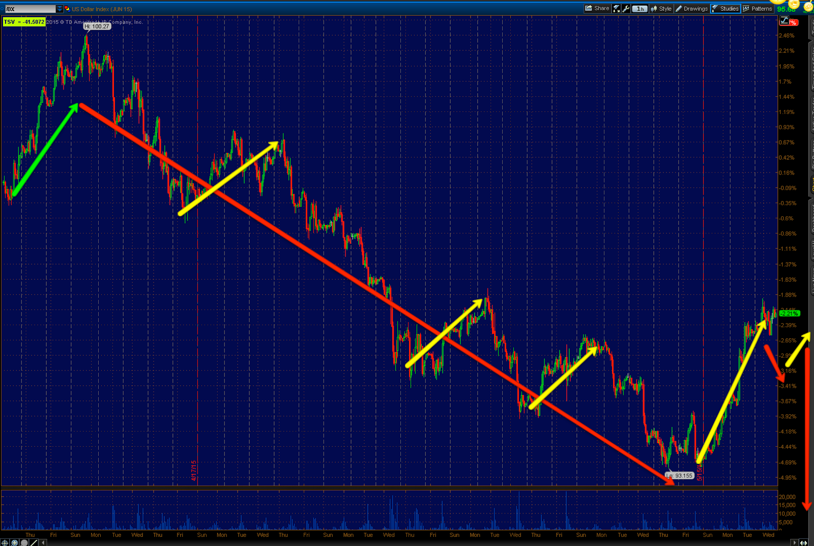
In any case, if you pay attention to the longer term charts you'll see that same trendily break in October of last year and the same triangle price pattern we have seen everywhere and that I have shown you in the past was not a naturally occurring price pattern, but rather an engineered one, you can even see evidence of it in XLF/Financials.

Finally, just so you can see the concept of market cycles that Wall St. (generically) sets up, you'll see the exact same bounce accumulation dates of May 6th/7th as the rest of the major averages and you'll see the exact same behavior in to higher prices that breakout above the apex of the triangle.

There are numerous ways to play a financial short from options to a straight XLF short to 2 and 3x leveraged bear ETFs like SKF and FAZ.

 XLF's most recent trend and a trend line break at the October lows with the same triangle price patterns . These are much too large to be consolidation/continuation price patterns, but I believe that's what they were constructed to make traders believe as we had pointed out in the past month that we'd be seeing false breakouts above those triangles as they are the most easily recognizable of price patterns even for neophyte technical traders.


 There are a couple different ways you can draw the trendines of the triangle, lets just go with the 2015 triangle that we see everywhere.Yesterday's bounce which seemed to be on the better housing data and the "Rate hike sooner" theme looks like a bearish closing candle with a tallier upper wick (higher prices rejected) and on increasing volume which is what I want to see from a potential reversal candle. Because of today's gap up in XLF there's a chance it may form a bearish engulfing candle which is normally taken as confirmation of yesterday's weaker candle with the taller upper wick.

Either way, XLF is above the apex of the triangle which is what we have been watching for somewhere around a month bow expecting breaks above to fail as many have and several have even given it a second shot.

 The long term 2 hour chart is negatively divergent in to the breakout above the apex area.

 As is the hourly chart which continues to accelerate in its deterioration 


 And the 15 min chart with more detail, but still a very strong timeframe is VERY clear about the underlying trend since the break above the triangle's apex, strong 3C distribution.

Swinging back around to the fastest 1 min chart and working out to monitor migration in the charts because this is the exact same set-up on the exact same date as all of the major averages...
 The 1 min trend shows accumulation at the sharp "V" bottom (the same "V" bottom in all of the major averages at the exact same data except the IWM which has a slightly wider "W"-like base. The positive or "Bounce" divergence just like all of the other averages (the same one that caused our 5/8 Week Ahead forecast to call for early weakness in to the beginning of last week followed by a bounce and taking it a step further, followed by a much larger, sharper decline).

I don't think I need to point out the 3C trend since.

 The 2 min chart confirms accumulation at the exact same area, Wednesday and Thursday , May 6th and 7th before Friday's May 8th "Week Ahead forecast".

Again, I think the 3C trend since is quite easy to see without any notation on the chart and also showing the process of migration or strengthening of the divergence.

 The 3 min chart shows the exact same features and migration with a bit of a cleaner trend with less noise.

 This is the 5 min trend and while I didn't mark divergences as usual, I did mark the areas they occurred in, you should be able to pick them out. The point here is the support or resistance created by these divergences are exactly what created this symmetrical triangle, just as we have seen in numerous other assets. In other words, it's not naturally occurring, it was purposefully put there for a reason. Technical traders will chase a breakout from such a large triangle even though these large triangles are most often tops/bottoms depending on the preceding trend, but technical traders won't even check the volume of a H&S price pattern to confirm its authenticity, so I doubt they care much about the triangle's size which is like a bill board Wall St. has put out to lead the lemmings where they want them. Can you guess why Wall St. might want demand at higher prices with divergences like the one to the far right where the breakout occurs?

 This is a closer look at the 5 min chart's trend which continues to migrate and see more damage.

Interestingly, the 10 min charts of the major averages have been the line in the sane or "Gas in the tank" for the bounce that was forecast to start last week after earlier week weakness.

 The XLF 10 min chart with a leading positive divergence at May 6/7 and the breakout above the triangle's apex starting May 8th. Again these are the charts that I've been most focussed on in the major averages, but they are everywhere. In other words, this is and always has been a Wall St. set u, we knew it in early May, we see it unfolding now and the results of that.

I do like Financials short in the area, it's an excellent entry with low risk. I may put out an additional trade idea for tracking purposes after I see how the charts develop before the minutes and if need be, after the minutes.


XLF/Financials looks like an interesting short here

This is already a core short position (long term), but is looking especially interesting after yesterday's move. I'll have some charts up in a few minutes.

A.M. Update

Not a lot has changed overnight as far as some of the near term currency based expectations that have been initially developing that may have a corrective effect on a couple of positions like gold and oil. The broad market still looks very sickly with the same deterioration I posted again in last night's Daily Wrap as a few examples, but overnight Index futures were actually quite flat.

The only real news on a macro level was Japan's Q1 GDP beat of 2.4% better than consensus of 1.6 and last of 1.1, but it turns out that 80% of that print was due to inventory stocking, more pulling it forward (the ECB's May/June bond buying yesterday), so Q2 better find some snow in Japan for an excuse as to why GDP is so low.

 ES 1 min flat overnight ahead of today's F_O_M_C minutes...

As mentioned yesterday, 1 min gold futures with a positive divergence look like a corrective move is likely after yesterday's carnage in precious metals, but I believe there's a lot more downside to go.

The  Yen 1 min positive suggesting a modest correction in USD/JPY to the downnside

The Euro futures 1 min also suggesting a correction in EUR/USD to the upside

 3 min Gold futures also suggesting the probability of a corrective bounce or maybe gap fill, but the larger trend is still more downside. This would be very normal behavior.

And the 3 min chart of Euro futures also pointing to a corrective move in EUR/USD (up).

And the 5 min $USDX with a slight negative divergence that confirms/compliments the charts of the Yen and Euro.

However looking at the $USD likely correction within its counter trend bounce on a longer 30 min timeframe...
You can see it looks like it is already starting. Again I fully expect it to resume its counter trend bounce higher after a brief correction, but this is based on what we know BEFORE the minutes at 2 p.m., make no mistake, they'll be the fulcrum of the day, just remember to be wary of any F_E_D based knee jerk move, they are wrong a lot more than they are right.