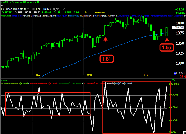
I mentioned I would look at volatility and although there are a lot of different ways to measure it, just eyeballing the charts is probably the easiest, but here are a few observations.
AAPL's 10 day Average True Range is up about 500% since the rally around the start of the year, yet AAPL is up .55% over the last 4 trading weeks. This is the volatility I talk about with regard to topping action. If you look at AAPL on a monthly chart...
Not only is the hugely parabolic move very apparent through 2012, but there's a near perfect doji star, you might look at the longer term chart as a depiction of churning and you know how I view parabolic moves, they almost always end worse and more intense than they started.
On April 10th at the market lows or at least the SPX local lows, we saw stronger divergences in financials, Tech lagged badly until the positive divergence popped up unmistakably yesterday in Tech as we have been expecting, today's NASDAQ 100 move was the biggest move up all year at +2.01% and this after a -.93% decline since April 10th, again, that's the shakeout move we anticipated on April 10th.
Just look at the volatility from the start of the year through March and then from March through the present. After all of that volatility, this leaves the NASDAQ 100 up +.98% over the last 5 trading weeks, compare that to the compare that to the +22% gain from the start of the year until the last week of March; again, a depiction of churning.
The SPX saw the second largest move today of the year on a shakeout, ironically, both through the same price level and trendline. Note the extreme volatility in the 1 day price percentage change yet we are no higher now then we were 5 weeks ago. If Financials still had been leading sector rotation today, we would have likely seen the biggest 1 day move of the year. Don't let me mislead you and leave you with the thought that I think this is bullish activity, it is just a reflection of the volatility I warned about several weeks ago, saying,"The market will continue to get more and more volatile".
The 10-day S&P-500 Average True Range is up 200% since February when all seemed well with the rally. Even back then, I pointed out the market wasn't making very big price moves, it was just making consistent moves up.
I suppose the moral of the post can be summed up with 1 chart that while on a much different scale, addresses parabolic moves and extreme volatility and what typically follows...
That would be the 2000 Tech bubble. I don't mean to compare the situation now apples to apples, but the market is fractal and what we see on 1 min charts we see on quarterly charts.
I'll be doing a some more poking around. I took a quick look at today's Price /Volume relationships for the 4 major averages, 3 of 4 were dominant in Price Up/Volume Down which is the most bearish of the 4 relationships, especially given the price percentage moves. Only the Russell 2000 had a dominant relationship of price up/volume up, which is the most bullish of the 4 relationships. None of the 4 averages were so dominant that they looked like they could present a 1 day overbought condition, however I still have some other internals to look in to.


No comments:
Post a Comment