As we saw in the last update, the 1 min intraday charts which are normally pretty reliable for intraday moves, are almost totally unremarkable, meaning very little divergence, very little signal, not even worth a post by themselves.
I tried to explain what I think "could" be happening because of sentiment and Black Friday-the last thing anyone in government wants to hear is the market took a dive on the last day of trade before Black Friday shopping, in fact quite the opposite as was speculated here Sunday night.
AAPL is responsible for about 20% of the NASDAQ 100's weighting or roughly the same as the bottom 50 weighted stocks all combined, so AAPL alone can move the NASDAQ 100 and the averages tend to move together.
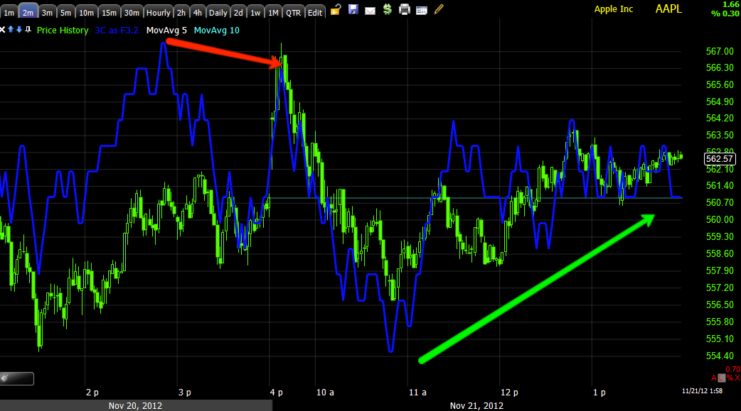
So I took another look at AAPL and it is an even better example of this freaky aberration on the charts today, which if they hold up, meaning no pullback, I'd have no problem calling out the F_E_D PPT as being busy-bodies in the market today.


Any way, I thought I'd point this out as it's something I haven't seen before, but makes sense with Black Friday Shopping, the day that most retailers go in to the black, the 1 day that makes their year.
As far as we are concerned from a trading standpoint, I see no trade on the long side with a 5 and 15 min chart like this, I'd wait for the pullback to look at a long, I wouldn't buy on what is most likely very small time manipulation in which they are just picking up retail's offers.


No comments:
Post a Comment