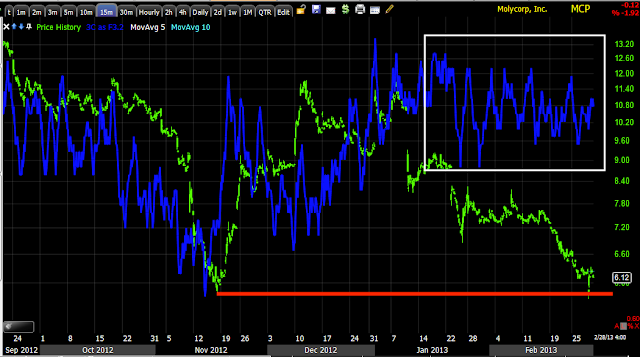
There appears to be a recent "W" bottom, in Technical Analysis textbooks they'll tell you the second bottom should fall short of the first, in other words never make it as low as support, but for years that concept has been thrown on its head, which is purposeful in my view- what better way to accumulate at cheap prices and with plenty of supply available than to clear out the stops as well as taking out weak hands.
Today's daily volume is up, but as you can see, it was on a wash out of the stops on the open.

The 30 min chart looks pretty insane, I almost wouldn't believe it if it weren't for the others...
The 15 min chart is also leading positive at the second low.
As is the 5 min chart.
Below 5 mins trade gets spotty and signals are less reliable, but for me, this is certainly with a speculative position, especially after having watched it so long, I tend to think whatever was originally seen is probably real as well.


No comments:
Post a Comment