Some of these charts may look a bit different right now (mostly futures/currencies) because I started capturing them at 4 p.m. at the close, I was hoping to get this post done by 5 p.m. before I'm suppose to talk to my wife, but no where even close so the point is, what they looked like that was a red flag, if there are any significant changes that will be updated later.
THERE'S A LOT OF VOLATILITY ALL AROUND AS PROMISED. The SPX closed up 0+94%, which is the best performance since last Tuesday's +1.04%. Something I mentioned with
"Increased Volatility" was that we'd not only see volatility in terms of percentage moves, but to expect volatility to be expressed in direction also (as well as ATR) and today's performance was almost the mirror opposite of yesterday's, (Up +0.94% vs Down -0.93%!). I had also mentioned this volatility could just create huge chop zones rather than trends, take the SPX's open yesterday at 1597.55, today's close was 1597.61, that's a difference between yesterday's open and today's close of 6 cents or 0.00003%! It's almost like one big day rather than two that closed right where it opened, that's the kind of volatility I was talking about at this stage of the game!
I guess I should make the boiler plate statement that the SPX closed at all time new highs today, despite the fact that a 0.25% move or at this point even a 0.001% move can garner that same badge of honor.
Continuing along the volatility lines...
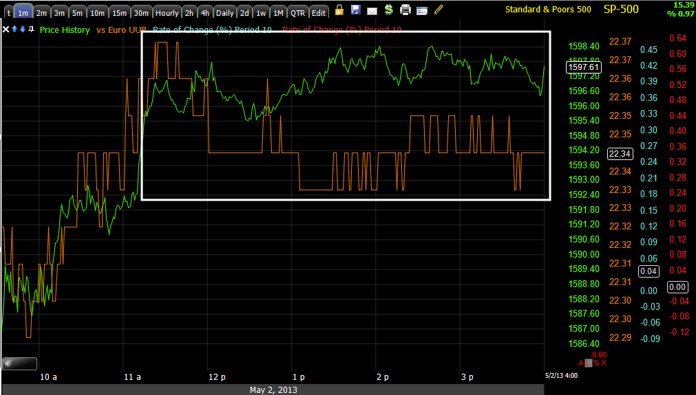
Despite negative divergences, this is one of the charts that bothered me... HYG, which is used to manipulate the SPY higher intraday through arbitrage correlations, was nearly diagonal intraday with its 2nd biggest 1-day gain of the year coming in at +0.65% which was just a bit weaker than yesterday's weakness with yesterday's biggest 1-day loss of the year at -0.68% which similar to the SPX situation mentioned above (yesterday's open vs today's close) put HYG just a hair shy of where it closed on Tuesday, for example...

Do you see it? Volatility is huge the last two days with the biggest 1-day loss of the year yesterday and the 2nd biggest 1 day gain of the year today, yet we are still -0.03 lower than Tuesday, in other words, exactly what I was trying to describe, extreme daily percentage moves and extreme unpredictability and choppiness, the end result is a lot of movement, but a flat trend (which is fine, we can trade that and make good money as we have, you just don't want to be left without a seat when the music stops, thus my being extra careful.
Treasuries were interesting as well... As HYG expressed a risk on posture helping the market today, at the same time TLT or, "The Flight to Safety" trade was doing its own thing.
Remember that the typical correlation is money bounces back and forth between safety (Treasuries) and risk (stocks) so TLT vs. the SPX as seen above, typically has an almost mirror opposite correlation, but today even though the market was headed higher, TLT which one would expect to move lower was just 0.11% shy of yesterday's close and had been trending higher all day since the gap down open.
So while HYG is representing a "Risk On" sentiment, TLT is representing a "Flight to Safety" mood and both on the same day, Talk about Volatility! Of course both are assets used to manipulate the SPY's pricing.
We can get an overview of intraday manipulation efforts from the SPY Arbitrage, (you'd probably find some interesting things by putting a Percent Change or Rate of Change type indicator on TLT, VXX and HYG as well as the SPX and compare it to the SPY Arbitrage model.
I can tell you for sure that part of the upside manipulation "Bang the Open" came directly from Treasuries (TLT's) open with the gap down, TLT's move from 12 to 1 would have been supportive of the market, TLT's move from 1 to 2 pm would have not helped the market and the Arbitrage is fading at the same time and TLT's slight downside over-reaction at the EOD would have been supportive as you can see on the SPY Arb. chart at the close.
VXX's gap down would have provided more positive effect on the open, speaking of which...
To the left is the gap down open in VXX is the one that would have supported the green opening in the SPY arb.., the failure of VIX futures to make a new low at "A" would not have been helpful and at "B" the slight over-reaction to the downside would have been helpful.
All in all though, putting a little perspective in to things...
The close in VXX yesterday at "B" compared to where the SPX closed yesterday compared to the VXX close at A last Friday compared to an even lower price in the SPX, demonstrates yesterday's bid for protection near the end of the day in VIX futures, some of that was obviously unwound today. You also get a little better feel for the inverse or opposite correlation between the two assets, but all in all, as the SPX trends higher, we are not seeing the complacency normally seen, but rather more fear as protection is bid in the VIX futures.
Once again, while not as volatile today with a -3.39% decline vs. yesterday's +4.22% gain, today's close was nearly exactly the same as yesterday's open ($19.10 vs. $19.14 respectively)-this is that volatility without a trend which is daily or day to day volatility I was talking about.
Risk sentiment as measured by our two assets that don't have a manipulative correlation with the market are showing the type of divergence I'm looking for in Leading Indicators to tell us when we are nearing the end and should be backing up the truck and loading it with positions (shorts)...
HIO has been risk off since the 29th which is understandable with the SPX's trend, except today it was clearly risk off which is the divergence I'm looking for, although FCT shows more of what I'd like to see.
FCT is the second sentiment indicator, today FCT was rather flat and stuck close to yesterday's close (faint light blue trendline) , but the overall recent divergence has been much clearer, there's a clear risk off sentiment here and thus we have the larger divergence that I'm looking for.
High Yield Credit (different than HYG), showed us something not only interesting, but telling yesterday, one of the reasons I went for the IWM and GOOG calls late day...
This is yesterday's action in High Yield Credit (a risk asset) vs. the SPX (green as always), not only did HY Credit not drop with the SPX all day, the last two hours it made higher highs while the SPX was making lower lows, this is why we call these "Leading Indicators". the SPX followed HY Credit's lead today, although HY Credit told us the day before.
Today HY Credit stuck near yesterday's closing high most of the day, this wasn't exactly negative, it was more reversion to the mean. Had HY credit dropped today with the SPX heading higher, I'd have a greater sense of urgency with regard to positions. Since HY Credit is less liquid than HYG, it tends to move first as bigger positions take more time to get out of.
Here's the overall near term trade, basically a reversion to the mean, I'll be watching for credit to dislocate or negatively diverge from the SPX.
Back to Treasury related, Yields which are like a magnet for stock prices, but do lead...

Over the last several days, Yields have been heading lower, they should move roughly in line with the SPX, lower yields tend to attract stock prices the same direction so an obvious negative divergence exists here, however it didn't grow much worse intraday, you can see it closed today just below yesterday forming a daily candle that is a perfect Doji Star, normally this would be an upside reversal signal, if so, that would imply the market has some more upside to go which is what I was concerned about today and why I waited on any new short positions even though we had excellent signals. However, remember that 3C is showing us what's going on, it's telling us with negative divergences today that today's price strength is being sold or shorted in to, that by itself doesn't mean an imminent reversal is at had, there are many pieces of the puzzle we must assemble, hence the name "3C". a reminder to "Compare, Compare, Compare".

Looking at the last month or so of trade, we have one of the CLEAR negative divergences vs the SPX that I'm looking for on a more consistent and deeper basis in all Leading Indicators. The recent action in yellow in the SPX has been more or less range bound while Yields make lower lows.
SPX prices are higher today at point "B" than point "A", however yields are significantly lower. There's typically a reversion to the mean, both short term and longer term. Speaking of longer term...
Since the November 16th rally cycle started Yields were in line with the SPX until they stopped making higher highs early in 2013 when we had the massive economic data manipulation known as "Seasonal Adjustments", then around the same time the SPX tripped a stop on my Trend Channel, signaling a significant change of character had come in to play.
Yields have fallen lower and lower as the pundits on TV got the "Great 2013 Rotation Out of Bonds and In to Stocks"totally wrong, as usual (this is why I don't watch CNBC)
actually the flow went the opposite way.
As for some currency deviations from the trend...
The $AUD which had recently taken over for the Euro as the currency that tracked the SPX went completely negative today, these are risk off signals, but I would like to see a series of at least several days of this kind of divergence.
The Euro didn't follow the SPX higher on the rallies in yellow, but did follow the general trend, however the Euro too (which should follow the market generally) lost significant ground vs the SPX today. As far as the negative divergences in the market today, had the intraday action worsened significantly, that would have been a part of my analysis leaning toward shorts, but pother than the open, intraday there wasn't much negative diverging.
The Euro since the November 16th lows (which were a decline that started on September 14th, the day after the F_O_M_C announced QE-3, we got a day and a half of upside knee-jerk reaction followed by a downward drift and then a decline of around -8% to the 11/16 lows).
Note the significant dislocation vs the SPX.
The $USD today vs the SPX, it seems that the afternoon action in the $USD either held back or helped the SPX, but roughly kept it in place.
The longer term trend, in yellow the normal correlation of $USD up/market down is ignored by the market, in green you can see what the normal correlation looks like, there's more but I didn't want to clutter the chart. In white the $USD is pulling back from a much larger base which has allowed the SPX some upside breathing room, strangely the SPX hasn't done much with the room and I believe the $USD is about to reverse to the upside and start a significant uptrend,
very market negative.
Here's the bigger picture, in white I trace out the large "W" bottom in the $USD,
if the F_E_D normalizes policy as they have been hinting at, all of the $USD destruction from printing will have to be unwound and higher interest rates will prevail, along with other countries still debasing their currencies, this could send the $USD on a once in a quarter Century move to the upside which would be absolutely destructive to any risk asset from Credit to commodities to (probably most significantly) stocks. This would also make sense with the longer term Primary trend in gold which seems to have entered a bear market.
The Japanese Yen and it's correlation as a Carry Trade currency since the 11/16/2012 market bottom, notice where there have been consolidations in the Yen, it has effected the market. If you read my 2 part article,
"A Currency Crisis", you know that I suspect the Yen is about to move significantly higher, this would effect the market negatively as the carry trade (or what's left of it) would have to be unwound, first by selling assets bought with the proceeds and then selling the second currency and buying back the first (even more demand on the Yen would send it higher). With some institutions using 200:1 leverage on the Carry, even small market losses could trigger a downside avalanche and you'll notice the Yen has become more correlated to the market, or actually the market is paying more attention to the Yen.
Who would have thought?
The Yen seemingly not well correlated to the SPX to the left, but recently more correlated, you can see this on a larger scale.
Look at today's intraday action, the Yen moves higher (market negative and carry trade negative) and all of the sudden the market stops and doesn't make a single higher high. The lows in the Yen intraday nearly correspond with the highs in the SPX and we have seen this several times before recently.
Other Assets...
AUD 1 min seems to have moved down from an intraday negative, then a slight positive appears, this was a red flag., in fact it was as the AUD is now higher than any point today right now.
AUD 5 min the 5 min suggests a move to the upside is coming and significant, I'd expect this has to do with the market too, perhaps the SPX $1600
, you probably recall the last post and my comments about the emotional changes moves like this bounce are meant to cause and why.
AUD 15 min has the same positive divergence so I expect some market upside still, meaning today probably was not the best time to add/enter short positions.
AUD 30 Some recent bad economic news from Australia has changed the outlook for the currency. Previously any longer timeframes offer no clues as the RBA was seen as sitting on the fence as to further cuts this year until they saw the economic outlook. Now they have seen it, I suspect there's an expectation the RBA will be much more dovish, perhaps even cutting at the next meeting by 50 basis points. I expect that is why the AUD has been quite a bit more negative lately and I expect it to continue unless economic data gets better.
EUR 1 min looked like it would shoot up earlier today with a positive divergence, that would likely send the market higher, as the day went on that divergence faded, but I suspect the accumulated positions are still there and the move will come at some point to dump them.
EUR 5 min shows something similar to a bear flag. If so, I'd expect a head fake breakout to the upside before more downside, that fits with out market model of a move up. negative divergences increasing and that being the area to load up the truck.
EUR 15 min also suggests that head fake move to the upside from a bear flag-type price pattern.
EUR 30 min, ultimately I think downside prevails, this would negatively effect the market.
$USDX 1 min was negative earlier, suggesting the market would benefit from a fall in the $USD, that divergence changed a bit too, going slightly negative, another small red flag. Currently the $USD is making a small move lower, if it continues then we will be on track with the original divergence which I suspect is still effective.
$USDX 5 min in line
$USDX 4 Hour this is the right side of the "W" base in the $USD, the negative divergence is the current pullback in the $USD and the building positive divergence is the reversal of the pullback and a move to possibly a primary uptrend in the dollar, this would be very market negative.
$USDX 30 min I show the faster 30 min just to verify that the positive divergence to end the $USD pullback is actually there and building, if this coincides with a market decline, it will be like the perfect storm, especially if the Yen moves up as I suspect it will.
Yen 1 min is a sort of bear flag/pennant with a slight positive 3C lean, currently this pattern continues, it should lead to a highly directional move.
Yen 5 min as for the direction of that move, the 5 min chart suggests it is up, this is a market negative, but who knows when it fires.
Yen 30 min I suspect sees that move up, a bigger move down and then a primary trend re-assert itself on an upside move. Why?
Yen 4 Hour the long term chart says so
ES 5 min with a quite negative divergence in place, I'm not sure if this is a pause or volatility day to day or building out the final divergence.
ES 1 min intraday is not nearly as negative as some of the averages.
NQ 5 min again another negative divergence, but which timeframe? It's possible a 1 min could knock the futures down tonight and this is tomorrows divergence or possible that we keep seeing increasingly bigger divergences in to higher prices. We are not prisoners to this mystery, there are other indications that will help the pieces fall in to place.
TF (Russell 2000 Futures) 1 min are oddly more positive intraday than one might thoink given some of the negatives in the averages today.
TF 1 min is showing a HUGE leading negative divergence, if I was just looking at this, I'd bet everything on red that the R2K is significantly lower tomorrow and it may be, but that doesn't mean that today would have been the ideal area to enter shorts, Monday could possibly be up even higher and that may be the area to add shorts, there were just too many red flags today, each small and meaningless on its own, but taken together, they form a warning.
Strangely a TF 5 min positive divergence, again this suggests that today probably was not the right day to enter significant short or Put options. Timing is everything with options as we saw with our GOOG and IWM calls today.
Right now the market is seeing generally worse 1 min negative divergences and we have seen some downdraft from some of them, it's still unclear as to what they mean at this point and until we are clear like we have been, I encourage patience and not giving in to the emotion of greed, that you'll miss the move. There's always another opportunity.


No comments:
Post a Comment