Thursday I posted quite a long bit of analysis after looking at a number of stocks, Index futures, the averages, etc. and there were a few things in common. One was the promise of volatility and a directional breakout.
"What is a triangle when it comes to volatility? It's like a Bollinger Band squeeze in which the ATR might be getting more volatile on an individual day, but the range in the market is squeezing like a Bollinger band pinch, which is THE PROMISE OF A HIGHLY DIRECTIONAL INCREASE IN VOLATILITY."
I won't get in to what we forecasted as it was easy just based on the concepts of the market using technical analysis against traders as traders are too predictable, but as of that analysis Thursday here,
IMPORTANT: AAPL Set-up & Market Movement I showed a few things like AAPL's triangle and the
"Promise of volatility" which has been a major theme we have been looking for and finding intraday (ATRs).
As of Thursday at the white arrow, this was the triangle and the comparisons I made to a Bollinger Band pinch being the promise of increasing volatility. I made a case for the Non-Farm Payrolls print to come in below consensus, it came in at less than HALF of consensus and why and the upside breakout in AAPL and why it would make this move.
Today you can clearly see the breakout we were expecting, but this is a proxy for broader market implications.
I showed the highest probability resolution of AAPL (4 hour charts)
Just as with the broad market and here you can see with Index futures (ES/SPX E-mini Futures) the distribution in to the breakout, even though we didn't get an extremely dovish statement from some F_E_D member, we did from Goldman Sachs and PERCEPTION is what counts, a neophyte trader can put together "Bad NFP Print=Rate Hike Delay), at least that's the perception and that's all that really counts.
Just like the broad market averages today on their foray in to green and green on the year for some... ES / SPX futures is showing the same intraday distribution in to market strength as the averages and as forecasted.
Just like the averages or Index futures shown Thursday in the 7-15 min timeframes, AAPL has the same 15 min positive, as well as the same trend in intraday charts showing these triangles
WERE NOT COINCIDENTAL as well as why...
AAPL 15 min positive right at the tip or apex of its triangle ...
As for AAPL which made a much cleaner, more obvious breakout in a widely watched stock, the intraday action thus far would not have me moving to call this a short entry. However intraday it is moving in the direction forecasted and the direction we have already seen earlier today on 3C charts of the averages as AAPL was used as a proxy example for the broader market Thursday (see last update) as expected in our near term forecast,
IMPORTANT: AAPL Set-up & Market Movement
AAPL 1 min already seeing early negative divergences which typically will see confirmation for the first few days, suggesting this may be a faster move than a few days of upside. On the flip side of the coin, you will see below there is strong data to suggest it is more than just a single day which is why I'm not calling out positions yet unless you were playing this on the long side, which I'm not fond of as you know, I simply think there's too much risk vs. potential reward, especially when we know with a fairly high degree of certainty that the "Come to us" trade is a much stronger set up.
AAPL 2 min migration
AAPL 5 min migration, but I wouldn't try to make a case much beyond that in AAPL any way.
As for the averages... I didn't include every divergence in every timeframe, but posted charts of about how far they went within reason without stretching the divergence or torturing the chart.
As for the evidence I said that suggested this is more than just a 1-day event, well I think that was plain from our week ahead forecast using AAPL as the market proxy on Thursday, but just to show you why I would not consider this a high probability put/short entry area from a tactical basis...
This is the NASDAQ 100 daily chart. You may recall the bottom/bullish reversal daily candle last Wednesday, a "Hammer" which can be seen with a white arrow below it; this is one of the reasons I think we were close to an upside move given we had that strong upside reversal candle and a pinching set of triangles at their apex.
While not the best example of a Harami or inside day, Thursday's narrow range (open to close) Doji Star fell within the real body of Wednesday's hammer, another bullish reversal candlestick signal, although far from textbook, which suits our purposes just fine.
Finally today is a bullish engulfing candle as its real body engulfs all of Thursday's daily candle. This would be a confirmation candle, confirming the previous Hammer/Harami reversal candles.
Intraday divergences...
I don't think I need to draw on most of these charts as the divergences are quite clear. The typical rounding top intraday was also interesting as there wasn't a bunch of chop and most of the action was early in the day as the TICK charts display.
As I said, I didn't put every chart, but this 3 min DIA is leading negative, the intraday lows had a nice positive that sent it higher. The 2 min chart forms a nice bridge or connection from the 1 min to the 3 min and shows the process of migration of a divergence which means as it gets stronger it migrates to longer timeframe charts.
Here the 5 min DIA also shows the early bounce off the opening lows and leads negative intraday.
5 min charts on an intraday basis are what I consider to be the demarcation line between the 1-3 min intraday steering/timing charts and the institutional distribution (or put more simply, I'd consider the 1-3 min charts to be the signs of market makers/specialists or other middle men/HFTs performing that function, while a 5 min chart is a more serious signal intraday, much more than the simple 2 min difference would imply).
DIA 10 min is one of the few cases in which I feel that the chart is strong enough to post it as a distribution event,
this would mean that there was actually quite a strong distribution process and like past bounces over the last 5 or 6 weeks, distribution is starting immediately rather than showing the typical confirmation of a stage 2 mark -up scenario for several days before distribution starts like we have seen in the not so distant past.
QQQ 1 min has a very sharp leading negative divegrence. If we had not anticipated a triangle/breakout event last week, I would expect a divergence like this to turn the market south intraday, but in this case it is a distribution process which is also evidenced by the migration of the divergence to longer term timeframes.
QQQ 5 min which is marked to show today's action only to the right.
SPY Daily, like the NASDAQ 100 daily chart also showing the hammer support
(several averages showed it right at their 100-day moving averages last week as was pointed out) followed by a Star indecision candle (not as strong as the NASDAQ's Harami-like pattern) and today's confirmation bullish engulfing candle.
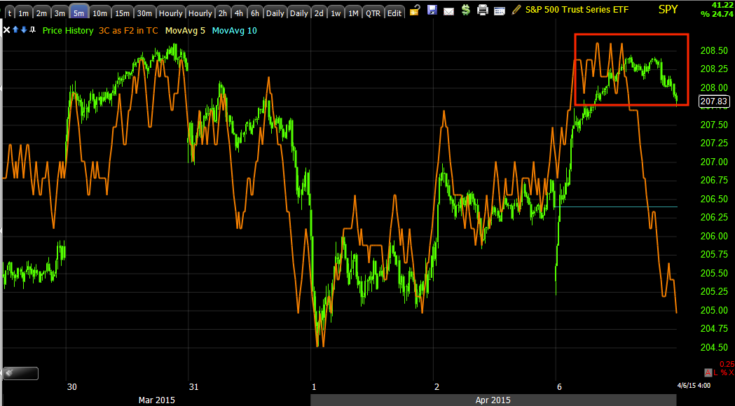
SPY intraday 1 min
This is very much like the ES 1 min chart above. As well as the 7-15 min positive Index futures were showing the same thing as the 10-15 min averages in last week's updates.
SPY 2 min not shown, 3 min leading negative above. It seems in many ways SPY saw some of the strongest distribution activity today.
SPY 5 min which is leading negative, but I won't go any further and claim credibility, although if the process keeps up at this pace, I'd imagine we'd be looking at 10 min charts with negative divergences tomorrow and soon after the 15 min charts that need to turn south before we look at entering any broad market correlated shorts or puts.
IWM is a bit on a lone wolf, it has a weaker base foundation, it has a weaker overall positive divegrence, it doesn't have the same apex type price pattern, as you know it has not had very many Dominant P/V relationships compared to the other averages or even the historical norm. It does have a late day intraday positive on the 1 min chart suggesting more upside early tomorrow or at least starting nearly tomorrow, which is a bit different than most of the other averages.
I'll have more for you as I warp up going through charts, but this is the move anticipated,
strangely we even got the likely leaked Non-Farm Payrolls as anticipated, as far as the super dovish, "Talk the dollar down" event, not quite. However it may very well be that the Payrolls data was so bad as well as the additional macro data today that the implication on F_E_D rate hike policy is simply assumed without the need for further elaboration or commentary from a F_E_D member.
I believe that a lot of this is more $USD related and it dumped on the Friday Payrolls data, but has recouped most of that today, so whether we hear from a F_E_D member on the issue or not may have to do with how the $USD performs near term.
We also had an interesting twist with the Philly F_E_D all but saying the BLS employment data is worthless, not even worth their time to post on their website, which should become more clear as we move forward, but as I hinted earlier today, this has been a pattern with the F_E_D running right up in to the start of removing accommodative policy and no matter what may be said in coming days or weeks, I think we all have a pretty good idea what it's really about.


No comments:
Post a Comment