Friday, January 6, 2012

Day Traders-I won't say much more

If you think the exodus out of the market has eliminated the once mighty day traders (remember the late 1990's when day trading was a status symbol), you'd be wrong. The bevy of proprietary or "Prop. Trading" firms is alive, I'm not sure if they are well, but alive.

You may have been contacted by one of these firms, they advertise everywhere from Craigslist to Google adsense. Here's the idea, you get your license and you bring your own money and essentially become an employee of the firm, they say you can trade their money, but I doubt few ever get that chance. The appeal of prop. trading is the leverage these traders can use, this is a grey area or loophole that skirts Regulation T regarding day trading. So in some cases, these prop traders can get 10:1 leverage, far above what your broker can give you because of Reg. T.

The catch is you have to be trained by them and trade their system and I will say that the very same 50-bar 5 min moving average that day traders used in the 1990's is the same average they use today. Here's proof:

Note the quick dip in the QQQ below the 50 bar 5 min moving average and look at the volume spike, guess who those guys are? Prop traders. It's amazing to me that they don't get that Wall Street knows their habits and has had their number for a long time. In any case, you might want to keep this in mind when placing stops or looking for opportunities, it's pretty much a given and embedded in prop. trading to this day.

Market Update

 I've been looking at this faux-ascending triangle and wondering what was going to happen, head fake move (about 80% chance) or not? Since there wasn't been an uptrend in to the formation, it's less likely to appeal as a head fake move, as I said, it's a faux pattern.


 The 5 min chart hasn't gotten any better, just worse, take that with the macro environment in the breadth post, the market doesn't really get the benefit of the doubt.

And here's the start of a break below the triangle and before it has reached the apex, which is actually a stronger break.

Volume picked up on the first break below support, so some stops got hit. The way ES s looking, I'm going to presume that we'll see some more downside action. My BAC puts from yesterday are at a gain of 3.92% for the day, not what I was looking for in the trade, lets see what happens in to the close. With Europe out of the mix today, it's been a listless market.

If you are in the BAC trade, feel free to contact me about it.

Breadth Indications

I usually save these posts for after market but being the market has been so slow today I decided to take a quick peak and I'm not surprised by what I found.


Here's the definition of market breadth from Investopedia, although it only deals with certain gauges of market breadth.

Definition of 'Market Breadth'

A technique used in technical analysis that attempts to gauge the direction of the overall market by analyzing the number of companies advancing relative to the number declining. Positive market breadth occurs when more companies are moving higher than are moving lower, and it is used to suggest that the bulls are in control of the momentum. Conversely, a disproportional number of declining securities is used to confirm bearish momentum.

Here's what I found.


 The S&P-500 is the comparison symbol and it is always in red, the green line is the particular breadth indicator we are looking at and these are all daily charts. This is the % of all NYSE stocks that are 2 standard deviations above their 40-day price moving average, in other words, stocks with good momentum. Note that before the market declined 17% in late July, we had two nearly identical peaks, good market breadth would have shown the exact same reading at each, bullish breadth would have showed a higher reading at the second peak, that would have suggested a bullish move was about to occur, but that ddn't happen. The percentage of stocks at the first peak was 29 and at the second, almost half of that at 14, this is negative breadth and a warning that something was not right with the market. Being that prices in the S&P are about equal to the late October period, we should see similar breadth, instead it goes from 50% down to a staggering 16%, a huge decline in the percentage of stocks above their 40-day m.a.+ 2 standard deviations, this spells trouble.

 This is just the plain percentage of stocks above their 40-day moving average (no standard deviations). Once again back in July at roughly the same two price peaks, we saw that percentage fall and once again currently, we see that percentage fall, in other words, the market has advanced at this second move (currently) on  much weaker breadth or fewer stocks participating, which means we have a thin market, you can see what happened the last time in July.

 This is the percentage of all NYSE stocks trading 1 standard deviation above their 40 day moving average. n July it declined from about 55% to 45%, right now the decline is from nearly 75% to 47%, so we have 3 metrics all showing the market lacking robust breadth, this is showing a problem in the market.

 Here's the Advance/Decline line for the entire NASDAQ Composite (every stock trading on the NASDAQ network). The advance decline line is created by taking advancing stocks for the day and subtracting declining stocks for the same day, the higher the number the better for the market. Again in July at nearly the same price at the two peaks we saw only a modest decline, but it sent the S&P 17% lower in a matter on a couple of weeks. Now we have an even worse reading, fewer stocks are advancing, more are declining even though we are at similar price levels, again, a thin market with problems.

 This is the same A/D line but this time for the NASDAQ 100, look at the July decline and the current decline, to even be considered a neutral market the green line right now should be equal to where it was when the second white arrow starts. To be bullish, the green line should be well above that same reference point, this is a bearish reading.

And here's the A/D line for the broad Russell 2000, again, a negative sign.

Don't under-estimate breadth, it can tell you when the market s getting ready to make a bull move and it can tell you when the market s unhealthy like now. You can see what even small changes did in July, these are much bigger changes.


Sarkozy Takes a Page out of Merkel's Playbook

But why? It might have something to do with rumors that Greece may be about to leave the Euro zone, whether forced or voluntary, I have no idea. In any case, Merkel made a similar comment not too long ago, something along the lines of 'don't take peace for granted' or something like that.

Or perhaps....

Either way, France and Sarkozy may be facing their economic Waterloo quite soon.

As we all probably know, this excerpt from Reuters just today is probably not an "if", but "when"

"S&P announced on December 5 that it was reviewing the ratings of France and other euro zone countries for possible downgrade and singled out France as the sole AAA-rated country that might be dropped two notches as opposed to just one."

Market Update

While the bear flag-like price pattern (I don't think it was a real bear flag because volume didn't confirm) didn't do exactly what I would have thought, the main point is it has started to reverse which was the end result in any case.

Here are some of the more significant harts in the averages today.
 DIA with the white positive divergence shown earlier which created that bear flag like move up and since it has gone negative and slightly leading negative now. The DIA remains down on the day.

 Here's the short term IWM, the reversal is pretty clear, the leading component is one of the stronger leading negatives n the market right now. I suppose you could look at the bear flag like pattern as being head faked with a move in to the green, that would produce the same results as far as traders go, now the IWM has moved back in to the red.

 The 2 min chart shows the positive divergence which lifted the market off the early lows and you can see the negative and leading negative divergences in effect here-not a great move considering the NFP.

 The Q's also have a bad leading negative divergence, they reman slightly in the green, although I don't expect this to last much longer.

 Here's the SPY positive divergence (notice all the averages had a positive divergence off the early lows today- like when we have good confirmation like that) and it has since put in a negative divergence, again right as the SPY poked its head in to the green. So the head fake on the flag I suppose did happen, just in a different way then we usually see.

The 5 min chart here (which is a lot more meaningful the the 1-2 min charts) has probably the worst leading negative divergence, not just because of position, but because of the longer time frame.

Credit/Risk Basket Update

 We will start with an intraday chart of commodities, Wednesday they held up well and provided support for the market to recover off the earlier intraday lows, but since then, they have been trending down. Remember the point of looking at Credit which leads equities and the overall risk basket is to judge the validity of a risk on move, it's sort of like a breadth indicator and we know when breadth is thin in the market, the move is highly suspicious. A risk on rally should include all risk assets, otherwise we are likely looking at a manipulation of equities and in the past these dislocations have provided good short entry set ups.

 Longer term commodities have been on the decline and this is how we knew something was wrong in China weeks before their Services and Manufacturing PMI data came out showing contraction. The PBoC which was fighting inflation just 3-4 months ago has changed gears and dropped rates, foregoing inflation and trying to boost a struggling manufacturing industry, not to mention the housing crisis China is going in to. It's amazing to me that so many countries are just entering a housing bust, China being an example, Hungary certainly a prime example. Commodities as of now, seem like a good play on a number of elements from a housing/development bust to contracting manufacturing, to different countries.

 Here's a larger chart of High Yield Credit , you can see how it has been a leading indicator, currently there's another pretty serious dislocation.

 Yields/Rates also act like a magnet for equities; on this intraday chart, the led on the Jan 3rd bounce from the intraday lows, since they have been dislocated and trending lower.

  On a longer chart, you can see where they led and made higher lows while the market was moving in to the October lows just before the October rally. Since they have been dislocated as well.

 The Euro gave a little support to the market this morning, but it remains severely dislocated from the legacy arbitrage correlation as we move through longer timeframes.

 For example, this chart covering the start of the new year shows the Euro moving significantly lower which is what we expected (remember after the initial break of $1.30 we expected and saw evidence of a Euro based bounce as the longs at $1.30 were substantial. We were looking for the next break of $1.30 to be decisive and lead the Euro lower, which is happening now. The ECB's LTRO has been a failure thus far with banks depositing a record level of money in the ECB's deposit facility on a reverse carry trade, the exact opposite of the purpose of the LTRO. Banks are willing to take the LTRO money for a 3 year term at 1% and redeposit it right back at the ECB for a .75% interest rate, which makes it a -.25% carry; rather then taking that 1% money and buying BTPs yielding close to 7% for a positive +6% carry trade (which is what the ECB intended with LTRO). Predictably, the banks are shoring up their tier 1 capital base, something they've been doing for the last 5 months. Why the ECB didn't see this coming is beyond me, the banks were told to raise huge amounts of cash, yet the ECB thinks the banks will get this VERY HARD to find 3 year / 1% funding and will just buy up toxic debt?  Nothing new really as all EU plans have been predictable failures.


 On a 30 min chart, the Euro/S&P dislocation is rally seen. Generally speaking, each EUR/USD pip is equal to 2 Dow points, I can't even imagine what the true correlation would be if the DOW or when the DOW returns to the correlation, I'd guess close to 800 points.

 And every time I have shown you the daily EUR/USD chart, I've always said I expect the Euro to move to the bottom channel, which means the next target on the Euro s below $1.20. Things may get dicey between the Central banks and currency interventions, but generally speaking, if you have the firepower to ride out the draw down, the F market trends much better then equities.

Finally High Yield Corporate Credit continues to sell off and today is a prime example of the dislocation, I would expect equities to revert toward credit as they have been shown to do historically.

Baltic Dry Index

I was meaning to look at this yesterday, here we are...
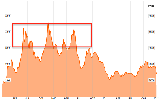
 Anyone remember this period trading the shippers?  Admittedly , the index is volatile, but try to visualize the general trend.

Here's a 6 month chart with the SPY in green, unfortunately the scaling doesn't make the market look like it rallied much, but we know starting October 4th the rally was on, the BDI seems to have been a leading indicator for the rally, if so, then it's also giving some leading signals now, I'm sure you can see what I'm talking about.

This is just another confirmation of the China Syndrome. This weekend I'll be looking at ways of playing China, FXP is obvious, but I think certain commodities, maybe even the shippers might be a better play, especially given the Euro's trend regarding the latter asset class.

Speaking of which, yesterday I though FCX looked pretty good as a potential short play, thus far today it's confirming that view. For the more conservative, a break below $36.50 increases probabilities quite a bit on the head fake move.
FCX and what  believe to be a head fake on the triangle.

Yesterday's BAC Trade Update

As you know, yesterday I went with some BAC March 7 puts as the rumor/news about the F_E_D's white sheet sent BAC flying, which I viewed as a non-starter as Congress does not want to expand the GSEs , in any case, this morning thus far they are at a nearly 11% profit, but I think I'll hold them a bit longer and wait for this morning's bear flag looking move to resolve. Furthermore...


As I mentioned in the last post, I think the Bloomberg denial from the WH was known well in advance and this 5 min 3C chart seems to agree. This would fall right in line with the post last night about the government and Wall Street connection. If I'm even close to on target, this would have been a gift to Wall Street and one they used to sell their BAC holdings, too bad they didn't do this before December 27th.

No Big Surprises Here

 There was a 1 min relative divergence in the area so the "bear flag" looking move right not is not surprising.

 The 5 min chart does a better job in showing the rollover, if I had to guess, I would say that the 4:10 p.m. Bloomberg denial of the Obama mortgage plan was known in the market if not all day, at least toward the close, BAC showed some problems late n the day and we see a negative divergence late in the day as well.

 The bigger picture here is still not pretty with the 60 min leading negative.

 So we have what looks like a bear flag, volume is a bit off for the pattern, but most traders have forgotten about volume and have turned to a number of the latest trendy indicators so I would think this bear flag looking price pattern may see an upside head fake before it moves lower, although it's not really that big.

As I spelled out yesterday before it happened, (what happens with ascending wedges), pretty much everything I touched on has happened, the head fake out of the wedge, the move below it stopping out longs who thought the head fake breakout made it a failed pattern (I showed you the stops getting hit in the DIA yesterday from longs as I explained how they would switch from a short to a long and be 2 time losers.) Ultimately now, the downside target moving forward is a retrace to the base of the wedge.

I need to look at internals, but I see no reason we shouldn't move to that level.

NFP Comes in at a Controversial Beat.

ES shows the controversy as it unfolded...
The 8:30 print which beat considerably, 200k vs. consensus of 155k sent ES popping 6 points, but then it slid back down to levels seen just before the release, why?

Morgan Stanley has been circulating a note, "Not so fast!"

Apparently the seasonal adjustment says Morgan Stanley, produced a +42k quirk that will be given back next NFP report in February.

"some of the strength in this report should be discounted because of an seasonal quirk in the courier category of payrolls (Fed-ex, UPS, etc). Jobs in this sector jumped 42,000 in December, repeating a pattern seen in 2009 and 2010 (see attached figure).  We should see a payback in next month's report."


His  note was accompanied by a chart showing the seasonal oddity, that seems to be what has caused the initial excitement to wane, that along with the fact that the BLS has revised many components again in this report including the unemployment rate, but revisions are almost guaranteed and they are never positive.