Friday, March 9, 2012

AAPL Update... This looks like it...

Thi is one of those moments, I'm working as fast as I can to get it out to you...


 The closing high for an APPL head fake move would have to be above the previous close of $545.18 to draw suckers in, we are in that area.

 The last time I saw an AAPL head fake move coming this is exactly what we saw, Bollinger bands pinch in to 3C weakness- (although as you may remember I was looking for a bigger one, but didn't see how it would be possible as the Bollinger Bands were so tight and then the next morning we got the head fake move-small, it brought AAPL down 2.2% on the day, it's the bigger move I've been looking for this week at least on a closing basis)

 This was Monday's head fake move in AAPL I wrote about last Friday after the close and Sunday night, note the Bollinger bands, just like now, pinching.

 3C was weak during that last move on Monday in the yellow triangle, right now it is even weaker, however...

 The same chart as above zoomed in tight on an intraday basis, is showing the intraday divergence it would need to send AAPL higher, especially with the Bollinger bands pinched.

 Here's the 2 min chart with weakness going in to Mondays smaller head fake move, this timeframe remains leading negative.

 Zoomed closed you can see a negative divergence thought out today.


 The 5 min chart is leading negative and weaker then Monday

A closer view shows the wekness today.

This is essentially nearly the perfect set up for what I'm looking for, a price move in to 3C weakness, the same as Monday just on a bigger scale. The 1 min chart positive divergence is an intraday chart, it's just a primer to get the move under way, it's not indicative of strength.

Lets see what happens.

Sectors, FX, Context Models, etc.

Starting with the Capital Context ES and VIX models...
 Make sure to look at the time stamp, this is about 20 mins. delayed and ES trades 24 hours. The ES Model is weaker then actual ES, which is what I would expect, so no surprises there.

This VIX model is from the start of today's trade, the VIX is much lower then the implied level of their model, again not surprising considering the market is trying to move up with the EUR/USD in collapse, like I said, I can think of only 1 good reason it would try to do that.

As for our own models that are more specific...
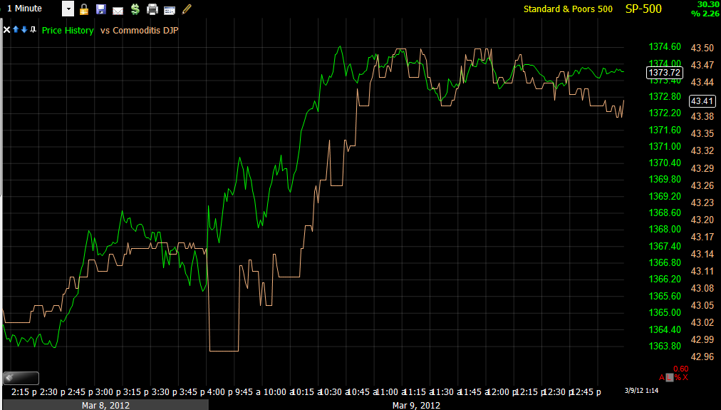
 This is very interesting, not only is the market up against its normal EUR/USD correlation, but commodities broadly as well today, this is aberrant behavior especially  for commodities.

 Commodities vs the SPX (green line) since the bounce, commodities clearly are less excited and longer term at a much, much larger dislocation since December. The point of looking at this is that commodities are a risk asset and when the market is truly in a real risk on mode, they should rally with equities (which besides everything else I've shown you, the market Breadth post from 2 nights ago clearly shows equities falling apart individually, that is not apparent in looking at the averages alone, only when you look at internal breadth).

 The normal Euro/Market positive correlation is absolutely smashed today, meaning today's move is a rare and strange move, again I think you understand why I don't find this to be strange, but expected.

 Longer term, divergences between the Euro and the SPX have sent the SPX lower, they should rally together for the most part unless something is very whacky in the currency pairs which makes the $USD and Euro travel in the same direction which they almost never do and are not doing today.


 This is what the divergence in the Euro/SPX from above would have looked like at the time before the SPX dropped.

 High Yield Corporate Credit should not only be in sync on a risk on move, it should lead equities, here it is lagging badly on the bounce.

 This is the Energy complex vs the SPX, in white Energy had more positive momentum and led the market higher, now it is negatively divergent with the market.

 Financials are in sync today with the market and have been pretty much that way throughout the bounce, but remember the Financial/Tech post from last night, underlying action is very bad.

 Technology led the market early in the bounce, today it is nearly running opposite showing a lot of weakness.

The findings from the 3 major sectors above (Energy, Tech and Financials) can all be seen and confirmed in today's sector rotation, Financials at the bottom have the best relative performance vs the SPX, Energy and Tech have some of the worst performance. Utilities are also showing strong performance, which is a bit odd as they are a defensive sector.

As for commodities strange behavior today (and strange behavior is part of what I was looking and hoping to find this week), lets take a look at a few major commodities.

As I mentioned above, the only way commodity strength today would make sense with the Euro down (because if the Euro is down, the dollar is up and the Euro/$USD pair is the biggest influence on the dollar Index-out of the dozens of pairs, it accounts for 50% of the DI) would be if there were a major FX upheaval that saw the Euro and Dollar trading together which I don't think I've ever sen, but just for confirmation, I use the dollar in these comparisons.

The basic concept to understand is that most commodities are traded the world over in $US Dollars, therefore when they dollar is weak, commodity prices must rise to make up for it, when the dollar is strong, commodity prices fall. Today the dollar and commodities are strong, aberrant behavior.

 This is a multi year chart of USO with the $US Dollar in red and you can see the inverse relationship I described above, when the dollar is up, oil falls, when the dollar is down, oil rises.

 Now look at the behavior today, even yesterday you can see a hint of the inverse relationship at 3 p.m., today they are traveling in sync.

 Here is USO but with the Euro as the comparison symbol, you can see (because the Euro trades opposite the dollar generally) the positive correlation, if the Euro is up, oil is up, if the Euro is down, oil is down, NOT TODAY.

 Here's copper vs the Dollar with the typical inverse relationship to the left and a totally whacked out correlation today. It's as if these assets are being moved against all odds, against all correlations or you might say they are being manipulated higher.

 GLD vs the dollar, everything is normal (inverse relationship) until today.

 The same with Silver

The same with Steel.

Like I said, it looks like these assets are being artificially manipulated higher to support the averages.

Greek Downgrade by Fitch

As I mentioned earlier this morning, we will hear from the rating's agencies, I'm surprised to see it this early and surprised it was the French based, Fitch (I would think Sarkozy would have been sitting in front of their offices all night giving them the "hairy eyeball").

Fitch from FXStreet:


Fitch cuts Greece's rating to 'restricted default'

The downgrade to 'RD' reflects Fitch's previous commentary that the exchange would constitute a sovereign default event under the agency's distressed debt exchange (DDE) rating criteria, and follows the downgrade of Greece to 'C' from 'CCC'  on 22 February. 


Essentially this is a downgrade from C to Restricted Default.


Here's the Euro/USD pair...

While the true extent of the Euro/SPY relationship will be seen later in the Risk Asset/Credit template, this gives you an idea of the head winds the market is trying to rally against, in my opinion there's only 1 good reason for such an attempt.


AAPL Update

What we want to see in an AAPL head fake move or in the averages like the SPY or QQQ is strong price action and weak underlying action.

A smaller scale example would be when the FXP trade idea was first floated on 2/29, we had weak price action in that it broke the consolidation pattern's support and posted an ALL TIME new intraday low, however the underlying action was positive showing that the low was a head fake move being used to shakeout longs so the shares could be accumulated by the pros just before the FXP breakout. This example is the exact opposite of what we want to see in AAPL/SPY or QQQ.

Strong underlying action in 3C on the date FXP put in its head fake shake out.

Or maybe a more appropriate example would be the GLD head fake move, which was predictable a day or two before it even started.

Here's the GLD short (via puts) that made nearly 215% in days.
At the red arrow, there were already signs on 3C underlying weakness, I said on that day, "GLD will need to break resistance to sucker in the longs to create a head fake move. The very next day at the orange arrow that happened and at the yellow arrow, GLD posted a new closing high on the move, all the while the underlying trade was falling apart.

GLD since the first breakout above resistance, note the underlying trade falling apart, even as GLD made a new closing high, the next day was the -5.3% loss which was a huge move for GLD.

So now lets take a look at how AAPL is progressing...
 AAPL leading negative as it moves higher today and a sharp move.

A longer view of the same timeframe... AAPL weakness was present right in to Monday's -2.2% head fake move, which was only a small intraday head fake breakout from a consolidation triangle. With AAPL near the same area today, look at how much lower 3C is, this is what we want to see, whether it be a bearish head fake move or a bullish like FXP.

Longer term... AAPL is in a leading negative position and leading negative today specifically.

And even longer term (60 min)...
The green arrow is uptrend confirmation, then a sharp negative at the 15th and an overall declining 3C negative divergence which saw the 60 min just turn down today, this is the shorter term weak charts feeding in to the longer term charts.

So far, so good.

Market Update

Intraday trade is getting very ugly right here...

 DIA

 ES

 IWM

 QQQ

SPY

FXP- UltraShort China 25 Update

FXP was a trade idea on Feb 29th (long) as FXP staged a minor shakeout below support with good 3C support, essentially it was buying price weakness with 3C underlying strength, this is what it looked like then...

After a decent move over the next 4 days, on March 6th I said, 

" I'm not crazy about the gap it created today.  I'll be keeping an eye on this one as I still like it, but this market has been diligent about filling gaps."


"FXP is a long idea that many members already took and made good money, I would prefer to see a pullback to the 10-day moving average in yellow as an entry point, otherwise, a breakout above the recent highs would be the second option, these are market dependent."

Today, we are at the area of the 10-day moving average...
 Here's the Crossover screen, FXP is very close to a bullish/long crossover, the 10-day moving average is in yellow in the price window.

 However there is a question as to a gap left open below in the $22.50 area, this could be a bullish breakaway gap as FXP was breaking out of a base and a pullback that far, which would be below the 22 day moving average seems excessive.

 The long term 3C chart shows accumulation during the base and a leading positive divergence just before FXP broke out of the base. Long term this looks like it has many more up legs in it.

In the short term on the 1 min chart, we are starting to see positive divergences as FXP is in the area of the 10-day moving average. I would prefer to see this divergence strengthen and migrate to the 2 and 5 min charts before entering, however you could also consider a phased entry, leaving enough room in your risk management to allow for a gap fill to the $22.40 area 9we are at $23.13 right now, so it's not a huge amount of risk for a leveraged ETF like this).

I'll keep an eye on it today and see if this divergence grows stronger and migrates, we are in the target area, all we need for a high probability entry is a stronger 3C reading (not to say this one isn't positive and looking good, but the stronger the reading, the better the probabilities).

Again, I would maybe set some price alerts and keep this one on the radar.

Do we get the AAPL head fake move this week

That's what I was expecting for this week and hoping for, we are close....

Here are the levels to watch on an intraday and closing basis.

KMB Chart Request

As an aside, I use to work right across the Street from a large Kimberly Clark Facility, from talking to employees at lunch break, it was poorly run and they predicted its demise, sure enough a year later they closed the facility, but that's just an aside.

 KMB seems to be working on a decent size top, perhaps a complex H&S top, I'd have to do the volume analysis to determine exactly what, but a top nonetheless.

 This is one of the rare stocks that leaves gaps open, like the island top, which was the absolute top (highs) and more recently a bear flag gap down formation, so I would say chances are excellent this gap in left unfilled as well.

 The daily Money Stream needs no annotations, the divergence here is very clear and bearish for KMB.

 A 30 min chart encompasses all of the top, from the last accumulation stage to the Island top breaking down and the current bear flag formation to the right.

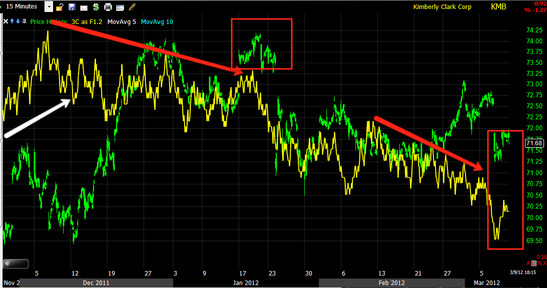
 The 15 min chart shows more detail, especially at the Island top, recent trade in February had no 3C support at all and has since gapped down on a failed bounce/rally.

 On a 5 min chart you can see clearly where the rally attempt failed, note it ended with a parabolic move which at the time would have looked very bullish, price is deceiving.  The bounce to form the bear flag isn't looking very healthy either.


 Here's a 1 min chart of the bear flag, note the deterioration in to the recent attempt to rally.

And a close up of the 1 min. I would guess KMB will start a new leg down soon from this small bear flag. However KMB is not a very high Beta stock so it is probably best played with options and probably on a short term basis until the top finishes forming and truly breaks.

MCP

Last night at 6:36 I posted MCP which had an extremely bullish looking 3C chart, I said, "Put this on your radar".

A few hours later while perusing Brieifing.com I posted this headline they were running about MCP


Molycorp to acquire Neo Material Technologies in $1.3 bln deal  (25.98 +1.07)
2012-03-08T18:00:36 ET
Co announced the signing of a definitive agreement under which Molycorp will acquire Neo Materials for approximately CDN $1.3 billion. This will create one of the most technologically advanced, vertically integrated rare earth companies in the world.

MCP this morning...
That's alright though, there' another bus right around the corner, however if the BLS needs nuclear security firms to safeguard their information, that should tell you something about how bad the leaks are in regular stocks/corporations.