Wednesday, August 29, 2012

Member Success Story

One of my long term members, probably one of my original members had been long TLT Calls and at last I heard he made 100% on them, he asked me for 3C updates, but used the head fake concept on his own to exit TLT yesterday.

He knew $126 was a whole number, it was an area where the head fake trade would be likely as TLT filled and hit gap resistance from 8/13-8/14, he exited yesterday (last I heard at a 100% gain , but I suspect even more).

TLT is one of the assets we were looking for a short term move down as it moves opposite the market, he used the concepts though on his own to get a fantastic exit on calls which we don't want to sit in through a correction or pullback.

I can't tell you how many times I've heard, "trying to pick market tops and bottoms is a fool's game" and for the most part I agree, but what if your concepts, methods, indicators and signals give you exits at the tops and entries at the bottoms? You are no longer trying to pick tops and bottoms, you are just following you trading concepts and signals.

This is as near to a perfect exit as I have seen and he is now waiting to re-enter TLT long. I'm happy to point out trades and ideas, but I really love when you take the concepts that we employ and use them in your own trading, when you break free from the sheep and become your own wolf, thinking and acting for yourself and not blindly following the pack; there's no greater joy for me, no greater vindication of the work and observations we make than to see you each use what we have learned and continue to learn, in your own trading.

So Congratulations Sam on an amazingly well thought out and timed exit from TLT.

The charts...
 Sam's exit of TLT Calls yesterday at the head fake move on an intraday chart above the whole number/psychological level of $126. You don't get much more accurate than that and those calls are surely worth a lot less this morning.


 TLT breaking just above gap resistance, an area traders will watch and buy a break above, gap resistance and support are actually some of the strongest resistance/support areas you will find, Sam's exit on a daily chart yesterday above the yellow trendline.

 All in all, TLT/Treasuries, the flight to safety trade look good in a leading positive 60 min divergence to a new high, this isn't good for the market.

 The 15 min chart with confirmation of the trend in green and distribution right at the move above $126 and in the general area.

 The 2 min chart showing increased distribution at the head fake move-like I said, these moves happen before reversals on all timeframes, even a 2 min chart because the concept is universal, it takes advantage of technical analysis and human emotion.

Already TLT is starting to show accumulation in to lower prices on the 1 min chart as we'd expect to see, look for TLT to continue to accumulate at lower prices, soon it will be a long trade again for options, for longer term equity longs, it's still a long trade.

I am pointing out 1 member's success, I hear these stories every day and I love them, this was just an amazingly excellent exit.

Opening Indications

Thus far things aren't looking good for the market, if you recall it was last Wednesday and Thursday that we saw fractured positive divergences (not clean, not particularly strong), but they did manage in most cases to make it to the 5 min chart. As of Friday, the 1, 2 , 3 minute 3C charts and even 2 of the major averages' 5 min charts were already breaking down, this was unusual because after an accumulation period, no matter how small, there's usually a mark up of prices before distribution starts, this is just common sense if you think about it, you accumulate at $10 and you mark prices up to $10.15 before you start selling in to price strength to guarantee a profit on the cycle. Friday was unusual in not only did the negative divergences start the next day, but they travelled or migrated through multiple timeframes to the 3 min chart and even some 5 min charts started to turn, this is partly why I believe the distribution of assets, especially stocks like AAPL, smack of desperation. It seems there's a very limited door/window and not all are going to fit through it in time so they started selling as soon as there was any price strength, profits be damned, the door was open.

This theory fits with the 89% of hedge funds under-performing the SPX and the sheer volume of redemptions coming in September and at the end of the year, it also fits well with the very consistent, yet highly unusual 3C signals across the board as I showed you on many separate occasions, but specifically last night.

What I have been looking for are some new highs in AAPL, breakouts above triangles in the market, etc, but all of these are just a conduit to see what happens with the 5 min charts as once they break, the door closes.

The opening indications don't rule out the possibility of these higher prices which I want to use to sell longs in general and sell short in to price strength, however they also don't look good and are doing what I hoped to see, they just aren't doing it in to price strength which smacks of even more desperation.

Take a look...
 DIA 1 min not off to a strong start this a.m.

 DIA 3 min leading negative.


 DIA 5 min falling apart.

 ES not looking good on the open.

 IWM 1 min is in line, this has been the strongest average.

 However it is now seeing the most damage-2 min chart

 IWM 3 min

 And the 5 min IWM chart-this is where it counts.

 QQQ 1 min

 QQQ 2 min looking bad.

 QQQ 3 min really looking bad as it leads negative, this is where it effects the 5 min.

 And there's the effect on the QQQ 5 min

 SPY, may still be able to break above the triangle, I hope so to add shorts.

 SPY 1 min leading negative

 SPY 3 min leading negative


This is last Wed/Thursday, I'm hoping there's enough to make it above the triangle to set up additional shorts, but it's not guaranteed, although I think likely.

GLD Trade may be coming together.

For a equity short, GLD is in the right area, since I already have GLD Puts, I'd only enter more on a price concession (like AAPL) and I think it's one we have a good chance of getting, especially after seeing the early trade.

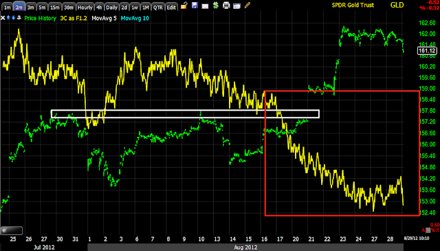
Pay attention to the chart because this is the same scenario as Energy, Technology and Financials I laid out last night, VERY CLEAR underlying institutional action at specific key levels.

If you are looking for a Put trade, then I'd urge a little patience or maybe consider phasing in to it, but I do think the chances of getting the price concession I have been looking for in GLD (and AAPL) are pretty good. Take a look, lots of familiar concepts at work here.

 The GLD breakout of multiple price patterns, take your pick.

 The hourly chart going negative on the breakout move as QE hopes fade there's no reason to think GLD won't fade as well.

 30 min chart on the breakout leading negative

 5 min chart on the breakout leading negative to new lows.

 The exact same on the 3 min chart

 As well as the 2 min chart, the picture here is pretty clear isn't it?

 And the 1 min chart's trend, this is why I was so amped up last night, I've never seen such clear underlying action at specific levels in which you'd expect to see that kind of action, but this is very clear on multiple time frames and in multiple asset classes. This is like a new chapter in understanding and confirming the concepts we have followed regarding underlying action or put more simply, institutional actions.

 The clearing of stops in GLD this a.m. also sets up the ability to accumulate a few shares, remember I'm looking for a breakout above the recent 3 day resistance range to enter a put. Lets see if these stops that were hit were accumulated...

It looks that way, it's not big accumulation, but it seems to be just the right amount to move GLD above $162.50.

This is making a trading plan, trading your plan and letting the trade come to you.

Taking the bait?

It looks that way, the short vs intermediate and long signals had me looking for short term price strength yesterday that works in to worsening underlying conditions, yesterday the market decided to spend its time building very visible triangles instead, from a technical trader's perspective, they are bullish consolidation/continuation triangles, from my perspective they are a chance to see if the underlying trend finally breaks the market as there were a few key stocks we've been waiting on such as AAPL.

This is a start and its early in the day, which is when I suspected the strength would materialize.


Here are the triangles and it looks like technical traders tool the bait on the most common price pattern in the financial markets.

 The markets are fractal in nature, what happens on longer charts happens on shorter charts, it's all driven by human emotion and taking advantage of human emotion, that's why some things never change. This double triangle in AAPL with the seconds smaller on a 5 min scale looks a lot like BIDU's final head fake move, except that was on a daily scale.

Just adjust the scale and they are very similar, signals are similar too.

 AAPL on the open from yesterday's triangle.

 IWM from an ascending triangle.

 QQQ from a sym. triangle

SPY this a.m. from a sym triangle.

ES pre market

 ES up on some vague Merkel , EU/ESM cheerleading...

Weekly VWAP.

With that triangle from yesterday in effect, I'm still looking for a move to the top of the ES weekly VWAP channel.

A Few Examples

You've already seen a lot of charts like this in the averages, stocks such as AAPL, GLD, USO, etc.

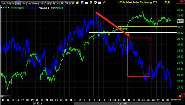
Here are the 3 most important industry groups for any rally. You'll notice 3C changes dramatically at the same area in almost all timeframes, the price levels are also either important highs, or psychological levels where buyers will step in (retail), look how institutional money behaves at these levels and these are only 3 industry groups. I've never seen anything quite like this, each level where retail stepped in to buy new highs or breakouts, the institutional underlying trade degrades significantly. There are probably a lot more triggers such as dates and price patterns that I have not investigated, the behavior is more than enough to make the point, to show how smart money uses technical buying levels to sell in to, but more importantly, how drastic the charts degrade at higher levels and key areas.

There are simply too many charts doing the same thing at the same place, too much confirmation for this to be coincidental or random, this is without a doubt one of the strongest distribution cycles I have seen with almost a desperate hue to it.

Often a single divergence can be meaningful, here we see a lot of trends which give us a lot more information about where things changed and how much they changed.

Energy
 (30 min)
$70 is a serious resistance level from April, watch how 3C reacts as price passes the trendlines.

 (5 min)
This is a gap up move over the 8/6 highs

 ( 3 min)
More detailed distribution at that same gap up area

 (1 min)
This is a quick new high over a 5 day resistance area.

Financials
 (30 min)
$15 is a whole number and a psychological level, it's also an early August resistance/congestion area, a break above this area brought in volume, the $15.20 breakout was above resistance for a 1 day new high and a gap resistance area from May 4th, all technical levels.

 ( 5 min)
($15 again

 (3 min)
The same two levels


 (2 min)
Again the same 2 levels, distribution gets progressively worse.

(1 min)
 Huge distribution on at the +$15.20 area

Technology
 (4 hour)
Distribution on a 4 hour chart at a new high, also a relative negative divergence on a double top.

 (30 min)
$29.50 is a psychological level, a breakout area and important gap resistance area,

 (15 min)
$29.50. $30 which is a psych level and $30.25 which is a breakout level from May 1, May 1 was also the last day/ market high in the market before a major reversal to the downside.

 (5 min)
The same levels see a dramatic transformation in underlying trade

 (2 min)
The $30.25 level

(1 min)
$30.82 was the highest closing high, the next day above it created a daily bearish engulfing pattern.

There are tons of charts like this that show areas where demand picked up by retail at significant technical levels, that demand was used to sell/short in to.