Here are the 3 most important industry groups for any rally. You'll notice 3C changes dramatically at the same area in almost all timeframes, the price levels are also either important highs, or psychological levels where buyers will step in (retail), look how institutional money behaves at these levels and these are only 3 industry groups. I've never seen anything quite like this, each level where retail stepped in to buy new highs or breakouts, the institutional underlying trade degrades significantly. There are probably a lot more triggers such as dates and price patterns that I have not investigated, the behavior is more than enough to make the point, to show how smart money uses technical buying levels to sell in to, but more importantly, how drastic the charts degrade at higher levels and key areas.
There are simply too many charts doing the same thing at the same place, too much confirmation for this to be coincidental or random, this is without a doubt one of the strongest distribution cycles I have seen with almost a desperate hue to it.
Often a single divergence can be meaningful, here we see a lot of trends which give us a lot more information about where things changed and how much they changed.
Energy
(30 min)
$70 is a serious resistance level from April, watch how 3C reacts as price passes the trendlines.
(5 min)
This is a gap up move over the 8/6 highs
( 3 min)
More detailed distribution at that same gap up area
(1 min)
This is a quick new high over a 5 day resistance area.
Financials
(30 min)
$15 is a whole number and a psychological level, it's also an early August resistance/congestion area, a break above this area brought in volume, the $15.20 breakout was above resistance for a 1 day new high and a gap resistance area from May 4th, all technical levels.
( 5 min)
($15 again
(3 min)
The same two levels

(2 min)
Again the same 2 levels, distribution gets progressively worse.
(1 min)
Huge distribution on at the +$15.20 area
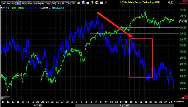
Technology
(4 hour)
Distribution on a 4 hour chart at a new high, also a relative negative divergence on a double top.
(30 min)
$29.50 is a psychological level, a breakout area and important gap resistance area,
(15 min)
$29.50. $30 which is a psych level and $30.25 which is a breakout level from May 1, May 1 was also the last day/ market high in the market before a major reversal to the downside.
(5 min)
The same levels see a dramatic transformation in underlying trade
(2 min)
The $30.25 level
(1 min)
$30.82 was the highest closing high, the next day above it created a daily bearish engulfing pattern.
There are tons of charts like this that show areas where demand picked up by retail at significant technical levels, that demand was used to sell/short in to.


No comments:
Post a Comment