Monday, December 16, 2013

USO Update

It's no secret that I like USO / oil a lot for a position type move, longer than a swing trade, not quite a primary trend trade though, still worthwhile.

It's also no secret that I've been expecting a correction in USO, corrections can be price based as in a pullback or time based as in a lateral consolidation, I "Assumed " USO would see a price based correction, but that wasn't an assumption I had any grounds for, it's highest probability, but the only thing I had grounds for was a correction, as to what type, that's for the market.

USO is still acting well within the normal parameters of a correction, I'm not convinced it's a long again yet, but I am convinced it will be.

I've tried not to draw on the charts to allow you to look at the divergences for yourself, although I have given hints. Remember that the longer term charts are the highest probability and in a correction situation, the short term charts will usually be negative and we know the correction is ending as they start going positive and all new divergences (such as this positive) will start on the fastest timeframes and work their way to the longer timeframes like 2, 3 and 5 min.

Here's the charts for both the WTI based USO and the Brent based Futures, you'll find they have very similar signals at similar areas and timeframes.

 USO 60 min big picture, there are several set ups here, the most recent is the most important and the highest probability.

The 15 min chart shows the initial movement warning of an upside move and then the movement warning of a correction and there's even a head fake signal in there just before the reversal to an upside move.

The 2 min chart is the intraday action, this shows you more evidence of a probable pullback, but also tells you something about where the pullback is in the process. Certain things will have to happen before the short term probabilities change and move USO back on track toward the longer term highest probabilities, this is all very normal price action, there's nothing here unusual.


 Here's the X-over system, it's hard to call a pullback to a specific average when the long signal just started.

Crude (brent) futures.
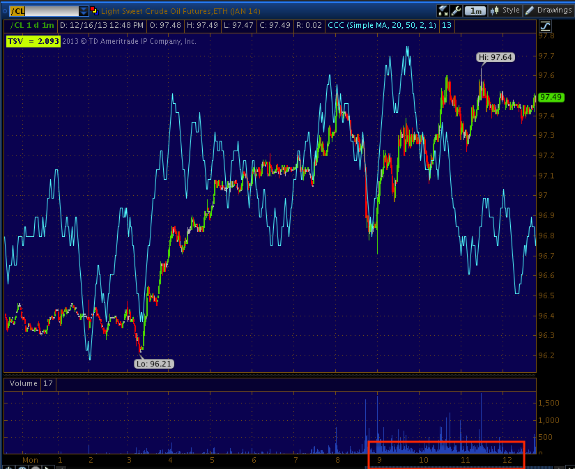
 intraday 1 min chart tells you something about where oil is in the pullback process, much like USO's 2 min.

The longer term 5 min chart tells you something about how serious or not serious the correction is.

The hourly chart is kind of an overview map of what is going on

And this 4 hour chart shows the changes in USO and the highest probability trend right now.

UNG Update ( DGAZ Long)

UNG is another long term long position that I really like, it had a recent breakout and as of last week I was expecting a pullback in UNG so I went with DGAZ as a way to play the UNG pullback (DGAZ is the opposite of UNG essentially with 3x leverage).

UNG, as expected pulled back today (or started it) and DGAZ is the #1 long from last week's trading longs picked, so far a 6+% 1-day gain. So whatever the UNG analysis, it applies to DGAZ inversely (opposite).

Even though we have a decent gain today, I never thought this would be a long duration or even medium duration trade (like the rest of the positions/market). Here's what we have thus far...
 The first thing that caught my attention about UNG almost a year ago now was the change in character from a solid downtrend to a large or ever increasingly larger lateral trend consistent with a base. We've had long term trades, we've had +25% gains and traded around UNG and have done well, but the big picture trade hasn't emerged yet, that's a stage 2 liftoff out of this long lateral base and when that happens, UNG has the chance to be one of the biggest runners of the next year or two.


Here's the recent breakout, volume and the candle for the day were excellent, a strong breakout, but there were signals back then that we'd see a pullback, we just had to wait for them to become more defined. Note in yellow the bearish reversal "Hanging Man" candle and the increased volume, one of our concepts when dealing with candlestick patterns is volume confirmation, I'd say a candlestick pattern that has increased volume (bullish or bearish) is about 3 times more likely to work than one that has normal or average volume, so that candle was impressive.

 This is what DGAZ did today, the recent surge in volume here is indicative of a change of character and a short term capitulation event, taken alone it may not mean as much, but with UN?G, they tend to confirm each other and raise the probabilities of our trade working.

My X-Over Screen is tricky in a lateral range like UNG has been in, but it is in a long signal, even now. The first pullback with this system on a new signal is almost always to the 10-day yellow price moving average, in this case though that "seems" a bit shallow to me, but for today I think we've seen as much as we are going to see, at least for now.

UNG's 30 min 3C chart has been deadly accurate in calling distribution and accumulation and the most recent pullback signal on a negative divegrence, but not one so damaging as to threaten the breakout.

 The 5 min chart overall has been a good timing indication as it went from in line on the uptrend to negative recently, so far this morning's gap down "seems" to have some accumulation, this is what we want to see considering DGAZ is a short term trade, the longer term trade is UNG long and the accumulation of a pullback is EXACTLY what we look for to confirm our opinion about UNG and to allow a tactical re-entry long in UNG or for a new position, it allows you to get in at a better price with a better risk/reward profile.

However, I don't think this signal on its own is enough to tell us to close DGAZ long and re-enter UNG long, it's just a good sign that things are going as planned.

The 30 min DGAZ shows the same confirmation of the downtrend as UNG showed at the uptrend and shows the same positive divegrence where UNG showed a negative divegrence, again this is confirmation as these may be related, but they are two different assets completely with different leverage, different management, and most importantly different volume which is key to 3C's signals, so when we get confirmation like this, it's very valuable information.

The 5 min DGAZ was also showing the probability of a near term reversal was very high with a leading positive divegrence, compare to UNG's 5 min chart. What makes the chart more compelling is how it has been spot on correct about the negative that turned prices lower, the in line signal confirming the trend and the positive sending it higher, that's 3 for 3 and with UNG confirmation, it's 6 for 6 on one timeframe alone, this is how we build a case or discover a built case for a trade, the more confirmation the better, after all 3C is a reminder to "Compare, Compare, Compare".

DGAZ's X-Over Screen is in a sell/short signal, but will likely correct like UNG to the 10-day yellow moving average, that is where the first correction after a new signal usually ends up, in this case, I could see a little deeper correction toward the blue moving average, but then again with the F_O_M_C Wednesday, there may not be enough time.

For now DGAZ is just being managed, I'm looking for shorter charts to start changing and giving us a clue that the move is about to end, then DGAZ will be closed for a profit and UNG will be bought at a lower price.

So far, so good.


MCP Update

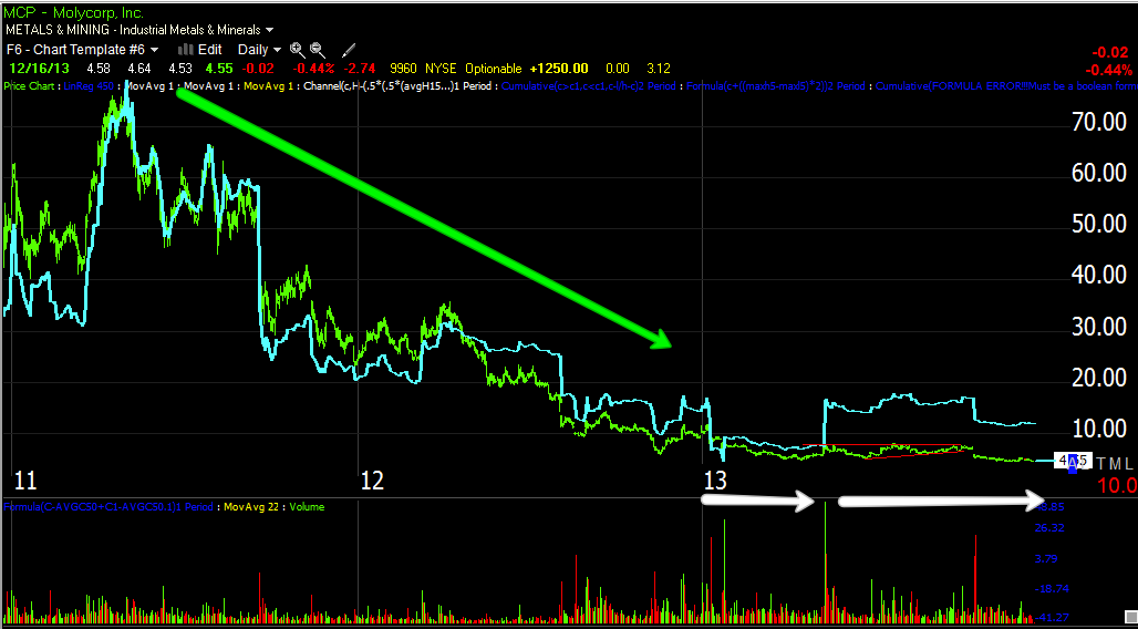
MCP is starting to put in a strong intraday positive divergence (leading), I'll post it after it has had a little longer to show it's full size.

In the mean time I was just going to update short/intermediate charts and maybe some implied price targets, but I went a bit further.

 3 min 1) we have an "in line" signal, no real divergences, price and 3C are confirming each other  2) is a small positive divegrence, it may have looked large at the time, but when compared to a much larger one it loses the impact, but it was enough to send MCP up on a stage 2 run and in to stage...  3) Which is a top/distribution and note the very volatile, seemingly bullish action, a parabolic or vertical ascent which forms the top, as always, price is deceptive. 4) We have a positive divergence that sends price higher in a mini stage 2 and 3 and finally stage 4 decline which is a small correction, at least it looks that way.  5) We have a huge leading positive divegrence, this is seen most often at the second bottom of something like a double bottom of "W" base, the second base sees even more accumulation which has accrued in to a stronger signal, so it is probably appropriate to view the entire area from #2 to #5 as one big base from looking at this chart alone.


 A 5 min chart shows the exact same areas, in line, positive, a run up and negative divergence at the parabolic top where price "appears" to be the strongest, it's actually the weakest / breaking point to #4 which is a small corrective cycle and #5 , a stronger leading positive divegrence.

This confirms the chart above this one.

 Intermediate 15 min chart which can be a very powerful timeframe in its own right shows something interesting, the first chart (3 min) suggested that we view the entire area as one larger base asre, when looking at a 15 min chart we see an in line status in green as price moves down and we see the divergences and the base areas they developed in that traces out a larger "W" base, there's only a small amount of distribution at that parabolic top in the middle because it's not true distribution, but it's letting out enough supply to cause MCP to drop back down to the accumulation range. For instance, imagine accumulating 500,000 shares at the first base which causes price to rise as the float becomes smaller (not the true float, but what is available for trade at the moment, those 500k shares are removed from the market by whoever is accumulating). This causes price to rise, the distribution to send MCP lower to finish filling out the order may have been something like 100k shares to knock it back down (this is just for example, not meant to be real numbers), this leaves +400k accumulated and price back in the accumulation zone where another 600k may be added, giving an accumulated 1,000,000 shares and a stronger leading divergence. Now even more of the float is off the market, it takes less and less to drive the stock up as the float is reduced by the accumulator, simple supply/demand 101.

 The longer term 60 min chart makes it clear that the "W" pattern we were looking at above is likely part of a much larger "W" base, the 15 min chart's "W" above would be the second base in a larger "W" stretching from #2 to #5 and the 15 min chart's "W" is #5 alone. The same concepts apply though as #3 is distributed to send prices lower to finish accumulation.

Now we can see there's likely a much bigger base, notice how fractal all of the charts are, a small "W" making up one part of a larger "W" base and so on.

This is the daily chart, it definitely gives the same impression as the 60 min chart, this means the initial move to the upside will likely only be the start of a much larger move, the "W" here becomes clear at the white accumulation areas with the total base in the green box around the date scale.

Money Stream shows the same thing, in line as price moves down and transitioning to a positive divegrence, look closer.

This would be the same area seen in the longer term intraday charts.

If we use a simple price based, measured move which I think ois way too conservative for a base this long, we get...
Our regional base that likely moves to the 7+ area, which also is the area where shorts are squeezed as their stops are in the area from the GS downgrade. Once that squeeze begins, the larger base breakout implies a run to the $11+ area, but as I said, this measured move only accounts for price/bases from top to bottom, it doesn't count the length so it's likely very conservative in upside guidance.

MCP has long been one of my favorite LONG TERM long positions, I hope you can see why.

Early Update

So fat 5 of the 7 trading positions opened last week (actually 1 was a short that was held, PCLN) are all in the green this morning, even the PCLN short is in the green. DGAZ is the biggest winner so far at nearly a 7% gain off the open.

IOC (long) is down half a percent and MCP long, but I do like MCP long for a move here as a Call position was opened Friday and from what I see so far this morning, that was the right call (no pun intended...well maybe a little). That MCP call is up 10.5 % so far this morning.

Again, it's just be patient, manage the positions and let the market tell us when to make the switch back, patience right now, we were set up and ready for this last week. The movement now is setting up the next opportunity.

So far the new "Trading Portfolio" which does NOT include the MCP call or any options is now up over 15% since inception about 2 weeks ago.

A.M. Observations

Good morning.

Well, what can I say this morning that wasn't already said last night or that we hadn't already prepared for by Thursday of last week? I'm almost surprised by how brazen the invisible hand is now, so much so it really can't be called the "Invisible Hand" when it does things like a 10k block in ES contracts in thin overnight volume, I could only think of one reason to do that as I said last night, to accumulate during the rest of the long overnight session and here we are from an ES closing 4 p.m. print of 1768.50 to a 10 p.m. overnight low of 1754 to 1779.50.

Other than that, the Empire F_E_D missed consensus for the 5th consecutive time at .98 vs exp. 5.0. While margins were better due to falling input costs and higher prices received, the employee workweek saw a major hit from 5.26 to -10.84.

T?here's not much more to say, we're ready for today. I hope you all do well, I'll of course let you know when it's time to let go of those positions.

The Week Ahead

I hope everyone had an enjoyable weekend.

This week's centerpiece event will be the F_E_D's most important F_O_M_C meeting of the last year (as each of the previous ones have been as well, ever since "Taper" talk surfaced); it starts this Tuesday and we'll have a policy statement Wednesday at 2 p.m. Many believe that the F_E_D is set for a December Taper, of course many have thought the same about each of the last F_O_M_C meetings and have been dead wrong, but there has been some talk from F_E_D regional presidents just before the blackout period starting last week, that suggested a taper is more realistic now than any time since that early summer "Half the respondents thought QE should be wound down in full by the end of 2013", which in turn sent the 10-year interest rates up 100 basis points in no time and out of the F_E_D's control, thus the F_E_D reversed course and made no mention (for practical purposes) of a taper again. At the time when the F_E_D went from full-on Taper to the next meeting that almost totally ignored it, I asked the question, "What is the F_E_D so afraid of?" At first I thought it may be a taper coinciding with the government shut down and although that's a good guess and maybe even on target to some degree, F_E_D actions and statements since have shown what they were really afraid of was the bond market's response in sending the 10-year benchmark (that sets all kinds of other rates from mortgages, to car loans and credit card interest) up a full 100 basis points, something that previously only the F_E_D was known to have the ability to do in general.

Since then, the F_E_D has gone through extreme pains to reassure the market that the initial guidance of rates rising about 6 months after QE is wrapped up, is no longer on the board and "Accommodative policy" will remain in place for much longer than expected, which retail traders took to mean QE on several occasions when Ben truly meant ZIRP rates, but he did leave it ambiguous enough to allow for the market to think he was talking about QE, bond traders knew he was sending them a big olive branch with a huge bow and nearly begging them to trust the F_E_D won't hike that fast.

For my part, I don't try to guess what the F_E_D will do, but it is assumed that a taper would start on a small scale of $10billion a month or so at first and from treasuries while they maintain current levels of MBS purchases. For the market, it's always been the treasuries that have moved the market. QE1 started in 2008, you might not know it because the market didn't go bull-crazy until early 2009 when QE1 was expanded to include Treasury purchases, that essentially marked the bottom of the 2007-2008 stage 4 decline. I will make the same warning I have been making in front of every significant F_E_D event for the last 5 years, "BEWARE THE F_E_D KNEE-JERK REACTION".  We seen it time after time, it's a much higher probability that it will be there than it won't. It typically lasts from a few hours to a few days and it is almost ALWAYS wrong and faded. The knee-jerk reaction is strong, it's a hard trade to fade, but when timing signals are right, it can be a great opportunity, it's just another one of those very difficult emotional trades, to fade a move that seems so strong and seems to be a direct result of F_E_D policy which most people see as the Marty Z. mantra, "Don't fight the F_E_D". We'll cross that bridge when we get to it, but I'll say the market has seen a set up pre-NFP and the NFP print was about as bad as it could be for those wanting to see QE last, yet the market acted very differently, you may recall however that we were pointing out that this Friday NFP market reaction was being set up in credit 4 days before and in the VIX 3 days before. Additionally it's no secret that many believe a December taper is coming because the economic data on the whole has been supportive of such a move and it will be even more supportive as we have moved in to the Seasonal Adjustment period which we have seen the last two years. Economic data during this period that lasts until about March/April, sees just outright made up, strong economic data. The Economic Surprise Index that use to be available was a great tool for watching the trend start and reverse nearly on a dime. However at the same time many who were sold on a December taper are not as convinced because of Core CPI (inflation data). I personally didn't think December would be ideal considering holiday purchases connected to market headlines and more importantly the end of year market nuances. Also the inventory builds that saved Q3 GDP are going to likely make Q4 GDP not look so great and the F_E_D is aware of this, that's just opinion though not worth much.

Here's a full look at the U.S. economic data for the week...


Tomorrow before the open we have Empire State Manufacturing Survey and Industrial Production. Tuesday before the open we have CPI, Wednesday before the open we having Housing Starts and at 2 p.m. the F_O_M_C policy statement. Thursday are normal Jobless Claims , at 10 a.m the Philly F_E_D Survey and Exiting Home Sales (should be an interesting week in housing and getting more interesting as we move forward), Friday we have Q3 GDP (revision) that is expected to come in at consensus and at previous. Expect EXTRA VOLATILITY this week as we not only have significant data and the F_O_M_C, but Friday is Quad-Witching which is the expiration of Stock Index Futures, Stock Index Options, Stock Options and Single Stock Futures, being Quad Witching is coming up right at the end of not only Q4, but 2013, expect lots of volatility as WINDOW DRESSING will be a dominant theme, I suppose a lot of funds won't know which way they want to go with many assets until they hear what the FO_M_C has to say Wednesday, but that should set us up for a lot of volatility in to year's end. This is the time we typically have the Santa Claus Rally, but the last two weeks have been some of the worst weekly performances in many ways in months if not the year in many aspects. ***Since we have the holiday's (market closures and early closures), I feel the typical movement that has to be executed on a T+3 basis (Trade plus 3 days to settle) and considering the Wall St. vacations, I feel a lot of window dressing will be pushed forward earlier, in fact I'd say starting around 2 p.m. on Wednesday (minus the knee-jerk effect). Again, VOLATILITY seems to be what's in trader's stockings early this year.

One last thing, many of you know about our "Cats and Dogs" trading concept/season. It's a time when low cost stocks tend to run and make big gains in a day or a few days, they are usually well set up ahead of time, the psychology behind it seems to be the Greed Effect, people who missed the market moving jump in as late comers, but they don't want to pay up for stocks that have already moved so they tend to look for the "Cheap" stocks. I set up a filter/scan today for stocks under $3 with at least an average of 250k shares traded daily, optionalable and my secret to finding "EARLY NEW Bull Market Winners", stocks with a high P/E and very low or negative cash flow. I'm not quite sure why this works, but I've backtested it and it's one of the greatest fundamental edges in a scan for long positions. I'm guessing these stocks do well because they have something (as the market is all about sentiment and perceptions) that make investors willing to bid them up (evidenced by the high P/E) and don't care that they are bleeding cash, perhaps they believe in some product these companies have, but they are almost always NASDAQ (4 letter tickers) and they are typically easy to remember like: CRIS, ROYL, FOLD, COOL, DSCO, PLUG, SONS, IVAN, etc. 

These stocks tend to pop off left and right near the end of a bull market run for psychological reasons you can figure out. I ran through a large watchlist that met my criteria and there wasn't much of anything on deck, most had already made either move a while back, I'm guessing around the same time we kept (initially) hearing about record NYSE Margin and Investor negative net worth, the reach for yield on an extremely leveraged basis. The point is, the C&D trade wasn't there and psychologically, if it's not there at this time, it has already happened.

As for futures tonight, WOW, volatility has started.

 3C on an intraday 1 min chart really went south after Index futures opened tonight, you'll see it more defined in the other index futures, but around 10:08 over 10k SPX contracts were dumped all at once in a thin, illiquid market sending ES DOWN 11 POINTS IN THAT 1 MINUTE BAR.

Why would anyone holding ES dump such a large lot all at once knowing the reaction was going to be a huge loss unless.... ??? In any case, as I said, 3C picked it up just after futures opened for the week.

This is NASDAQ 100 futures, you can see a similar dump at the same time on just under 1900 contracts in that 1 minute bar.

The Russell 2000 futures like NQ above this chart both show 3C going very negative as trade opened for the new week, here a large block of about 800 contracts were dumped. I really don't understand this other than some kind of reverse ramp, maybe something that hasn't happened yet will explain it, perhaps the rest of the night will be accumulation in smaller lots, the Nikkei futures which got slammed as well seem to indicate something like that may be happening.


 Nikkei 225 futures, note 3C.

The EUR/JPY which opened earlier had been sliding, but I can't see that as reason to dump so many contracts in one big block or 1, 1 minute bar when they know what the outcome would be so obviously it was intentional, but for what reason...? 

The Yen as you might imagine, had been running (with EUR/JPY dropping), but it seems like even that YEN run is seeing 3C distribution which could turn the carry pair around and perhaps start accumulation overnight in more sensible size.

As none of the EUR/JPY move can be pinned on the Euro which is actually acting pretty well on its own, I had to look at the Yen, guess what I found?

Yen single currency futures, accumulation in the Yen as FX opened earlier for trade, this is what sent the EUR/JPY pair lower, not the Euro and it's clear as there was distribution in the Index futures, there was confirming accumulation as the new week opened for FX trade in the Yen, but just like the positive divergence in Nikkei 225 futes, we have a confirming negative divegrence currently in Yen futures, as I said above, perhaps someone will be accumulating on the cheap throughout the rest of the overnight session in lots that aren't going to call attention like this one.

Until the morning when we can see more, you know how we are positioned for short duration trades and our longer duration core positions, it should be interesting.

I'll see you in a few hours.


Archaea Capital's 5 Trades to Avoid in 2014


I reposted this article in full, not for any specific analytical reasons, but for larger concepts that will always serve you well throughout your investing lifetime. Some that really resonate with me as we see them nearly every day or week is the concept of "Reversion to the mean", many of my indicators are constructed on the premise, in many ways moving averages are used for this principle in much larger ways than typical traders realize, think of our Leading Indicators and the "Yields" indicator we use that not only is great at predicting changes, but just as important, in predicting moved that are pure "reversion to the mean".
There's some touching on "Crowd Think" or what I consider to be the third major form of market analysis (Technical, Fundamental and...), "Mass Psychology". Take for instance the, "This time it's different theme we have seen in every market bubble for over 400 years whether the investment be Tulip Bulbs, Rice, the South Seas Company (bubble) that robbed Sir Isaac Newton of his wealth, Tech of course was a major theme in the late 90's and surprisingly, the very (until 2002-2003) Housing Sector Bubble which even was awarded the mantra, "This time it's different", for housing? Really? By the way, just in having the experience of the bubbles I've seen in my life (it seems the more activist the F_E_D is, the more bubbles are produced) I'll say that I do believe there's ANOTHER real estate bubble, it's in "Investment Property". As I have alluded to (I share everything with the Wolf Pack because I really don't have anything I'm ashamed of and you're all like family) my marital status is "Fluid" which is just me saying to those of you I know really well and those of you who know me really well, I'll be getting divorced, likely before the year is over or thereabouts and that will likely lead to some good stuff like trading I have recently mentioned and some other things, I just haven't had good luck with Hungarians, except the dogs which I love as much as you can love something. 

In any case, the point being is our marital home is for sale, I work from home so I meet all of the prospective buyers and I serve as Treasurer and Secretary on our Association's board of directors for the second year. We've seen a huge influx of people buying (not as an investment for appreciation like the last real estate bubble), but as landlords. You've seen the data, mortgage applications, new home and existing home sales where we've seen 50-75% of all buyers paying in cash, those aren't people looking to live in the home. Our association's ownership has gone from about 4% rental units as of 2010 to 45% right now (it was actually difficult for use to get a loan I just signed off on last week because our units used as rentals are so high. We've heard of some of the biggest Private Equity firms getting ready to dump 75,000 or more units on the market as the landlord business doesn't have the projected profit margin they assumed. 

Maybe more indicative of a bubble are the number of foreigners that have looked at our unit and the number of people who are housewives or electricians. I knew someone who built a real estate empire in out county and I know how she bought, how careful she was, how she'd walk away from a 4 unit house over a 2% haggle in price because she knew what it took to be a landlord and make it work. I THINK IT'S SAFE TO SAY, WHEN YOUR WIFE'S PARENTS IN HUNGARY WHO SPEAK NO ENGLISH ARE READING ADS IN THE NEWSPAPERS ABOUT INVESTING IN US REAL ESTATE TO PROVIDE A LASTING INCOME AND THEY ARE SERIOUSLY CONSIDERING IT (DESPITE ALL OF THE OBVIOUS LOGISTICAL PROBLEMS OF LIVING 6,000 MILES AWAY) IT'S SAFE TO SAY WE HAVE ANOTHER BUBBLE. When these private equity firms dump their portfolios on the market en masse, I think at first the mom and pop landlords will think they hit the jackpot, but I don't think it will be long before they figure out what private equity firms are figuring out, being a large scale landlord is a very specific business that requires a lot more than just buying properties ABOVE ASKING PRICE!

For those of you who might be considering a home or a second home (give me a jingle if you end up in South Florida), I think within a year or two there are going to be some amazing opportunities to buy homes on the cheap as banks are forced to refocus their business model back to lending and away from speculation for a number of reasons that I won't get in to right now, but it's almost the perfect storm for those of us who might like to buy a home or a second home.

In any case, Archaea's piece isn't going to make you money tomorrow, but it's a sound, well written piece that touches on so many topics we've been harping on for some time, try to read it when you have a few minutes.


From Archaea Capital Research (pdf)
ANNUAL REPORT – COMMENTARY
2013 & 2014: Closing, Reflection, and Five Bad Trades To Avoid Next Year
December 12, 2013
To our Clients and Investors,
Our investment process continues to focus on filtering highly favorable reward-to-risk opportunities. Yet the last 12 months have presented an interesting anomaly. Looking back and reflecting on 2013, we find a year inordinately cluttered with apparent opportunities that turned out to be bad trades. More so, in fact, than any other year we can remember. In 2013, avoiding bad trades contributed more alpha to an investment portfolio than identifying great opportunities. Not losing was the new winning.
Too many investors, prodded by the unrelenting monetary zeitgeist or their own emotions (or both), voluntarily entered these traps, at one time or another, throughout the year. Identifying the bad calls in advance, and implementing a basic filter, saved a great deal of financial and mental capital—and kept us in the race. Looking through our global macro lens, we list some of these potholes in chronological order:
First among them was the universal belief starting around 4Q12, and lasting well into 1Q13, that Emerging Markets were going to be the star performers this year. Then by March, the latest fashion was to sell the British Pound on coming devaluation. Moving into April, Copper and Materials became a favorite short to ‘play’ the Chinese downtrend. Several faulty assumptions behind that logic chain, to be sure. By late June, the rage was to short Bonds on ‘taper talk’. Emerging Markets were declared dead. As July came, the Dollar was ‘breaking out’, and was a ‘must-own’. As September approached, economists had reached near-universal agreement on an imminent Fed taper. Few bothered to listen to what the Fed was actually saying, for the better part of three months (then proceeded to blame the Fed for poor communication). Fortunately, we had the courage to avoid (and even fade) these ‘top trades’.
Other pockets of frenzied consensus, to our surprise, managed to hold up—and in some cases, became even more misaligned. The ‘Great Rotation’ actually came to pass, as retail investors managed to dump their Bonds at the lows only to pile into Stocks at the high. Never mind who lifted those Bonds from them, and sold Stocks to them. Precious metals and the miners broke after everyone said they would, then promptly disappeared from the investment menu. Selling Yen after May, Selling Bonds and Gold in late June, all struck us as really bad trades. Most haven’t gone anywhere, yet their proponents are even more convinced the gains are coming. This bizarre contrarian “Moebius strip” has disguised several bad trades as good, for now. Even for the mighty S&P, 70% of the year’s gains were clocked in by late May. Chalk it up to Mr. Market’s convincing tricks, and investment mandates where patience has been cut to zero. Having long believed patience to be correlated with alpha, as we transition into 2014, we cannot envision a better time to keep a cool head.
In hindsight, perhaps one of the greatest lessons of 2013 was the importance of Japan to the macro discussion. To any market practitioner (economists not included) who has glanced at a 50-year chart of Japanese Equities, the Yen, and U.S. 10-Year Treasury Yields, we believe these trends happened together for very important, fundamentally separate but systemically inter-related reasons—all of which are too important to fit in a brief reflection note. Suffice to say, if an investor thinks that one of these two trends (Japan/U.S. Rates) has turned for a period relevant to their time horizon, they should take the time to study what the fundamental and systemic implications are for the other. Apparently, most investors have not.
Without further delay, let us return to the discussion on deceptive opportunities that become bad trades, as we ponder the coming year.
Five Bad Trades To Avoid Next Year
BAD TRADE #1 For 2014: Ignoring Mean Reversion
The stock market had a great year. Supposedly, history favors a good follow-through. We disagree. The chart below shows the S&P’s annual returns for the 20 years that followed two consecutive double-digit annual gains in the stock market. Over nearly a century, the third year posted a significantly smaller return than the historical median/average (84% less than the median return, and 65% less than the average return):
Here are the 20 thumbnail charts of those years for quick perusal, in order from the performance bars above:
Nearly every chart, with the exception of perhaps 1945 and 1997, favored mean reversion. In short, buying on January 2 and holding just may not cut it in 2014. Those levering for a repeat of 2013 in U.S. Equities are likely walking in to a meat grinder. As for the lessons of 2013 on currencies, commodities, and even Emerging Markets, please read the first page of this note. Trends were fickle, and we expect plenty of encores in the coming year. As a side note, the most bearish outcome for 2014 would be a gravity-defying big return (net of the mean-reverting swings we expect). From the eight best years above, three came in 1997-1999—and we know what followed. Worse, without these three bubble years, the median return falls to 0%, and the average to -1.45%.

BAD TRADE #2 For 2014: Which-flation?
This debate is also related to mean reversion. Below is a 15-year chart of U.S. CPI with relevant Economist magazine covers marked in vertical lines (to the nearest month). The covers read:
     May 24, 1999: Economy Wars – Starring Alan Greenspan, Inflation Fighter
     June 19, 2004: Back to the 1970s? Inflation returns, worldwide
     May 24, 2008: Inflation’s back… but not where you think
     Nov 9, 2013: The perils of falling inflation
As per above, there are only wrong answers in this eternal debate. If we were to guess, the Fed may finally get their inflation ‘on target’ next year—as inflation tends to considerably lag economic activity anyway (roughly 2-4 quarters) and 2013 was on balance an expansion year. Inherent lags could easily drift CPI (and Core) back to 2% or higher, throwing a wrench in all the central planning models.
Speaking of which, below is the “last gasp” (white arrow) in Core CPI during the previous cycle, with a 50-month moving average for guidance. Is a repeat coming?
If the question seems outlandish, the below chart shows the last seven U.S. Recessions, and Core CPI (white) relative to the same 50-month moving average (blue). The S&P is in yellow. Periods of Core CPI trending above its long-term average all led to poor economic and investment outcomes:
Looking to yet another time for guidance, in late 1989 stocks (yellow) made new all-time highs just as Core CPI inflation (white) stabilized around its long-term average (blue)—identical initial conditions observed today.
Inflation then rose for a year, while stocks were put through the meat grinder from September 1989 to September 1990. Ultimately stocks fell 20% as recession hit.
Below we overlay the U.S. 10-Year Treasury Yield (green) against the same Core CPI (white) for that period. Here, yields rose for a few months in tandem with inflation, but by year-end 1990 yields were right back to where they had started. Mean-reversion at its finest:
In a classic repeat of history, 2014 could see a late cycle (last gasp) rise in inflation of 50-100bps, and a Fed once again looking through the rearview mirror of a lagging indicator to set policy. As seen from the previous charts, this alone would present a whole new set of problems for asset prices. And of course, no one would see it coming, as the magazines already suggest.
As for interest rates, here are the same magazine covers placed over a chart of the U.S. 10-Year Treasury Yield. By the end of 2014 the current deflation scare may look a bit silly. Where Bond prices end up, and how they get there, remains to be seen. Between now and then, there will be no shortage of economists with consensus forecasts—try to ignore them.

BAD TRADE #3 For 2014: Forgetting Late Cycle Dynamics
Inflation isn’t the only late-cycle theme that has disappeared from the investment discussion:
Large investors turn cold on commodities—Financial Times, December 5
“After two years at the helm of the world’s worst-performing asset class, managers of commodities funds could be forgiven for feeling unloved. Wall Street analysts, big-picture strategists and powerful consultants have turned cold on oil, metals and grain futures as a decade-long rally peters out. And investors are listening, with many now reluctant to commit further funds. Some are heading for the exits. […]”
A Commodities Rally Isn't Carved in Stone—Wall Street Journal, December 2
“If the market had its own Ten Commandments, near the top would be "thou shalt revert to the mean"—or, what goes up must come down and vice versa. Commodities bulls betting on this lifting their favorite investment out of its funk need to ask themselves where that mean is, though. [...] Above all, in historical terms, prices for copper, oil and gold aren't even that cheap—they only look so compared to recent dizzy peaks. Somewhere in those alternative commandments is another instruction for investors: Thou shalt not catch a falling knife.[…]”
Interest in the Commodities space has been plumbing the depths throughout most of the year—and the market (as measured by the S&P GSCI index) has, unsurprisingly, gone nowhere:
Copper has also returned as a favorite short to ‘play’ China. The grand thesis is that Chinese policy is shifting from industrial to consumption-driven growth. So the consensus is to short Copper into the next Plenum. We’ll pass. The idea that Commodities are ‘dead’, as we noted with deflation also dominating the economic debate, seems to offer fertile ground for a temporary surprise next year.

BAD TRADE #4 For 2014: Blind Faith In Policy
Markets break rules. Investment aphorisms that gain enough believers usually stop working—right when they are counted (depended) on the most. On Page 1 of the market rule book stands, alone, “Don’t fight the Fed” (with a nod to Marty Zweig—who probably would have cringed at how ubiquitous the phrase has become—and who also said “the problem with most people who play the market is that they are not flexible”).
Central bank credibility is like any other asset. It swings in and out of favor, in fairly predictable cycles. The time to go long Fed credibility was five years ago. If we could sell global central bank credibility, we would do so today:
There are no good options for late-cycle monetary policy. Central bank mandates have an inherent structural flaw. They are tasked with controlling inflation and unemployment, both of which lag the real economy. That is, when both inflation and unemployment are stable and improving, and policy is accommodative, “Don’t fight the Fed” works rather beautifully. Straight lines work wonders in economic models. Unfortunately at the turns, model-driven policy tends to fall behind the reality curve. Lest we forget, 2007-2008 was a classic example. As the below chart shows, accommodative policy didn’t arrest the crash of 2008, the tech bust in 2000, the recession and bear market of 1990-1991, the double-dip recession of 1982, or the crash of ’74. Perhaps 2014 will see the Fed digging itself into the same late cycle hole, temporarily reducing accommodation just as unemployment troughs and inflation perks up. The models won’t like that—and we worry for those following blindly at the turn.

BAD TRADE #5 For 2014: Reaching for Yield During Late Cycle
Moody’s maintains a handy high-yield credit spread model based on rating changes. For the first time in this 5-year credit expansion cycle, predicted high yield credit spreads have crossed rather significantly above actual. It worked quite well as a leading indicator during the crisis. Overall, the history of these gaps does not bode well for sustained spread compression:
The above also suggests that placing blind faith in monetary policy (as we discussed previously), as the sole driver for further spread compression, may ultimately disappoint credit investors. Ignoring credit quality deterioration in late cycle is simply a bad trade.
Add Covenant Lite Issuance at 60% of loans, far surpassing the 2007 highs…
And PIK issuance off the charts (nearly a third to pay dividends)…
In both cases, we have a picture of investors who do not appear to be carefully analyzing individual credit risk. Further, companies are not levering up to invest in future growth, but to feed their shareholders. Call it the pillaging of corporate balance sheets, by the very insiders charged with steering the ship. Incidentally, just as they are (in aggregate) directing their companies to buy back shares and pay dividends (courtesy of savers, prodded by the Fed), only 17% of recent individual insider transactions have been purchases. According to Prof. Nejat Seyhun of the University of Michigan, this is the lowest level since 1990, when his database begins (the average runs at 38%). What could possibly go wrong?
As we enter a new year, we thank you for the opportunity to be a part of your investment process. May we together “figure out” the pieces of the market puzzle. May 2014 be rewarding for the patient, diligent investor.
As we like to say, “imagination, innovation, understanding, and action are pillars shared by all successful investors”. When some of the best opportunities come from doing nothing, the market’s message is one of great informational value. The value of avoiding big mistakes in 2014 may be greater than ever before. And with a long list of potentially bad trades already competing for investors’ attention at the opening gate, we will prepare for the coming year in careful study and thought.

Friday, December 13, 2013

Daily Wrap

With 5 min Index Futures positive divergences it's pretty hard to bet against those in the short run, but when we have 15 min (NQ/NASDAQ 100 futures joined ES and TF today), then probabilities are very hard to ignore.

Today was an unique day in that the op-ex pin seemed to coincide right with the basing area, I'd normally expect that on Thursday as Friday's max-pain pin opens close to Thursday's close, but all those divergences make it sort of overkill just for a weekly op-ex pin.

Nothing about the short duration analysis of the last two days changes any of our other standing analysis in the least, this is just what a normal market acts like and we are so conditioned to seeing a one way market over the last 4 years, when we see normal it looks odd.

The daily closes alone suggest that we have reached a short term correction point in the major averages...


Add to that the VIX-based derivatives at stall speed just as they were going in to last Friday's NFP, it looks even more like a short duration correction. Any movement is good, on days like today there's not much you can do that's a high probability position, yesterday was mainly the day to do that, but movement, even up in to bearish indications means opportunities, I'm thinking about PCLN and TWTR right off the top of my head as I write that.

Leading Indicators shows HYG outperformed the relative strength of the SPX today and it had that small divergence on the 2 min chart, actually a strong divergence, just a weak chart, but similar to last week. VXX also underperformed the SPX intraday relatively speaking as well so that's a clue that they're working on the SPY arbitrage, again a rise/wash/repeat of last week, however the carry trades are seemingly broken as I suspected they would be 2 weeks ago as they showed more and more trouble.

Yields which have been such a great leading indication are positive meaning the SPX should move up toward them, they have been positive for 3-days at an increasing pace, the last several reversals they called  were 2-days negative in to December 9th SPX highs, 2-days positive in to December 5th lows.

HY Credit was almost perfectly in line today (sideways) so no big indication there except it wasn't negative. Commodities have been almost exactly the same over the last 2-days, I think the PMs will need a day or two more, then GLS and NUGT longs should be working again.

As mentioned before, the major averages have short term bullish reversal set-ups (weaker ones) across the board, but you could guess that with the SPX almost unchanged, the Dow +.10, the R2K +.37 and NDX-.12%, almost no movement. With price movement or lack of it, as you might imagine there were no dominant P/V relationships today.

Compared to former VIX breakouts and big moves, the price action there is quite normal.

There was absolutely nothing remarkable about today's breadth charts.

It was actually quite a dull day, the real near term probabilities are right here in the Index futures.
 15 min ES

15 min NQ

15 min TF...

The bearish probabilities are in the same place, just stronger charts.

4 hour TF...

There really isn't much more to say about the market that hasn't already been said. I suppose if I were the invisible hand I might want to set up one last hurrah if I could before next week's F_O_M_C in which the consensus is for a December (partial) taper, it's really how the bond market reacts if they do taper that will be most interesting and may cause the biggest fuss. The meeting starts next Tuesday and by 2 p.m. Wednesday we'll know what the answer is to the most anticipated F_O_M_C meeting since QE began in late 2008.

I'm working on a new indicator based on the reversal process, the amount of accumulation/distribution and targets based on that and several other factors, if I can work it out and test it, I'll post it, I think that would be a great addition to our toolbox.

Have a good weekend, I have talked with most of you and know how most of you are positioned and I wouldn't be losing any sleep, so enjoy your weekend.


EOD Update

There are a lot of bullish closing daily candle formations among the major averages for the last 2 days (today).

Here are some of the charts, I'm leaving everything as is, as I suspected early today, it would be a day of paying attention, but mostly patience.

 DIA 10 min leading positive

IWM 30 min leading positive, small, but there.

QQQ 2 min shows the stop run was accumulated and volume shows stops were hit.

 QQQ 5 min with the head fake move as well

SPY positive intraday on the Tweezer bottom

SPY 10 min leading positive

And the 5 min TICK custom indicator.

I don't love areas like this, but we get paid to take risks, and this seems to be a pretty well calculated risk, it doesn't change any of our core positions or analysis.